Sugar
Brand and Packaging / Cosmetics
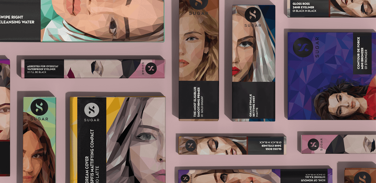
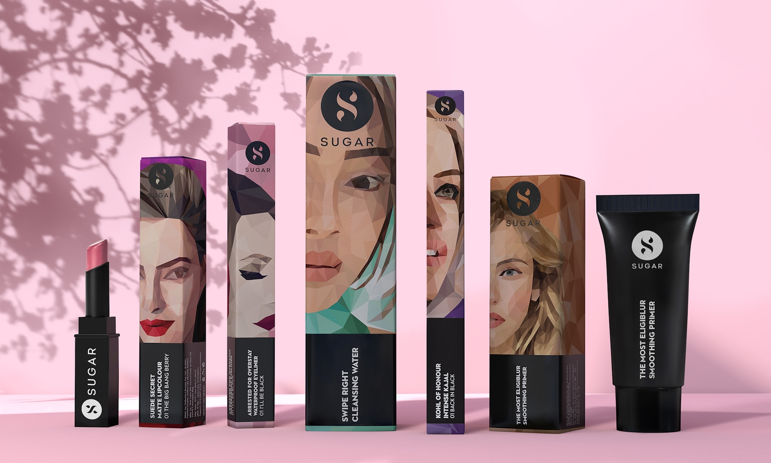
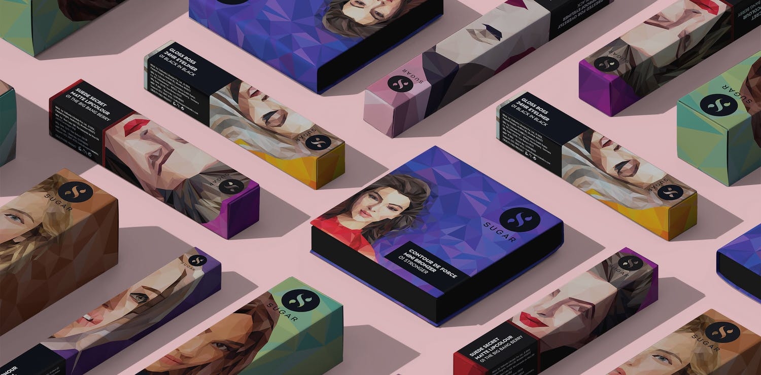
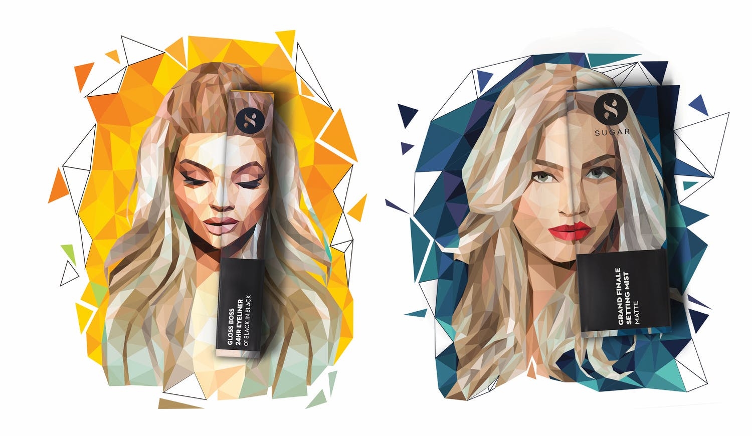
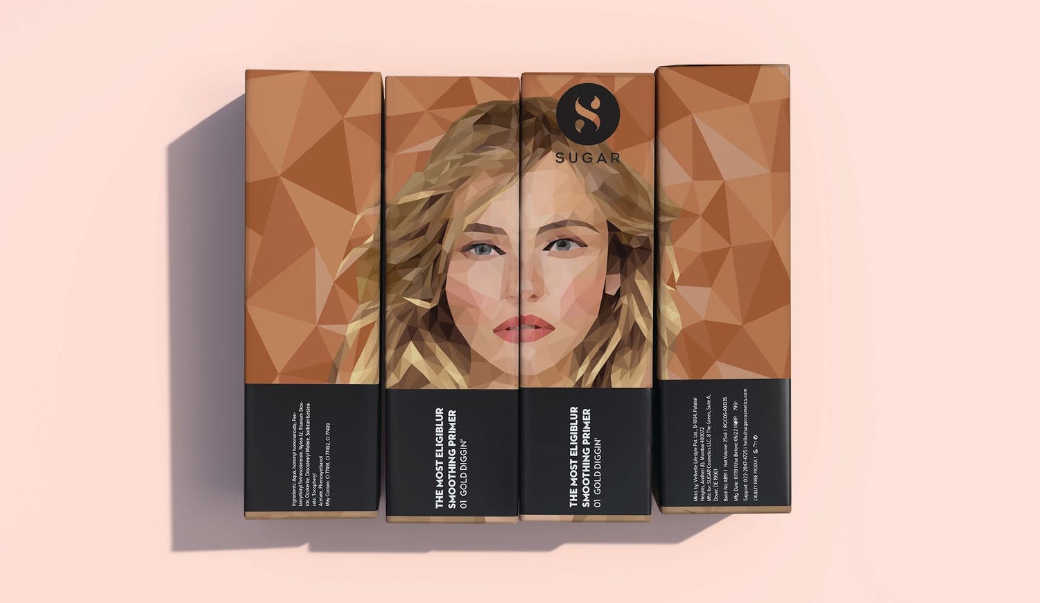
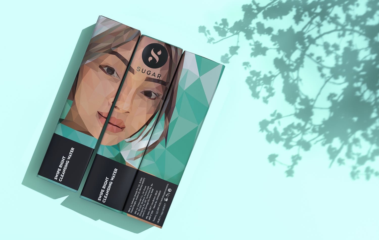
Founded by Vineeta Singh and Kaushik Mukherjee, Sugar is a true challenger brand in the color cosmetics space, dominated by multinational giants. We worked closely with the founders in 2015 to define the brand identity and create a packaging system. Our strategy for the brand was simple - create “thumb-stopping” packaging that becomes synonymous with the brand in cluttered online and offline environments.
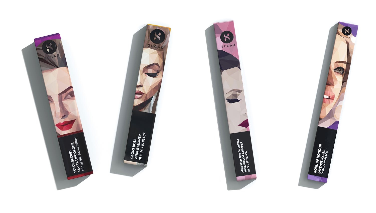
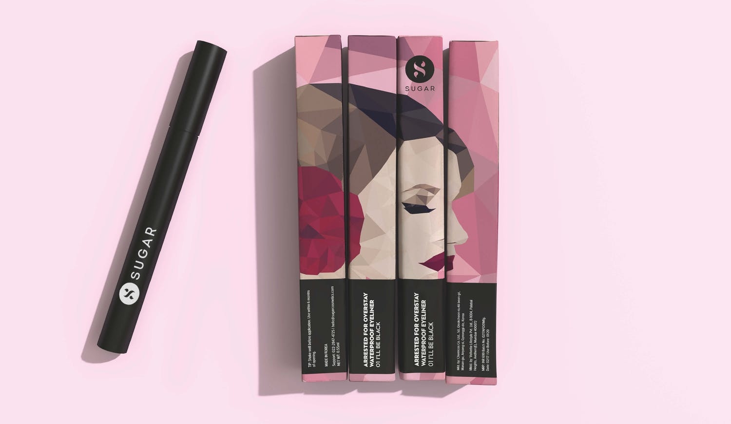
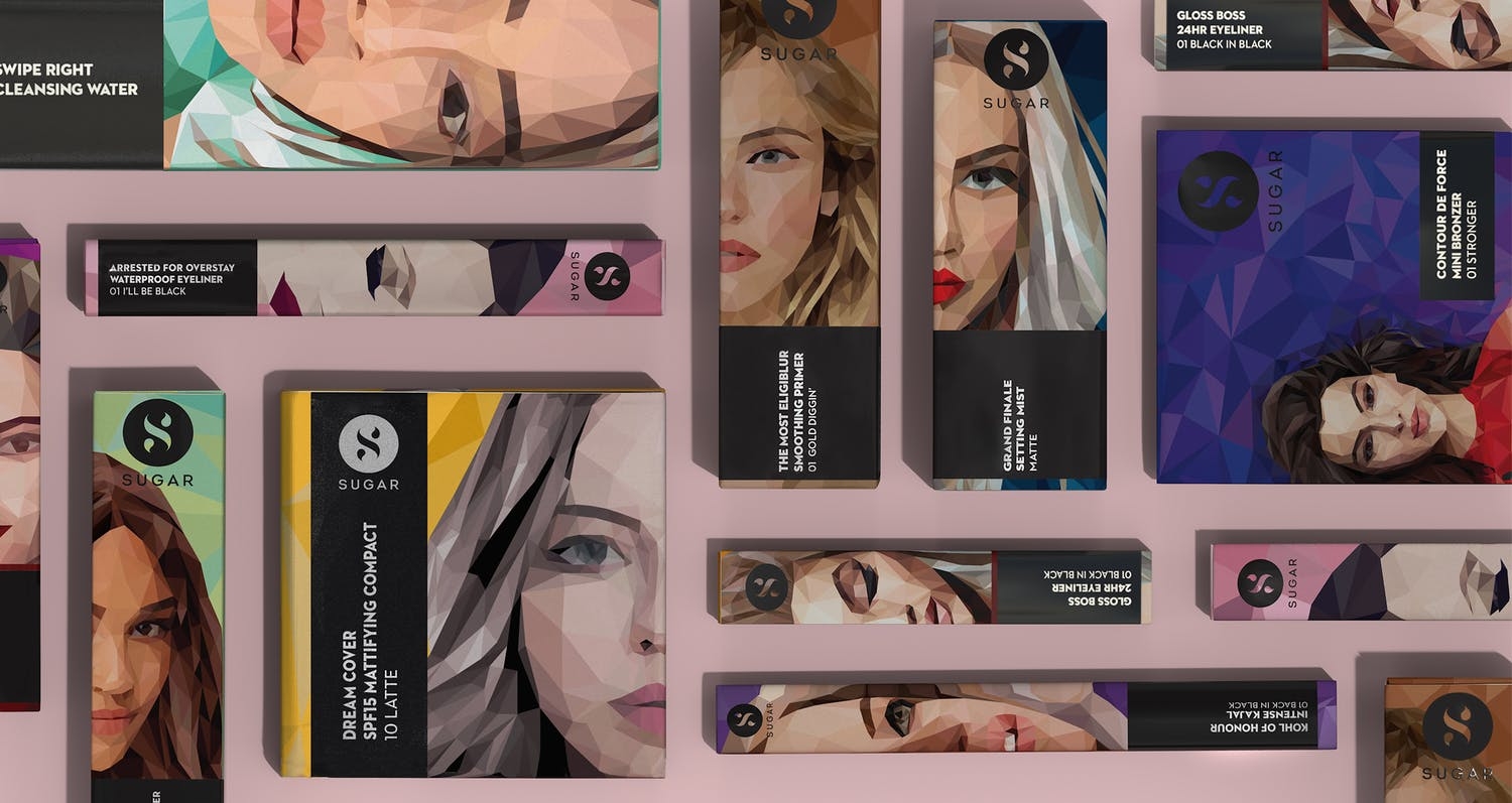
The expressive packaging aesthetic (a unique low-poly illustration style) was designed to be the key identifier for the brand, in a market full of minimal and bland products. Sugar's packaging is chic, sophisticated and bold - everything that Sugar's customer aspires to be. And it was designed to be highly scalable to match the ambition of the brand - from less than 10 products to 200+ products and counting, the packaging system has proven to be versatile across form-factors and categories, with just the right amount of cohesiveness and distinctiveness.
Sugar started as a digital-first, D2C brand and switched to an omni-channel model in 2018. We partnered with Sugar to translate the brand to Retail Touchpoints (See Project). It has now scaled to a network of more than 1,000+ retail locations across the country.
Since we began our ongoing collaboration with Sugar, it has raised more than $35 million in venture funding from marquee investors including Elevation Capital (SAIF), A91 Partners and India Quotient. It is on track to do more than Rs.200 crore in annual revenue in 2021.
