Sugar
Retail Design / Cosmetics
We built the Sugar brand and created the packaging a couple of years back. The brand has done extremely well, become an online favorite.
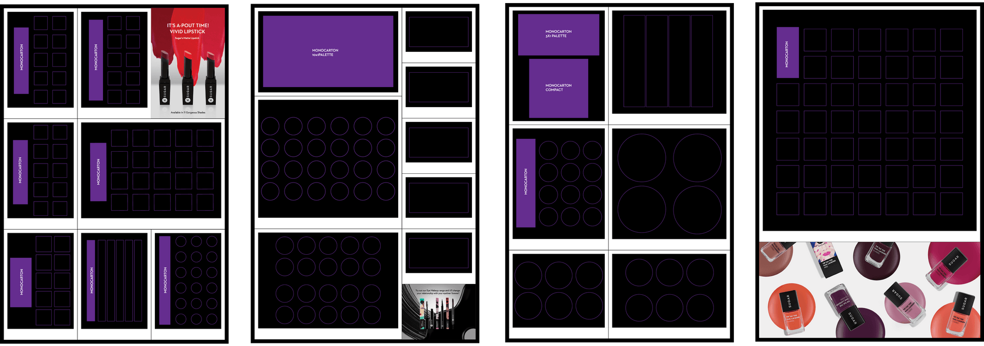
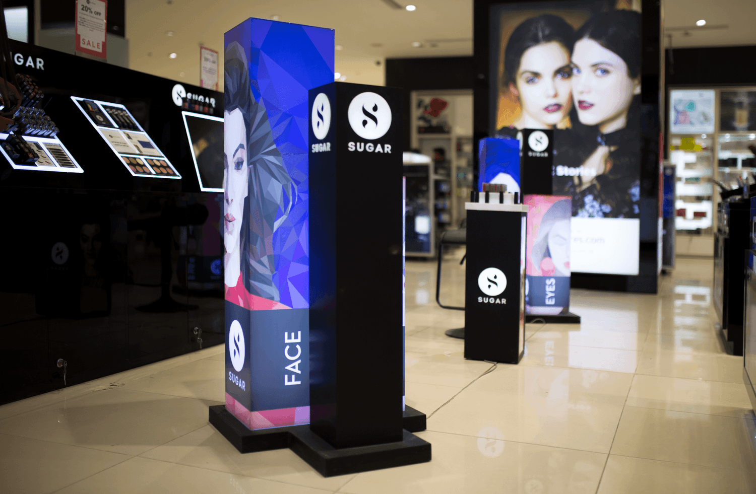
When they decided to start selling offline, the Sugar team approached us to design their retail presence. We started with a comprehensive study of cosmetic counters of major brands at lifestyle stores – and realized quickly that the space was ripe for disruption. Most cosmetic counters looked the same – change the logo and you wouldn’t know what store you walked into.
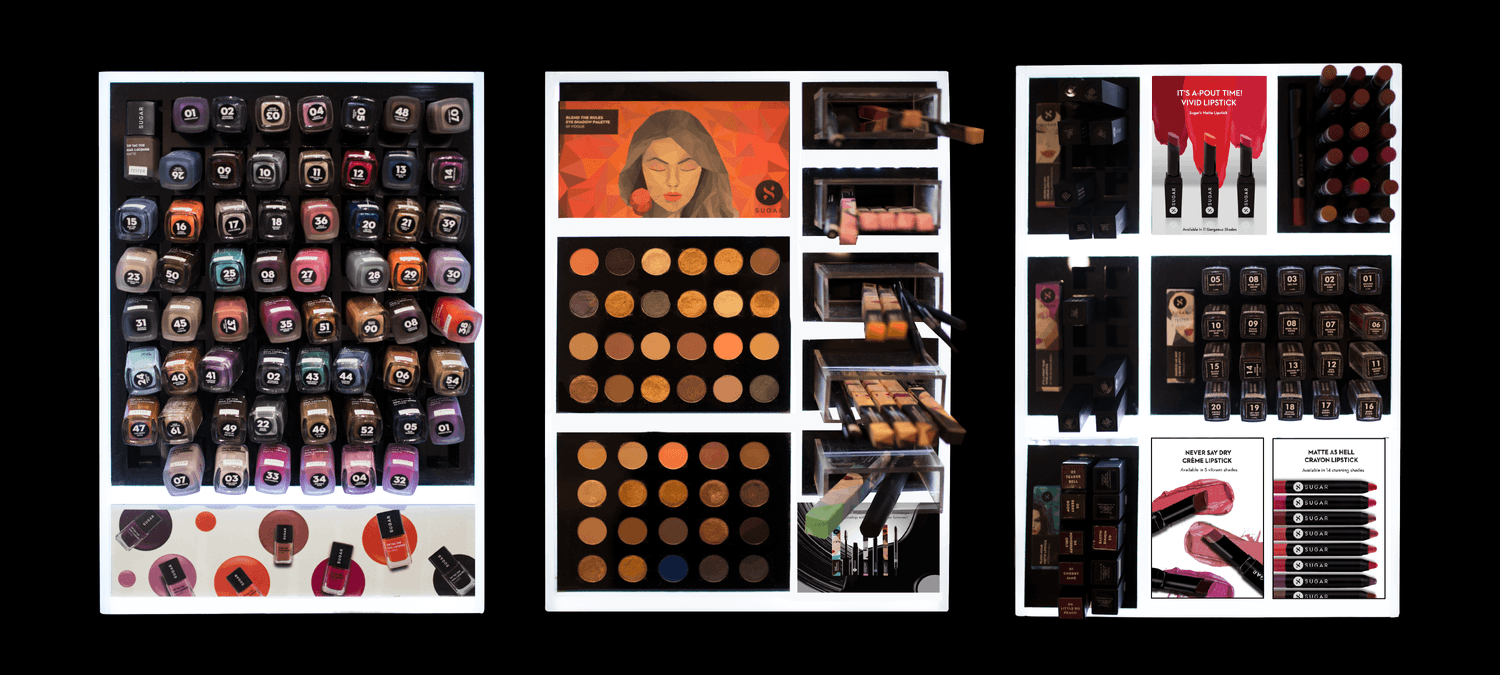
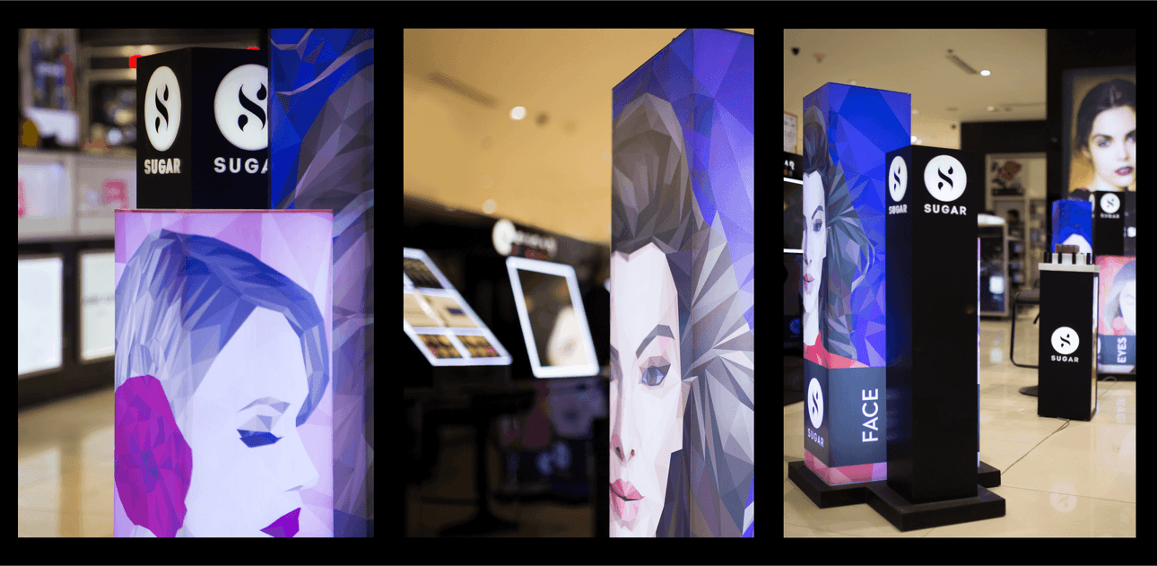
Our challenge was to retain the familiarity of cosmetic counters – while making Sugar’s retail displays stand out in a crowd of cosmetic brands. We achieved this by taking Sugar’s bold visual language and packaging and translating that to a retail context.
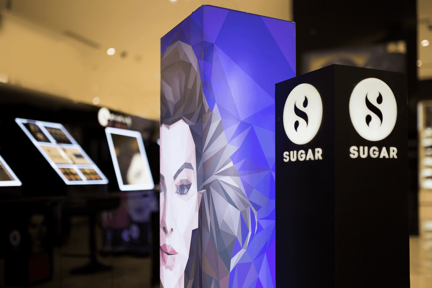
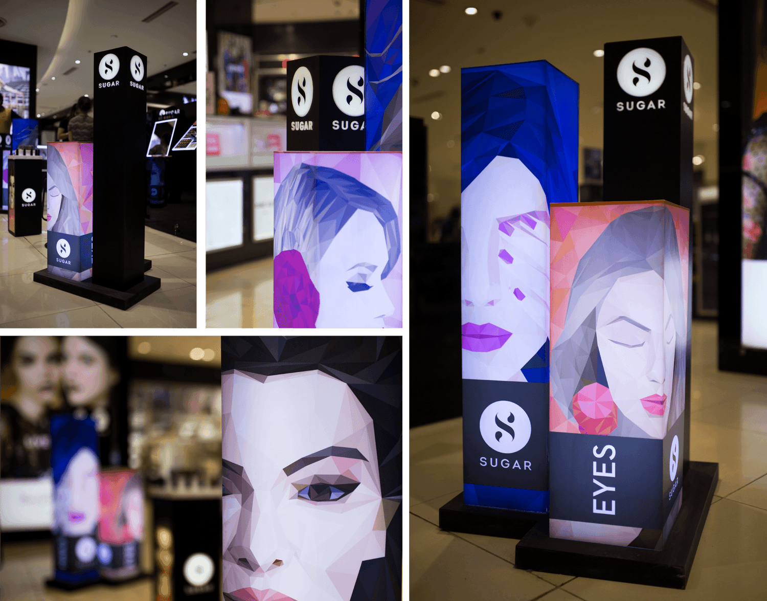
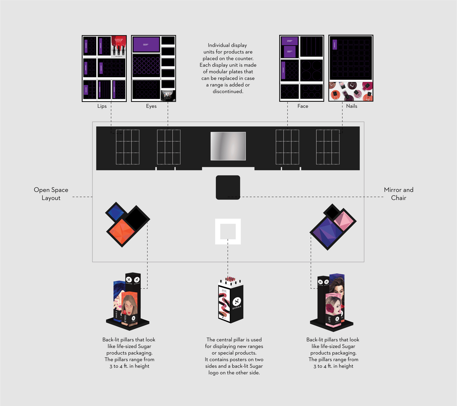
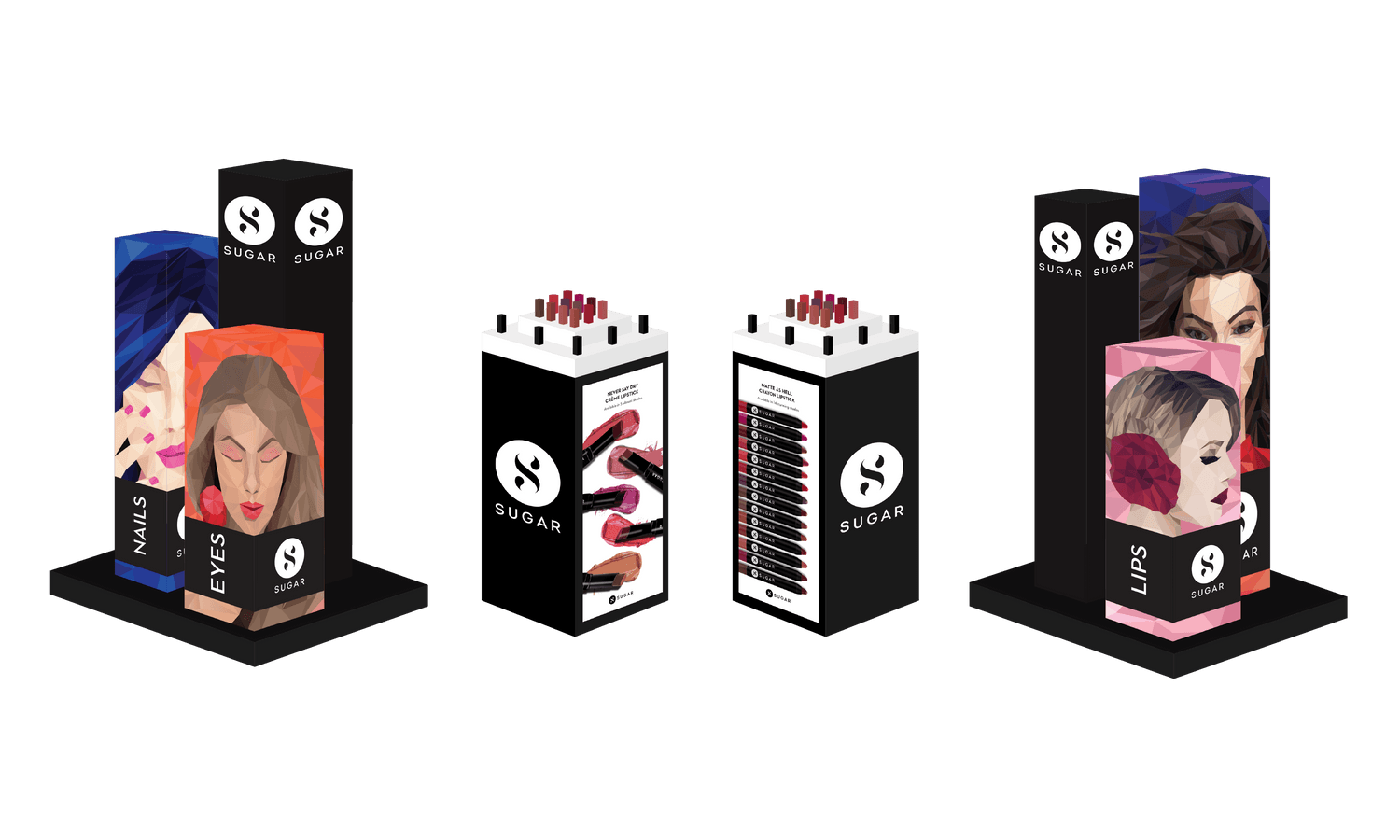
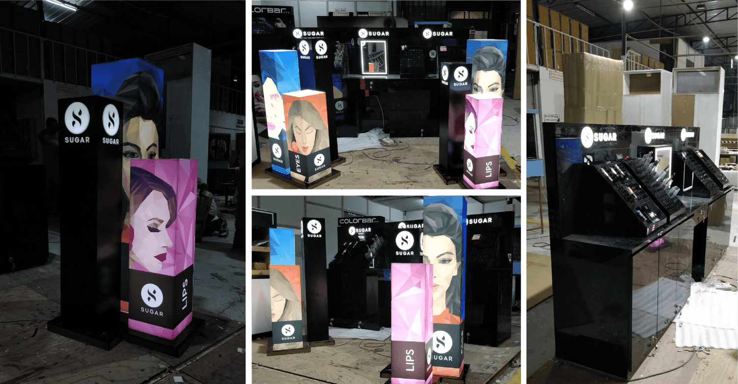
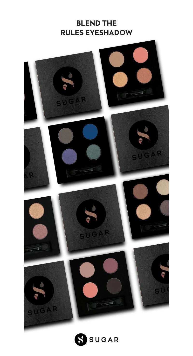
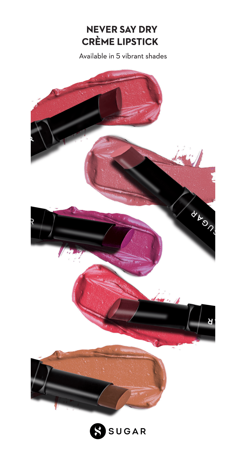
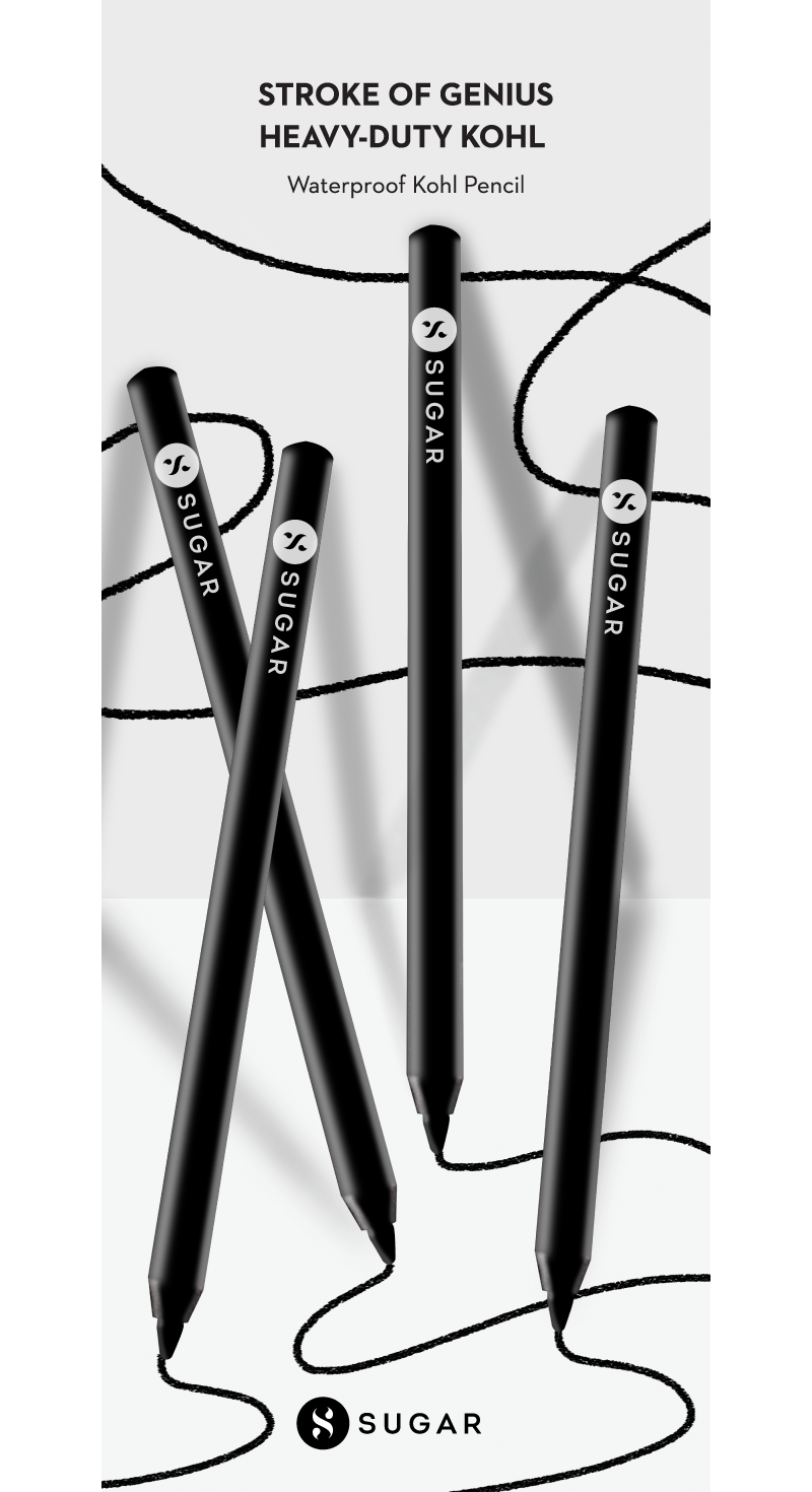
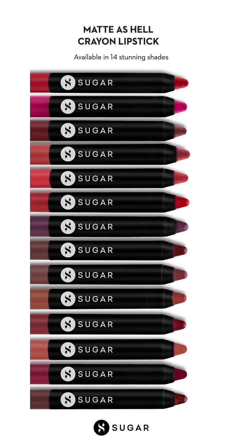
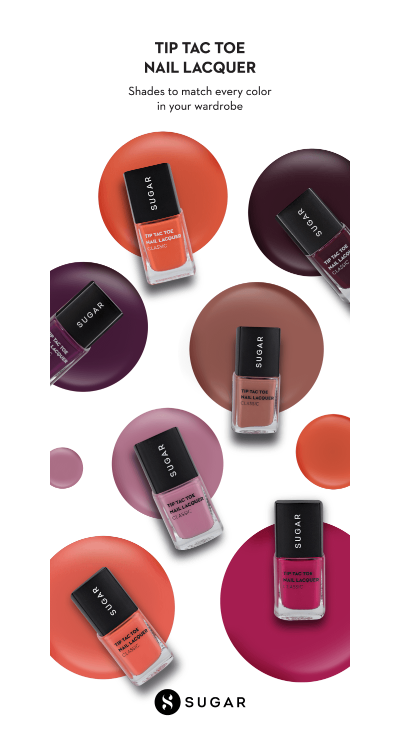
It is now easy to spot a Sugar retail display from anywhere in the mall – just look for life-sized, back-lit renditions of their well-recognized packaging cartons. These became the show stoppers.
We also chose an open plan layout, where the customers could walk around, without feeling the pressure to “buy” at a counter.
