Digit Insurance
UX/UI for Insurance
Insurance was meant to be a magical safety net for consumers. But it’s turned into anything but; it’s complicated, jargon-filled and a chore everyone would rather avoid.
Digit is an ambitious new Insurance company that’s seeking to revolutionize the insurance experience in India.
We worked with Digit over 16 weeks to build their online quote generator and website in a way that makes the insurance process quicker and easier to understand. [See web design project here]
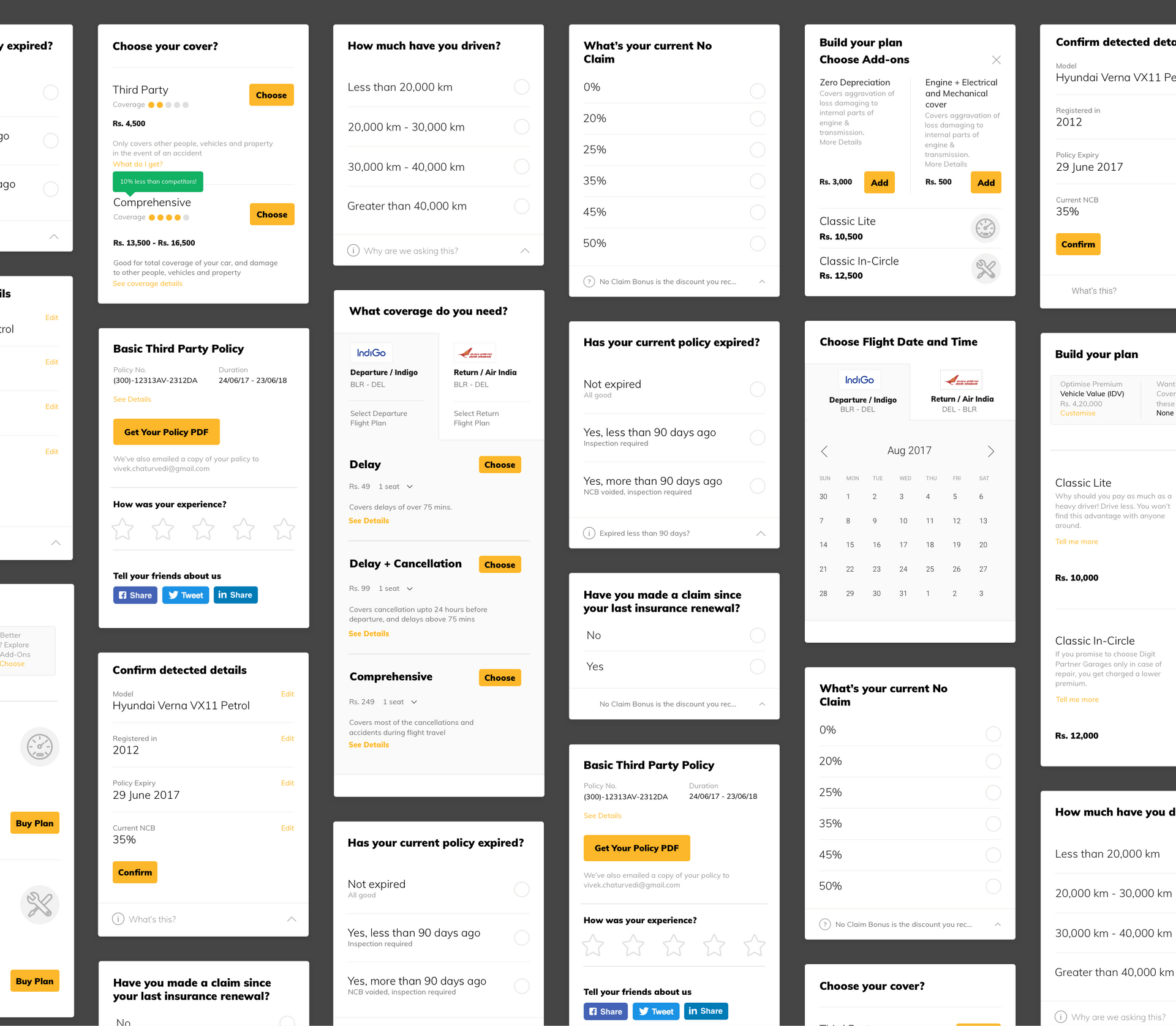
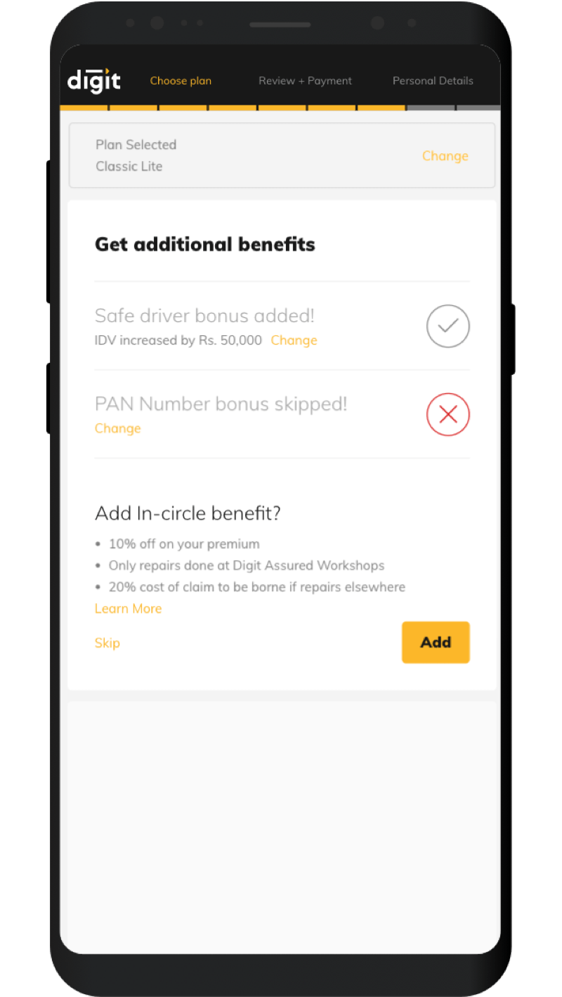
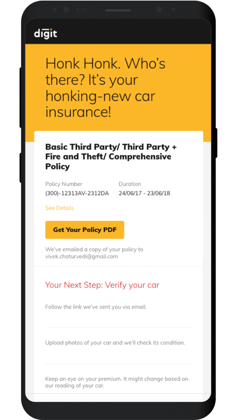
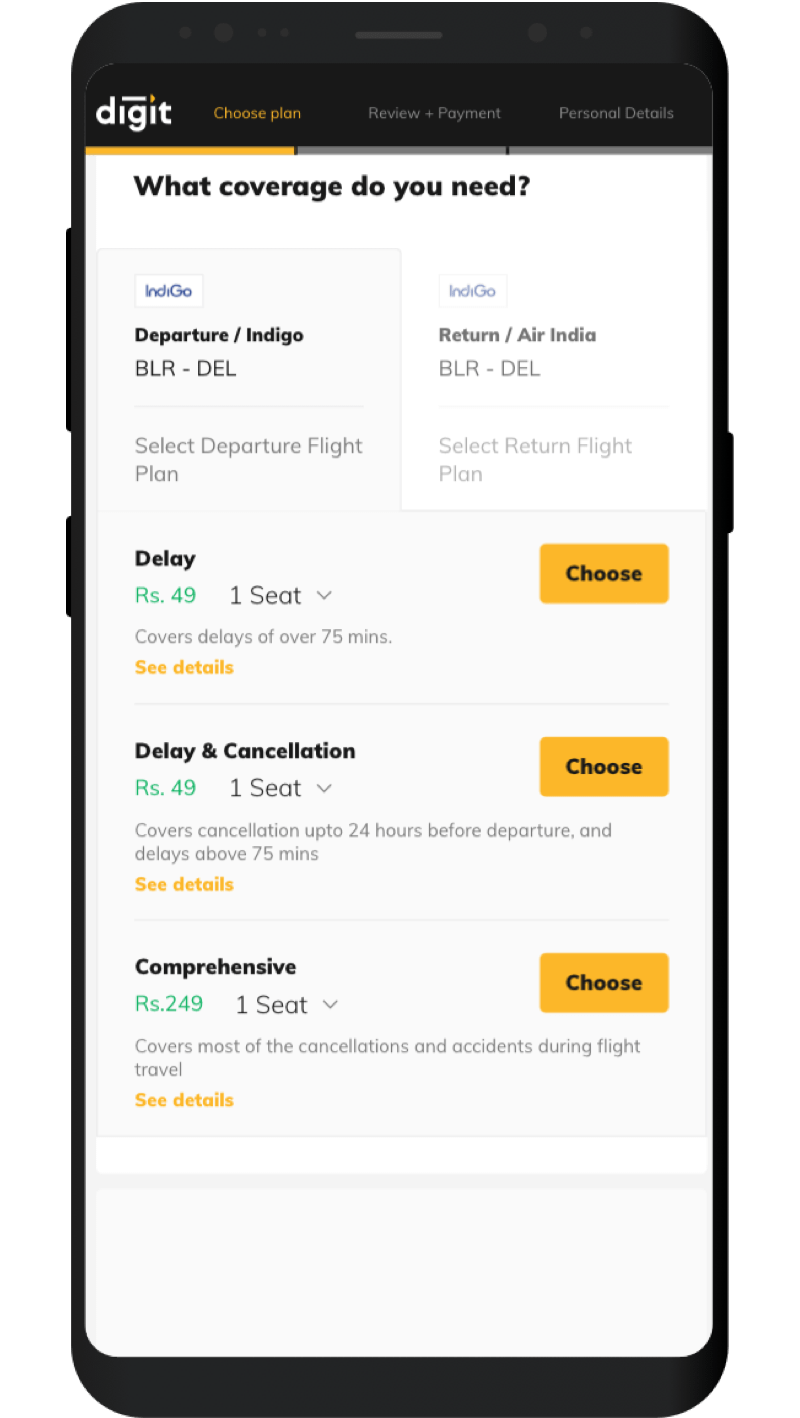
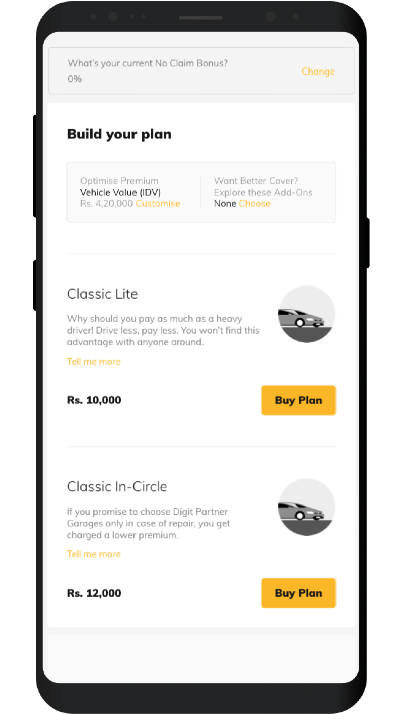
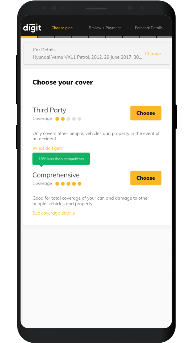
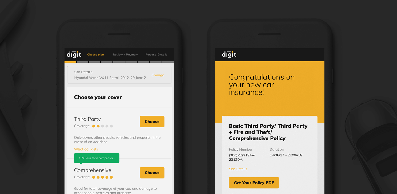
The quote generator we built was a nifty, mobile-first tool that was packed with useful features to optimize speed, accessibility, understanding and relevant recommendations. It incorporated contextual information provided by the user to make relevant recommendations for policies, so the user is more informed while taking decisions. All this was wrapped in a clean, intuitive card based layout that was targeted at improving user focus, and offer relief from the haphazard experiences they’re used to with other insurance companies.
Design Principles

Educational
Inform the user about insurance terms and best practices in a simple, contextual way.

Focused
Don't overwhelm the user with too many options; give them space to focus and make decisions.

Scalable
Create a design system that is modular and can easily extend and adapt based on increased requirements.

Familiar
Create units and components that users are familiar and comfortable with, so as to not daunt them.
Card-based System
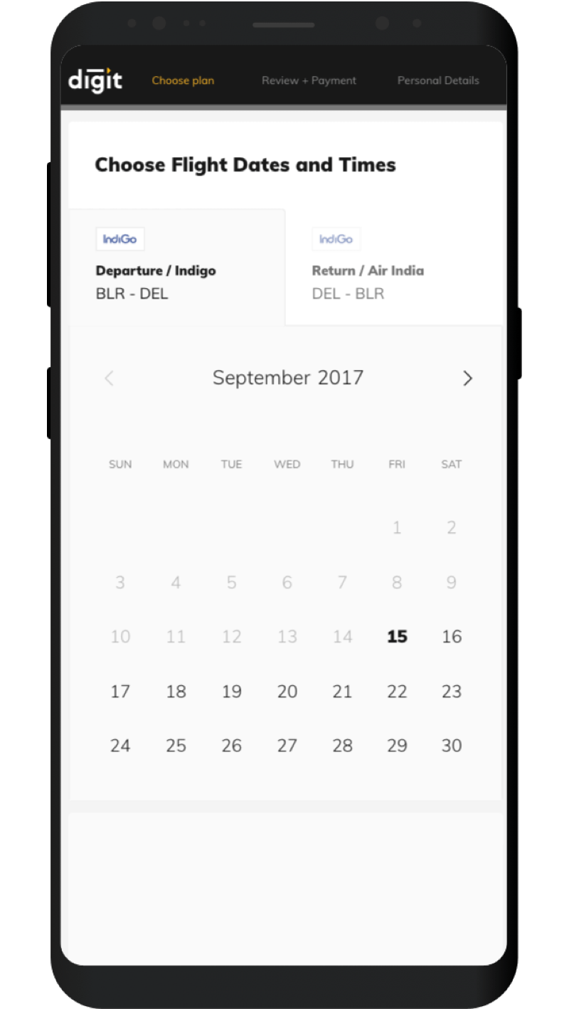
The whole flow is built on a custom, modular card system. For the type of content we had, cards were the best solution; they can be expanded, contracted, added or removed easily.
One at a time
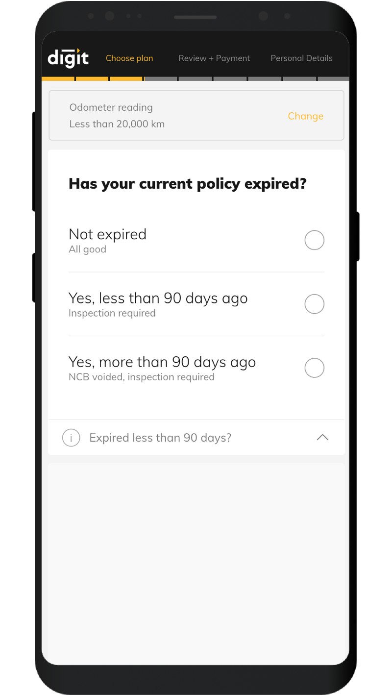
By showing only one requirement at a time, we solved two of the biggest issues users had with existing online insurance forms: Being confusing and daunting. Now, they can focus only on what’s required at a time, and we get more space to put in explanations.
Inline Information
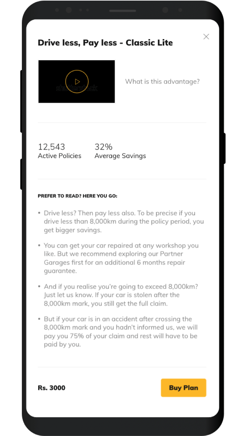
Handy explanations at each step for all the things most users wouldn’t be familiar with. Available as you’re buying your insurance, so you don’t need to jump anywhere else.
Contextual Recommendations
The system was built to intelligently recommend plans to users based on background information it gathered about their requirements.
Easily Editable
In case a user needs to go back to change details, it’s just a matter of scrolling up to edit what they need, and then jump back to where they were.
