Value Research
Space Design
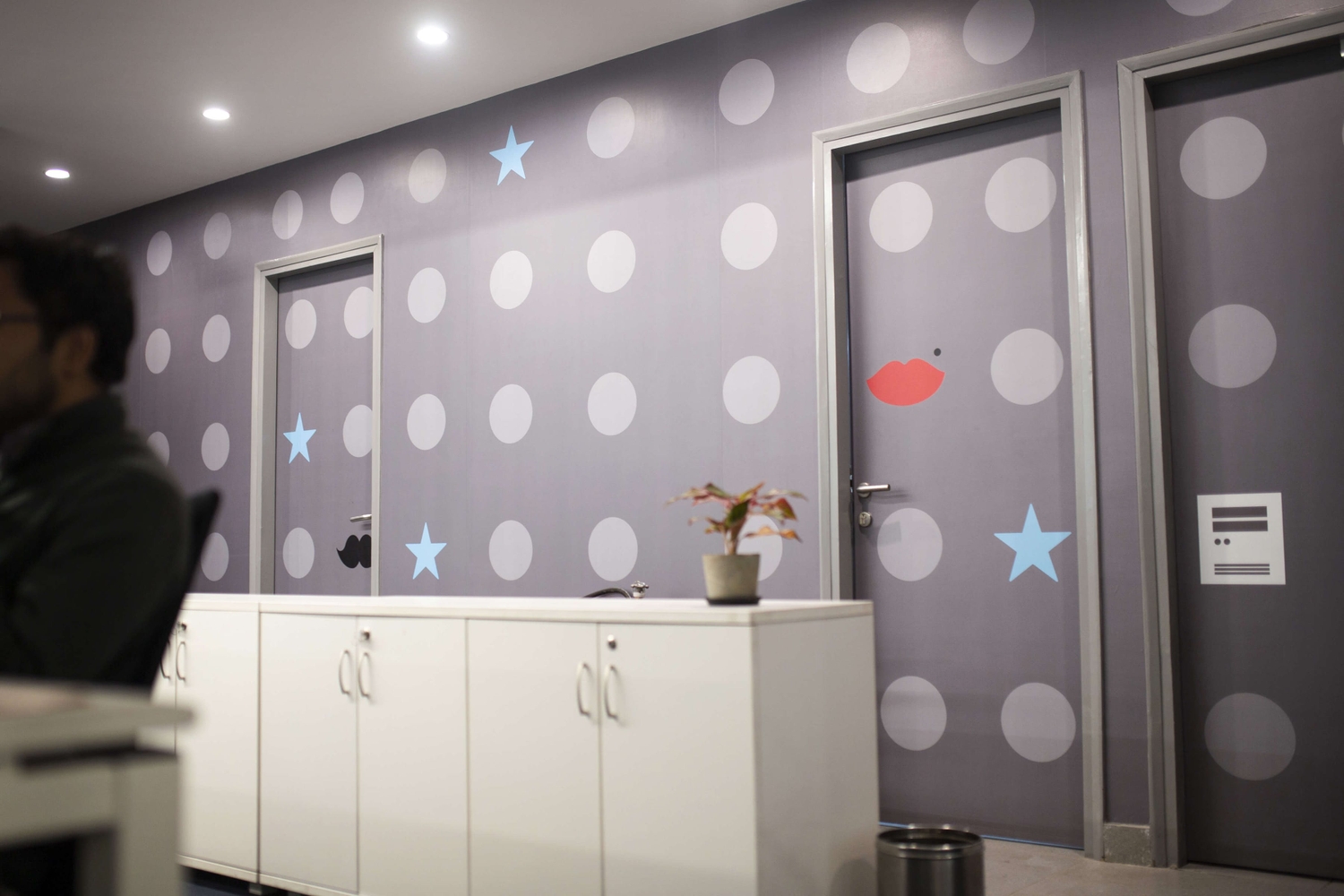
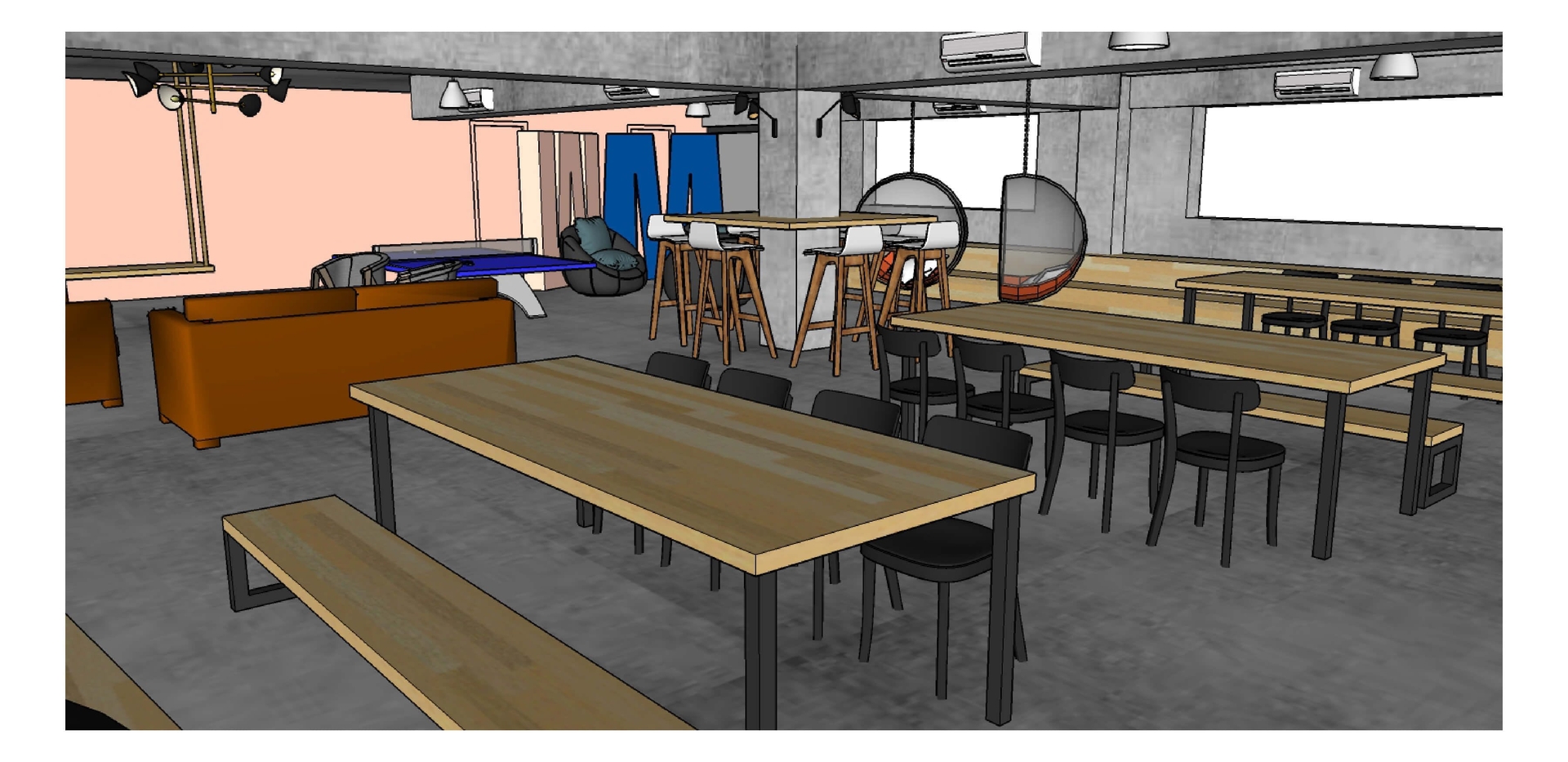
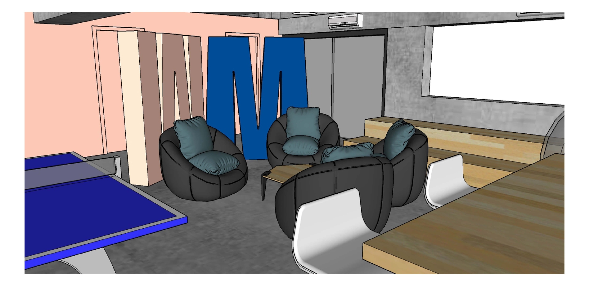
Our engagement with Value Research started with a rebranding exercise – but once that was done, we got down to implementing the new brand and visual language, starting with their new 5-storey office.
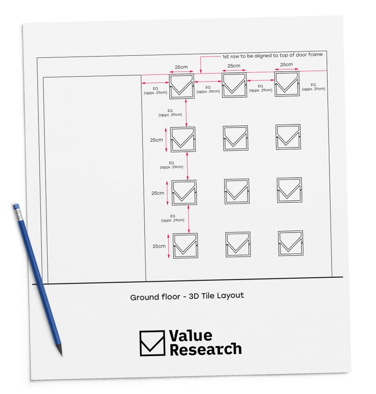
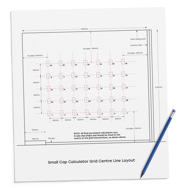
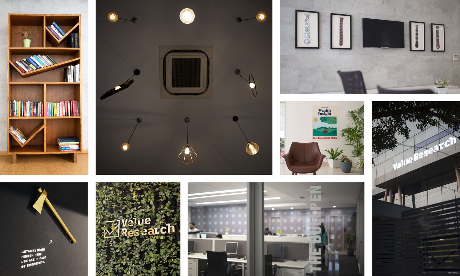
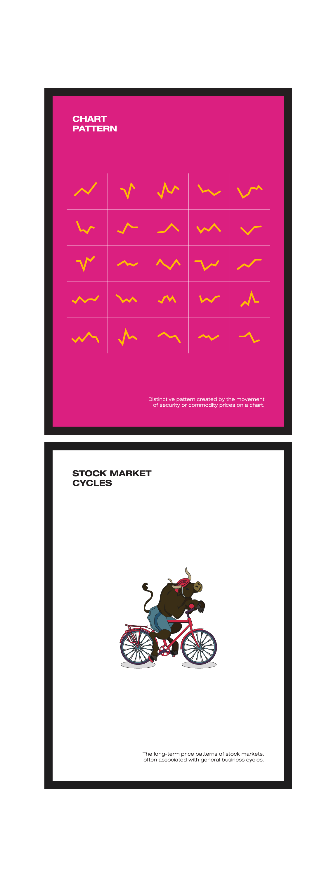
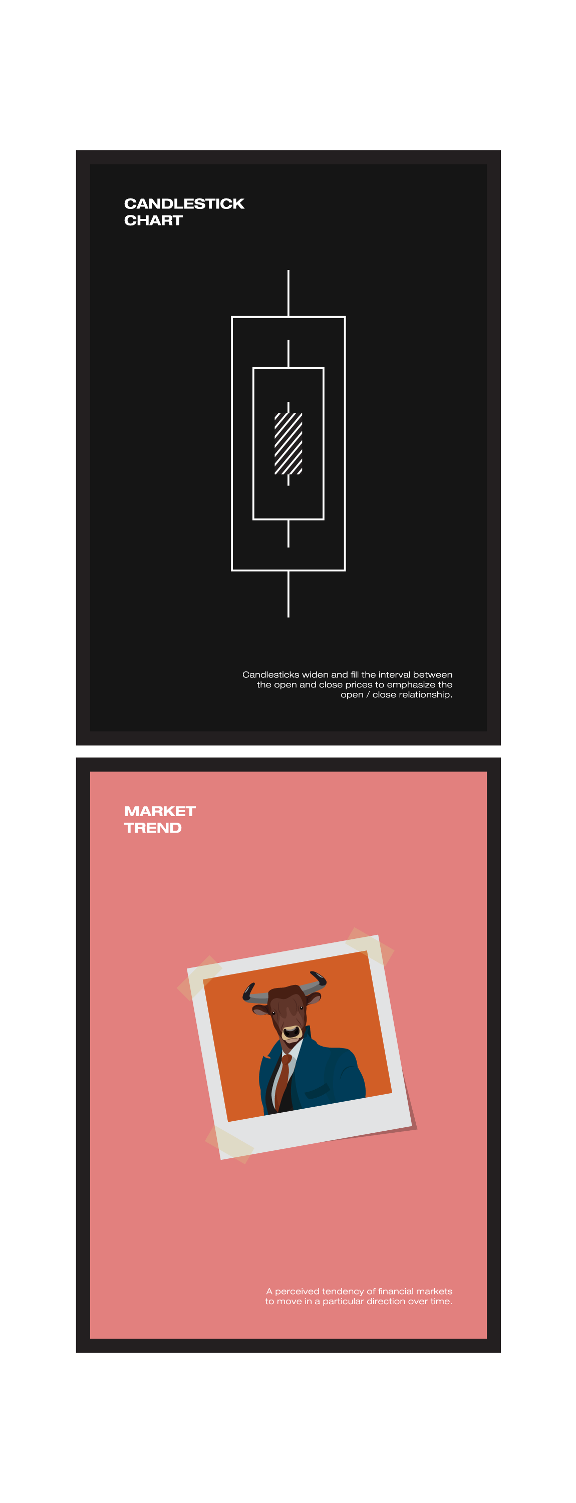
Our work was predominantly based on using physical objects instead of pasting graphics on walls. We took elements from the finance domain – calculators, currency notes, ties – and used them as decor objects.
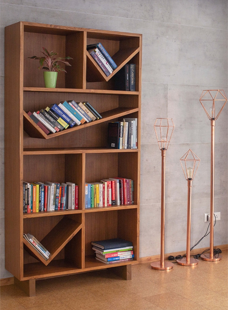
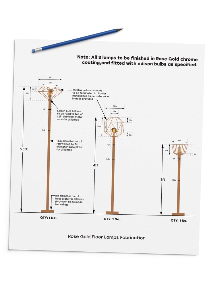
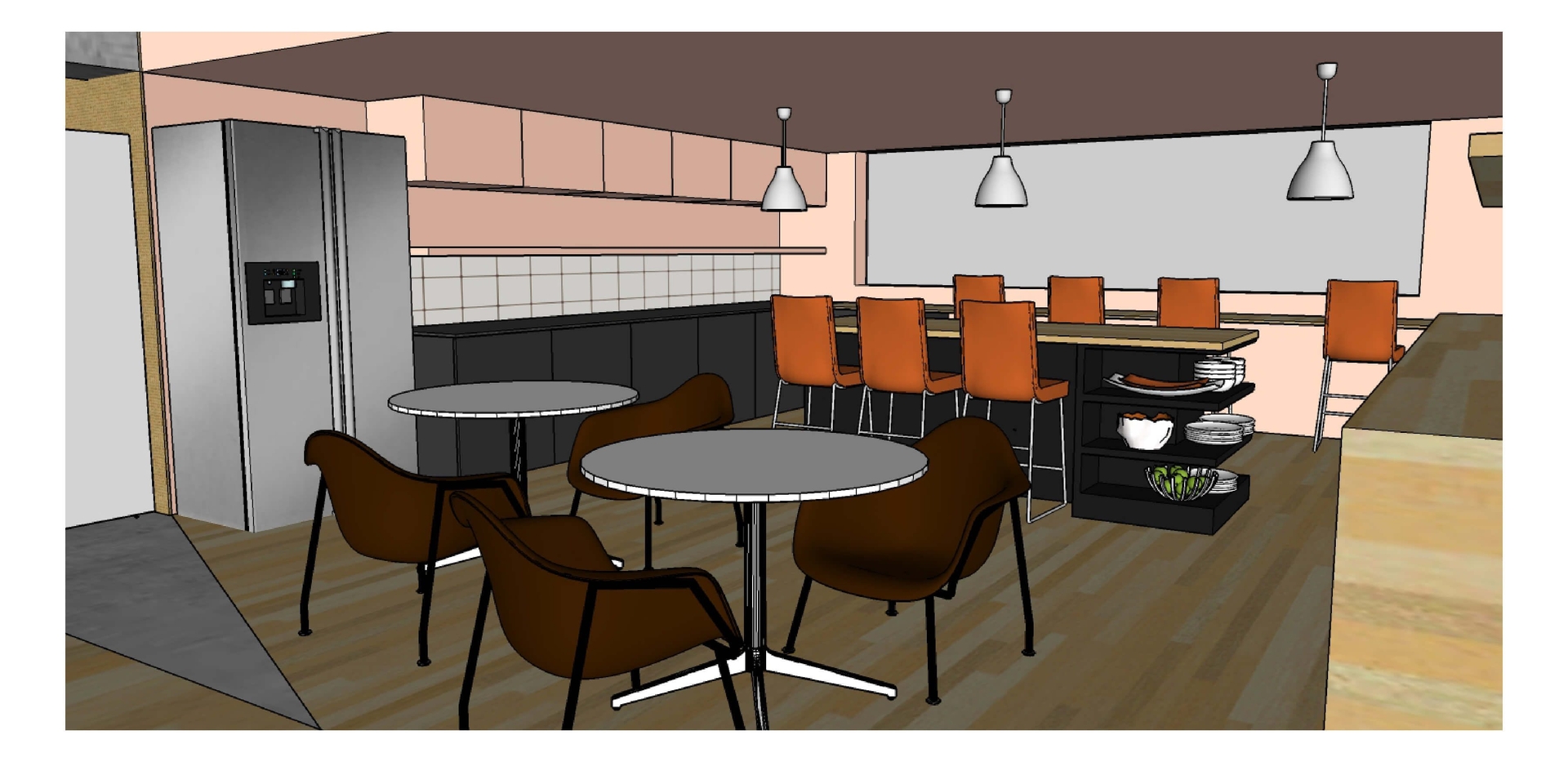
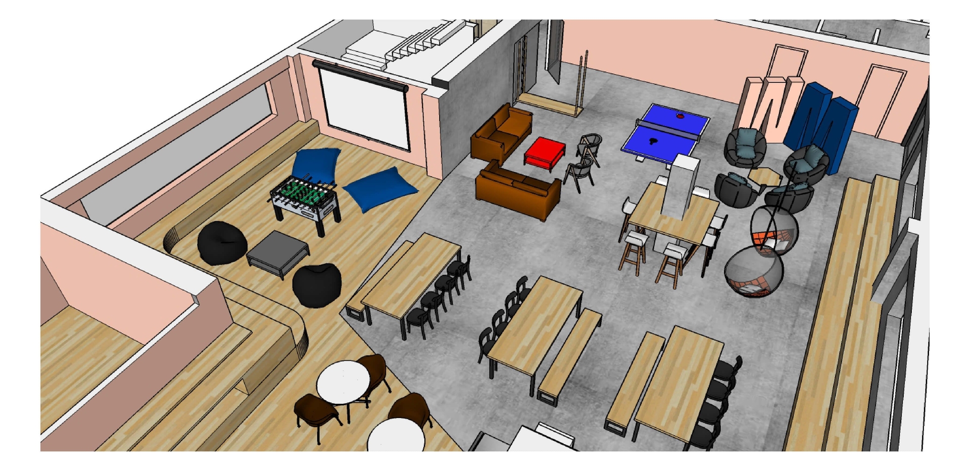
Our role also involved choosing (or in some cases designing) the furniture, creating the entire cafe, external and internal signage etc…
The two highlights of the project:
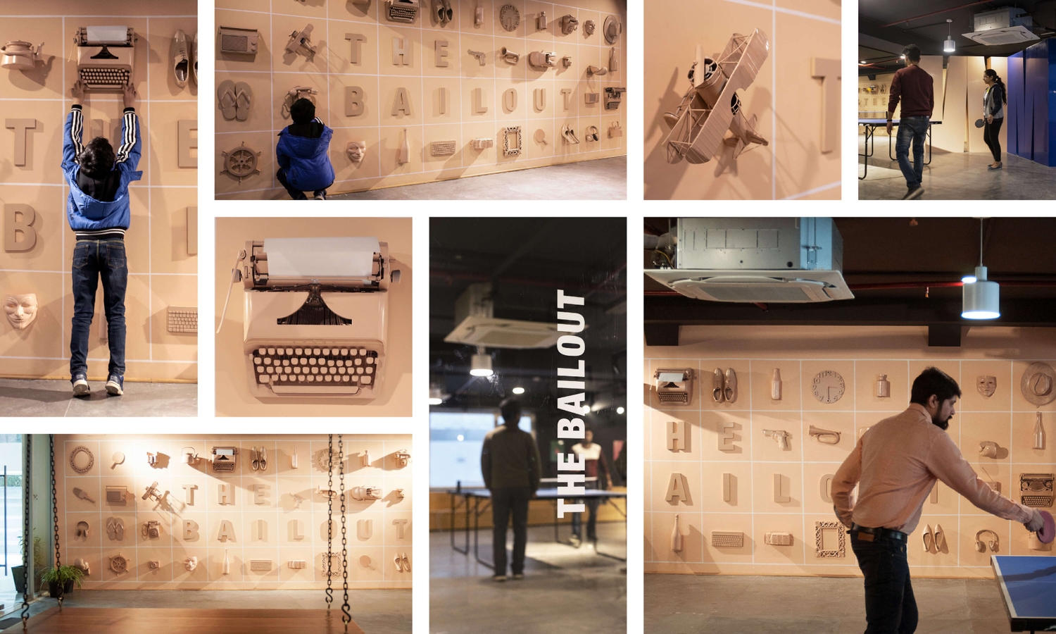
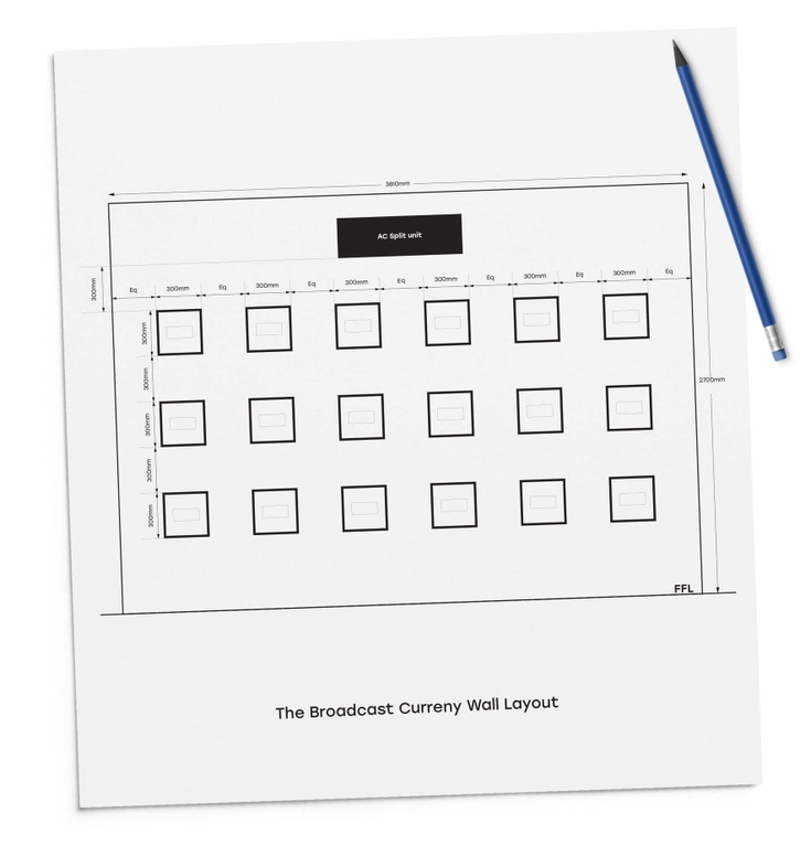
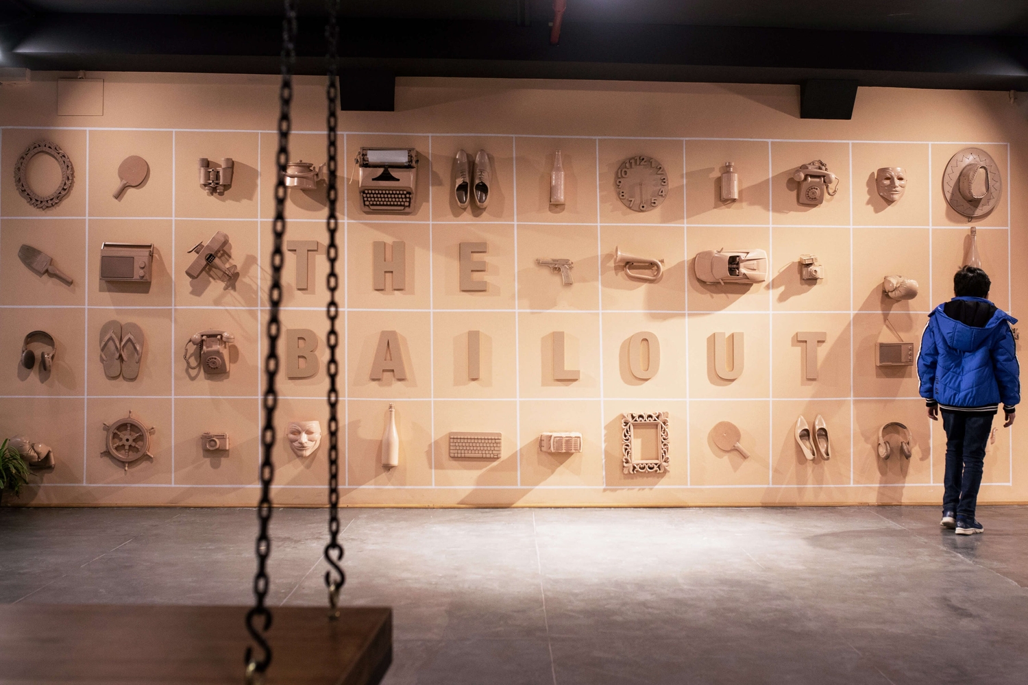
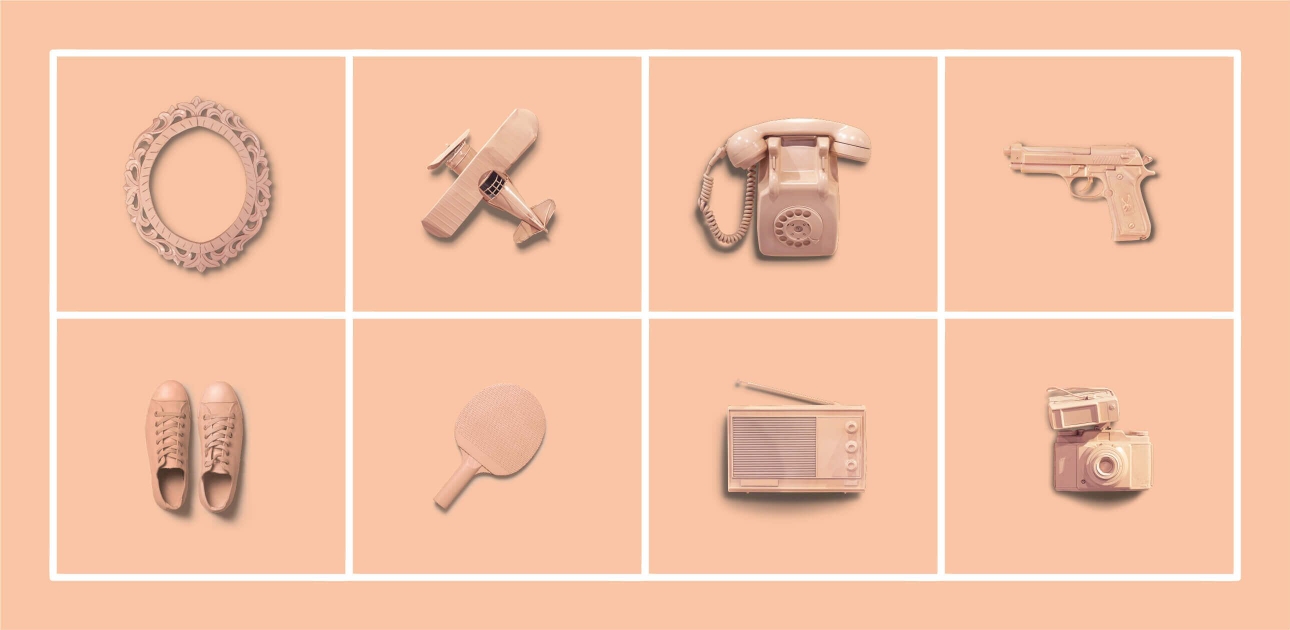
The Bailout Wall, in their cafeteria, which is made out of real objects (guns, typewriter, shoes, radio etc…) Duco painted and arranged in a grid.
The logo walls, on the first and second floor elevator bays, where we made the newly designed V symbol out of more than a dozen materials – different stones, wood finishes, metal finishes etc…
