The Ken
UX/UI for Media
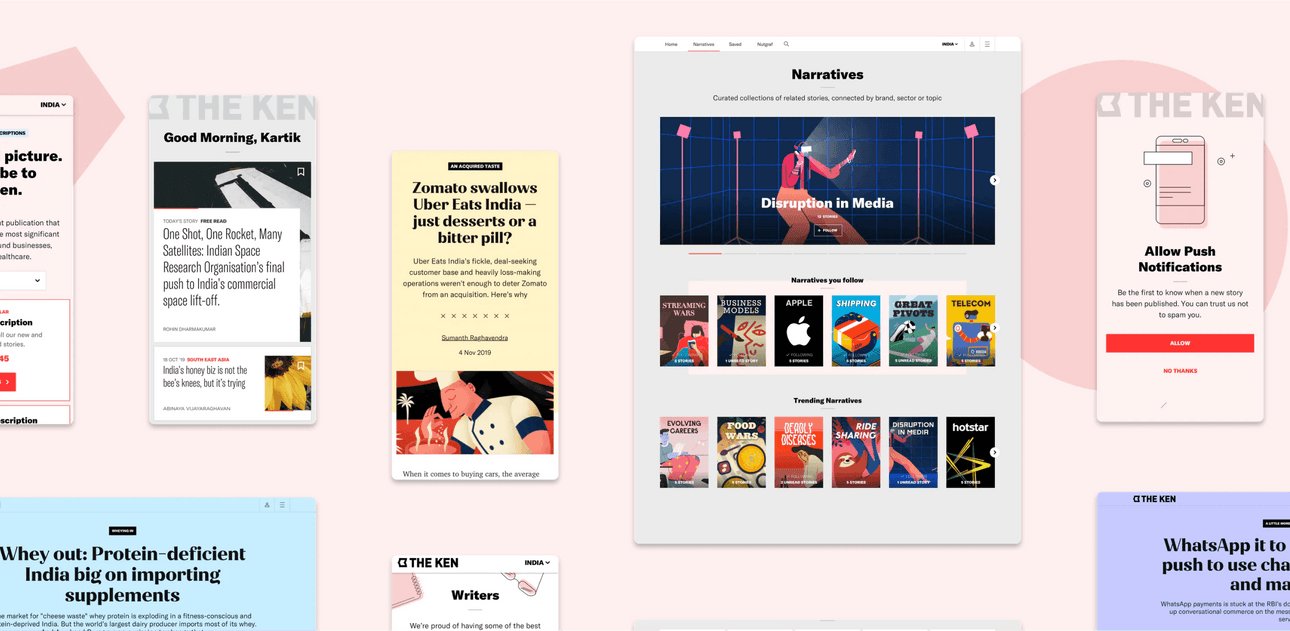
Founded by a team of senior business journalists and editors from Forbes, Mint and Reuters, The Ken is a pioneering re-imagination of business journalism. It is built around a clear idea – long form, analytical business stories, painstakingly researched and written by a team of independent journalists with a strict code of ethics.
Our partnership with The Ken started in 2016, when we designed and built the first, post-MVP version of their platform. This gave The Ken a distinct identity to match its editorial voice. Four years later, we received an email from Rohin Dharmakumar (Co-founder, The Ken), with the subject “It’s time”.
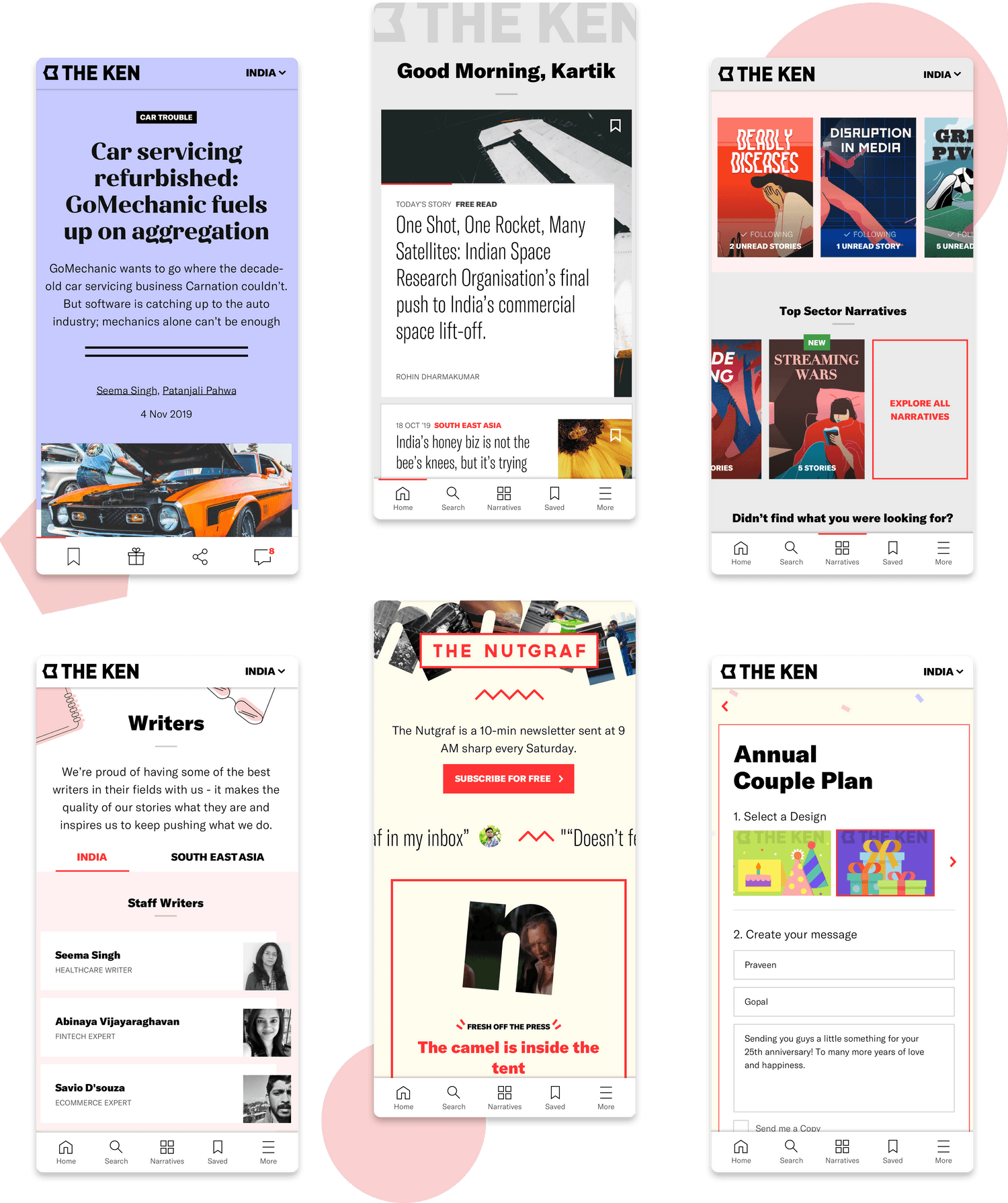
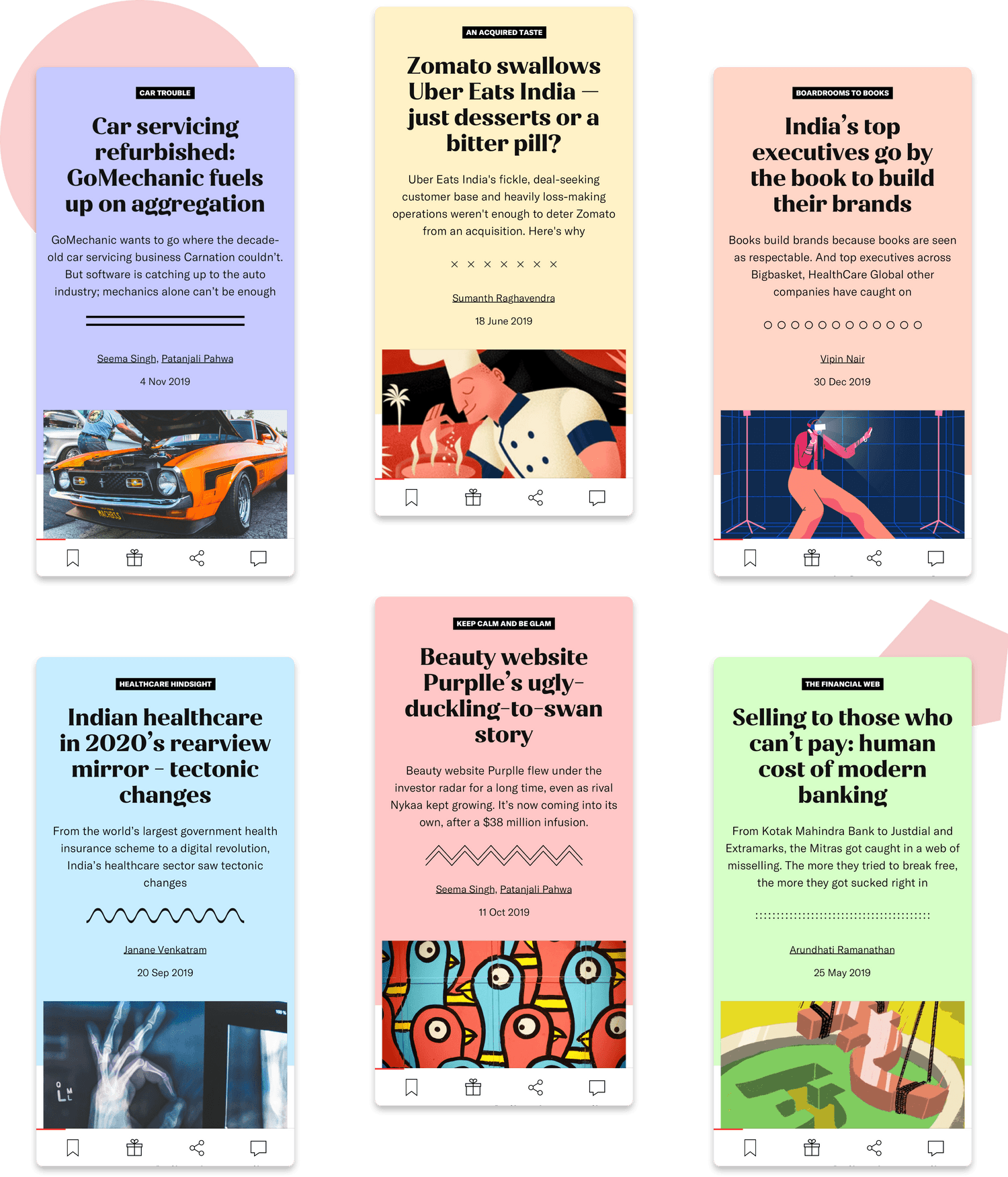
Over this time, The Ken had established itself as an important voice in the entrepreneurial ecosystem and built an array of new product features. Our task was to refresh the User Experience and Visual Design to consolidate all the new features and build a foundation for the future, including regional editions and different story formats.
We started by looking at usage analytics of the last 4 years to understand how users were interacting with what we had built. This was followed by a new Information Architecture that allowed for the new ways users were consuming stories and the new forms of editorial content The Ken was creating.
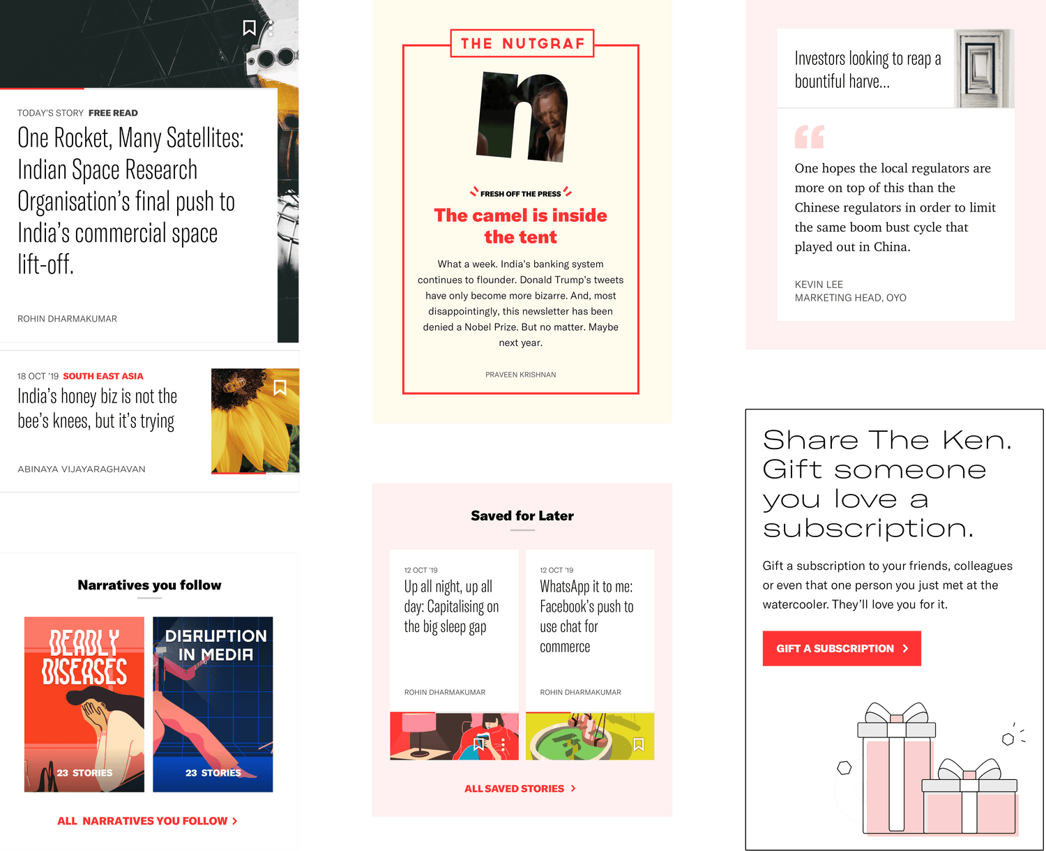
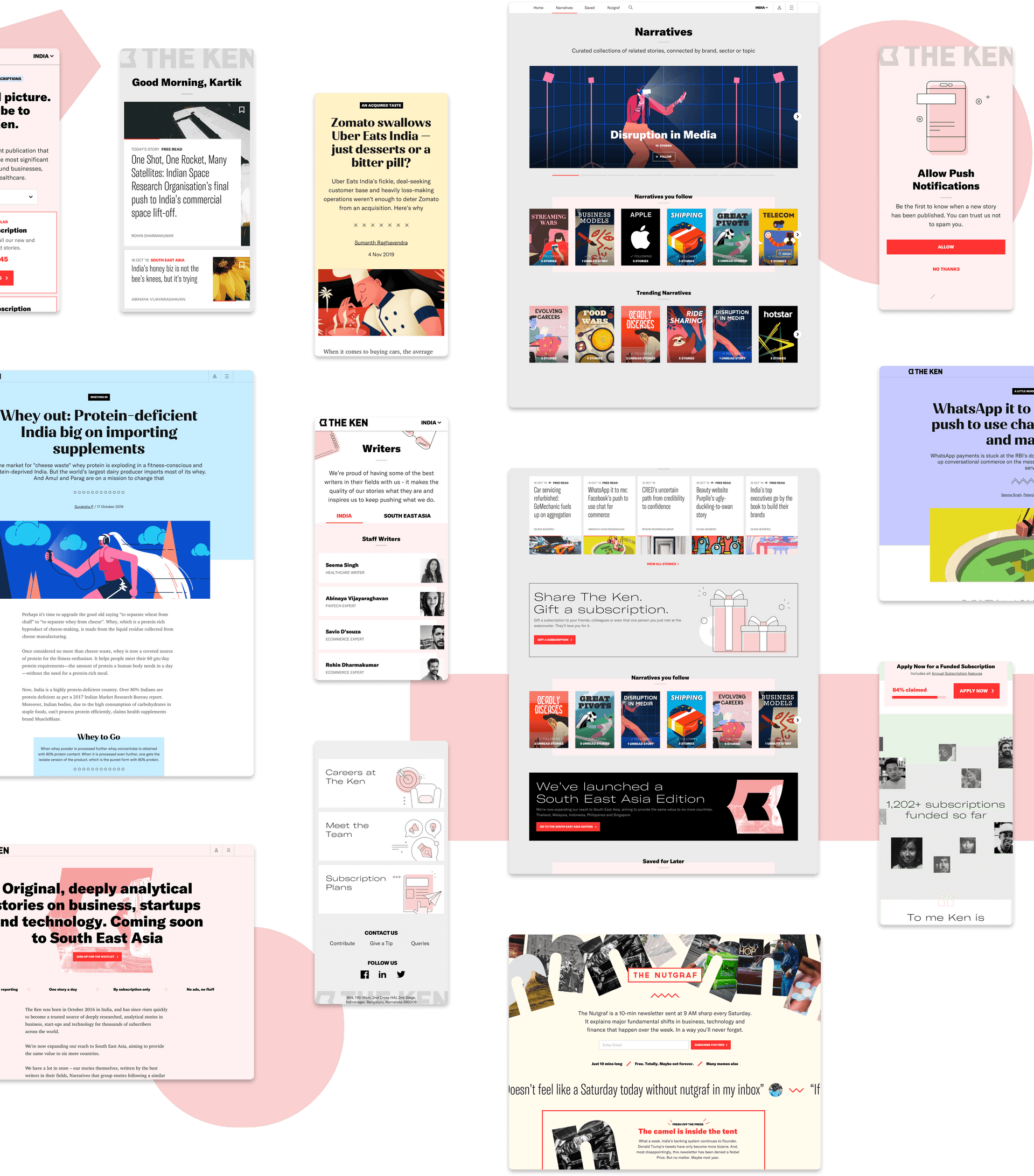
The redesigned discovery and reading experience, deep personalisation and a richer community feature-set are aimed at solidifying The Ken’s role as a benchmark in User Experience for media products.
Narrative Illustrations - Icons8