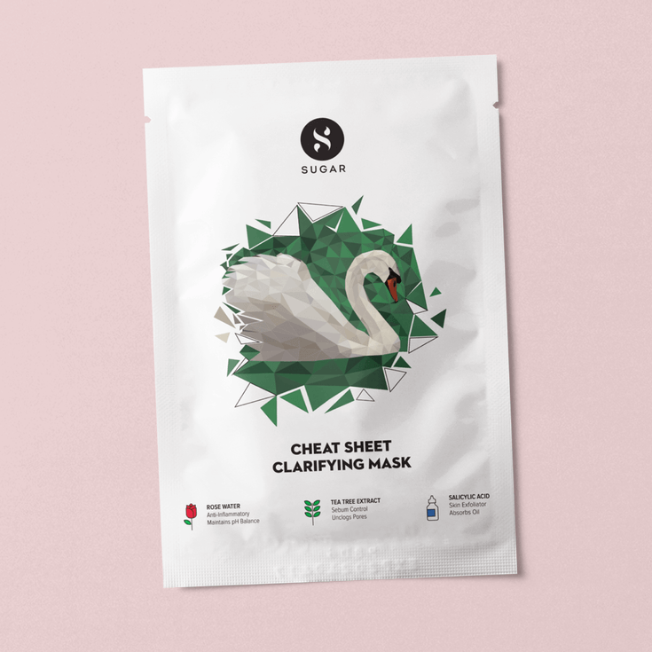
Sugar Sheet Mask
Packaging Design
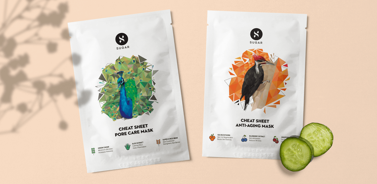
Sugar is a homegrown cosmetics brand that we worked with to create its core brand identity, visual language and packaging system (see here) in 2014. Since then, the low-poly illustration style we used has become iconic and synonymous with the brand. Sugar has grown dramatically, from being an online D2C brand to having a retail presence at 700 stores and a product portfolio with 350+ products across 26 categories in color cosmetics.
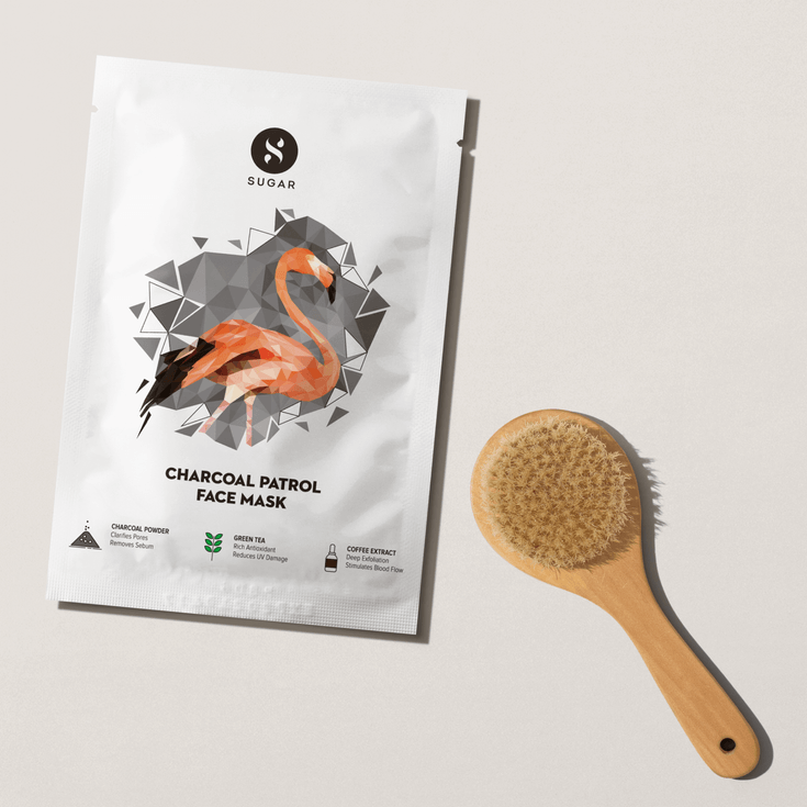
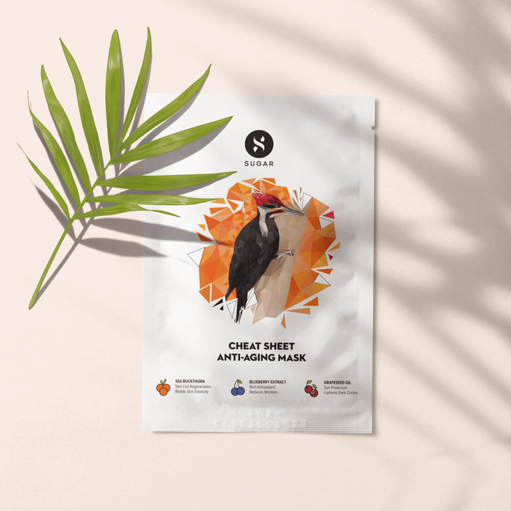
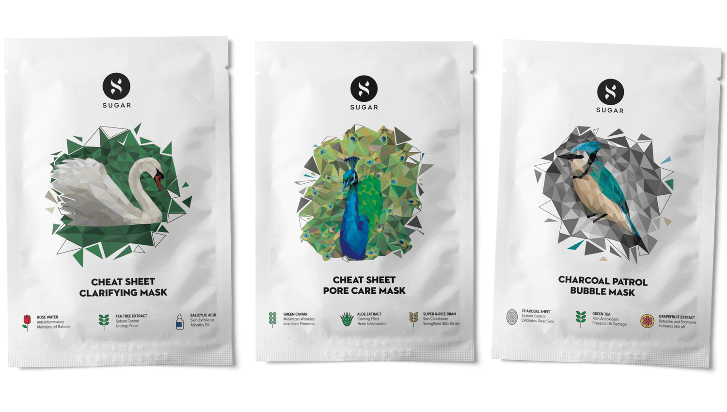
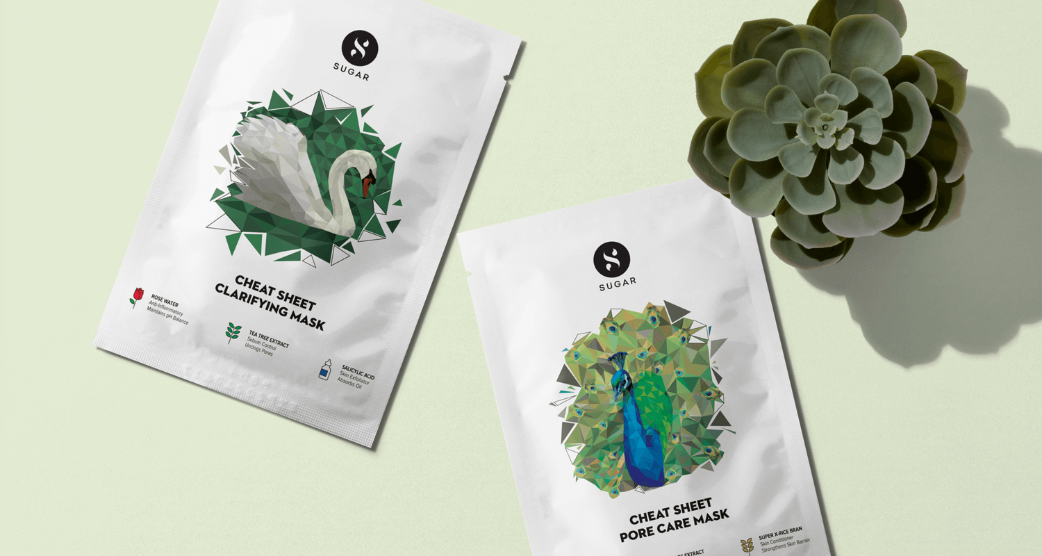
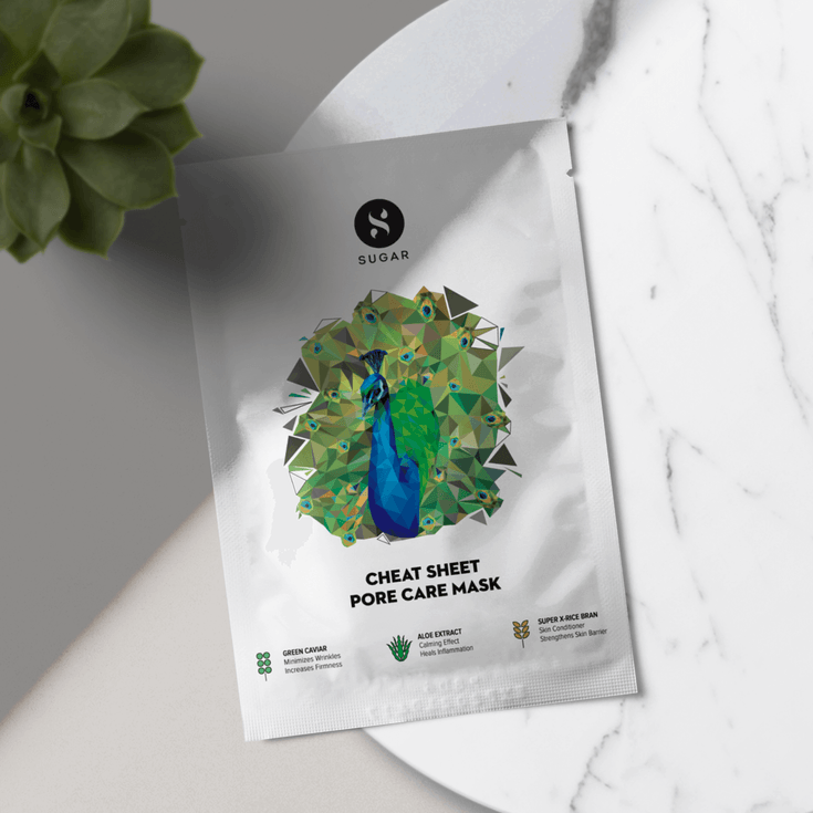
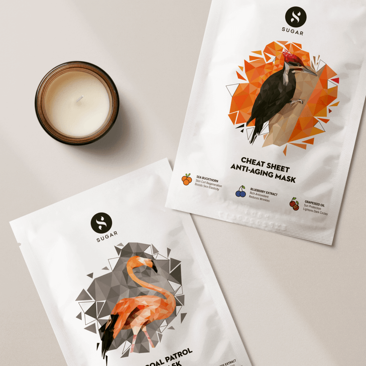
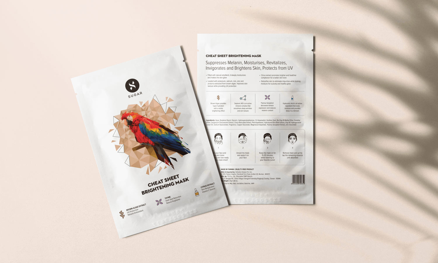
We teamed up with Sugar again when they decided to add a skincare line to their portfolio. Building on the instant recognizability of the low-poly illustration style, we took that forward, while fully utilizing the additional space afforded by the larger surface area of the product (unlike color cosmetics, which tend to be smaller packs). Our approach balanced the need for continuity and freshness by altering the usage of the illustration (island instead of full bleed) and the subject (birds instead of faces).
The result was a series of products that are distinctly a new category but within the larger Sugar Portfolio.
