Quench
Brand and Packaging / Skincare
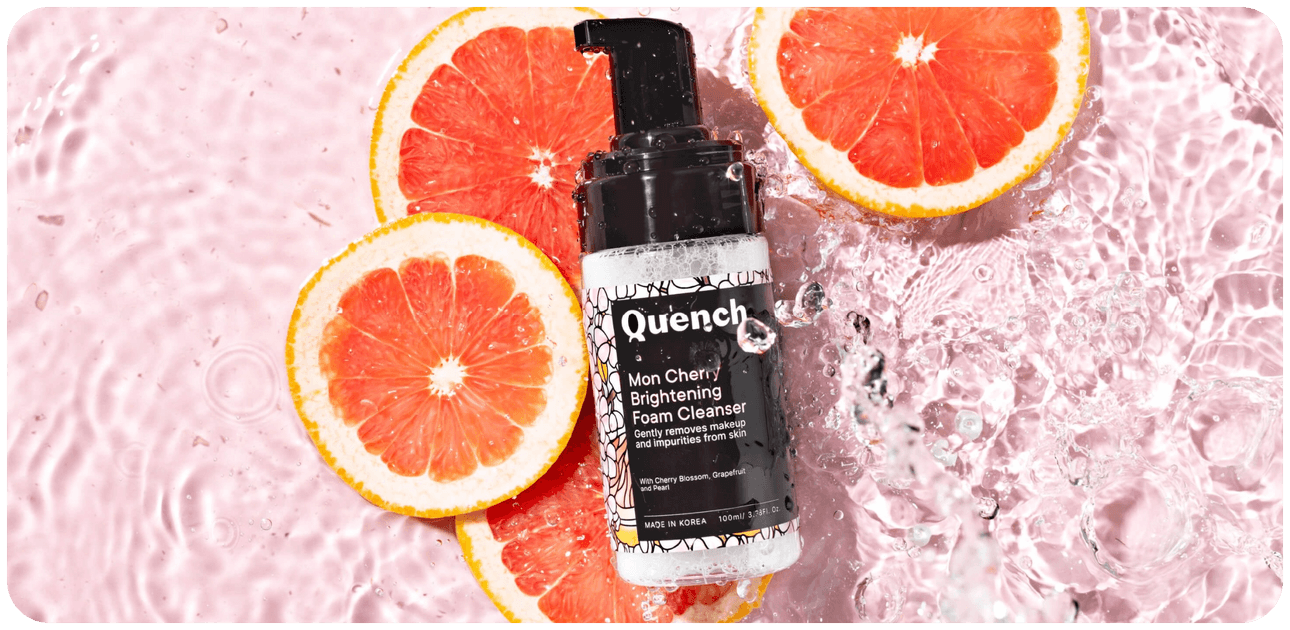
Two years in the making, Quench is the culmination of an amazing collaboration between product innovation, strategy and design.
While Korean skincare (K-beauty) enjoys a faithful following, we needed to introduce the concept to a new audience. We created a brand that is equal parts science and art. A rigorous approach, combined with natural, rejuvenating botanicals.
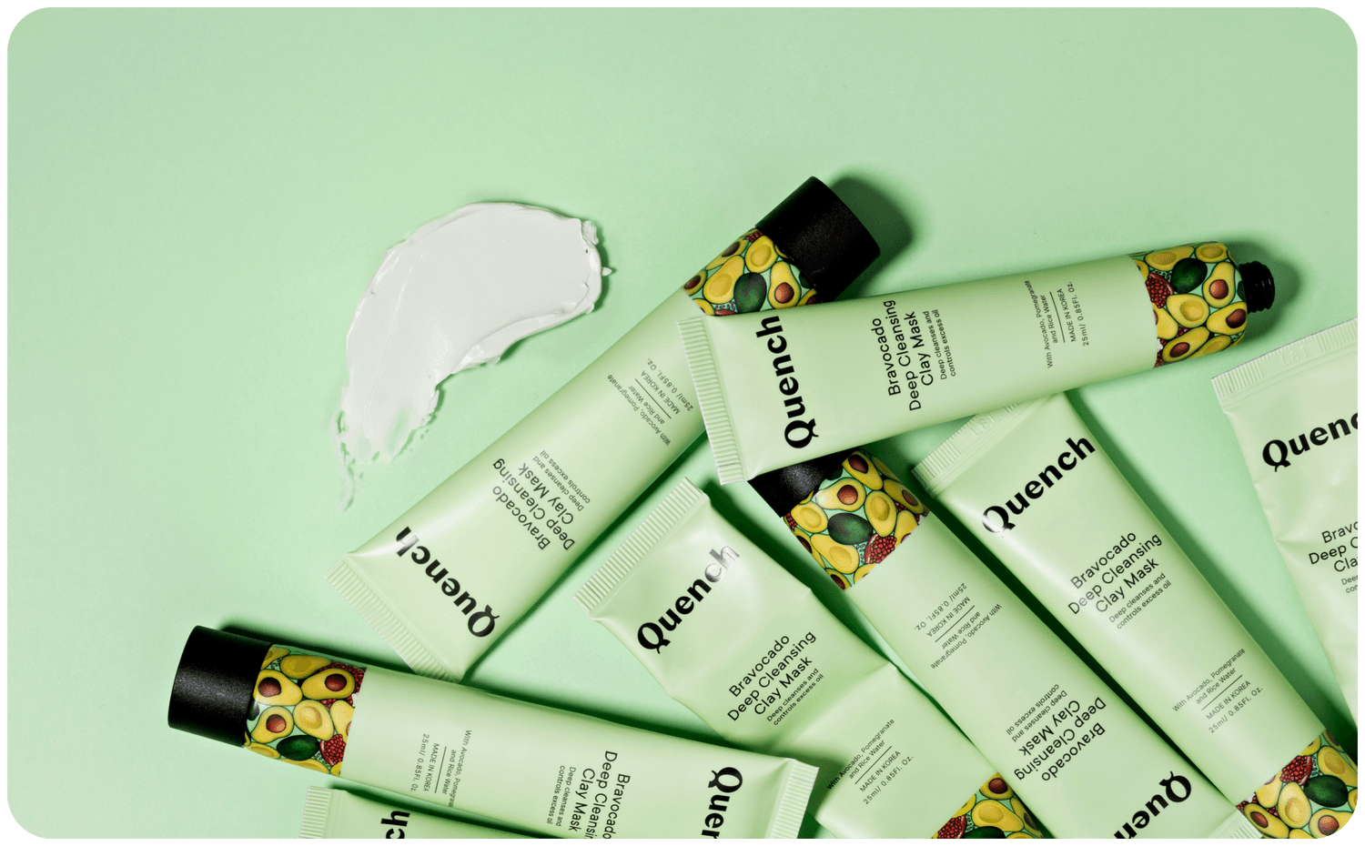
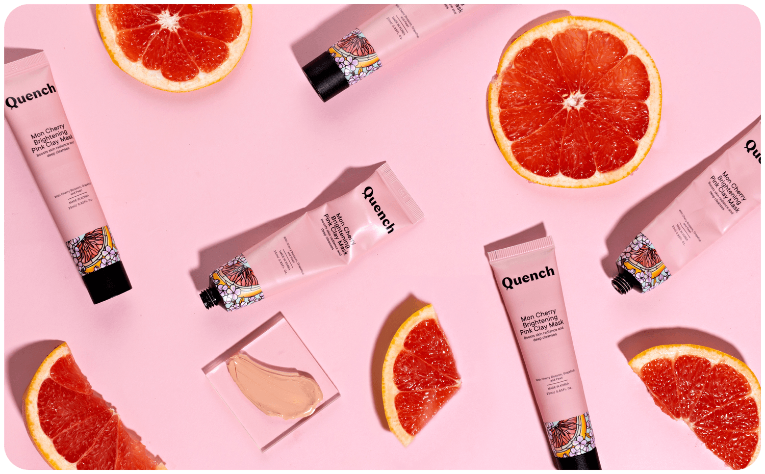
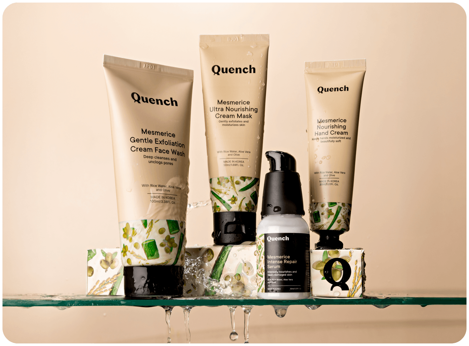
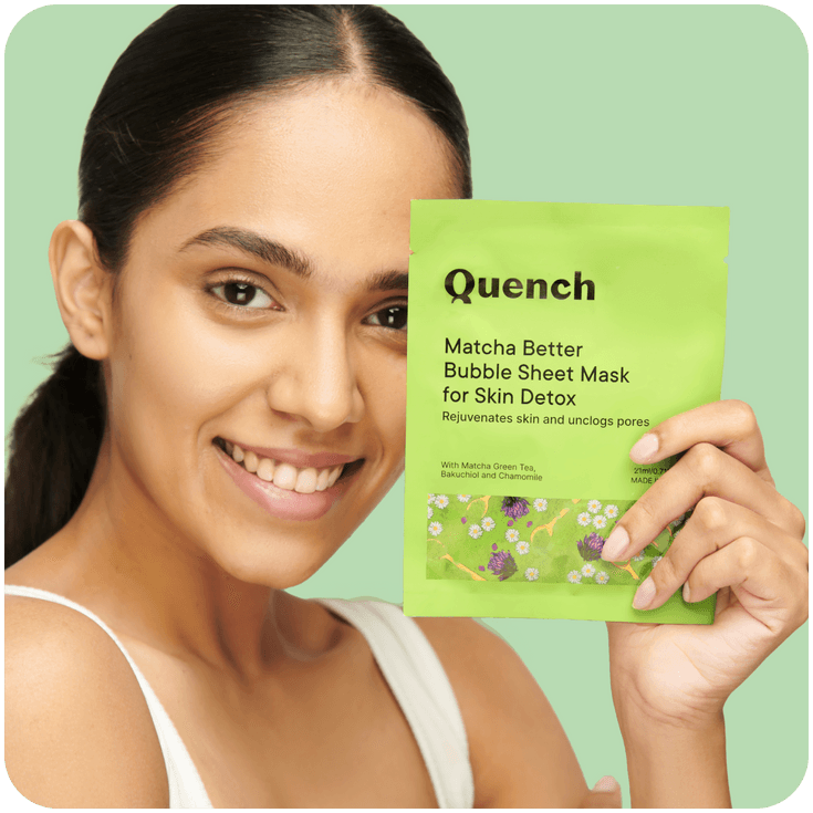
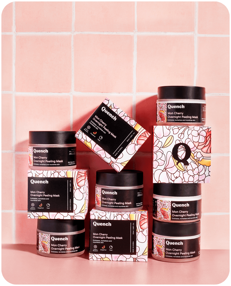
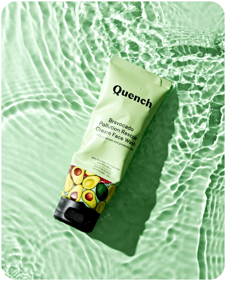
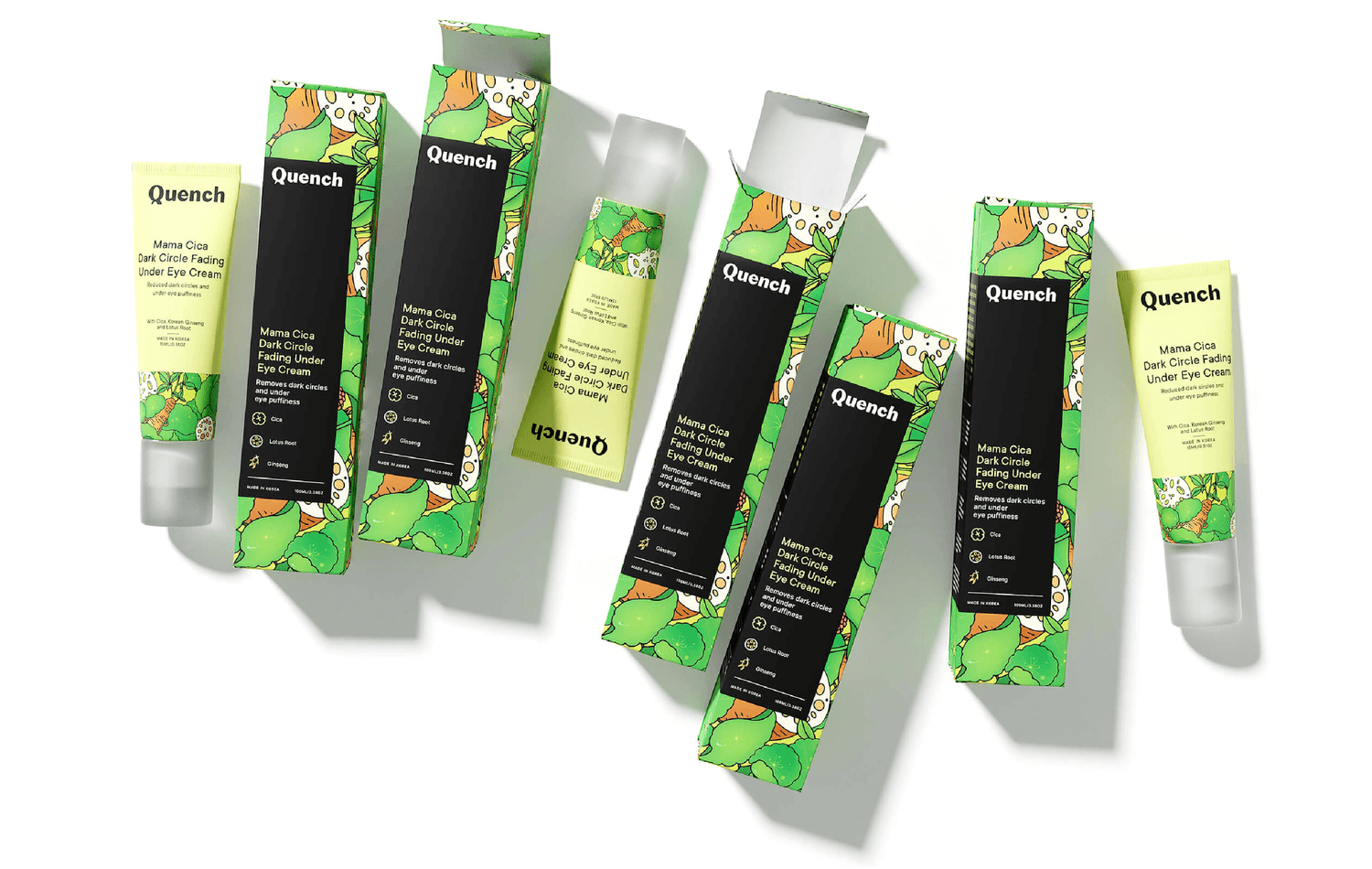
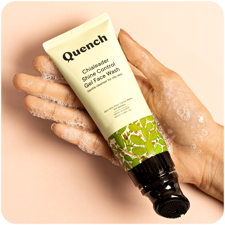
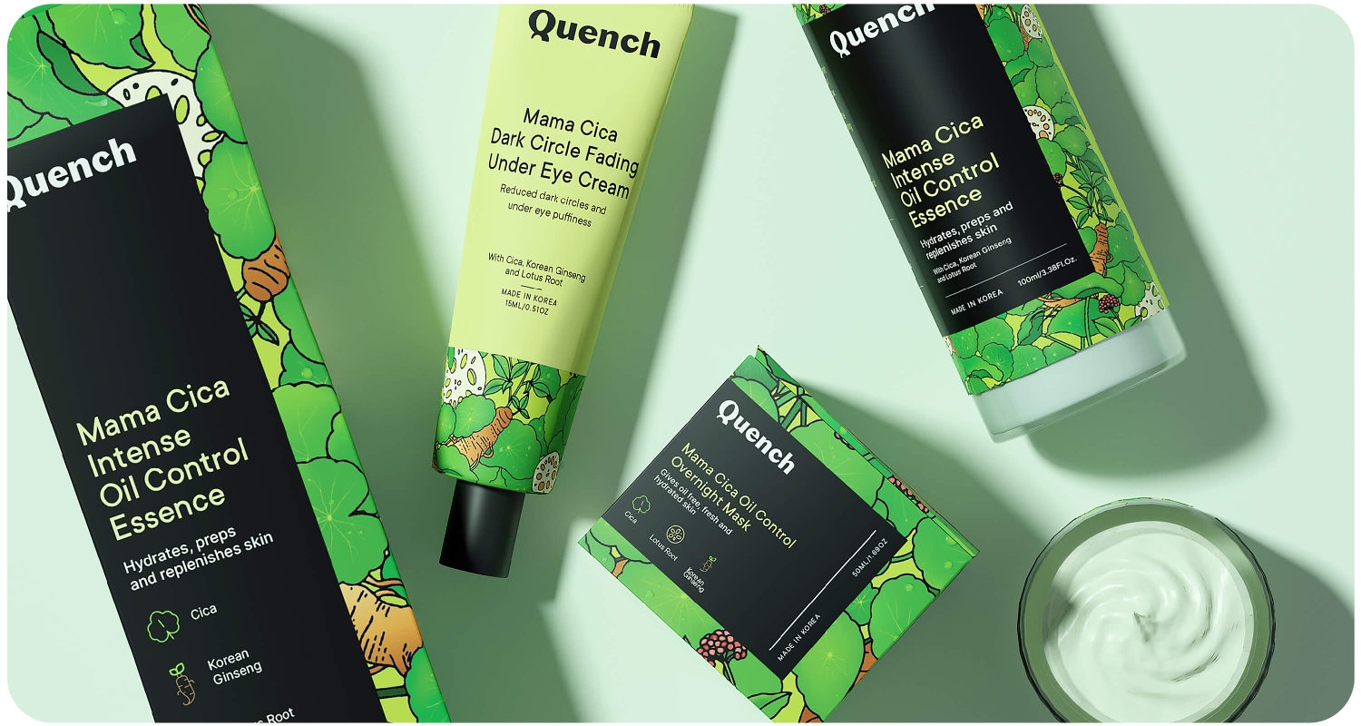
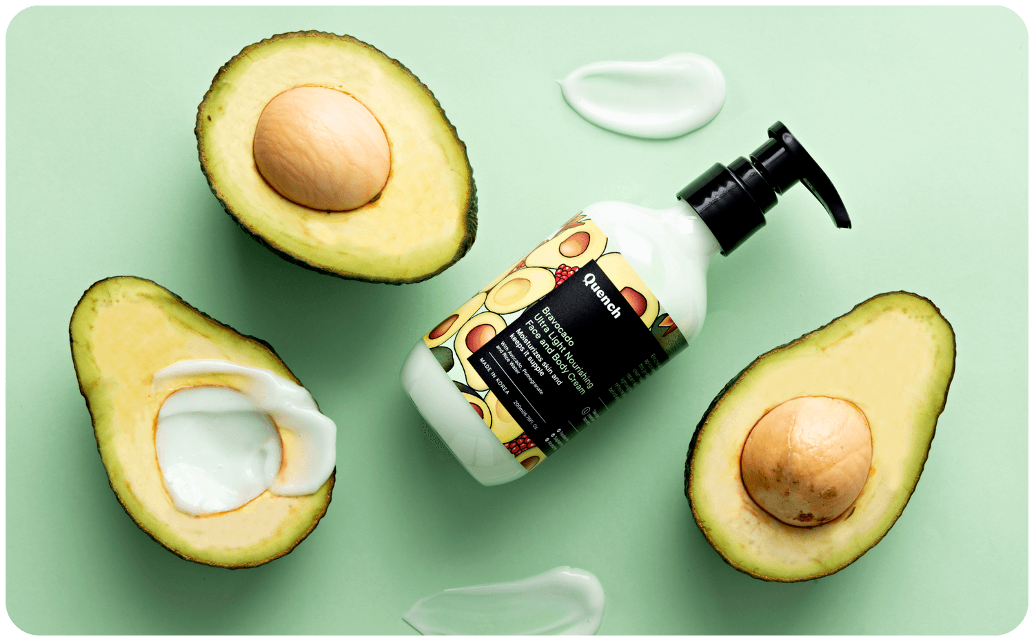
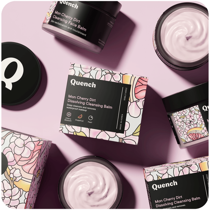
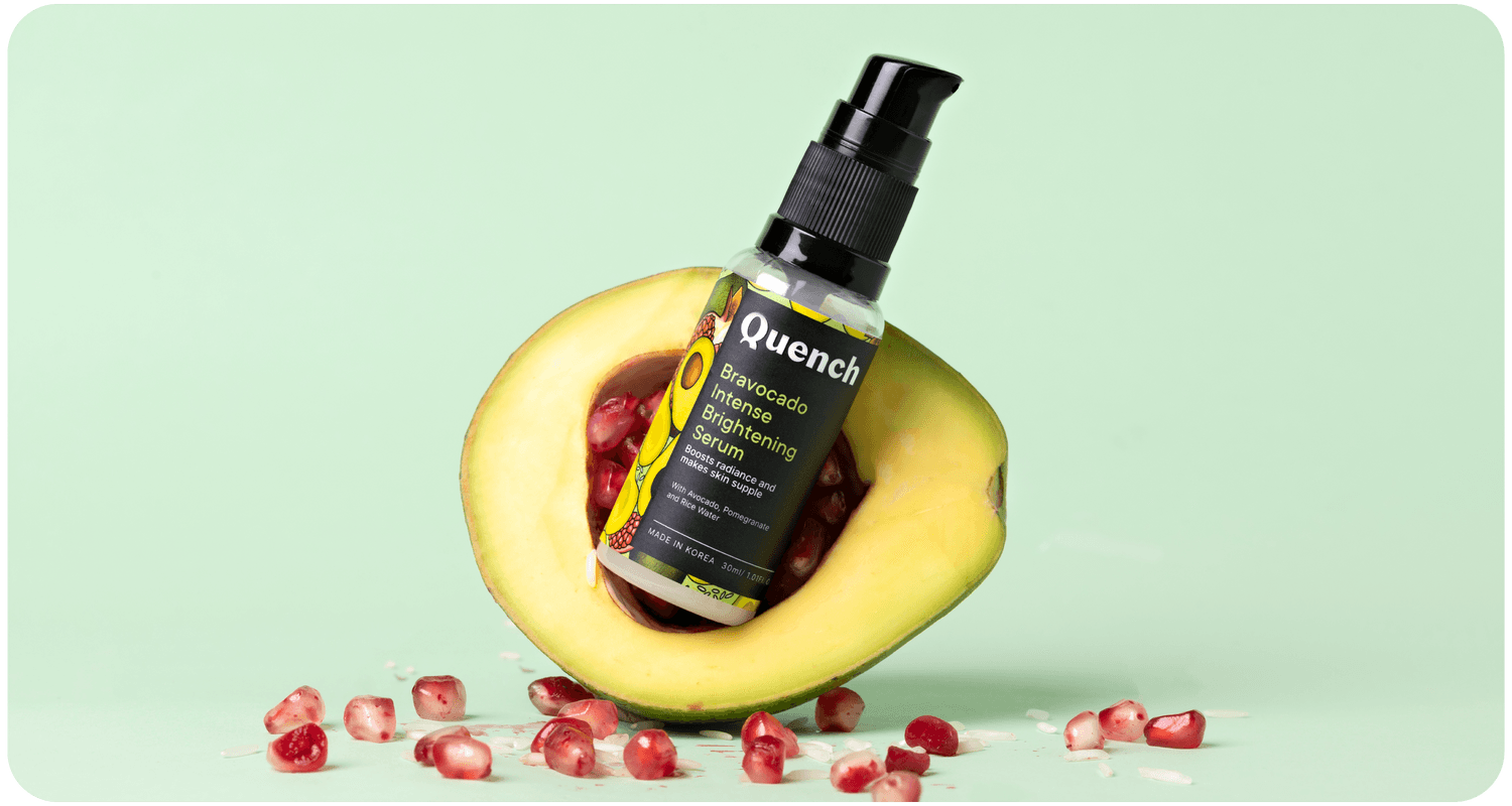
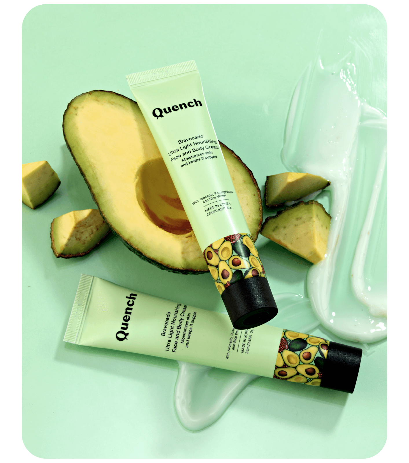
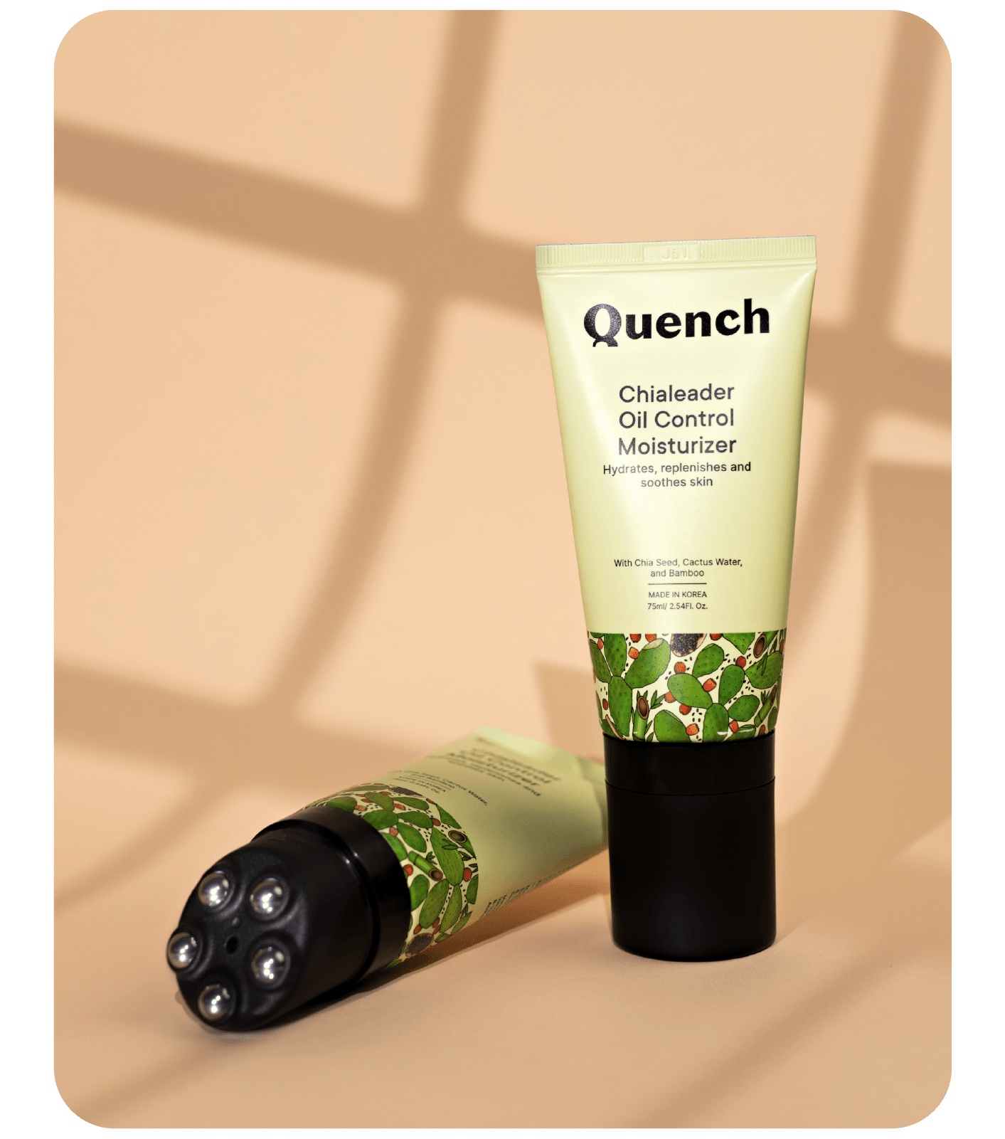
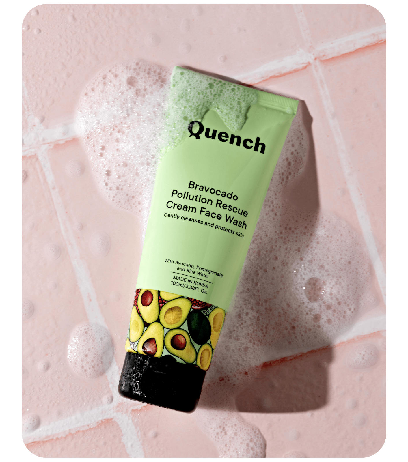
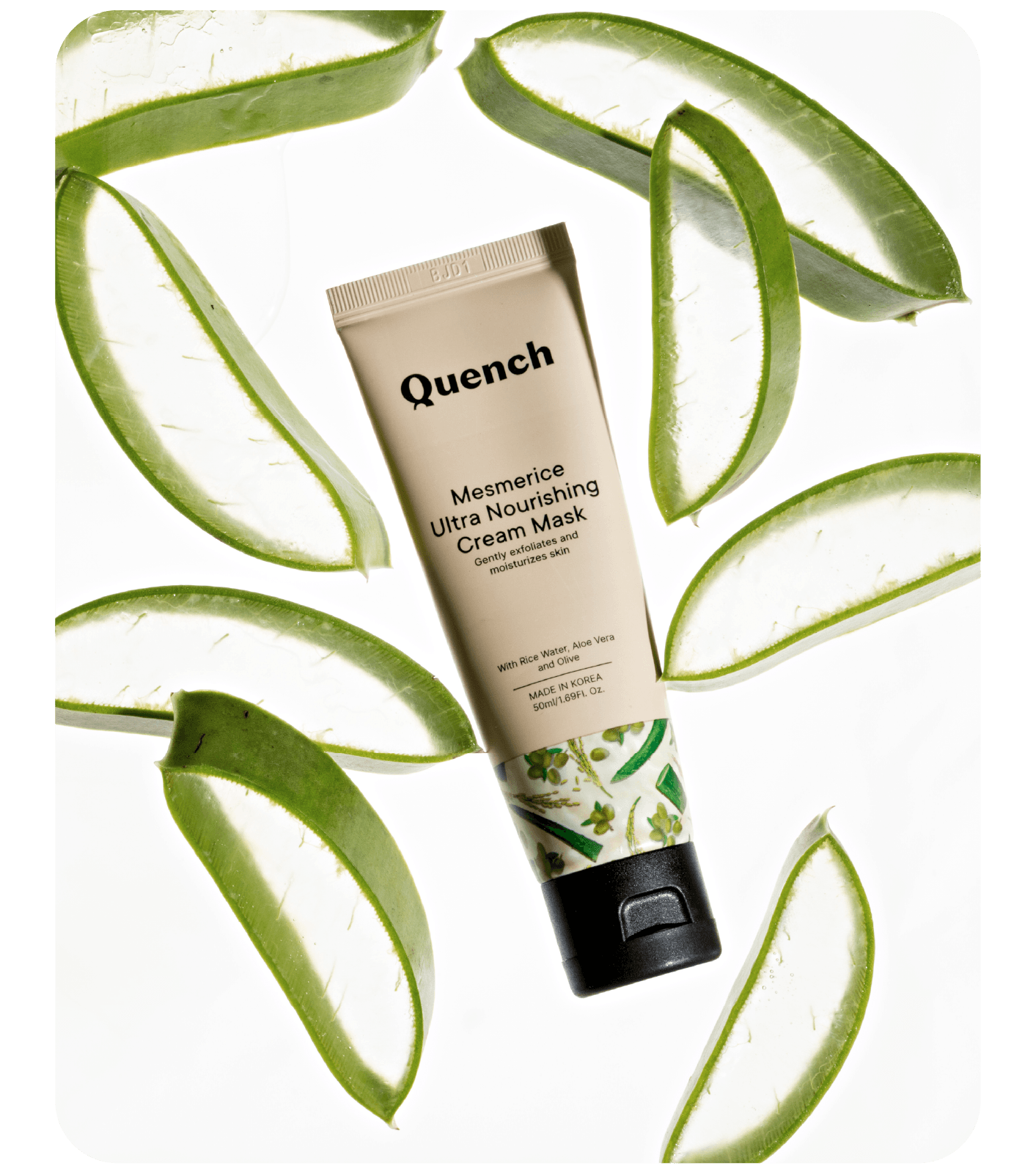
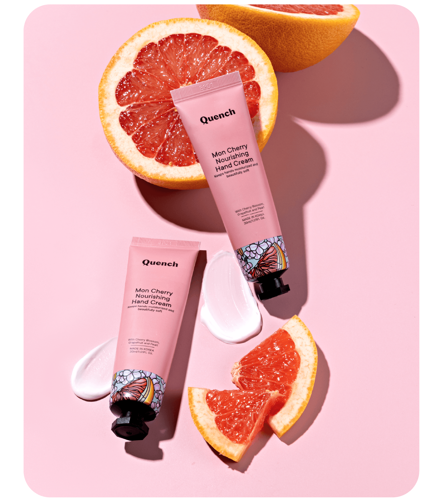
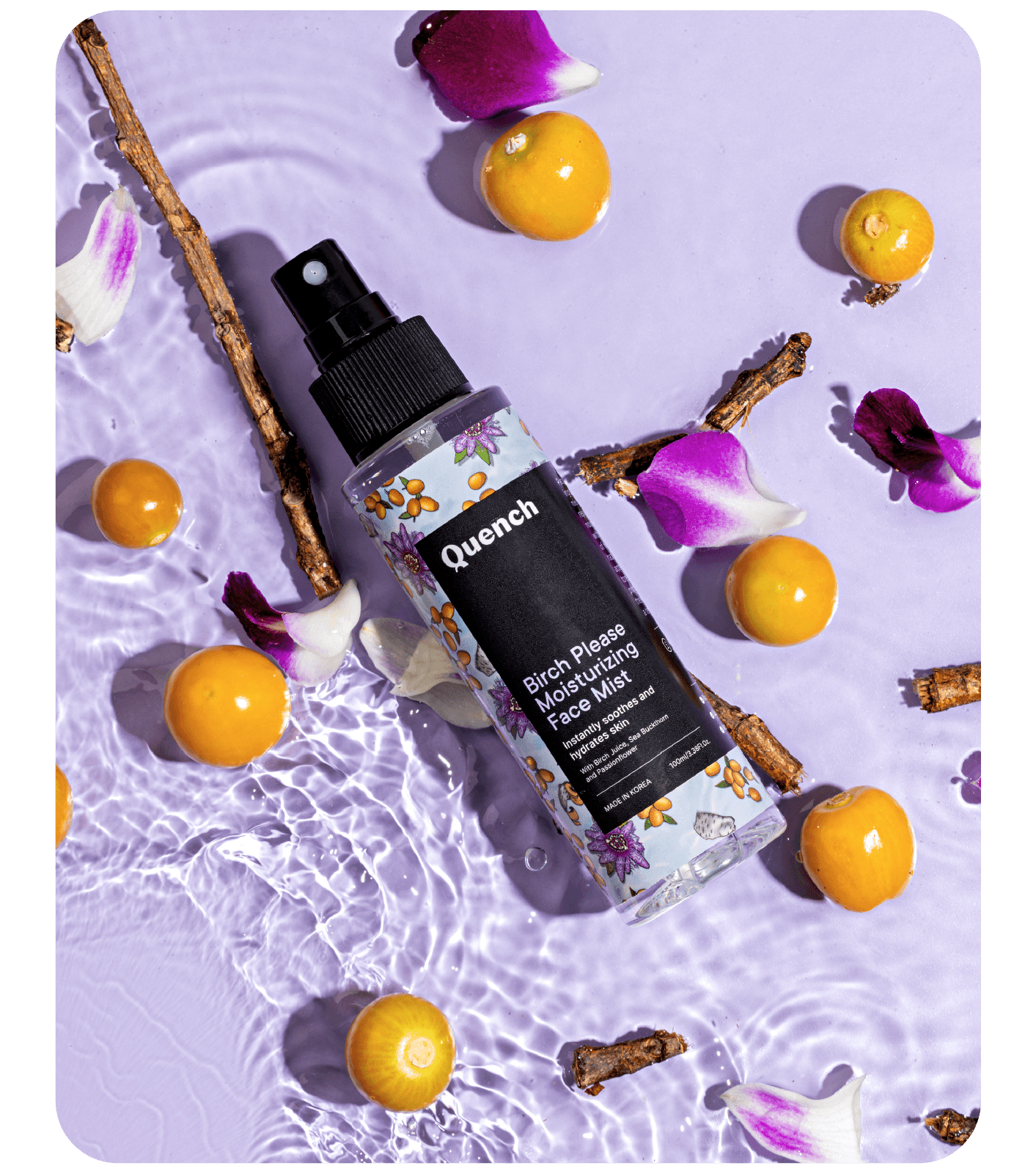
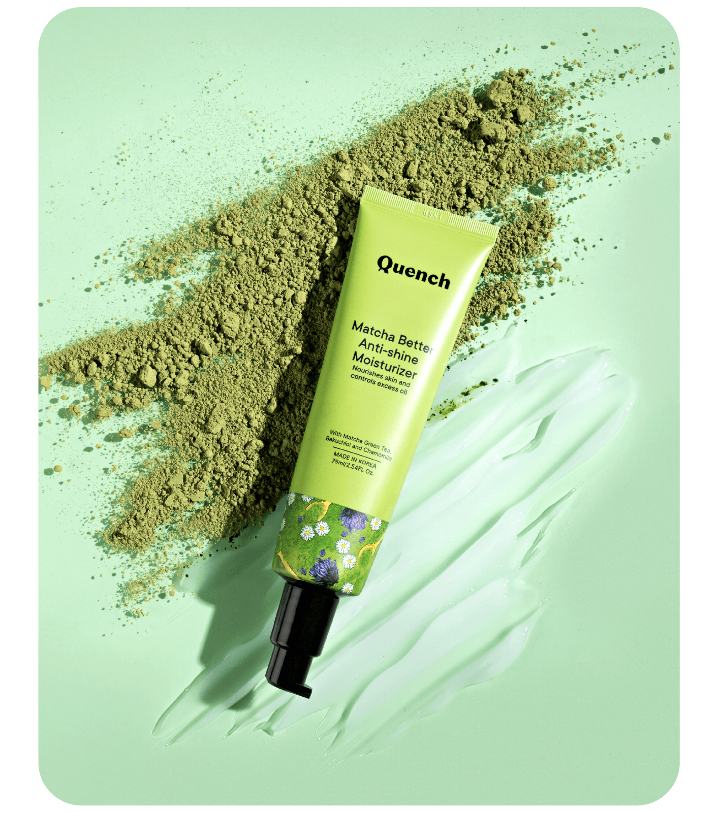
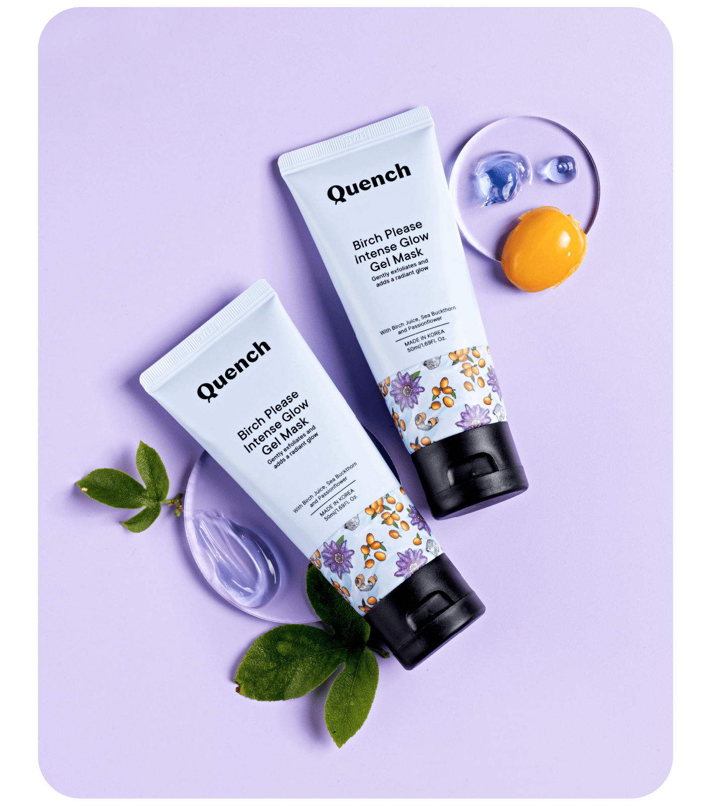
Quench simplifies the routine and makes it accessible through easy to use products. The brand and visual design support Quench's mission by surfacing the unique (and sometimes delicious!) botanical ingredient combinations through beautiful illustrations on the expressive packaging, that is an antithesis to the minimalism arms-race and clean-as-a-lab aesthetic of other brands.
