Plush
Brand Identity + Packaging
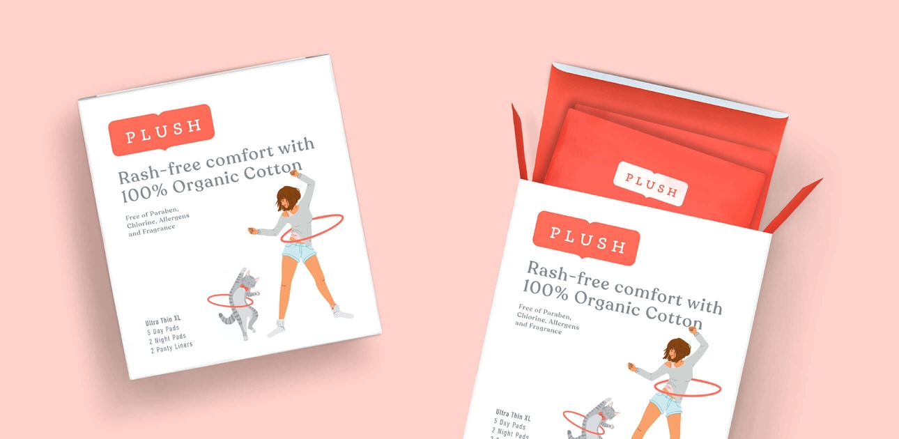
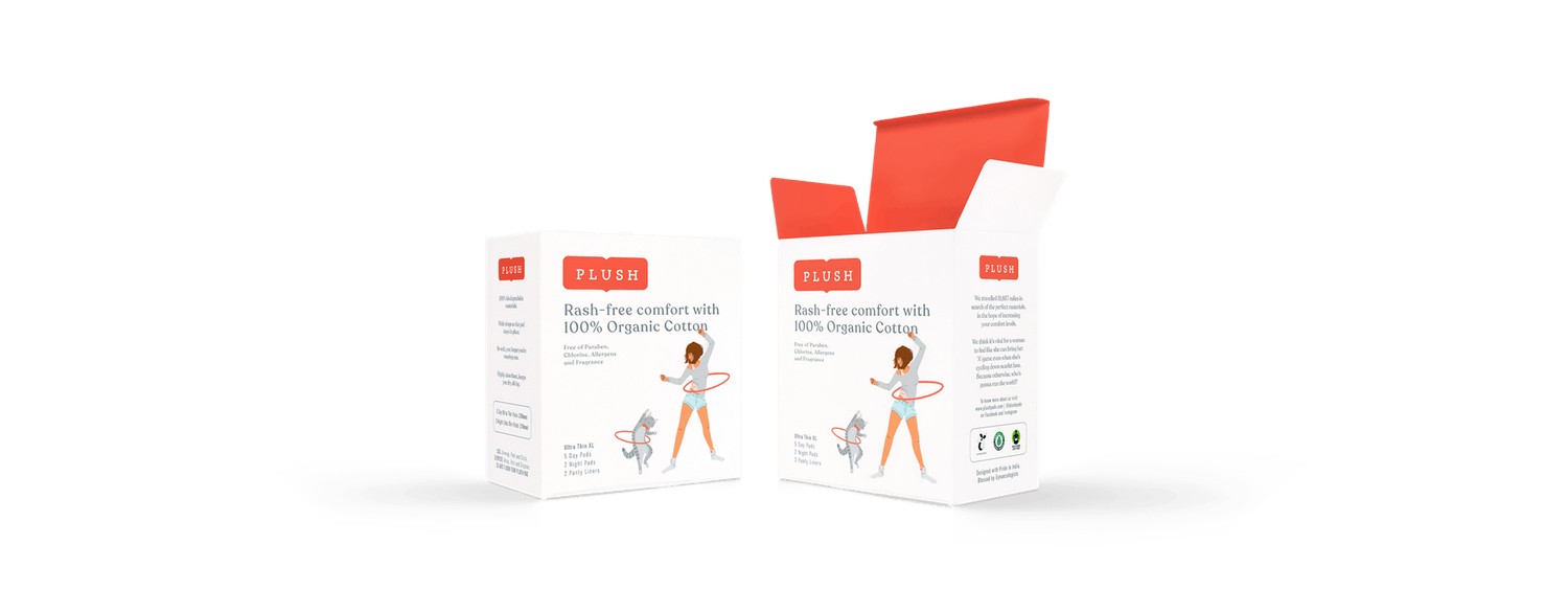
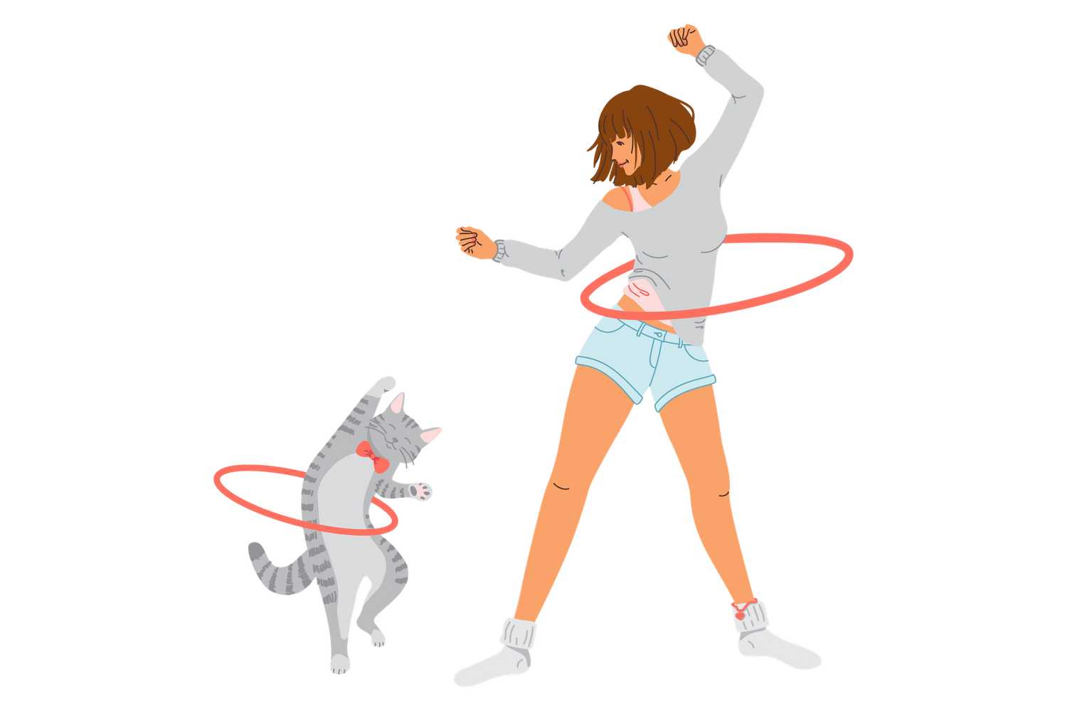
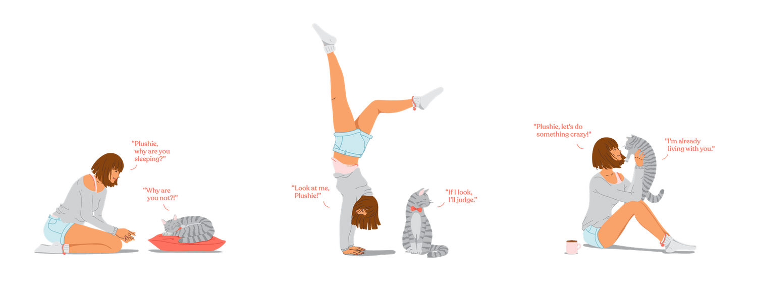
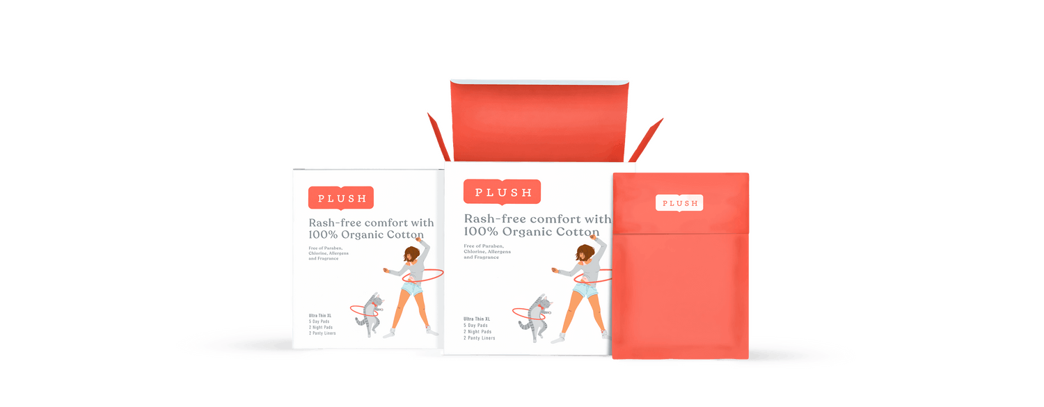
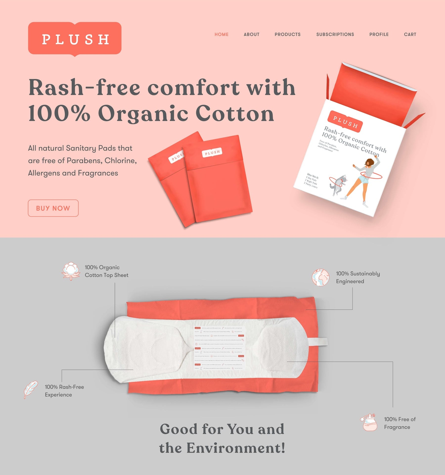
Plush is a feminine hygiene brand for the modern Indian woman – unshackled, unabashed and unstoppable! We personified these ideas in the brand through the creation of “The Plush Girl” and her cat, Plushie.
In a market, full of “me too” upstart brands focusing on ‘function’, we chose to build a brand that goes beyond the premise of comfort and materials. We also avoided the recent phenomenon of sanitary pad brands being built solely on the idea that “there’s nothing to hide about a woman’s periods”. Sure, there’s nothing to hide – but that’s a weak (and hopefully transient!) premise to build a brand on.
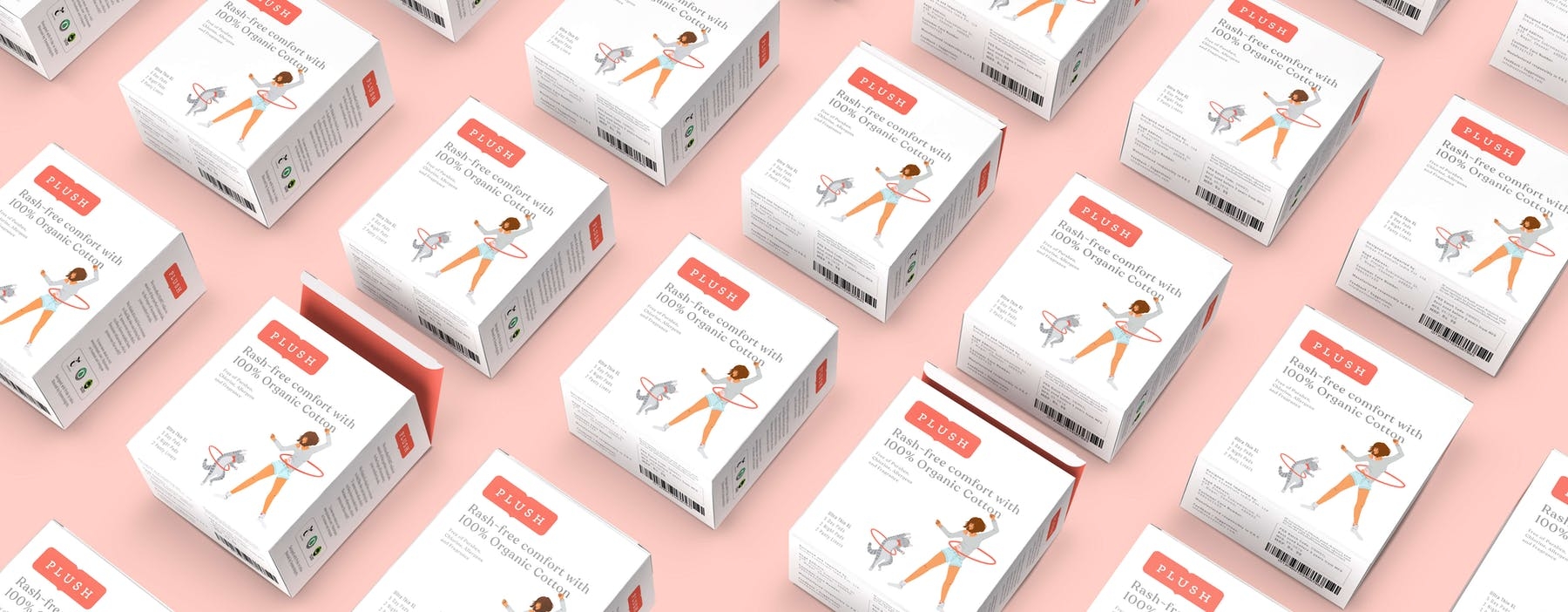
Unlike most upstart Direct-to-Consumer sanitary pads brands, Plush wanted to be available at retail stores (modern trade, pharmacies…) from day one. Our approach with the packaging was to break the visual clutter of established mainstream brands, with a visual language that stood out, not just in the category, but across categories.
NOTE: Due to creative differences with the client, we withdrew from the project towards the end. The actual brand / packaging design put out by the brand is not done by us.
