Paper Boat
Packaging for Beverages


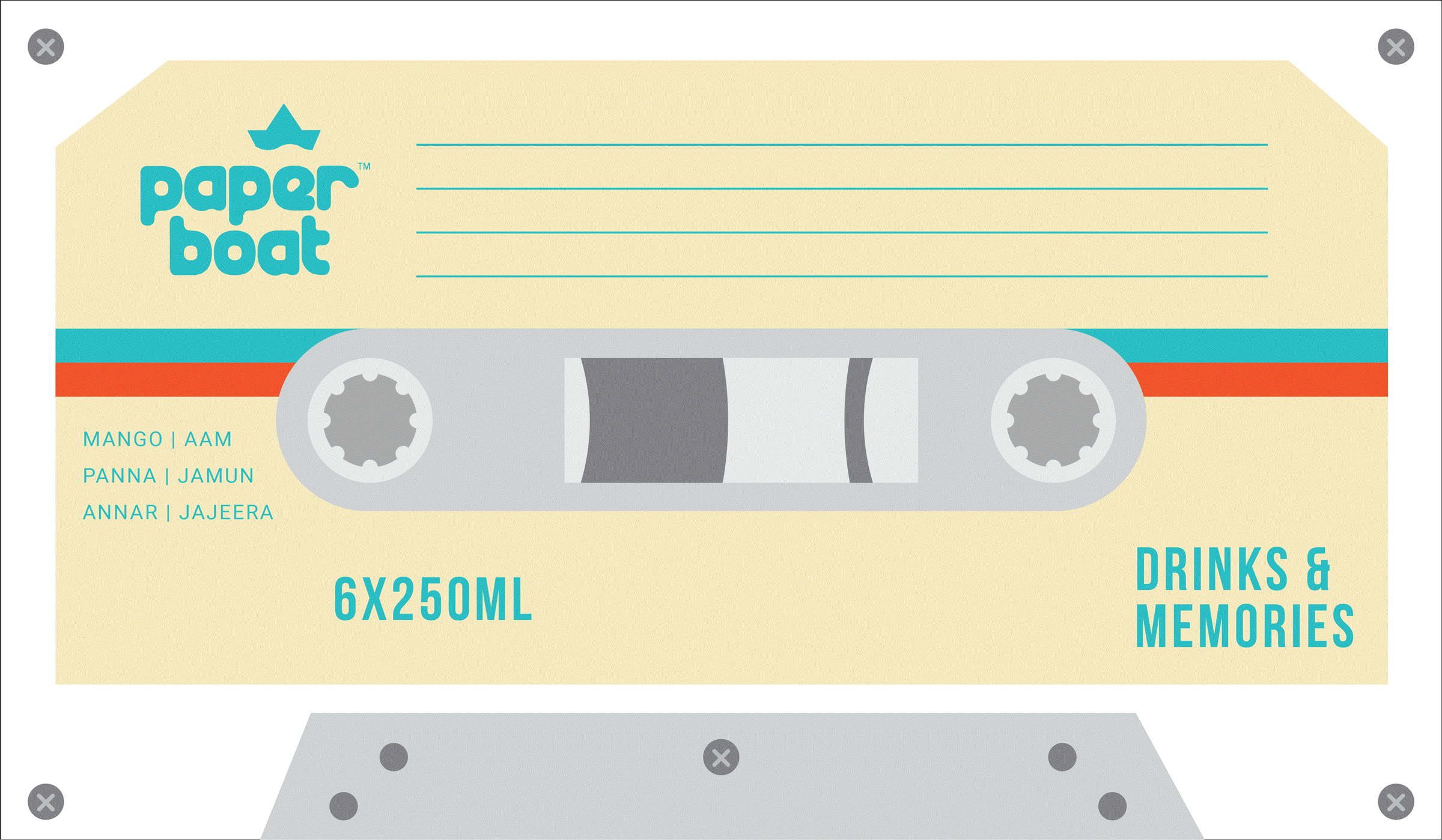
We worked with Paper Boat to create a limited edition, festival pack for their line of beloved traditional / nostalgic beverages.
The obvious route would have been to extend the brand’s visual language – which is playful and child-like. But this would come at the cost of making the limited edition pack feel like a bundle of products. We choose to avoid this direction and instead created a subtle new visual language, which doesn’t feel like an extension of the product aesthetic, but at the same time, doesn’t create a visual contradiction between the outer packaging and the product packaging.
The aesthetic is bold, minimal and abstract – this separates it from a typical FMCG festival pack – which usually uses cliched festival graphics, in very literal and realistic styles, or depends on ornaments and swirls to bring a “festive look”.