Owntastic
UX/UI for Mobile

Owntastic aims to redefine the meaning of consumer product and service “ownership” and reimagine the experiences that go with it. The service and its companion mobile app enhances the post-purchase experience of a customer – service and maintenance, upgrades and follow-up offers, second sales, AMCs etc…
We worked with the Owntastic team to:
1) Flesh out the concept and defining features
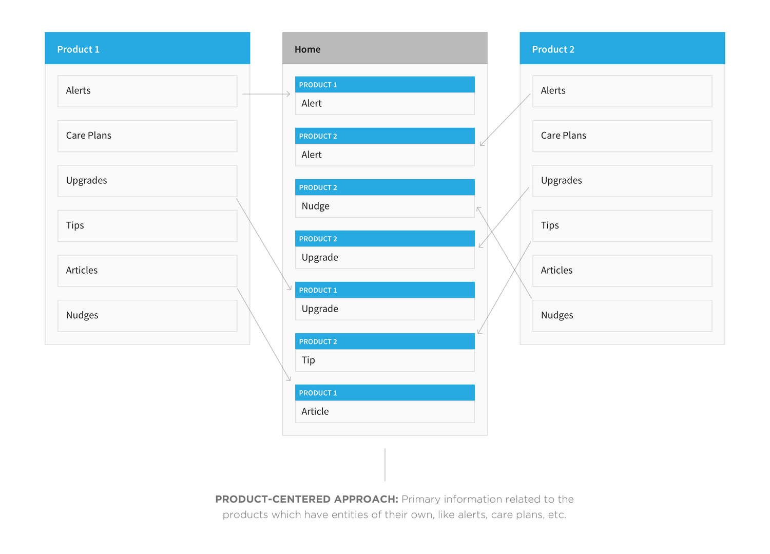
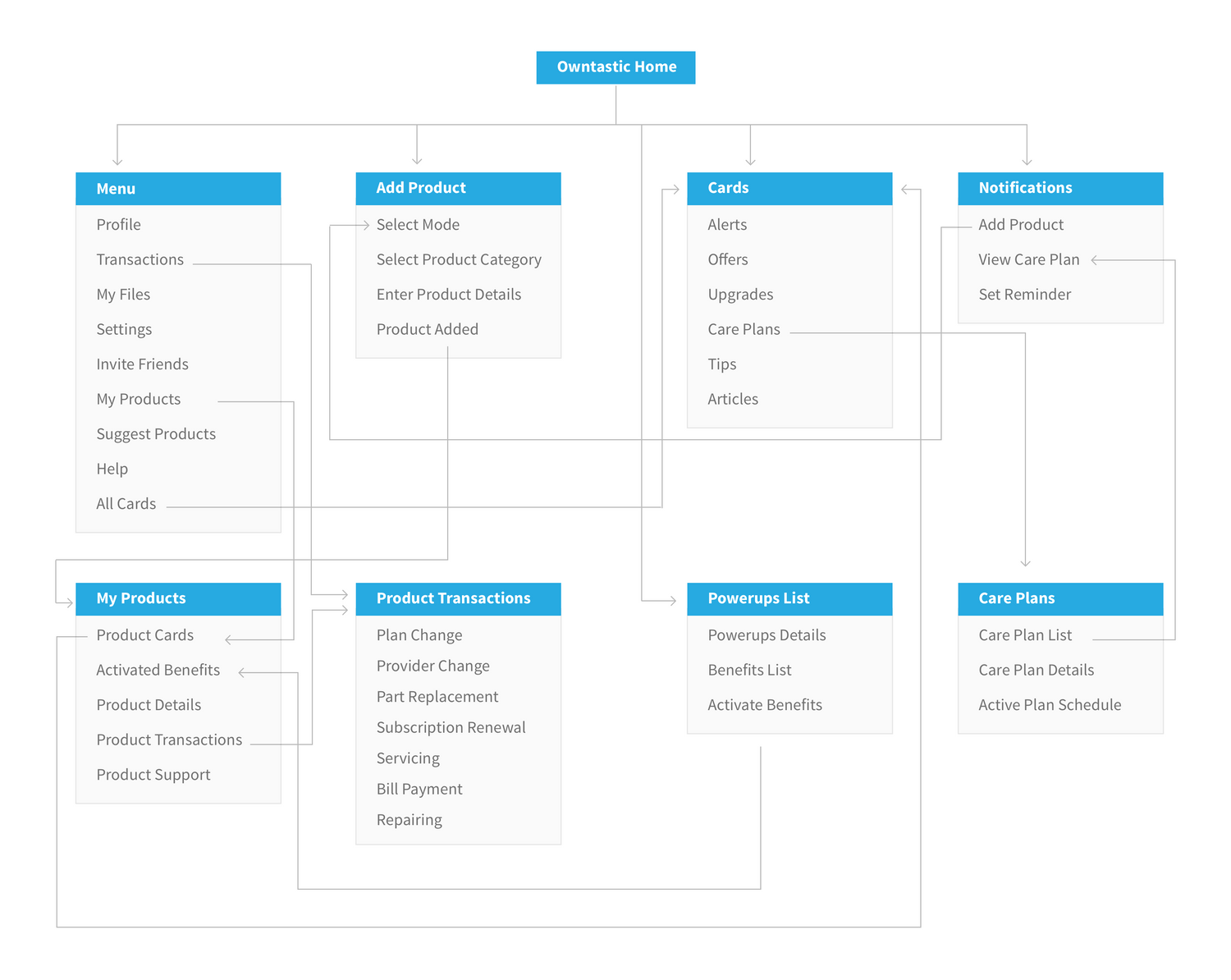
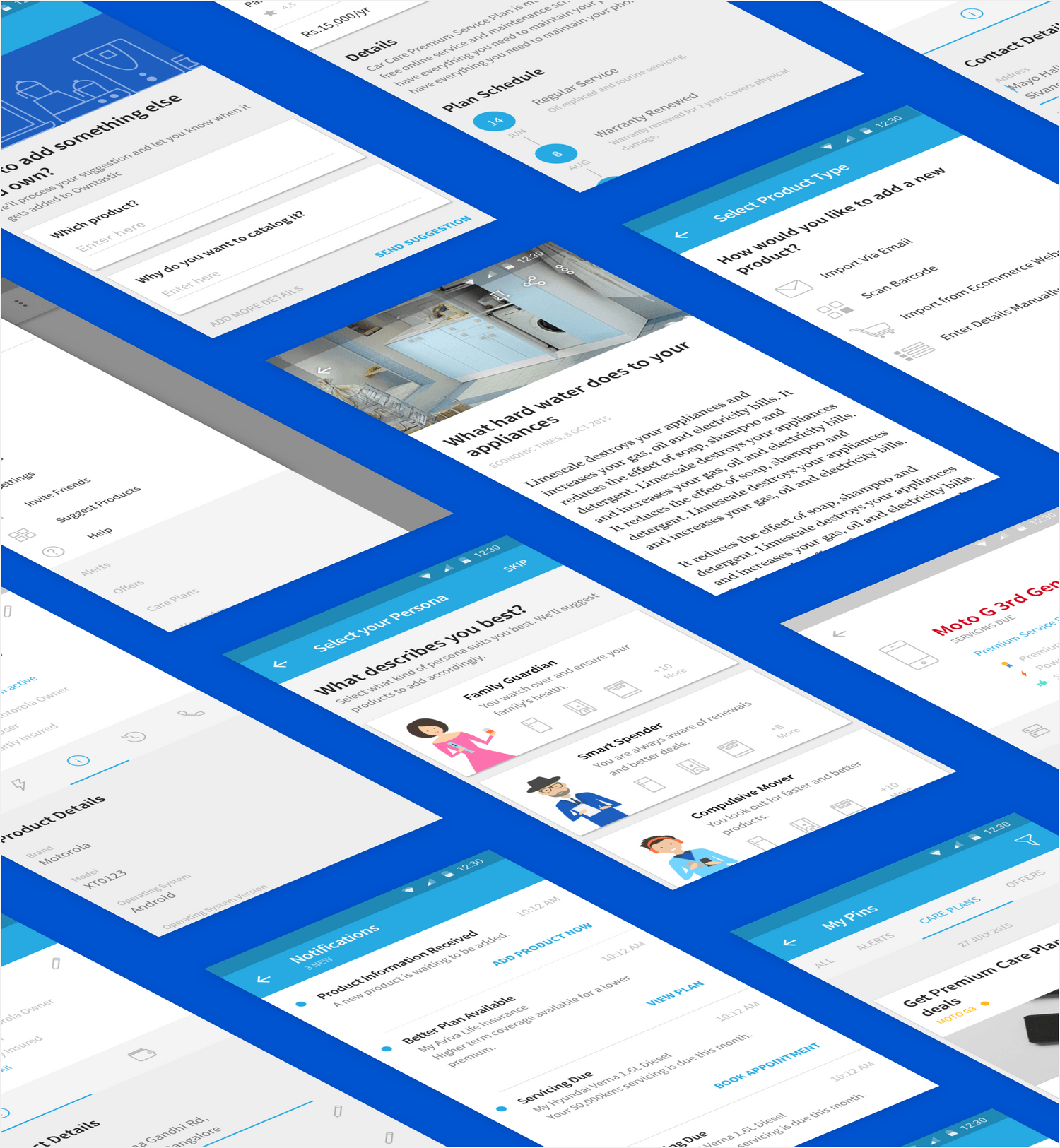
2) Understand Information Architecture underlying the app
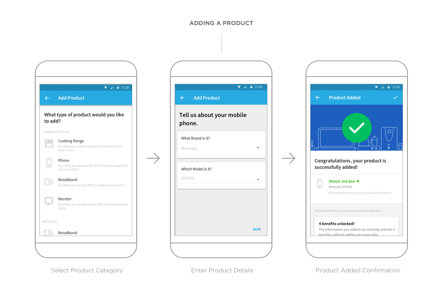
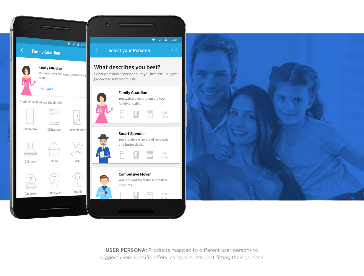
3) Create User Flows based on User Personas
4) Curate UX Design and Sample Prototyping
5) Build UI and Visual Design
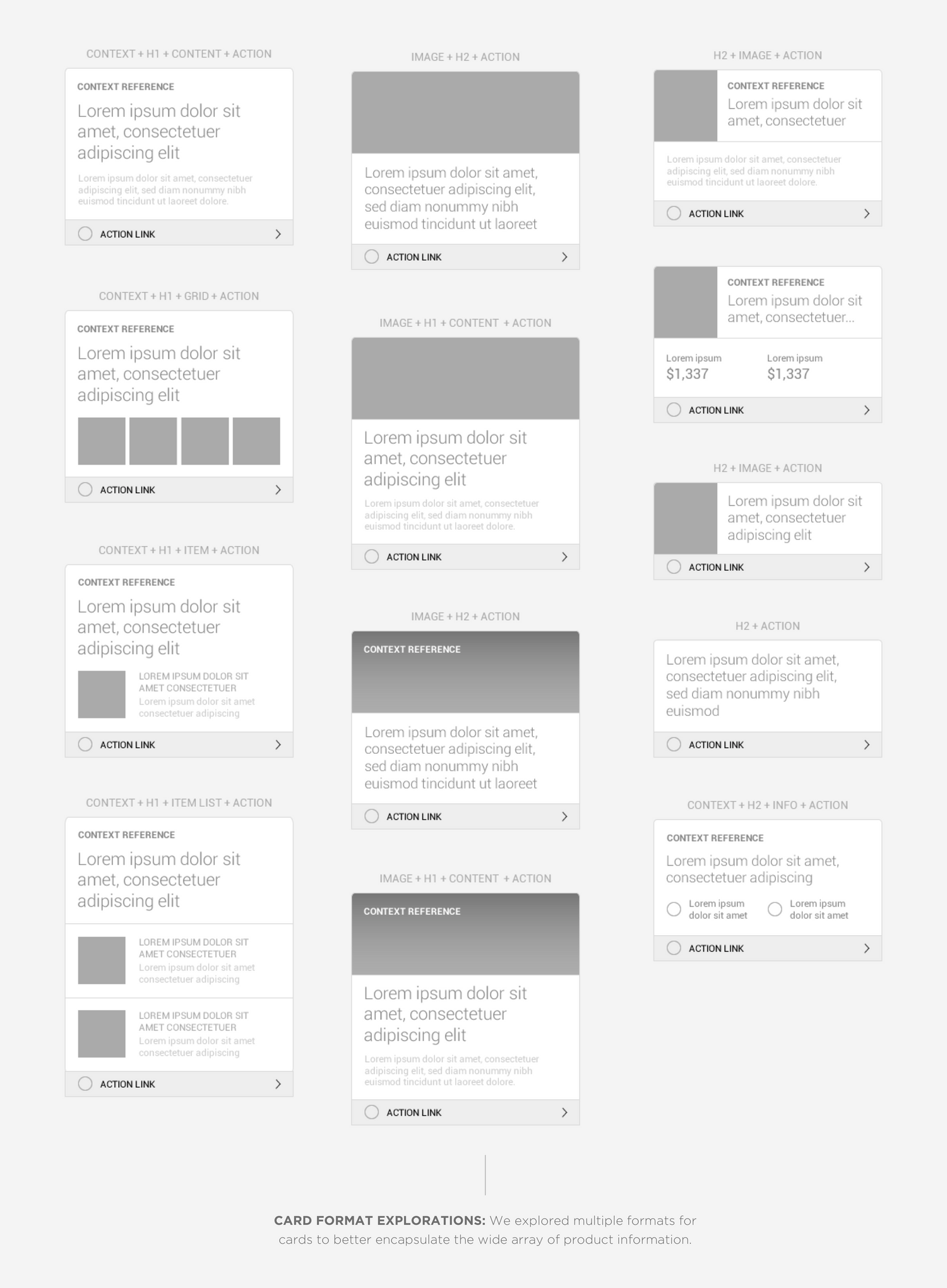
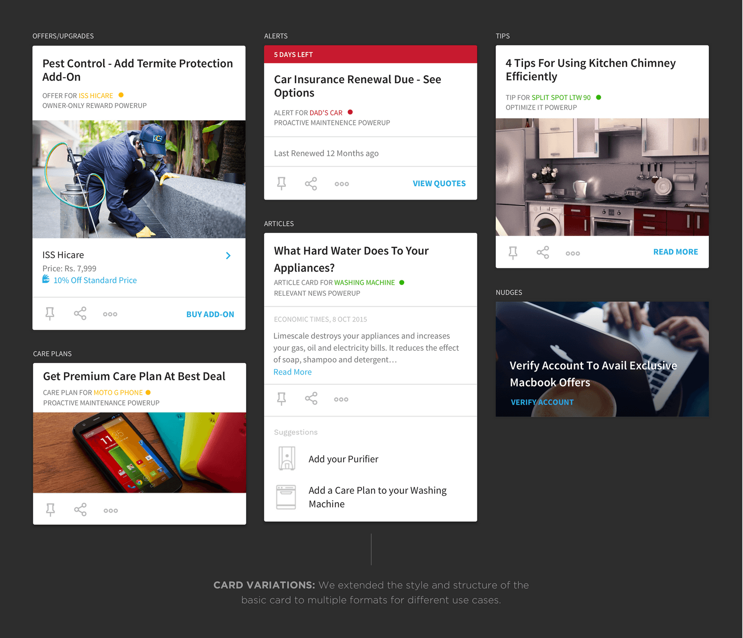
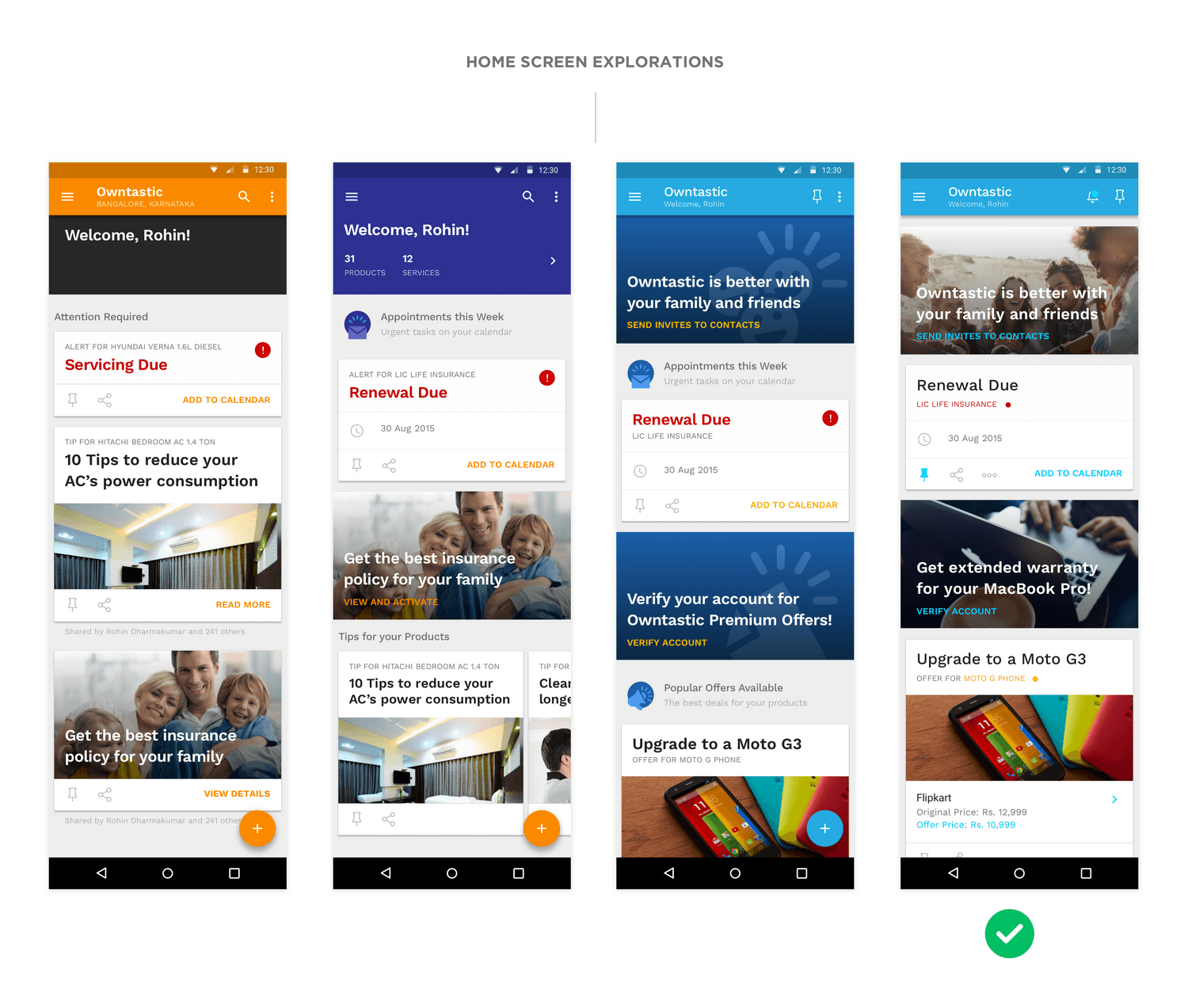
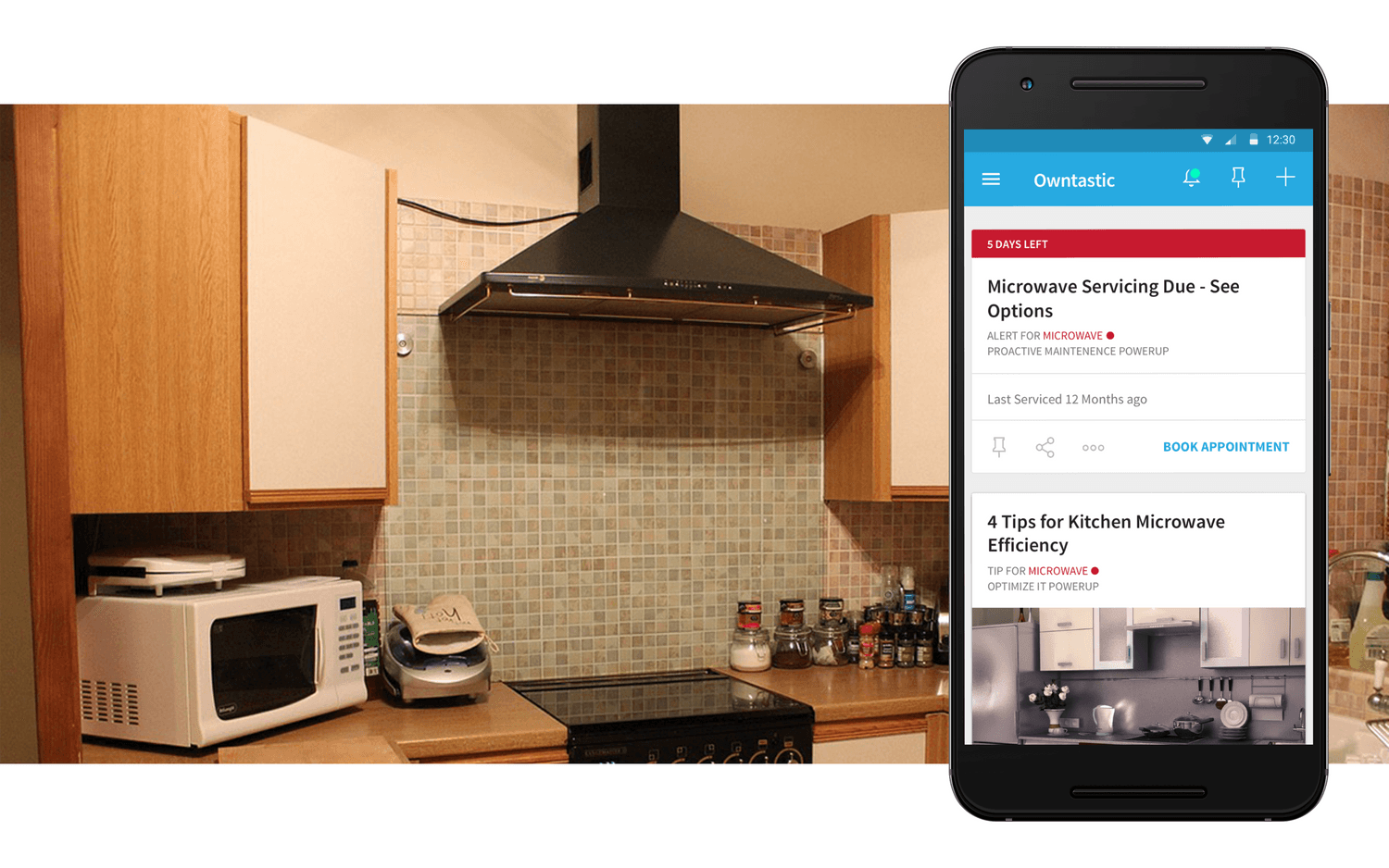
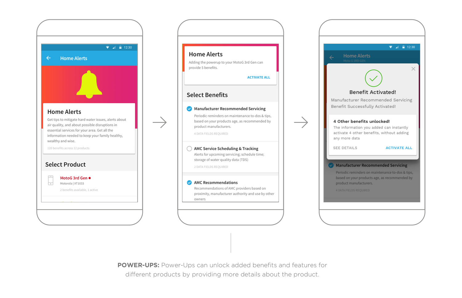
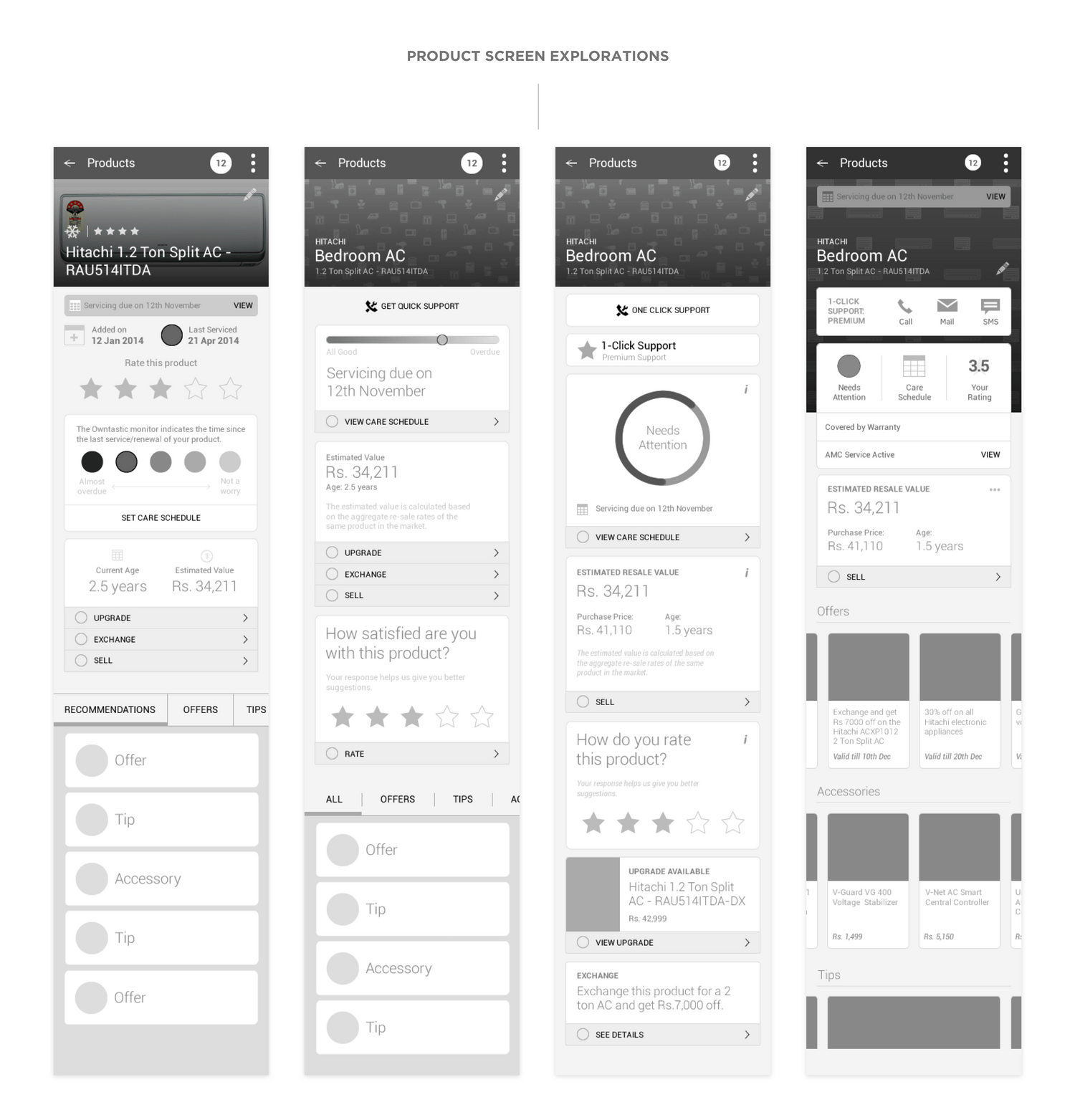
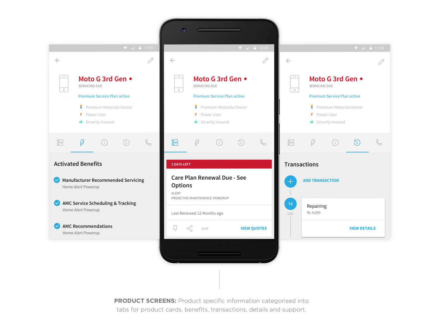
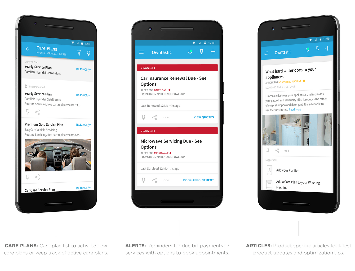
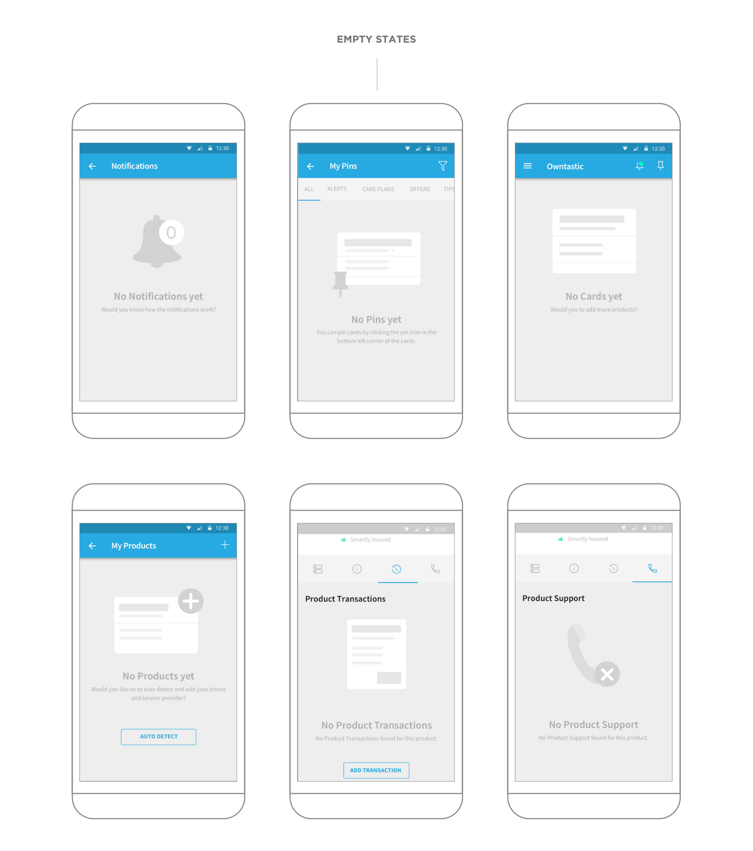
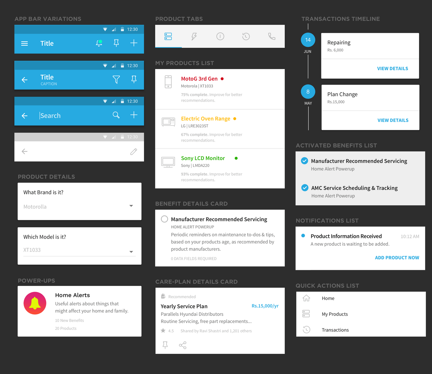
From an IA and UX perspective, we devised a scalable and modular system of cards and screens that allowed us to display the vast amounts of data on the app with different levels of detail, showing users only context-driven information at each touchpoint.
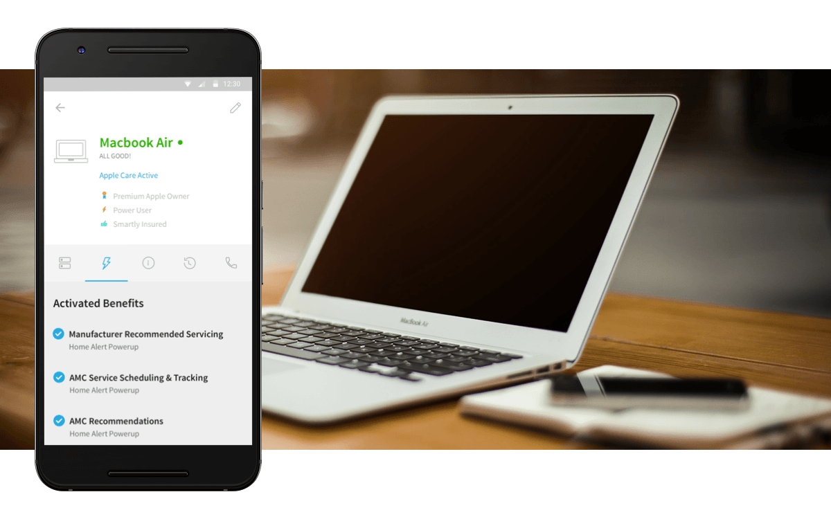
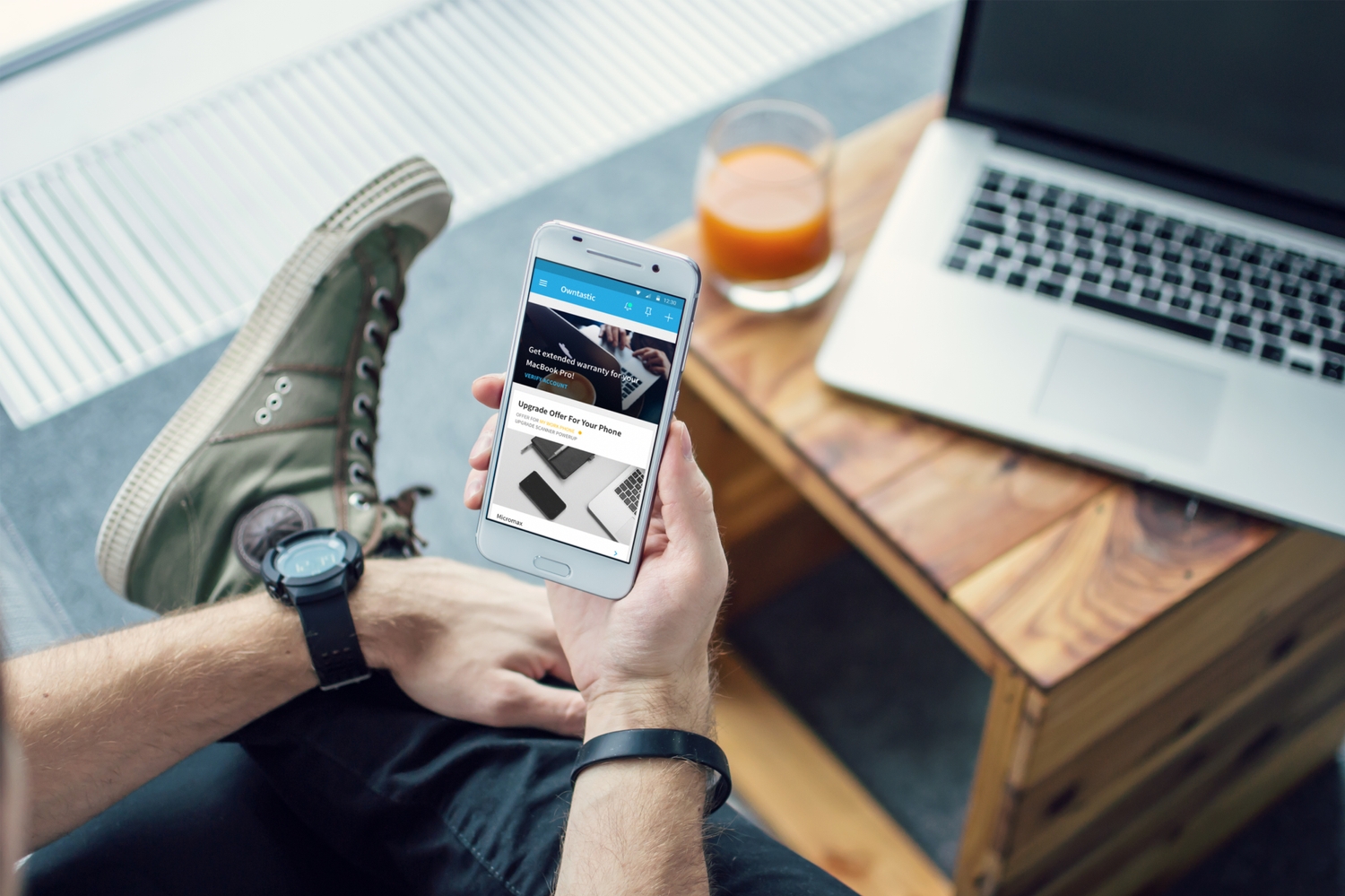
The visual language follows a functional and non-intrusive approach that keeps the focus on the user’s products/services. The goal of the UI was to create a feeling of familiarity – to spark immediate user engagement – rather than making a user learn new UI controls and metaphors.
