Ori DNA
UX/UI for Dashboard

Ori is an Edge Computing company based in London that enables developers to deploy edge powered applications over mobile networks.
DNA is their pilot on-demand mobile edge computing platform, which opens up the network edge for access to developers, and enables mobile operators to unlock new revenue streams.
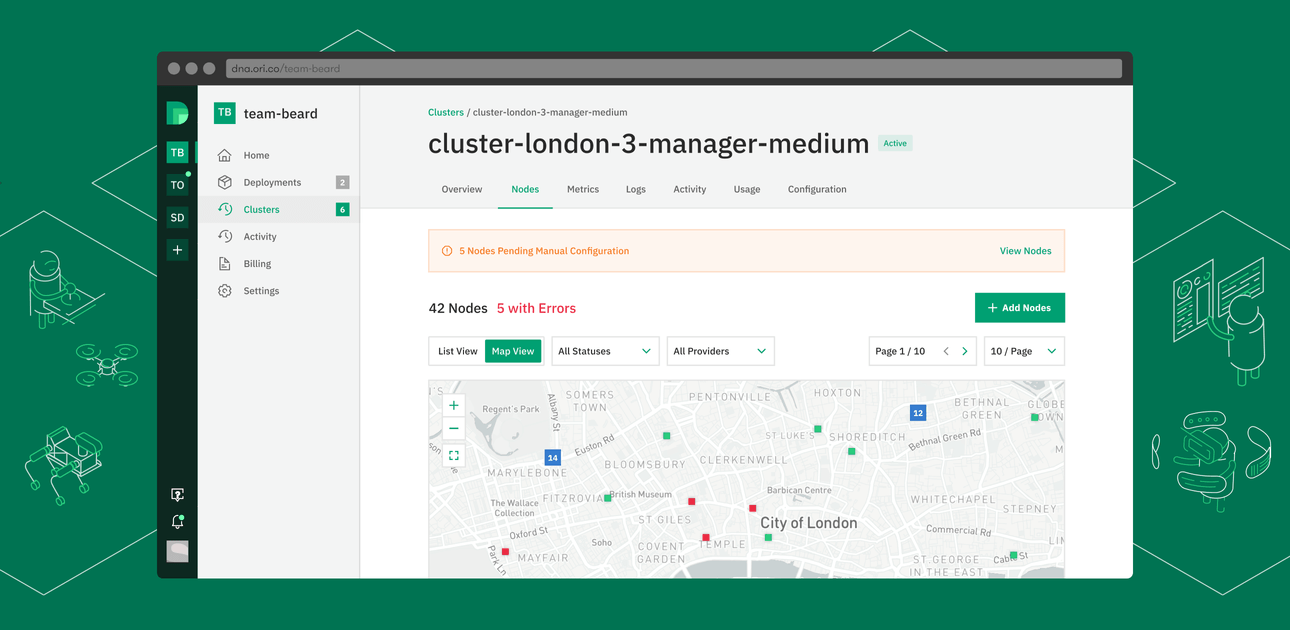
We worked with the founding team at Ori to understand the underlying tech and processes and design the UX and UI for the entire platform accordingly. This involved understand what things like Deployments, Services, Clusters and Nodes meant and then architecting the platform so that the relationships between these entities is clear to the user intuitively.
Edge computing is a new concept which has a learning curve, hence we decided to design the platform to feel native to developers, so that the interface itself doesn’t add to the learning curve as well. We followed and improved on UX patterns used by cloud computing software and other services developers use regularly, like Amazon Web Services, Google Cloud and Heroku.
The design also intelligently pushes key issues and action items across different modules into a single screen dashboard, so users don’t have to go to different modules individually to pull that information.
We also designed their website that talks about the brand and introduces the DNA Platform. [See Project here]
Critical Information – Push, not Pull
Any given account on DNA could have multiple applications deployed, with multiple services each as well as multiple clusters of nodes hosted. Each of these could have issues, updates or actions pending at any point of time. Instead of the user having to go into each entity to discover these, We designed a dashboard that intelligently consolidated all these onto a single screen so that they could act on them quickly and easily.
Interface in Layers
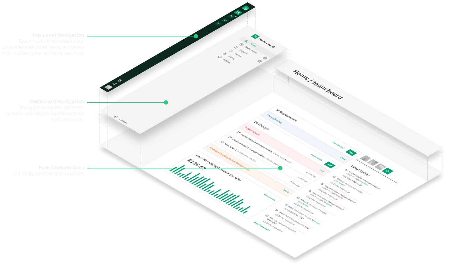
We followed a triple layer navigation approach, which aids in clarity of the navigation structure – specially due to the multi-level nature of the functions and content. As a happy coincidence, this mimics the DNA logo, which follows a triple layer structure as well.

Simplified Onboarding
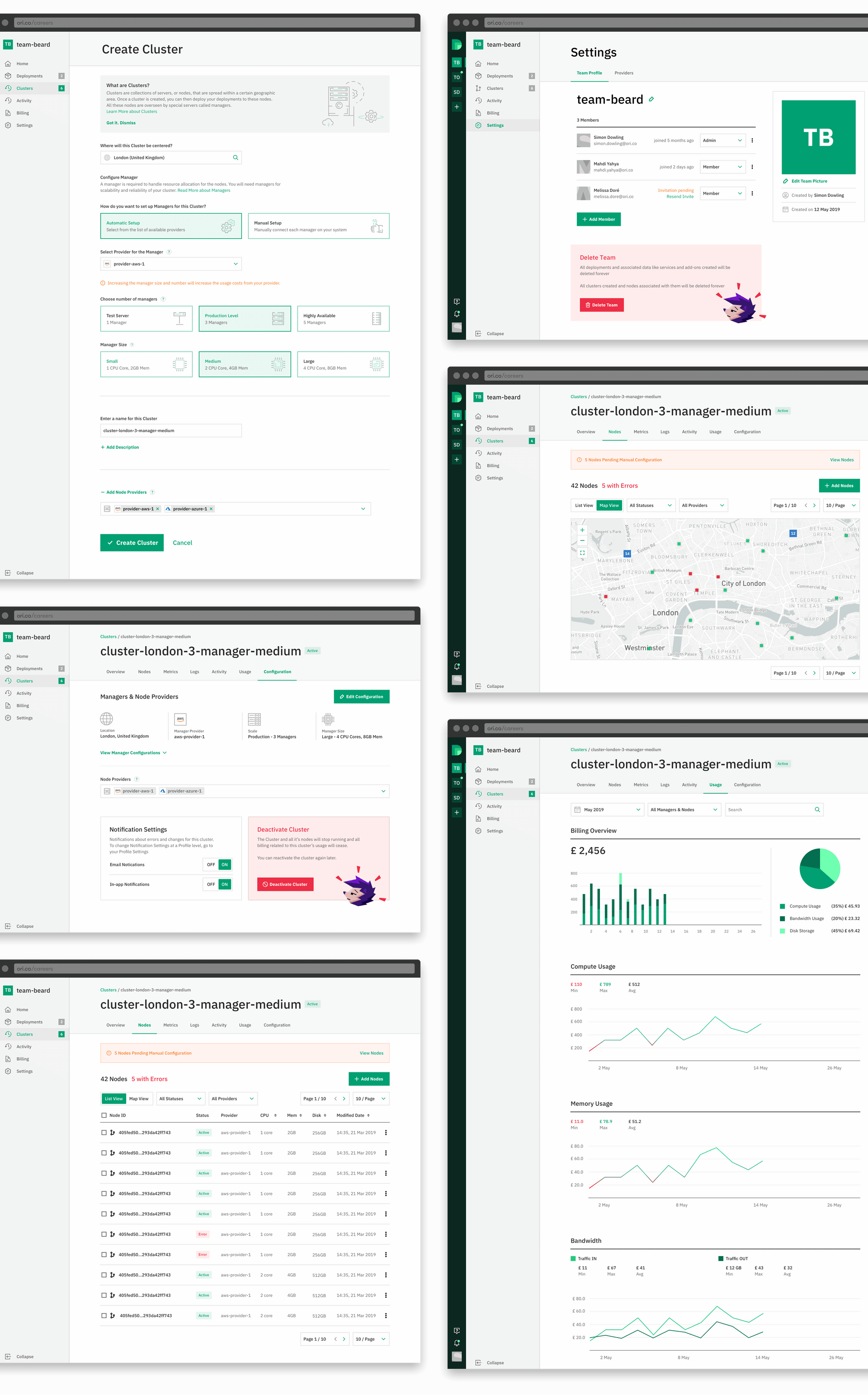
The process of setting and creating new entities can get complex. To simplify it and make it less daunting, we followed a progressive, step-wise format for these, along with providing contextual help where required.
Track and View Metrics
