Opposite
Brand Experiments

Opposite was founded in January 2012 as "Beard Design". We outgrew the name and changed it to Opposite in January 2020. This gave us the rare opportunity to be our own client. No scope of work, no constraints, no fees and no brief. This was an open, experimental project where we pushed the boundaries of how a brand is designed.
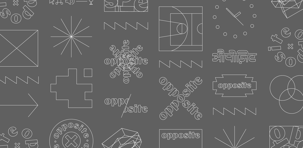
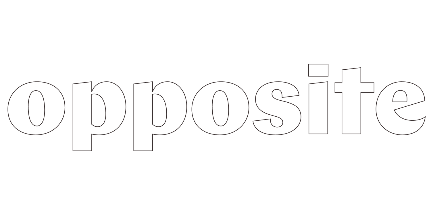
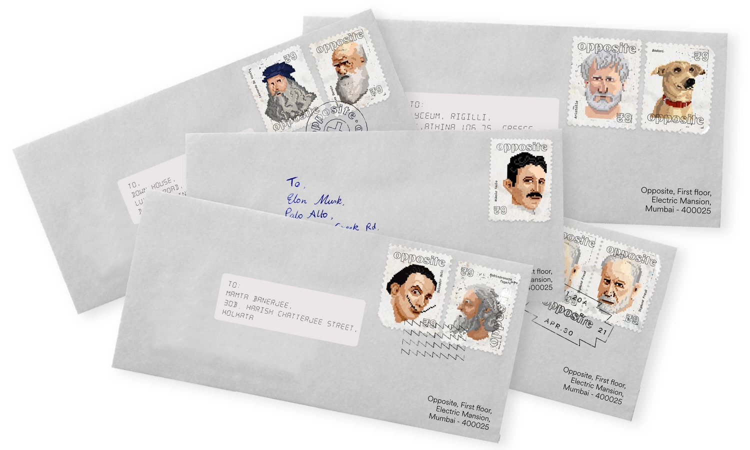
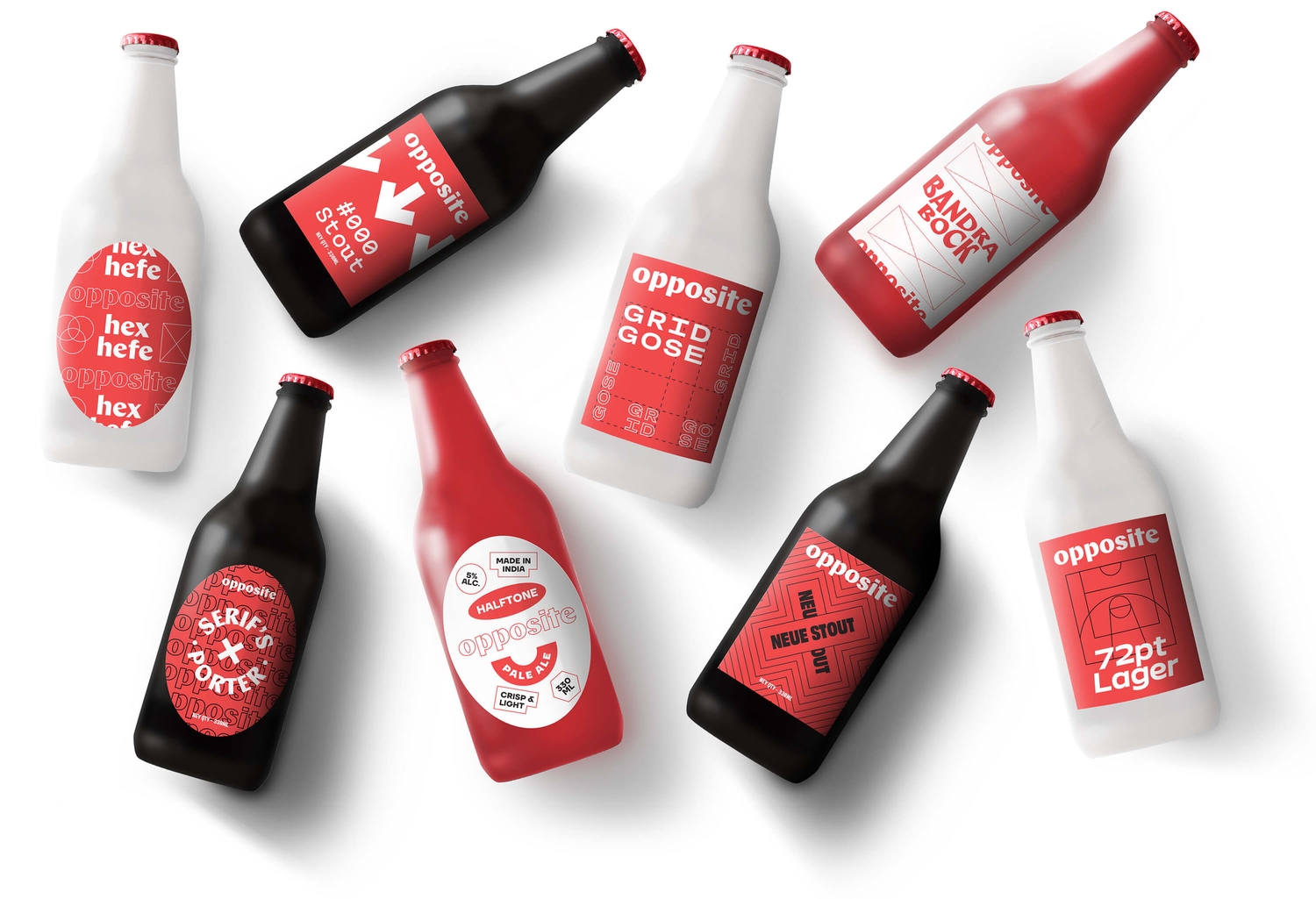
The brand starts with a very simple typemark, set in Chap by Schick Toikka. And it takes off from there in unexpected directions. There is no logo - there are more than twenty (and counting!). We've made and owned every cardinal sin of brand usage - cutting off the logo, distorting it, pixelating it, mixing aesthetics and more.
We love how all of these expressions come together to create an unpredictable, evolving visual language that is irreverent and truly the "Opposite" of traditional brand design.


