Miko
Product Design for a Robot
Miko is India’s first companion robot for kids, launched in 2014 by Emotix. It can play games, answer questions, sing and dance through voice commands on a companion phone app.
The new version, Miko 2 was built to have all this functionality built-in, without needing to use the companion app like its predecessor to control it. There were also a bunch of new features and functionality added in.
We worked closely with Emotix in a tight 4-week sprint on the physical and UX/UI design of Miko 2’s in-built navigation system, it’s interface, face & expressions, and the Parent app to oversee and manage their child’s usage.
Our goal overall was to make Miko 2 intuitive and easy to use, with a friendlier and more expressive personality.
Navigation System
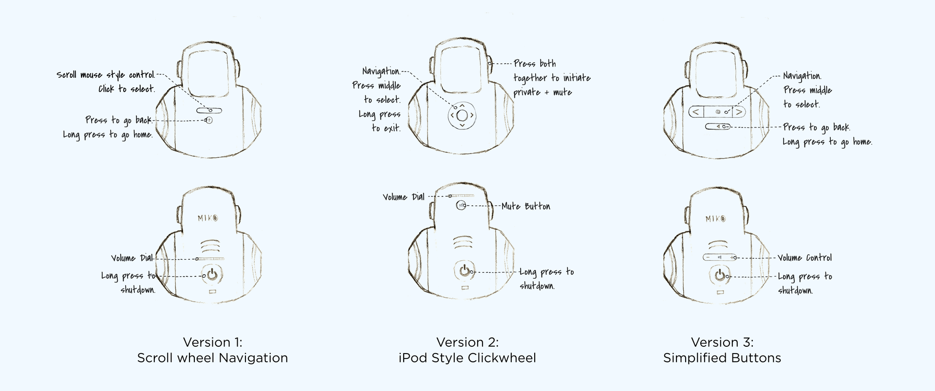
With Miko 2, all functionality that was previously controlled through a companion app was built-in into the Miko body itself. To control this, we needed to create a navigation system to navigate between menus and apps, within apps etc. This involved 2 parts; the design of the physical interactions the children would have and the interface itself.
There were a couple of technical restrictions to this; there was no touch screen available, it needed to work with Miko’s curved body, and not interfere with the internal circuitry of other parts. We also didn’t want it to feel like an “interface” but a natural part of Miko.
Hardware – Software Integration
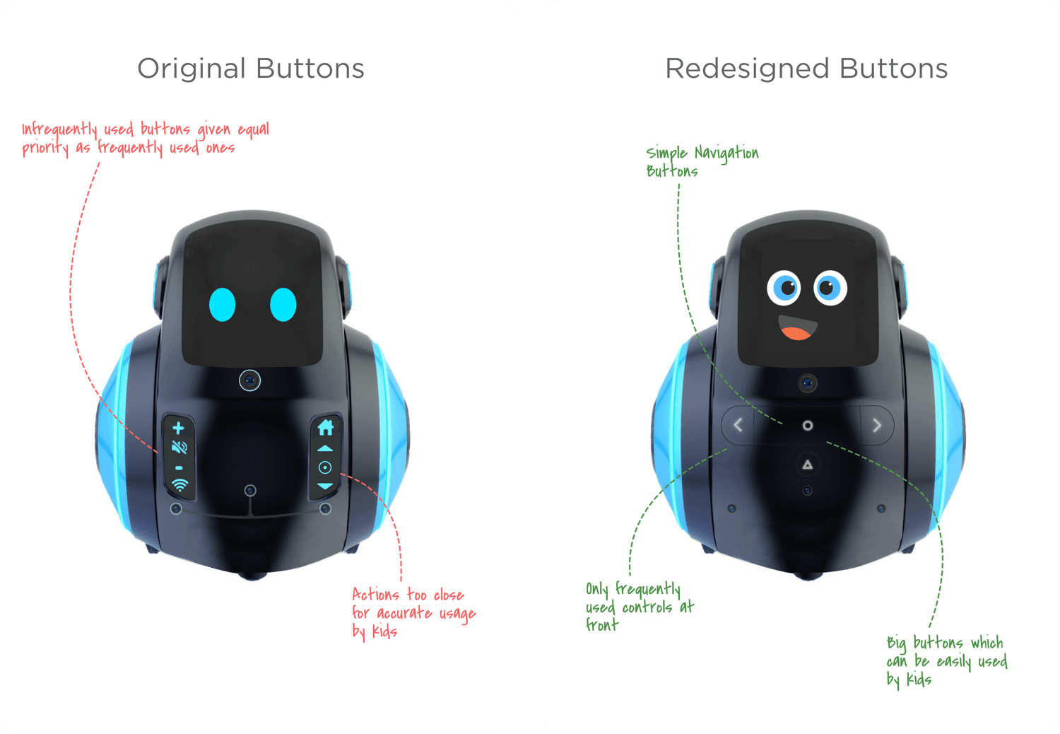
The physical buttons and the interface navigation were designed hand-in-hand to ensure an integrated, seamless experience.
Form follows Function
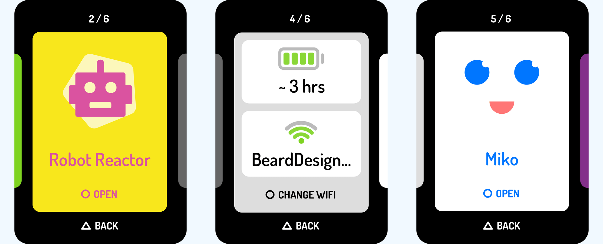
The on-screen menu navigation was designed as a sideways carousel instead of the more traditional vertical cards or grid format so that it matched intuitively with the side arrows buttons on the body.
On-screen Cues
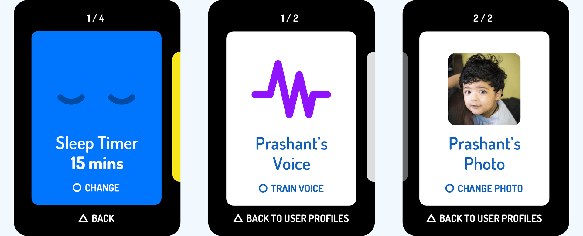
We added small text cues to indicate what action the ‘select’ and ‘back’ buttons would do on different apps and settings, so the user knows what to expect.
Interface Design System
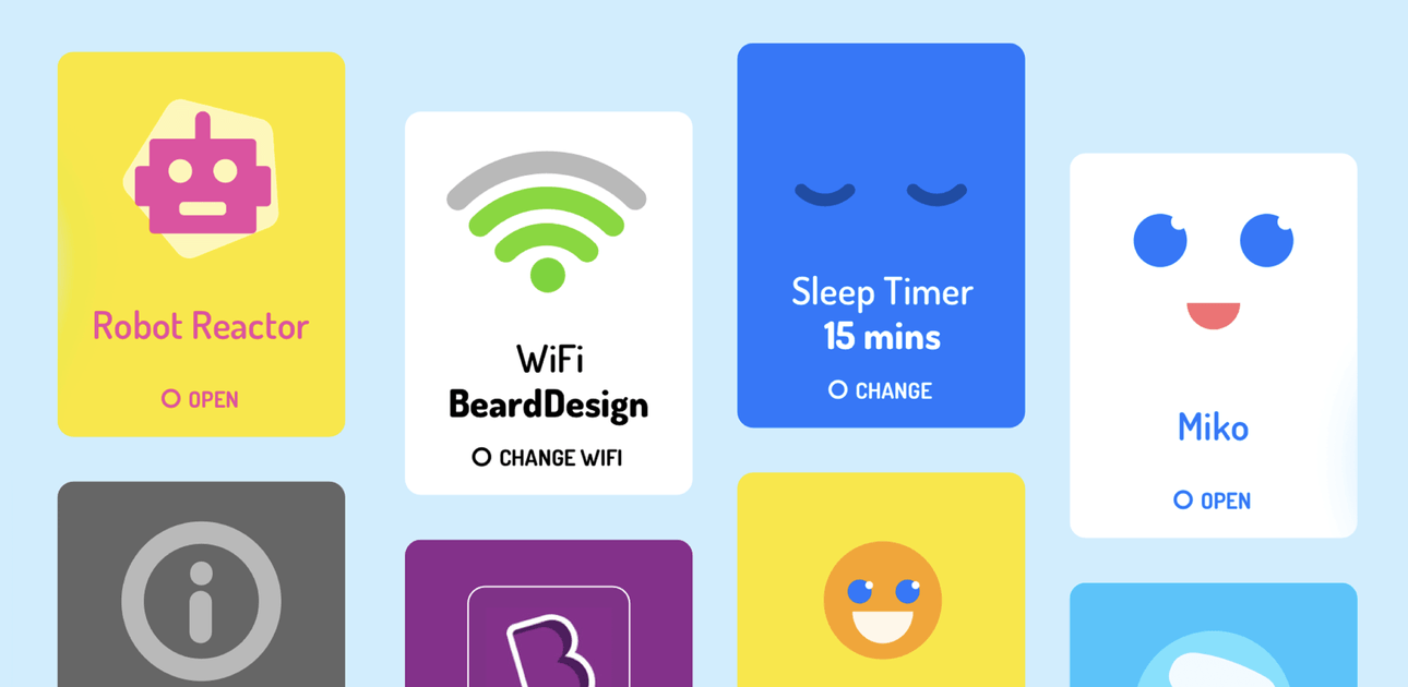
We took a fun, card-based approach for kids to access their games and apps on Miko. The card system was designed to be flexible to accommodate any kind of app or setting, and tiny micro animations were added in to make the interactions more delightful.
Face and Expressions
We gave Miko’s face a makeover as well. After multiple rounds of iterations, we arrived at a character that was friendly, expressive, and fun to be around. We also prototyped the animations for all of Miko’s emotions and expressions.
Explorations
Our principles with the explorations were to arrive at a face that felt more human than alien or robotic, was simple enough to merge well and not look cluttered on the Miko screen, and yet gave us enough elements to play with for the different expressions it would have.
Parent Companion App
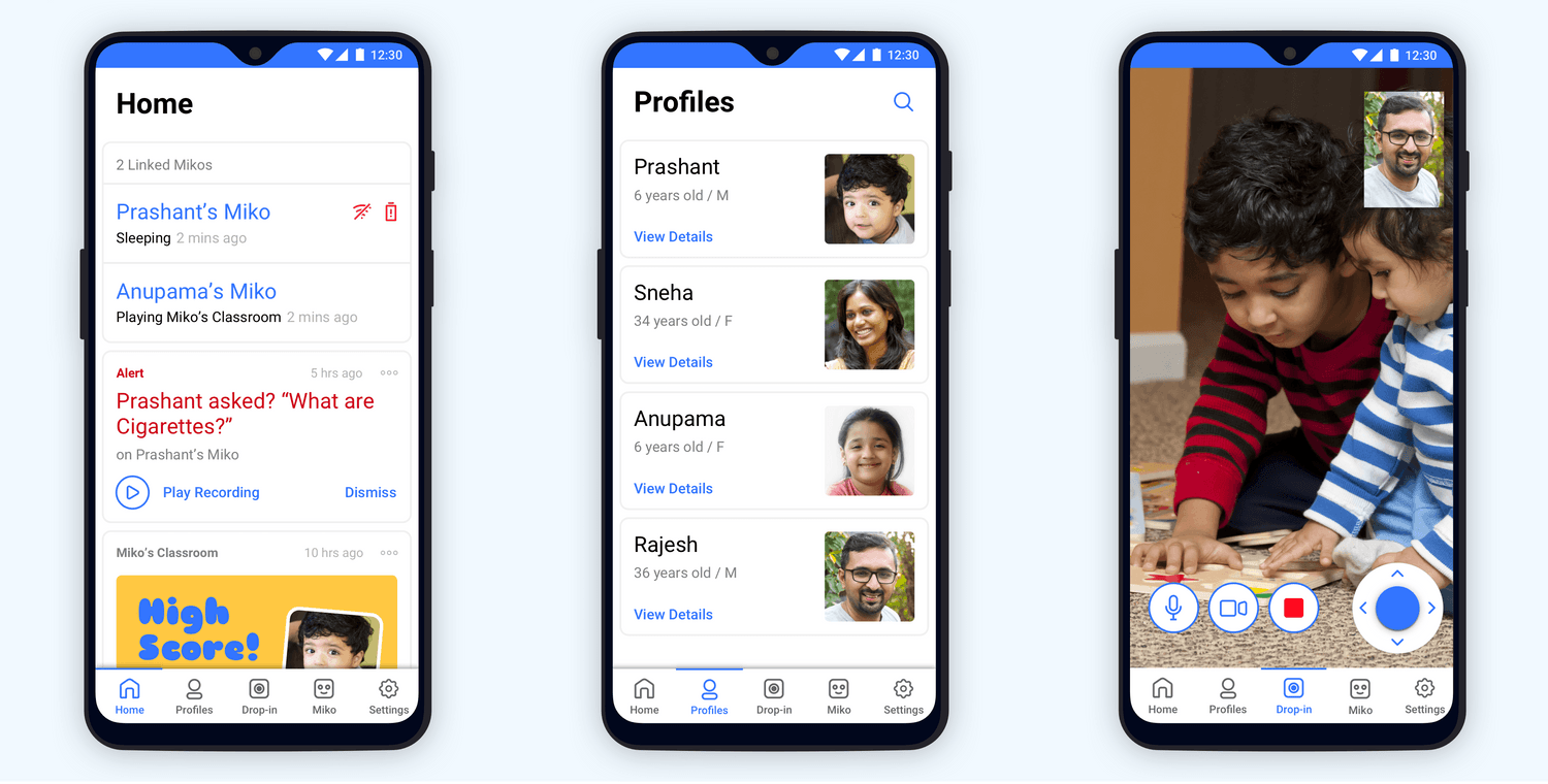
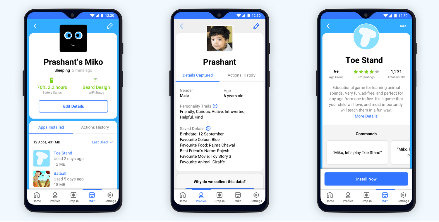
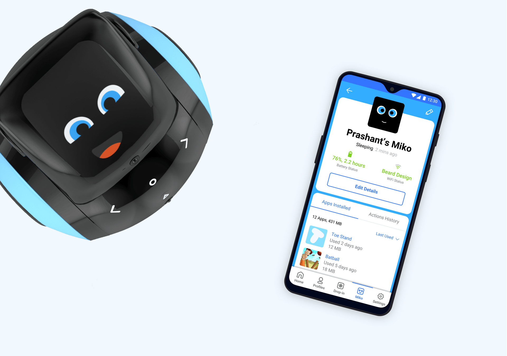
The parent companion app is used to oversee and supervise all activity on Miko. We designed the primary dashboard to be a feed of activity that’s most important to the parent, while still being able to switch between their other options easily.
