Local Oye
Brand Identity Design

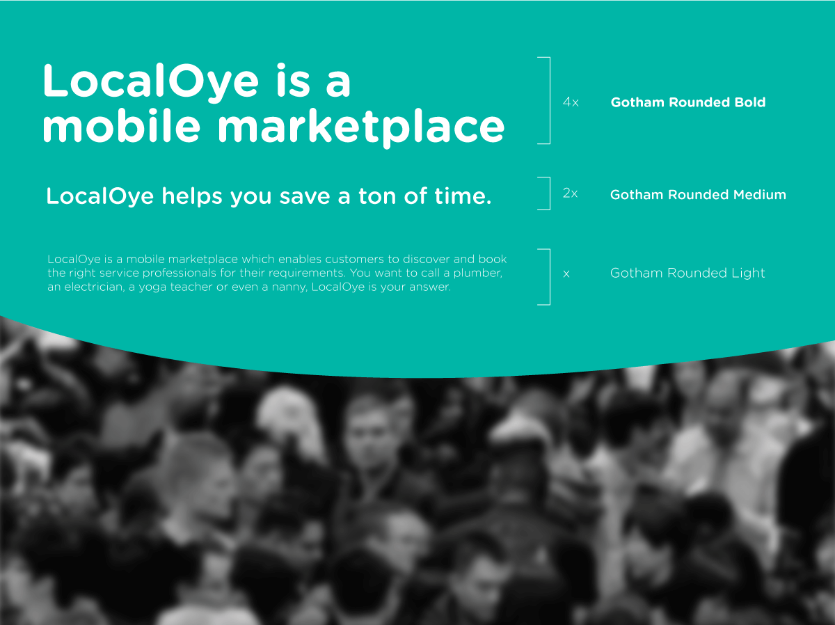
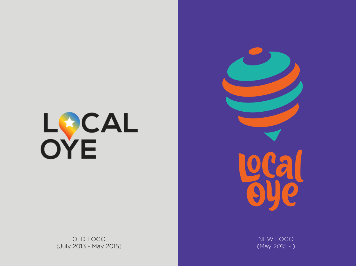
Local Oye was the pioneer in connecting consumers to local services (like plumbers, electricians…) through a simple web interface based on location. After validating the idea, gaining market traction and several rounds of funding, they were ready to hit the big time and needed a brand refresh before they rolled out their services across India. This also coincided with their move to shut down their website and focus on mobile apps.
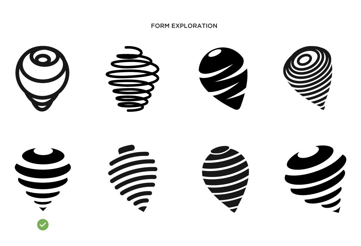
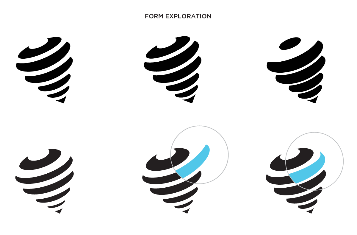
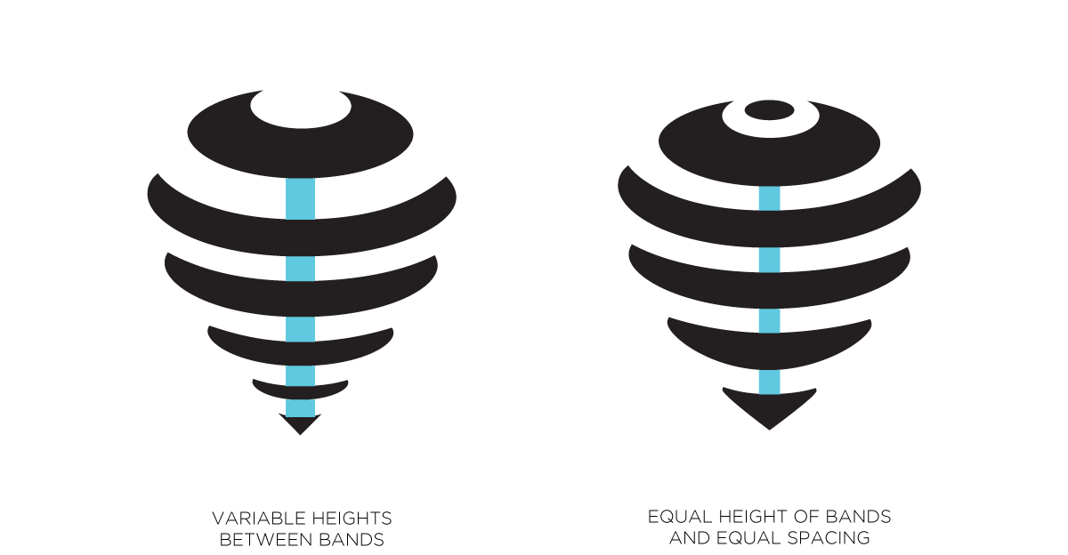
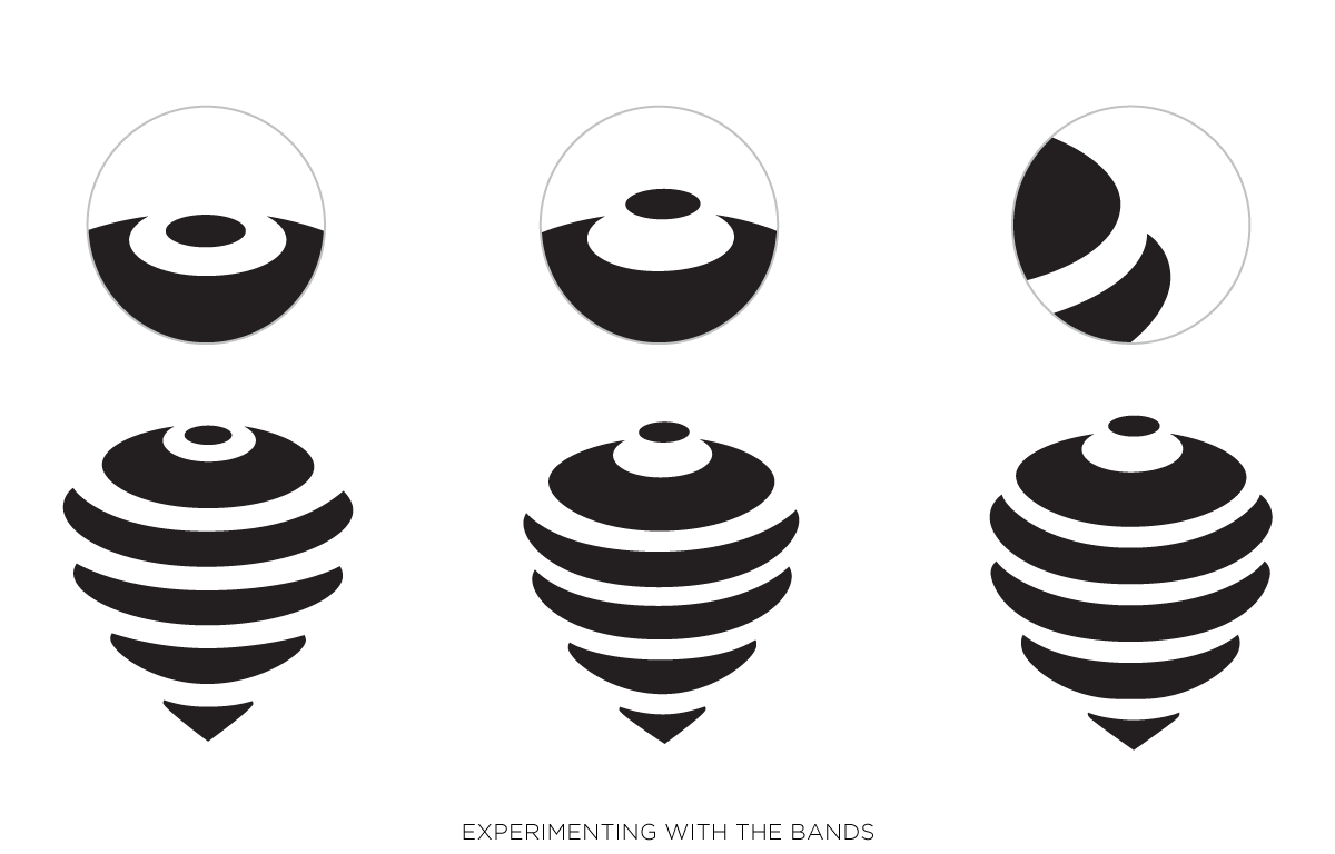
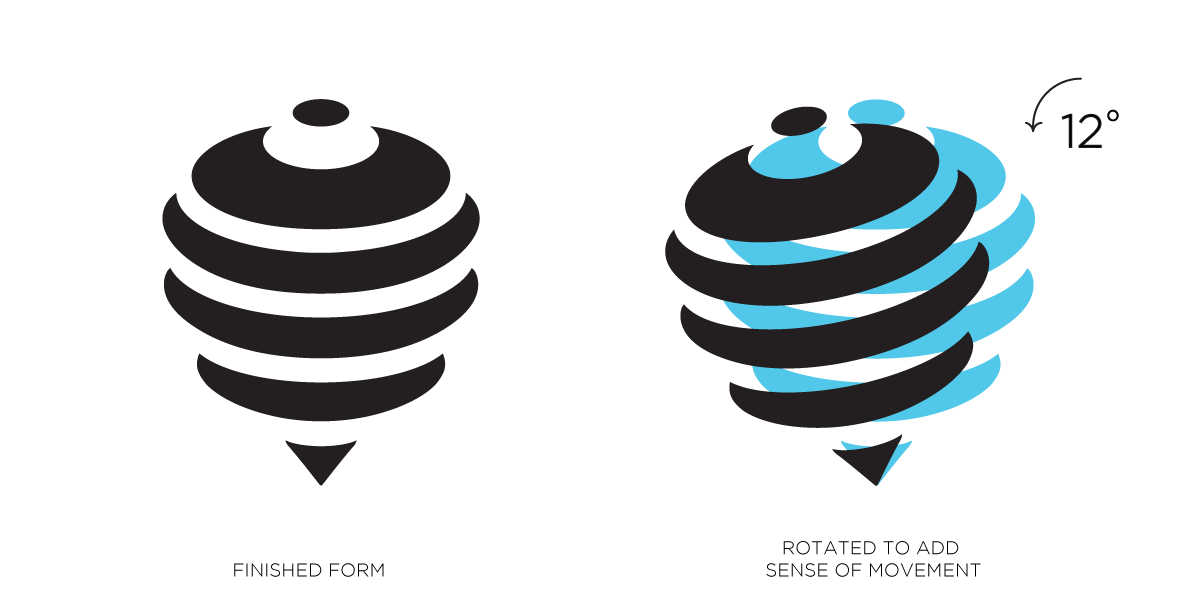
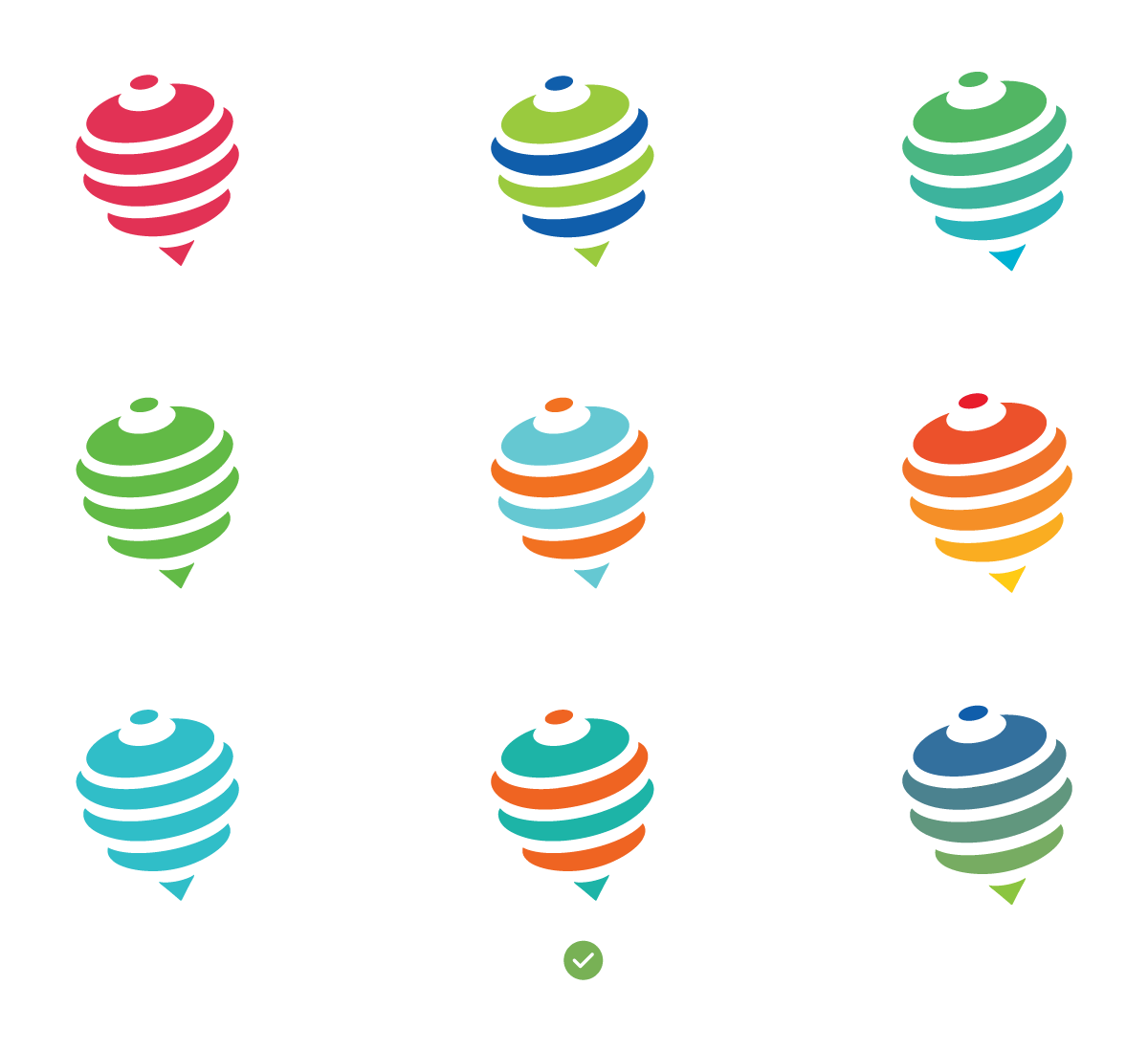
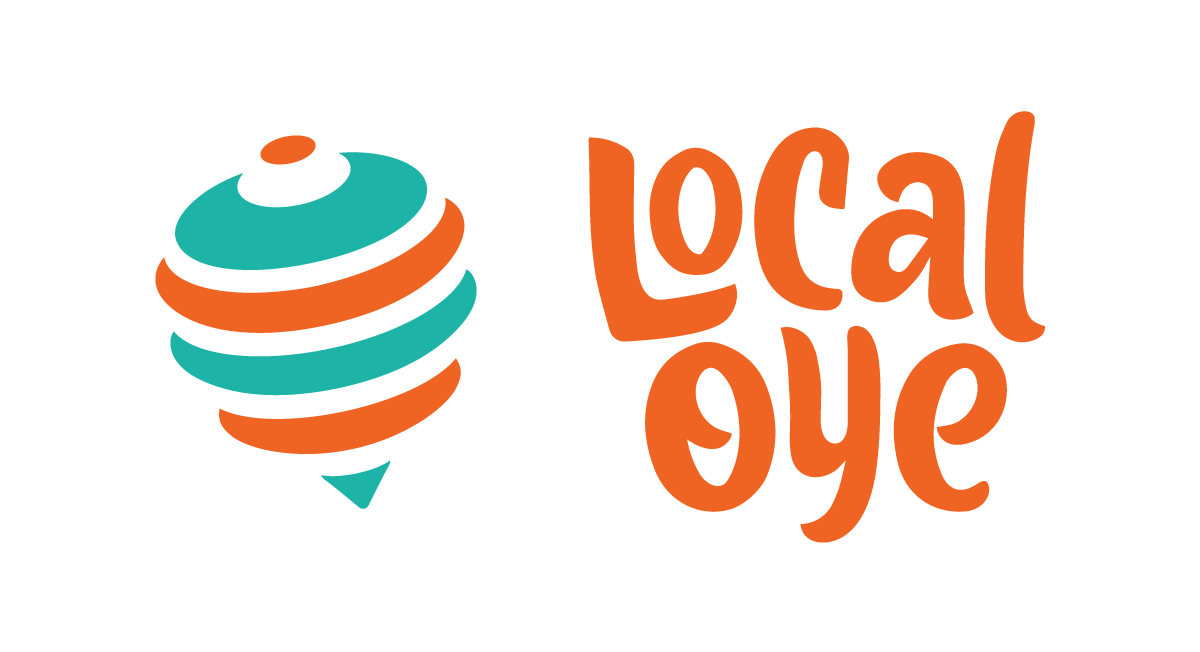
Local Oye approached us with a simple brief to reimagine their brand and give it a face for the next phase of growth. We worked with them over several weeks to arrive at the “spinning top” as the symbol for the brand. The spinning top is a commonly recognized object with some nostalgic value, but not a very commonly seen these days. That puts it in a good sweet spot of being easy to recognize and memorable, without being commonplace. It also doesn’t hurt that the spinning top has the same shape as a map marker pin, a commonly understood metaphor for “local”.
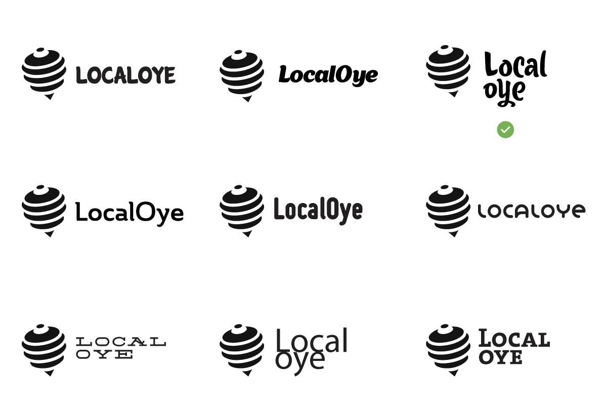
With a fairly powerful symbol, our inclination was to pair it with simple typography. However, during explorations we chanced upon a great script typeface which fit perfectly with the playful and slightly whimsical nature of the symbol. We ended up modifying this significantly to create a custom typographic unit for local, which has the flexibility of being used in multiple orientations.
