Hyphen
Brand Identity / Co-living
The "living" ecosystem for young people in urban India is broken. Low-supply of affordable housing. Poorly designed living spaces. Eccentric landlords. Lack of recreational and social amenities. Long commutes everywhere.
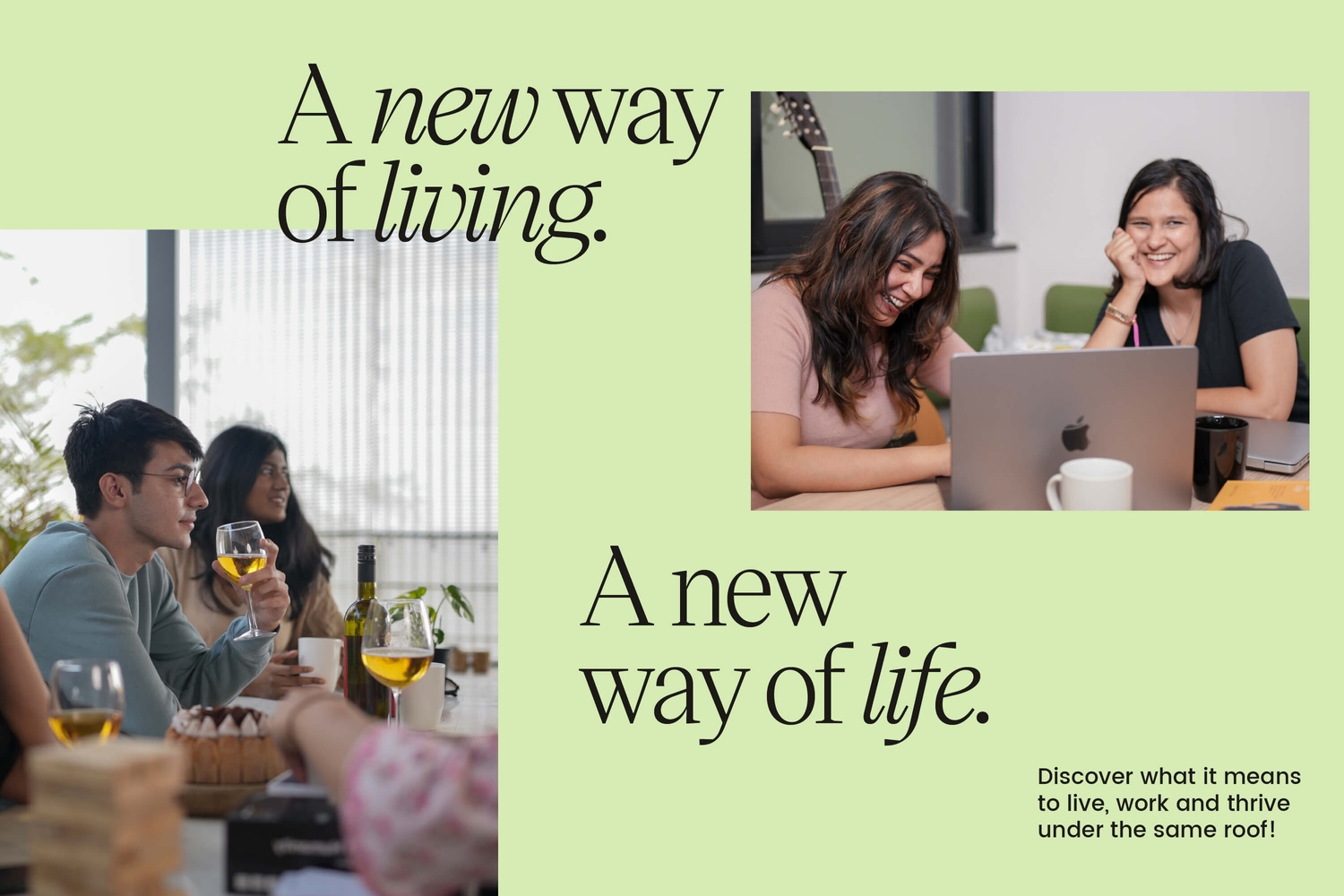
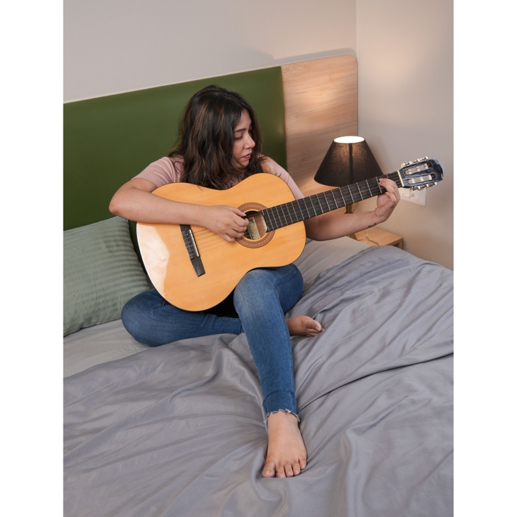
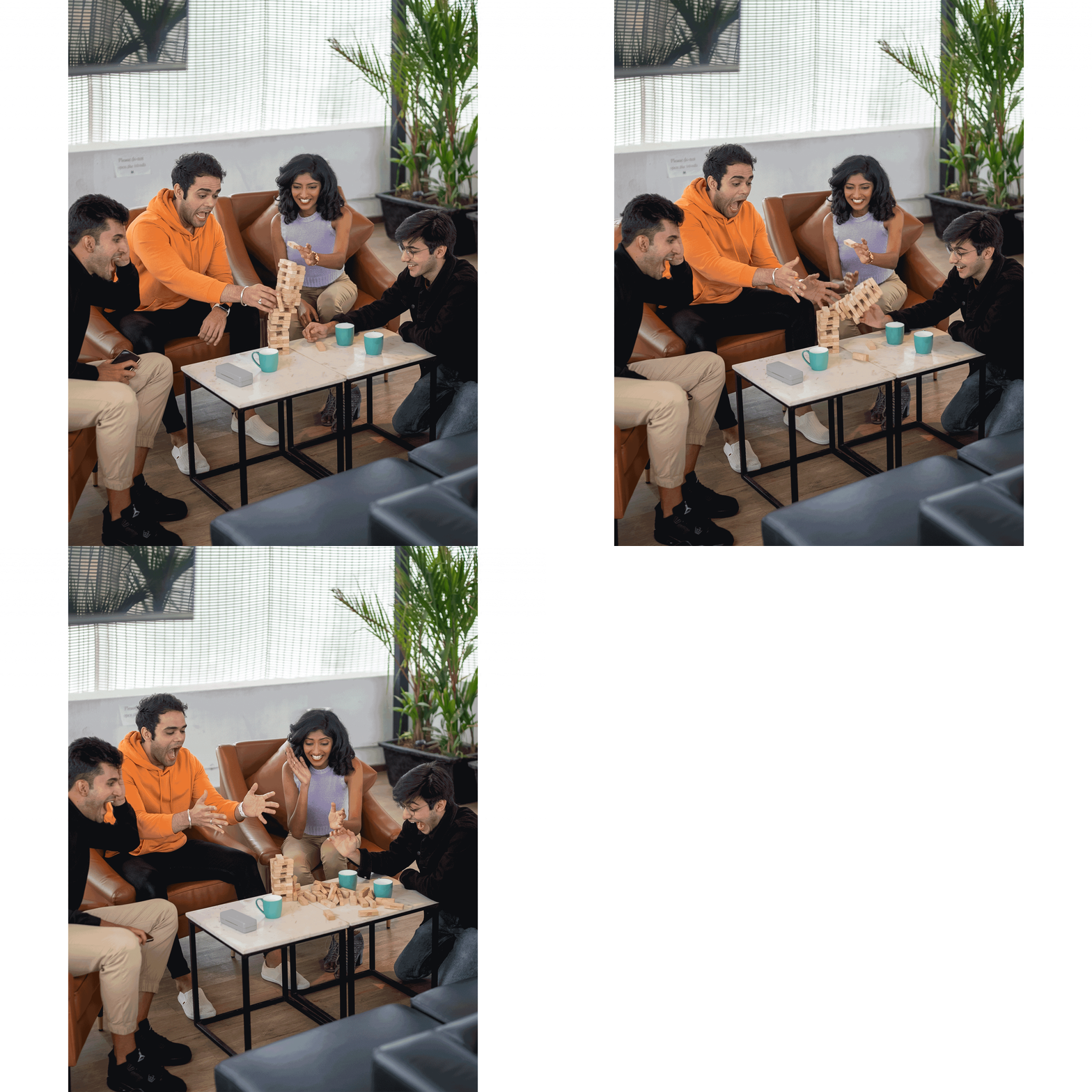
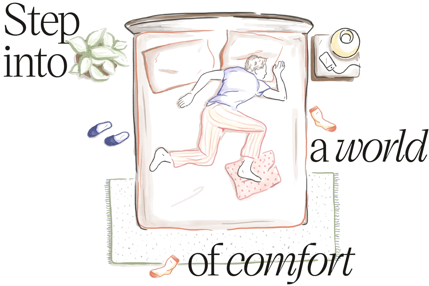
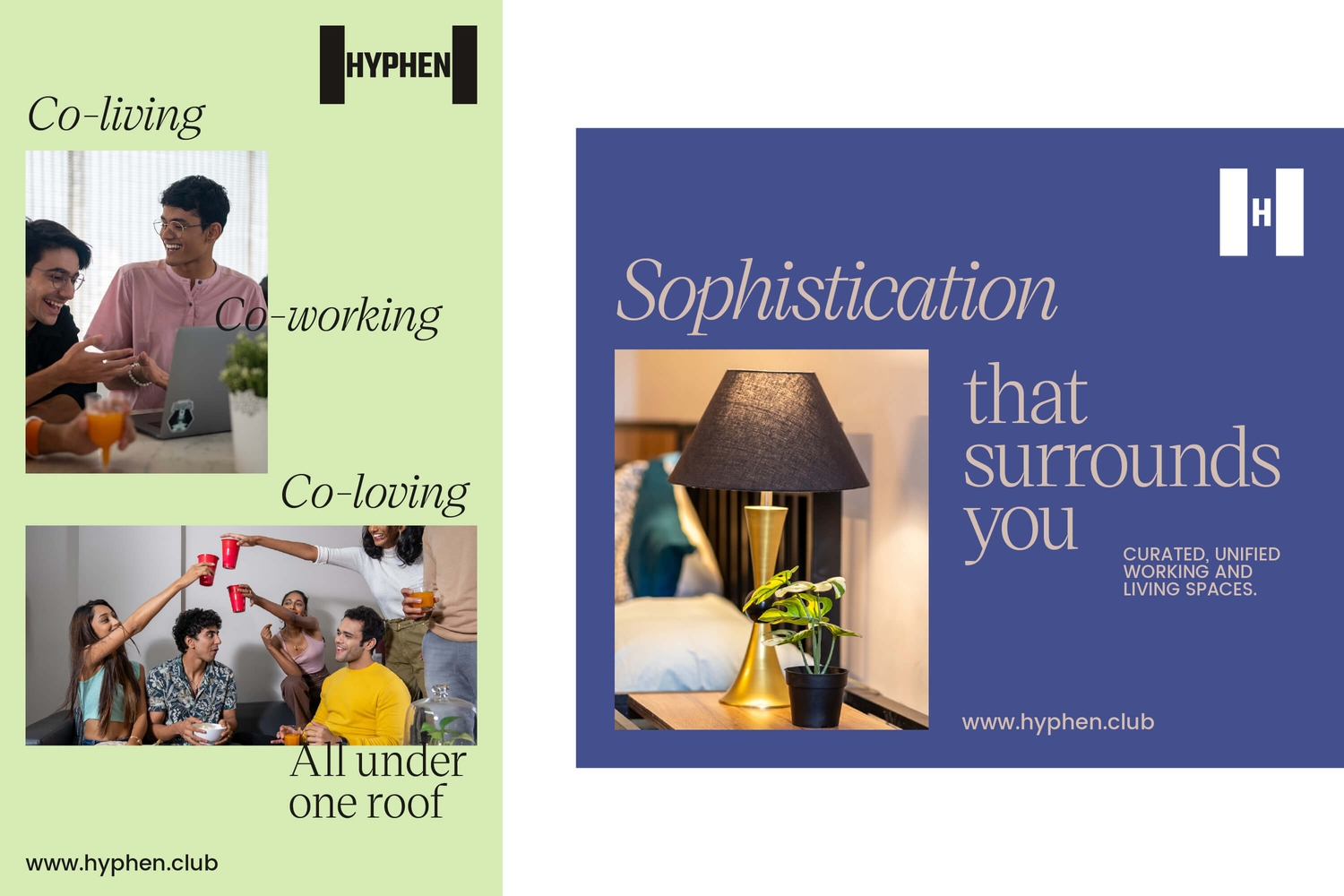
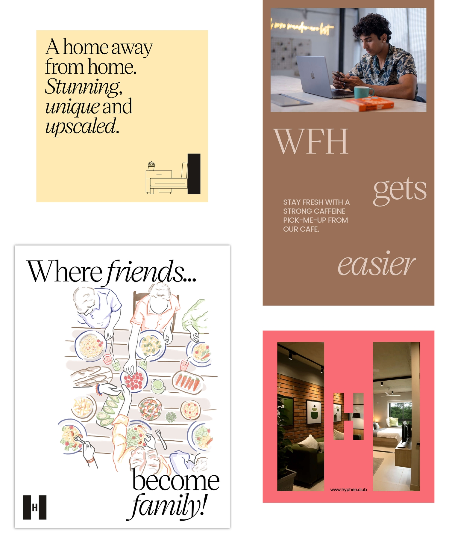
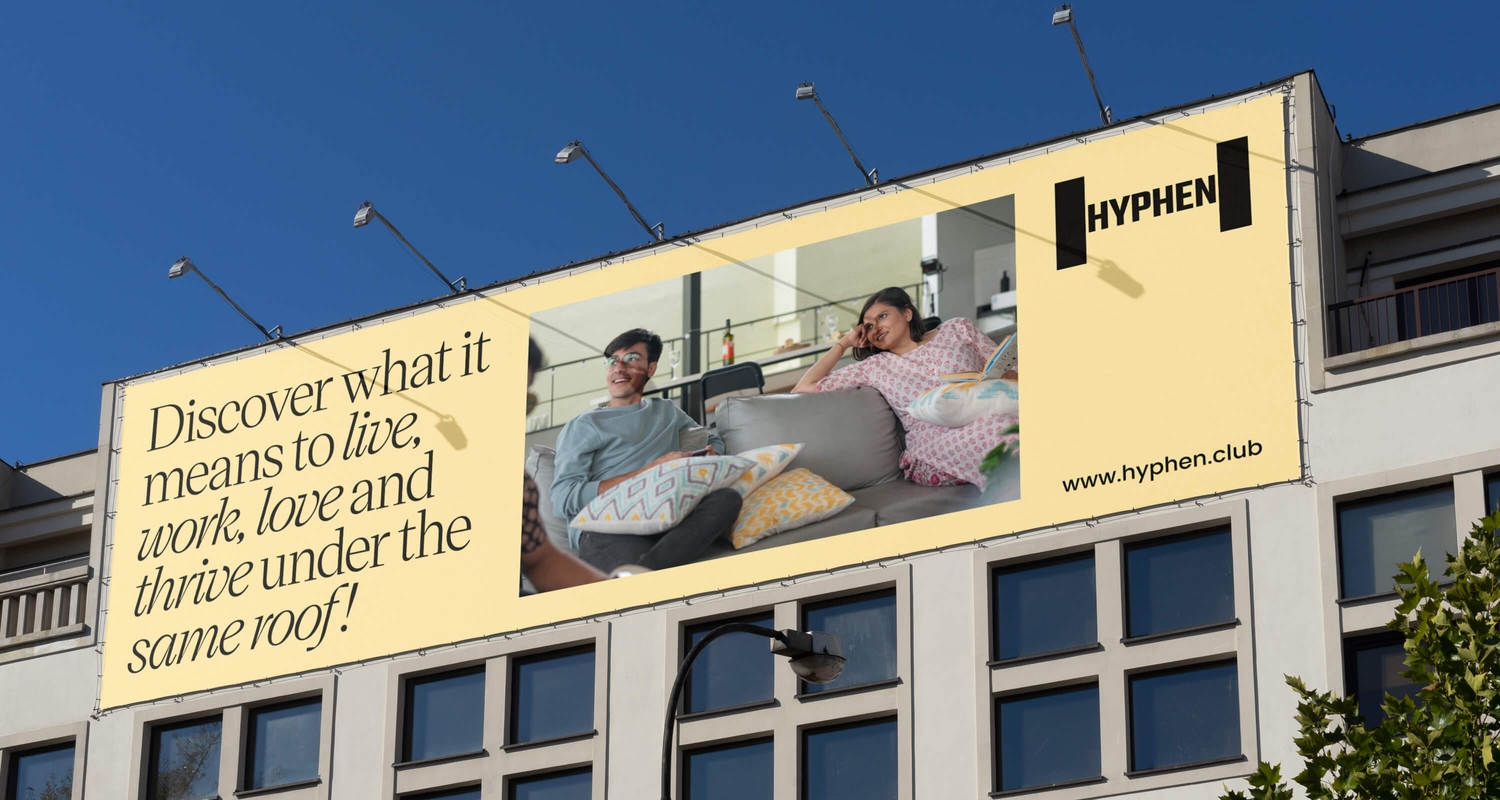
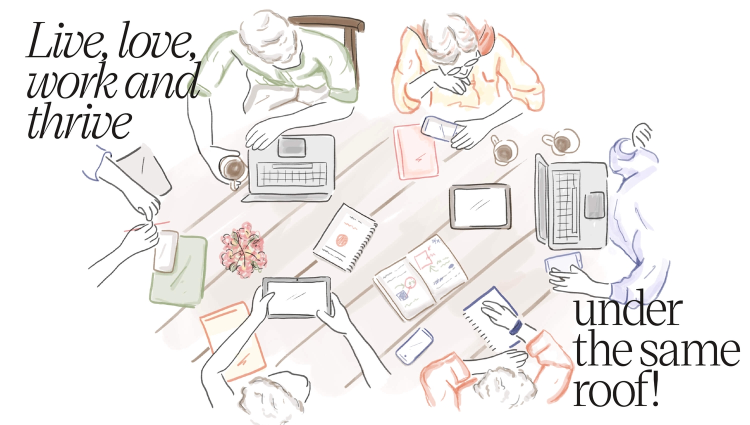
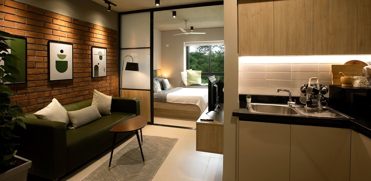
Hyphen solves this with their purpose-built, fully-managed co-living spaces specifically designed for urban 20-somethings. On the foundation of modern, aesthetic living spaces, Hyphen has created a vibrant community that engages the residents with events, workshops, parties and other forms of social interactions.
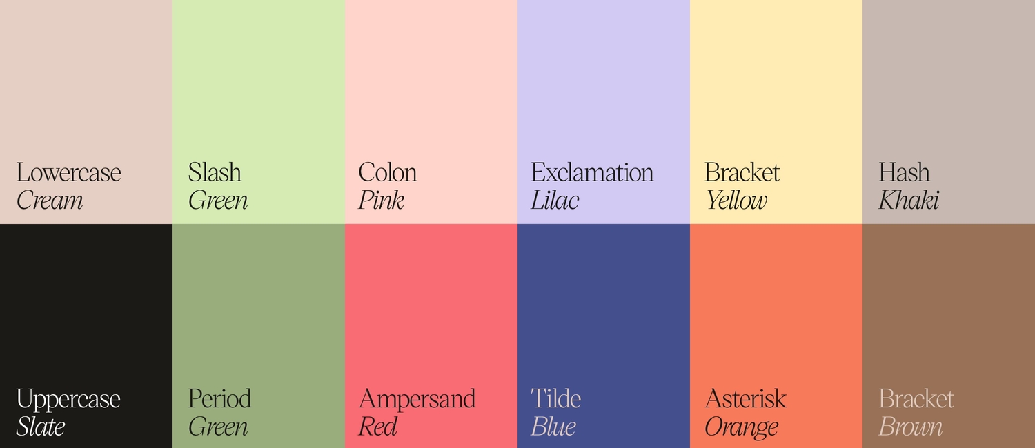
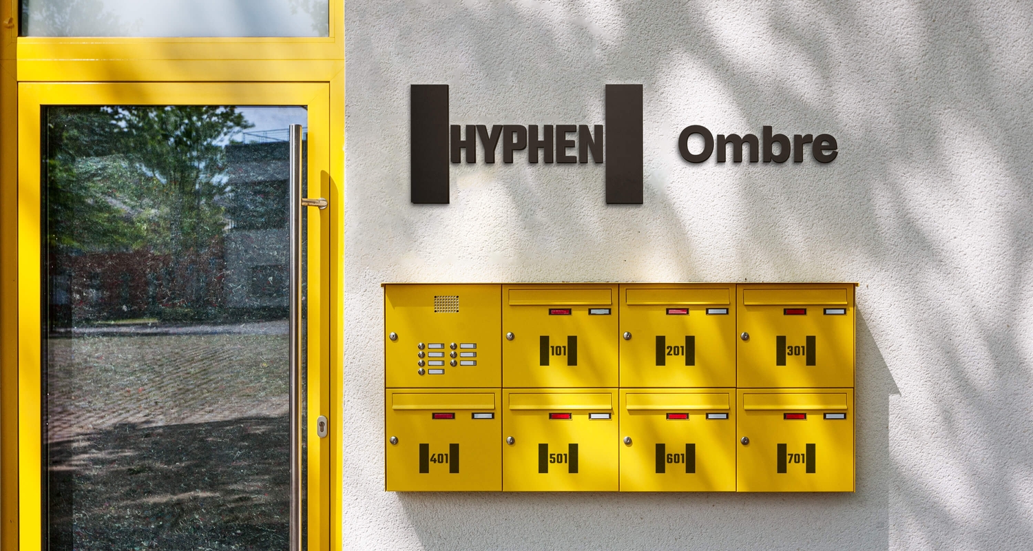
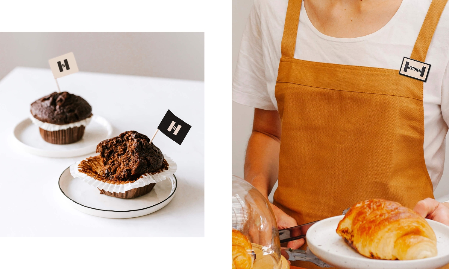
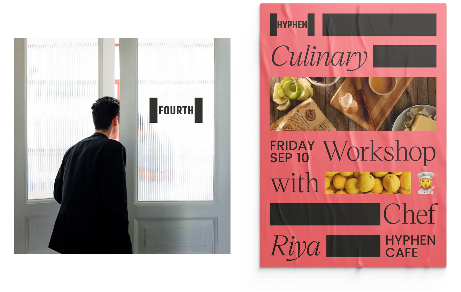
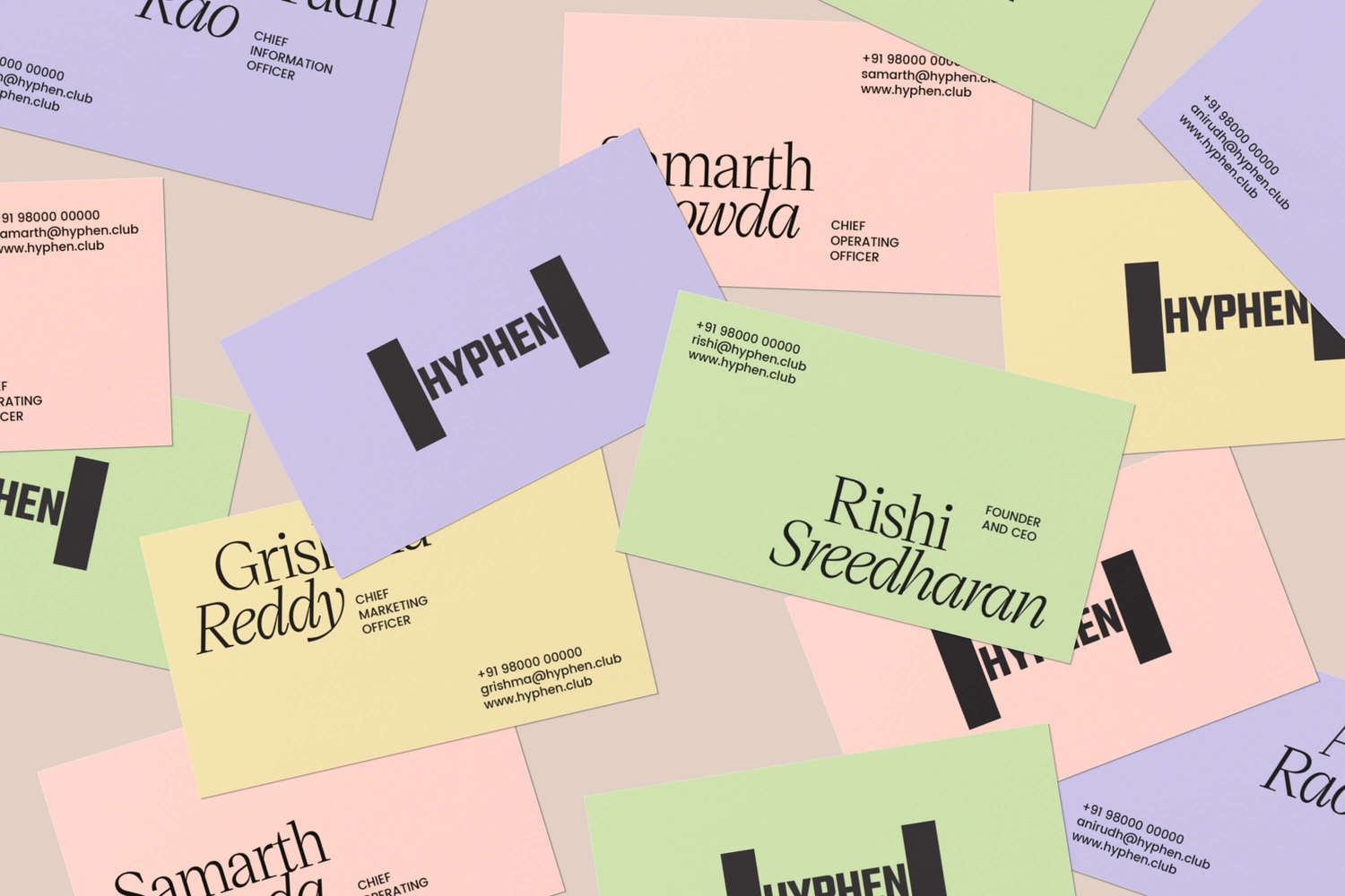
Opposite worked with Hyphen's founders to create a new brand name, identity and an exciting, sophisticated and adaptable visual language that elevates the brand over other co-living spaces.
