Hubilo
Brand Identity and Visual Language

Hubilo was founded in 2015 as an event-tech business. In 2020, with the shut down of physical events, they pivoted to become a Virtual Event Platform (VEF) that enables event organisers to host and manage virtual events end-to-end.
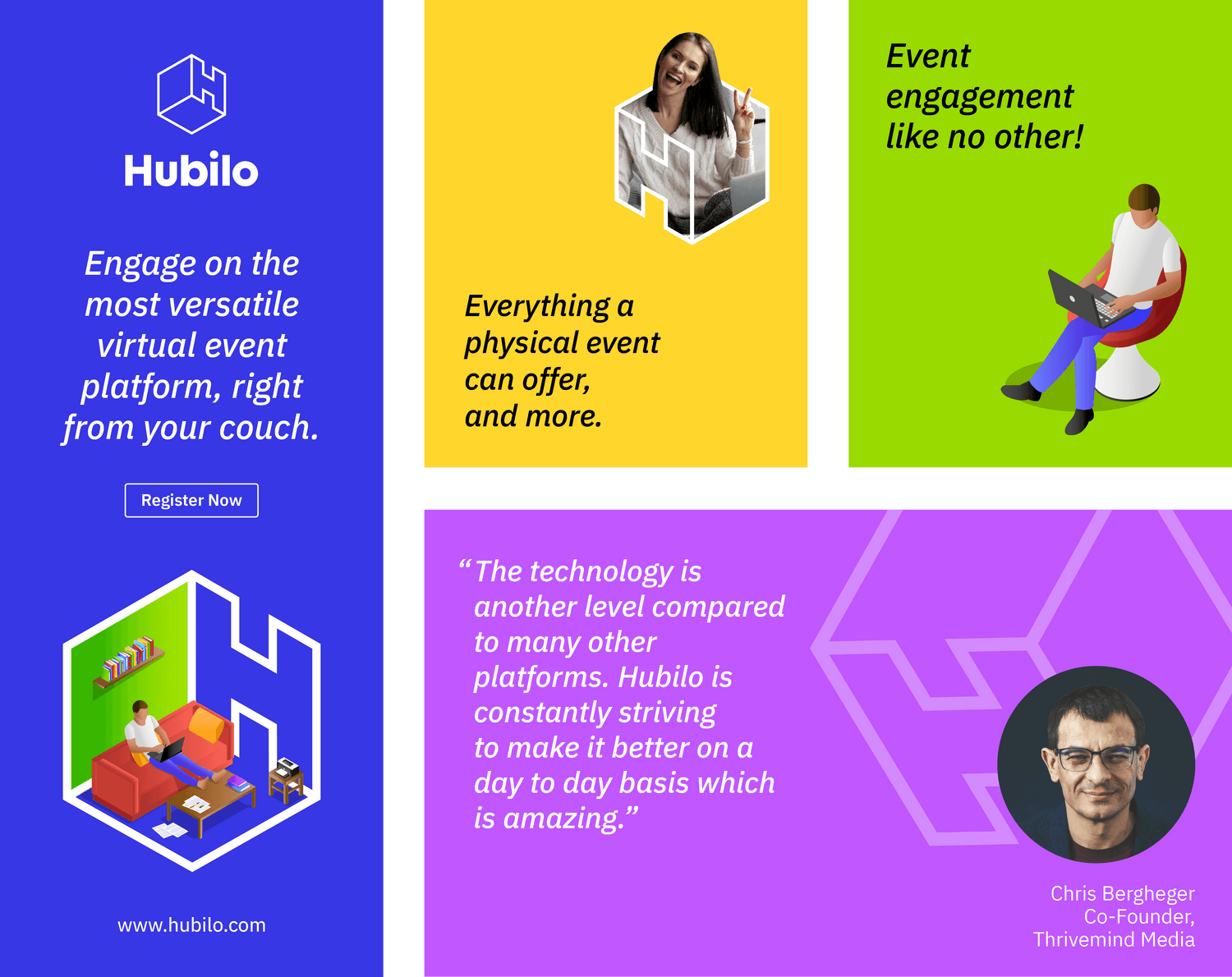
We partnered with Hubilo to create a new visual identity that reflected the new positioning. The brand and visual language are natively digital, meant to to make users feel at home hosting and participating in virtual events.
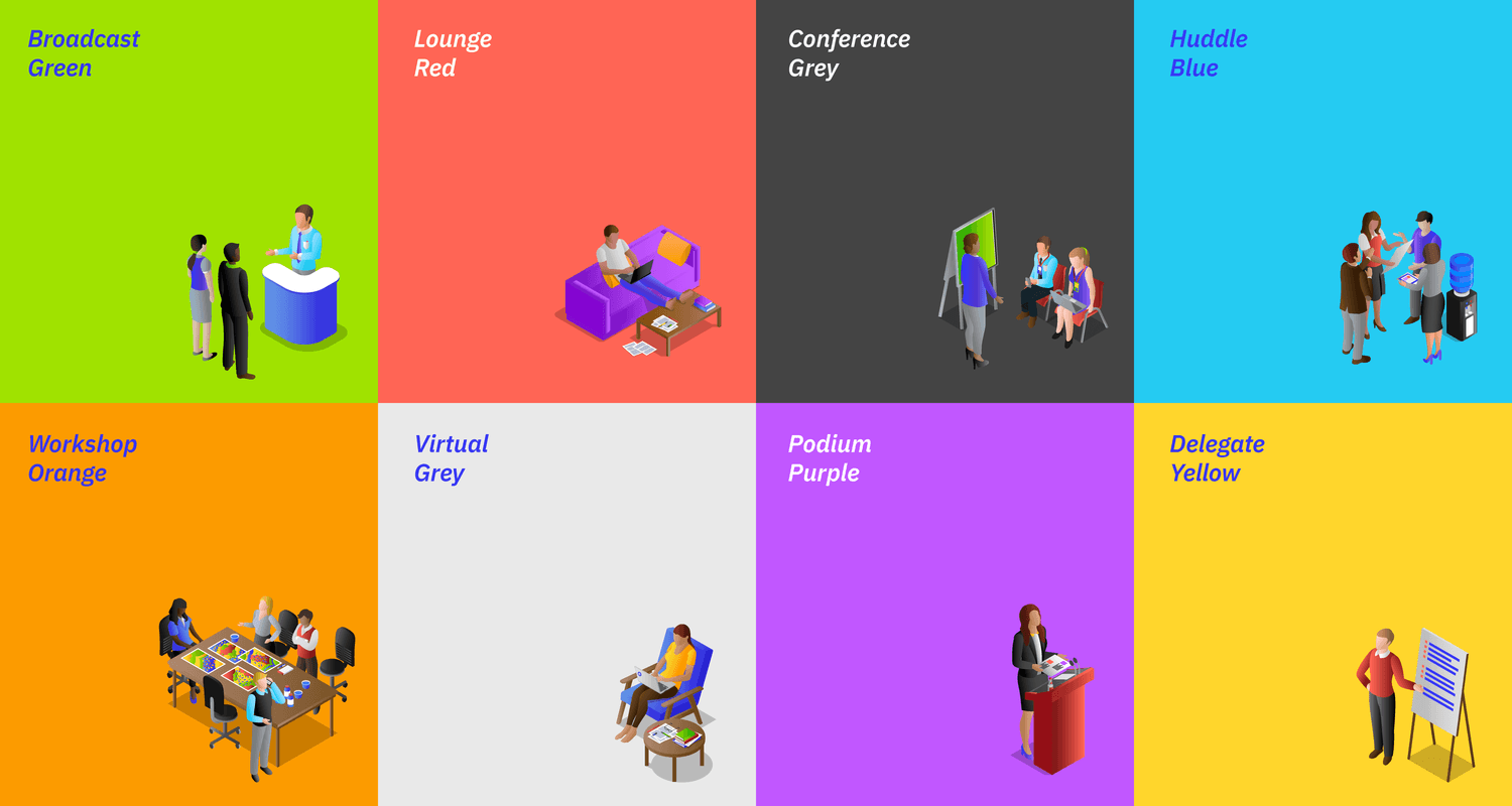
The core idea of "connecting people" is brought to life through the multi-faceted "H" symbol and through the use of isometric illustrations and graphics. This is reflective of the many ways Hubilo connects participants and brings together global perspectives. The rest of the visual language is crafted to keep the events and content, front and center.
Hubilo has hosted 2500+ events, across 100 countries with more than 2 million participants. Marquee event organisers such as New York University, United Nations and AIESEC have used Hubilo for their events. By 2021, it had raised $28 mn from investors including Lightspeed Venture Partners.


