Hostmaker
Website for Hospitality
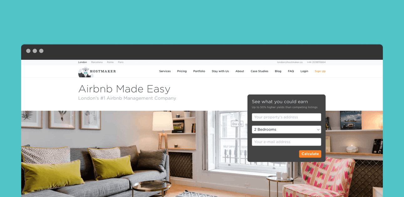
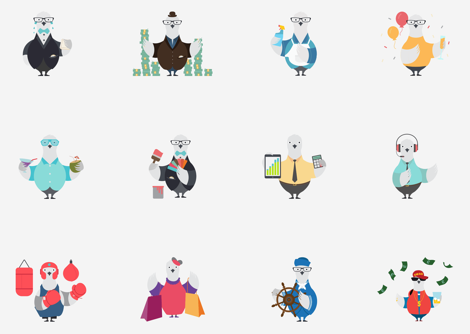
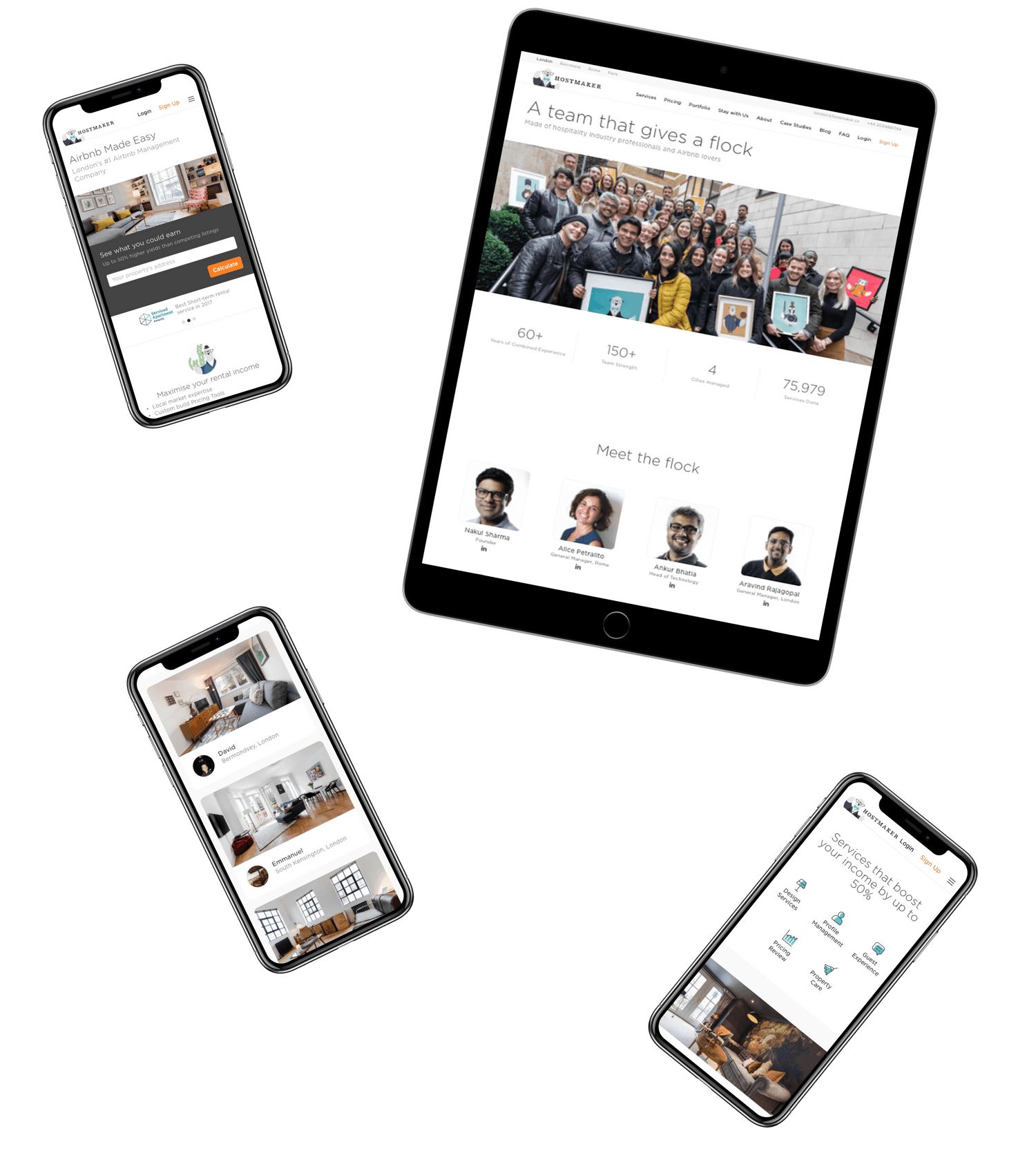
We’ve worked with Hostmaker since inception – creating the identity (the lovable Sir P.John), developing and evolving the visual language of the brand, UX/UI for proprietary tools, their first website, their second website… And now we’ve made their third website!
As the company has grown, it has scaled the team, launched services in multiple cities across Europe, raised funding and in many ways, validated the market. This has brought in competition and need to differentiate the Hostmaker Brand and refocus its communication from evangelizing the category to driving conversions.
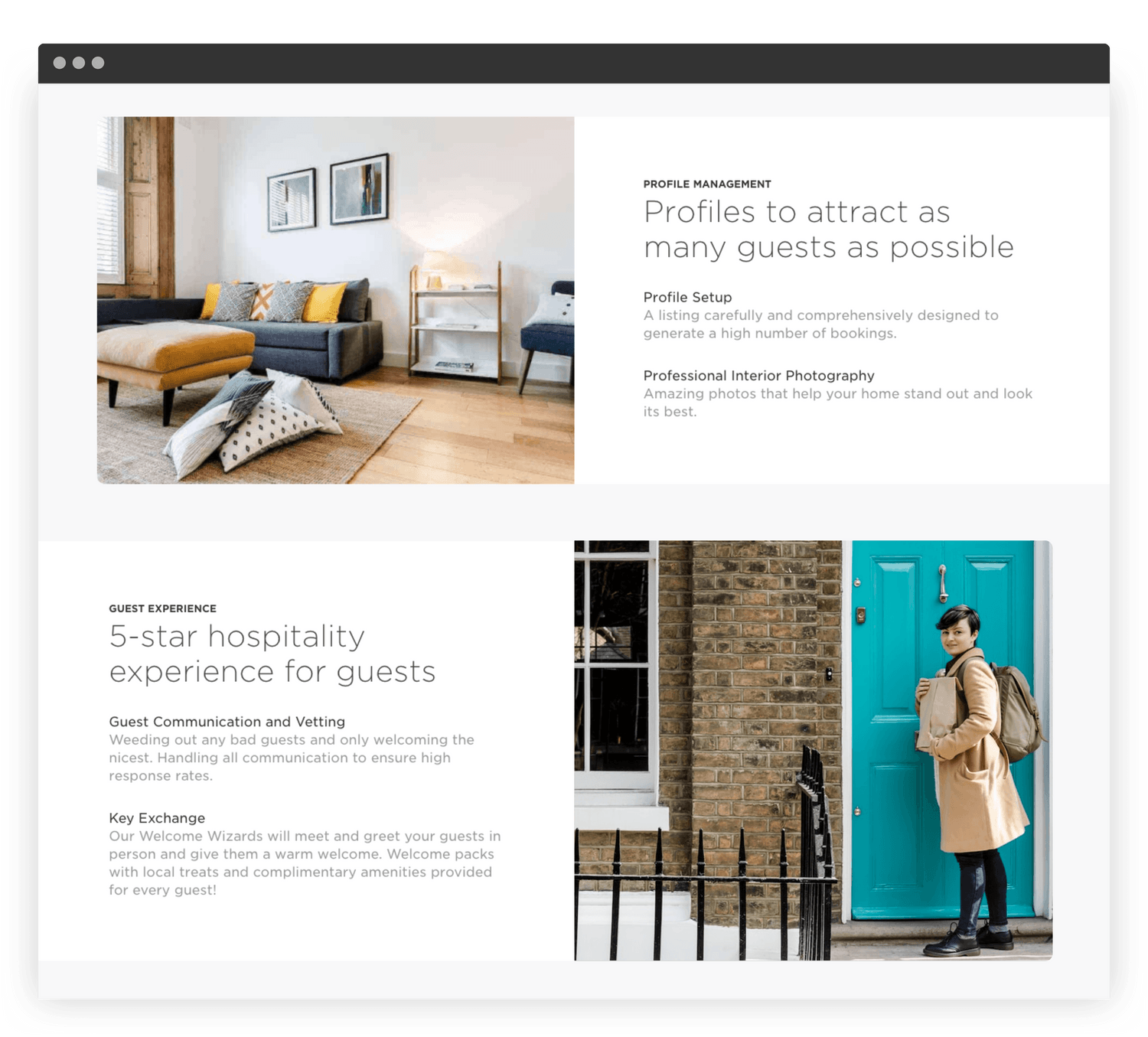
V3 of the Hostmaker website started with structuring and simplifying the content for a sharp focus on the key value proposition. The service was positioned as “Creating 5-star experience” rather than providing commoditized services like housekeeping. This meant that focus was on benefits rather than features.
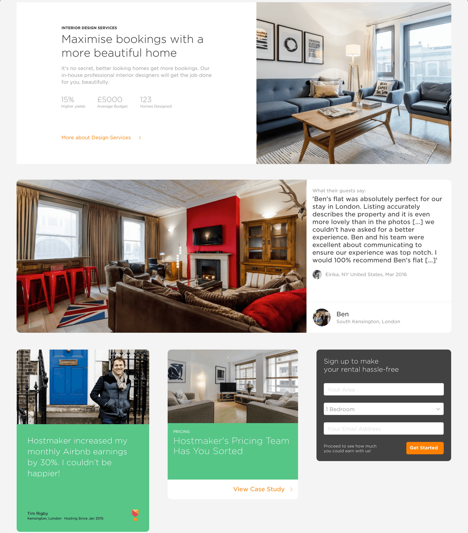
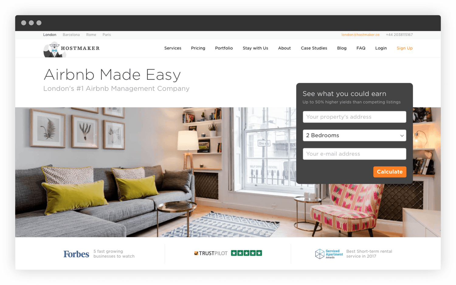
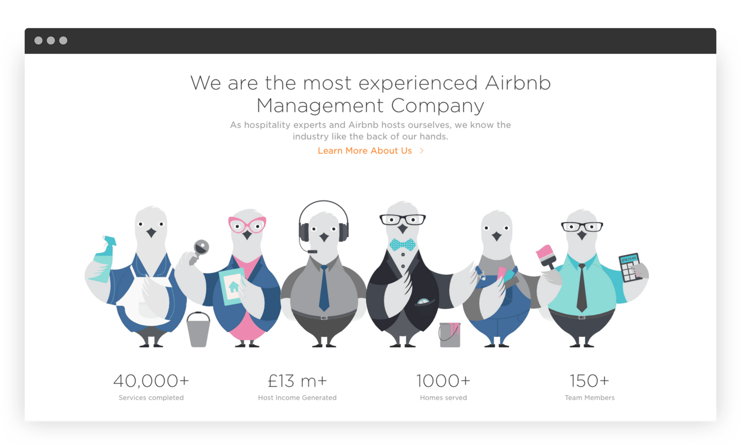
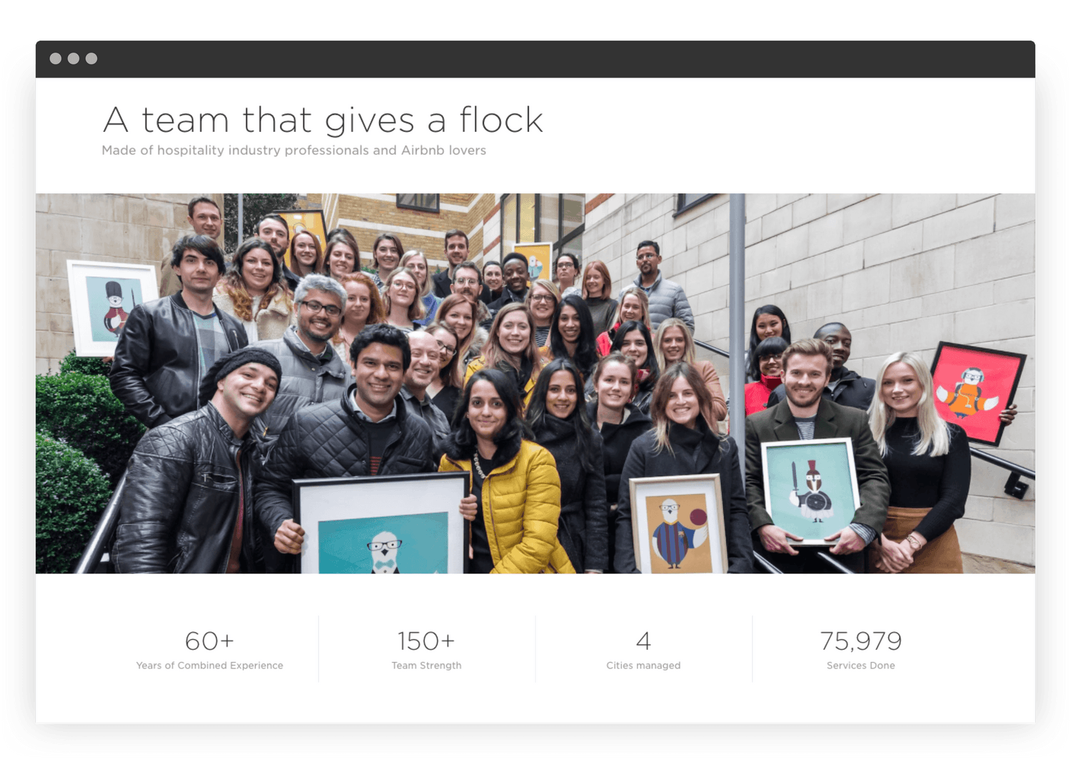
The visual language was refined to reflect the new positioning – combining the playful illustrations with beautiful “hotel-style” photography, an updated typographic style and a crisper color palette.
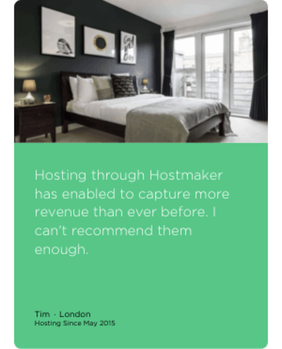
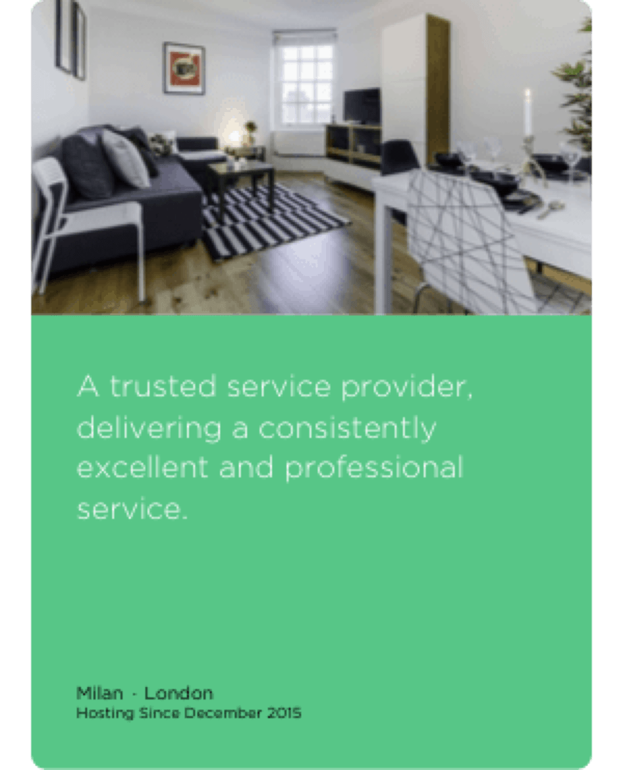
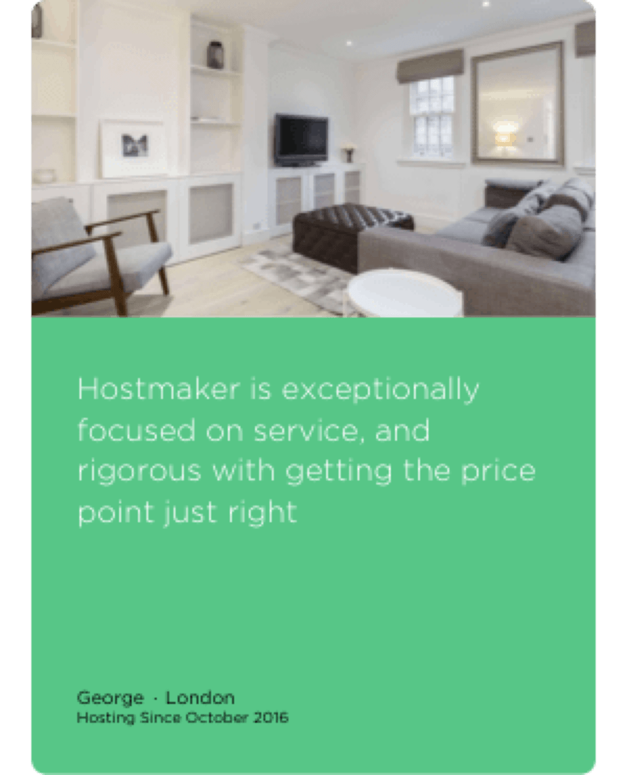
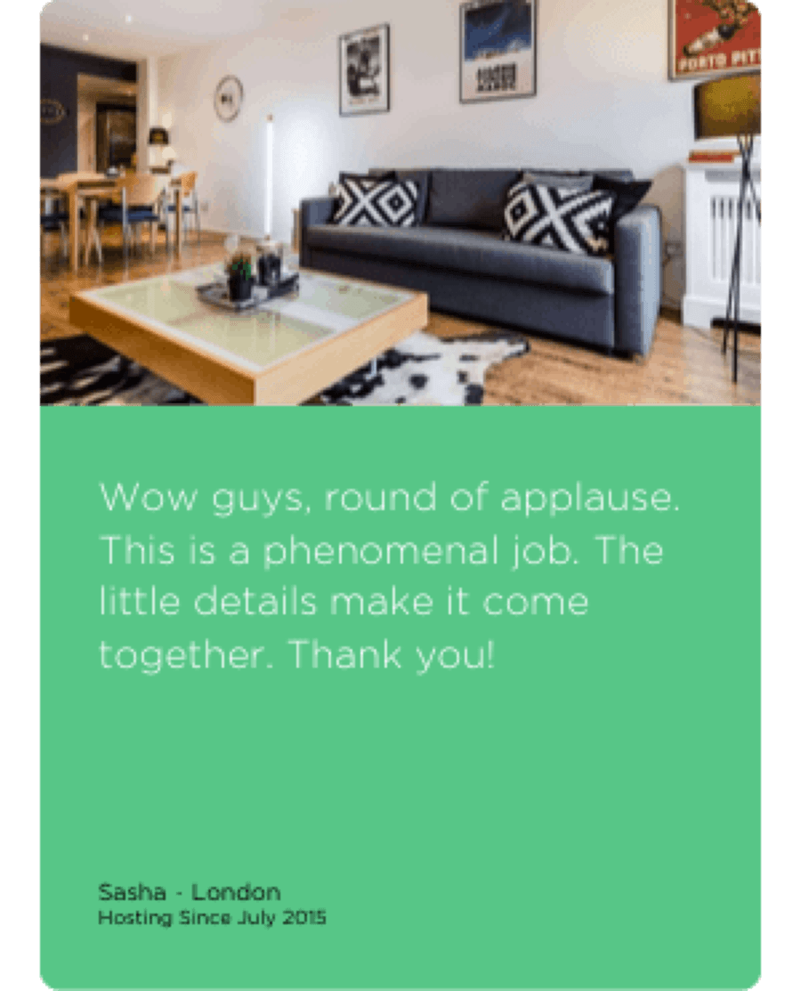
Card Approach
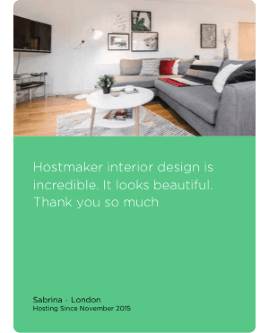
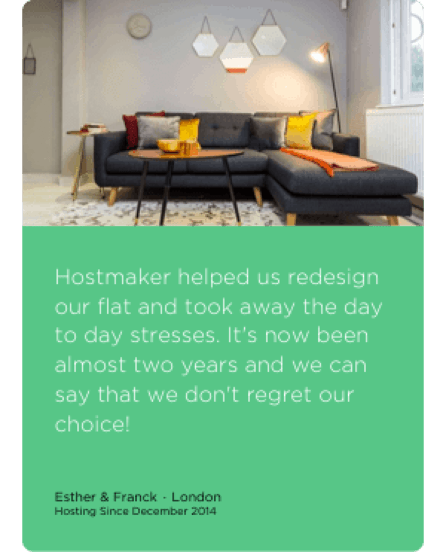
We created a visual language based on cards, that made uniform different types of content across all pages of the site. This has also been extended to all other digital products by Hostmaker.
