Hostmaker
UX/UI for Dashboard
Hostmaker is an Airbnb Management service, operating in multiple cities across Europe. We’ve worked with them since their inception – creating the identity (the loveable Sir P.John), developing and evolving the visual language of the brand, building their website and UI/UX for their proprietary tools.
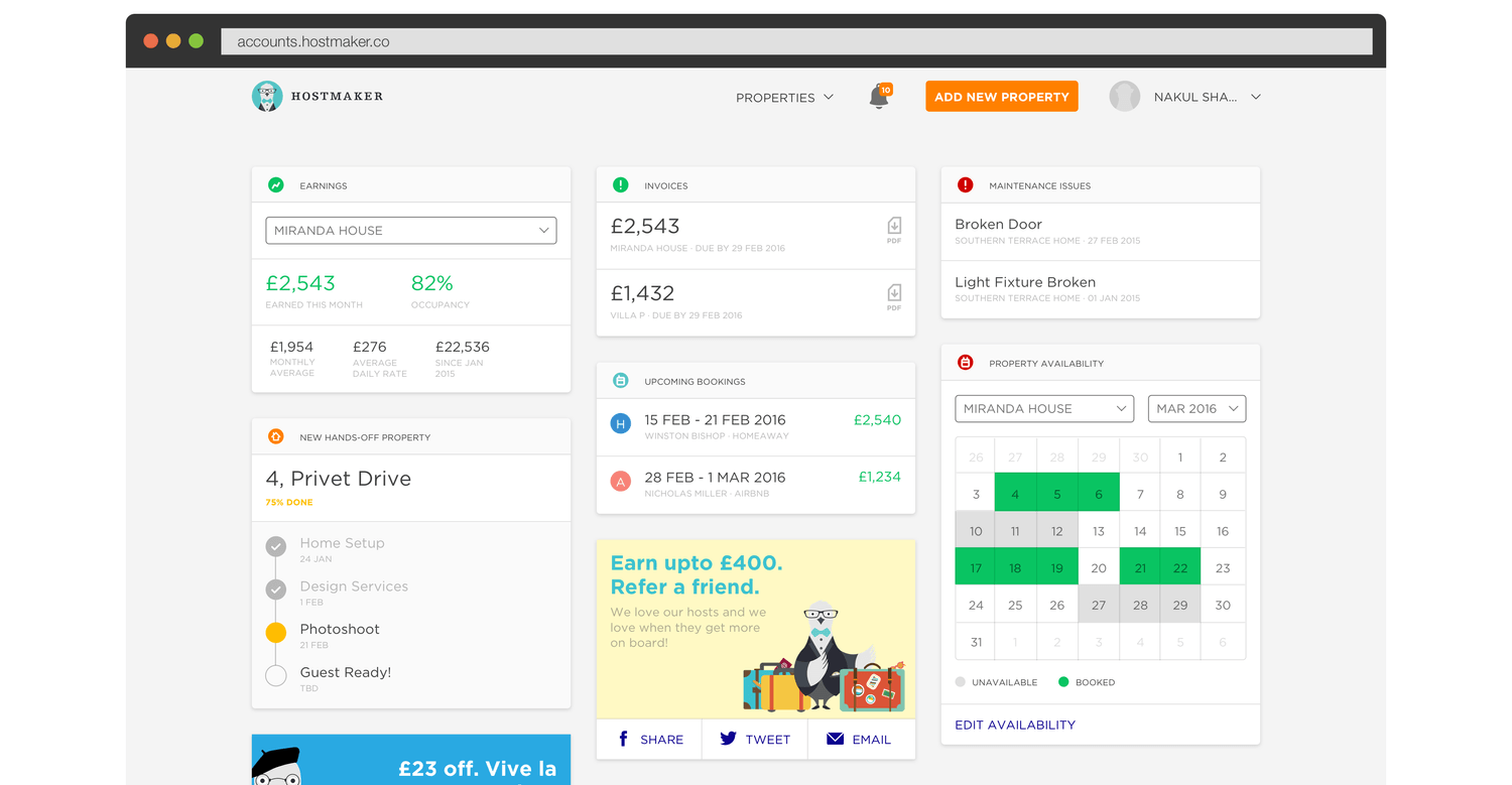
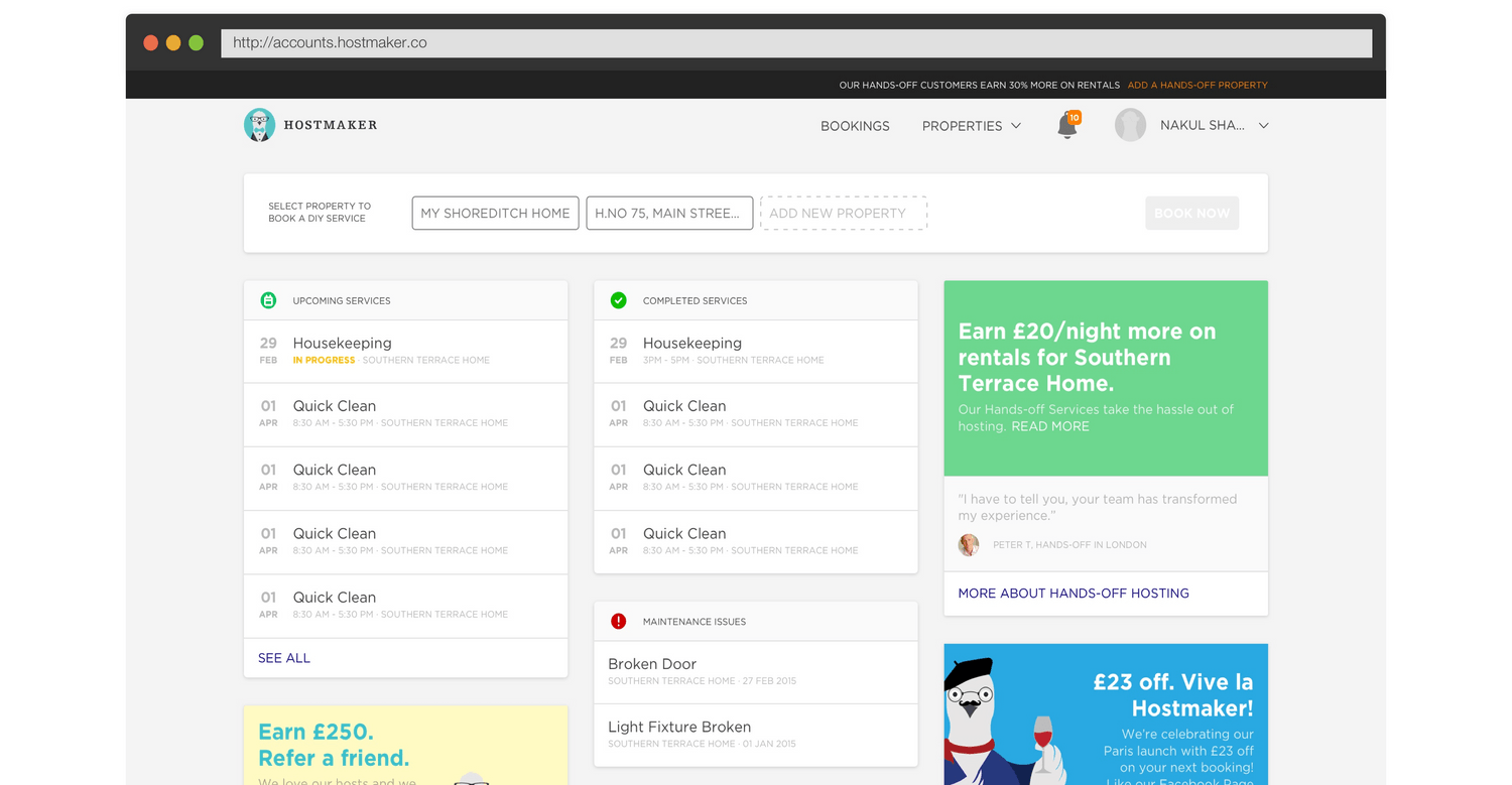
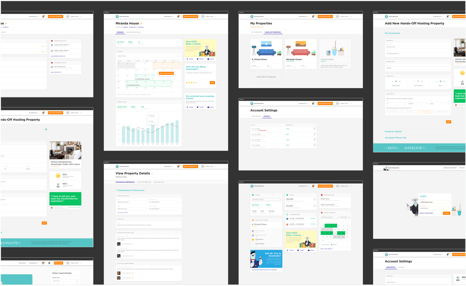
We worked with Hostmaker to create their first consumer product – a dashboard for their hosts to list properties, manage them, mark availability and keep updated about the status and earnings of the property on Airbnb, maintenance issues etc…
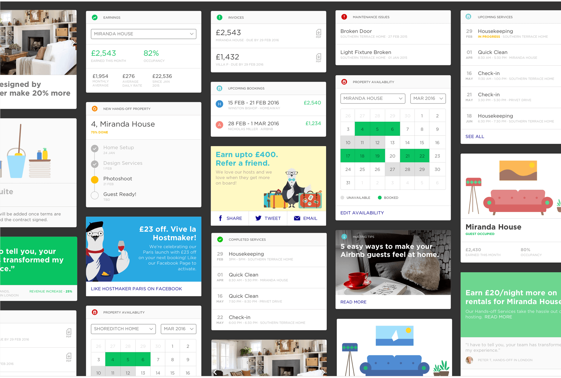
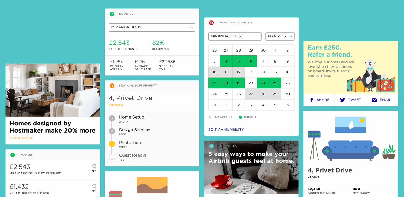
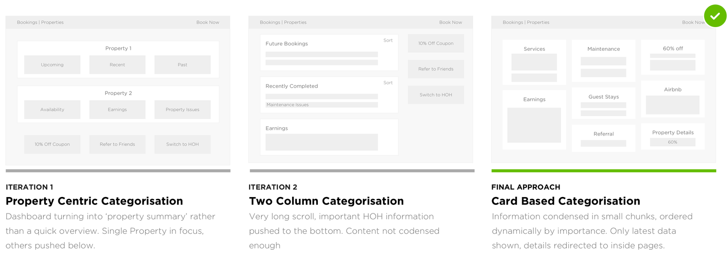
The process started with User Interviews to create a framework for the dashboard and the key outcomes. This facilitated UX explorations that took into account the user’s data priorities. We chose a card-based UX system – it is modular and flexible, which allows for the dashboard to grow in terms of data points and functionality, without requiring any structural changes.
Our role also involved User Testing of the UX, the Visual Interface Design, Front-end Development and a handover for integration with Ember.js
The dashboard is fully-responsive and easy to access across all devices. And it sets the foundation for all user-facing products for Hostmaker.
System Architecture
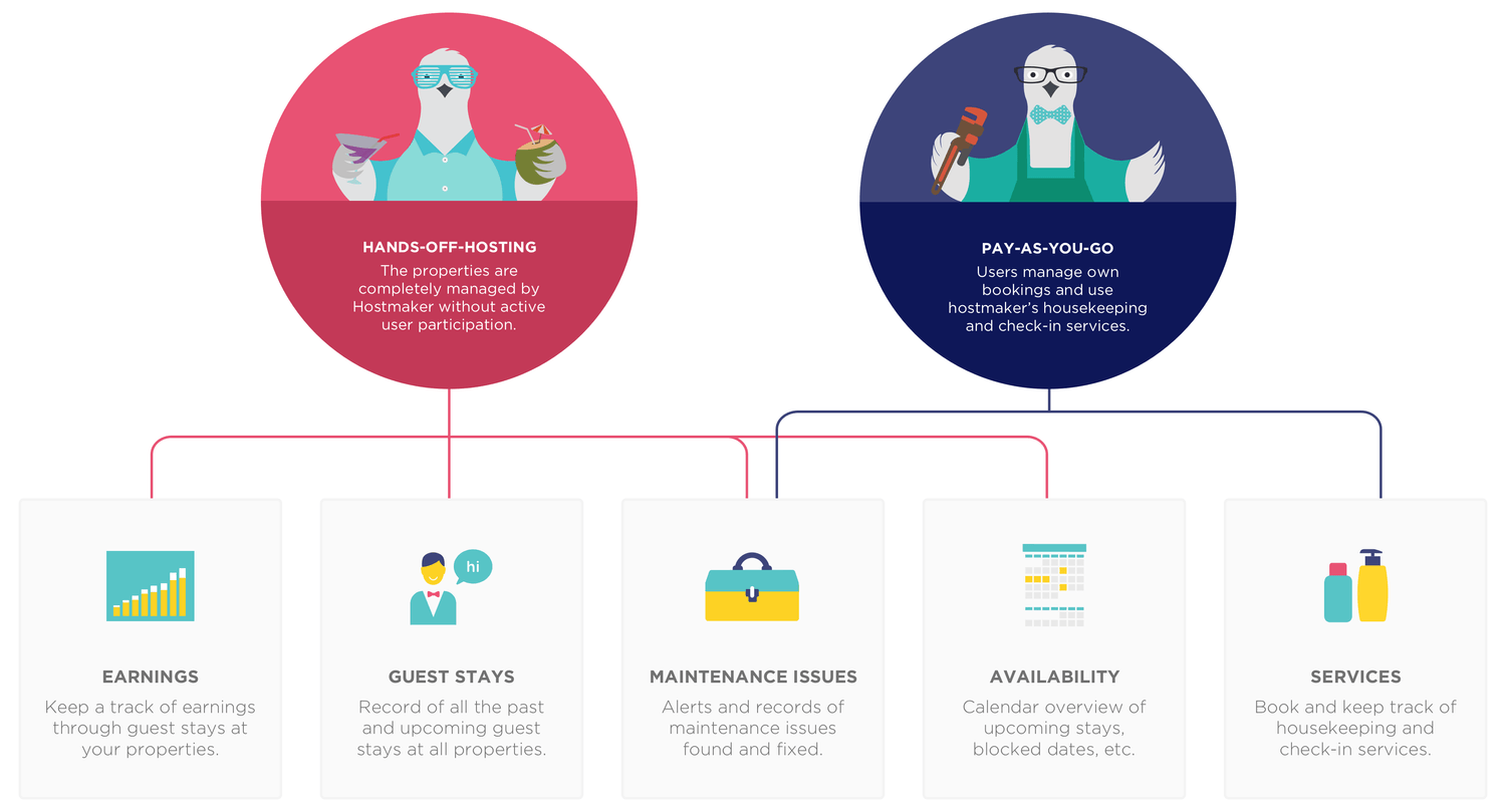
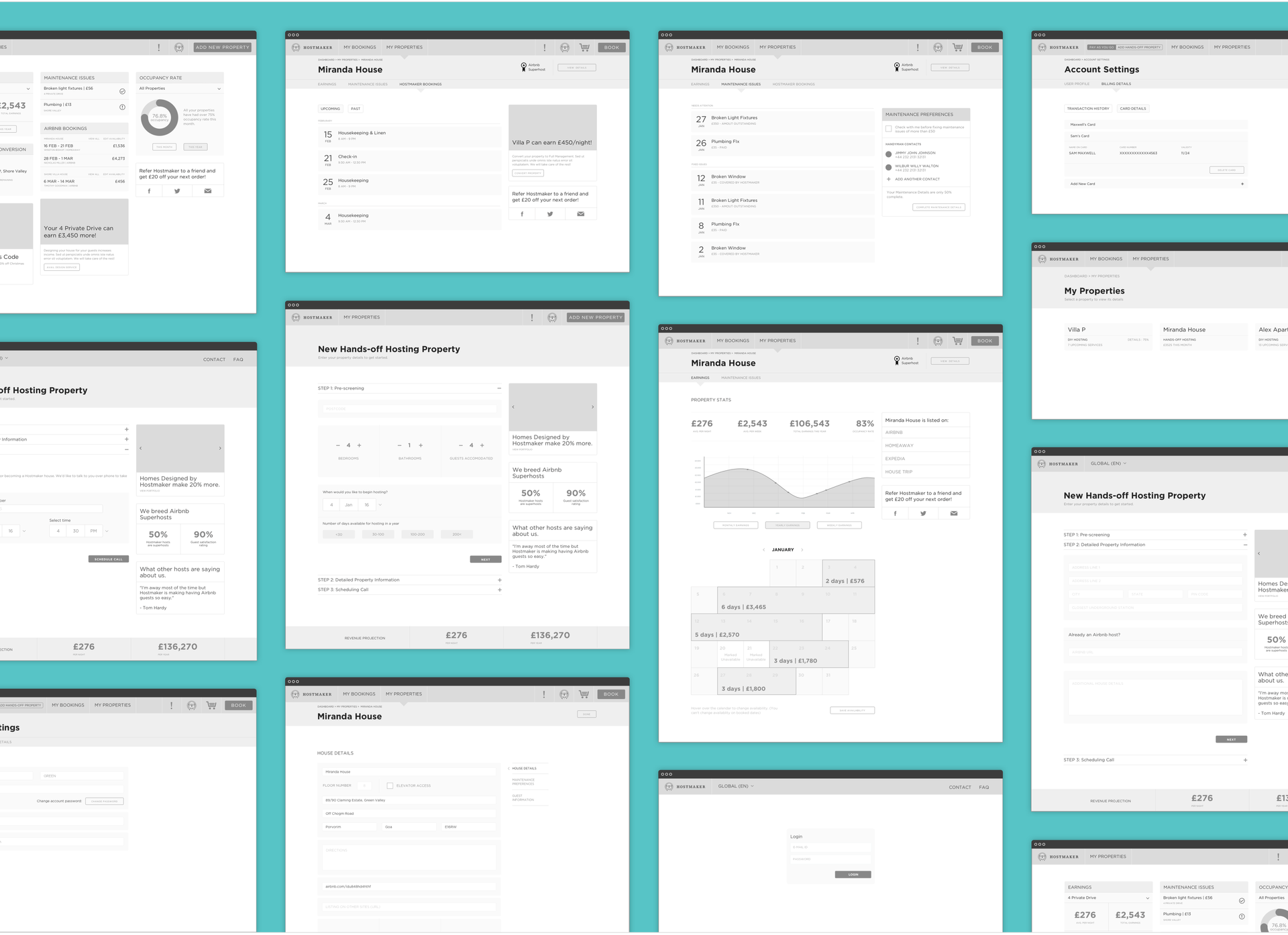
Determining the features necessary for each type of user (Hands-off Host and Pay-as-you-go Host), and creating the sitemap for each of them.
UX Design
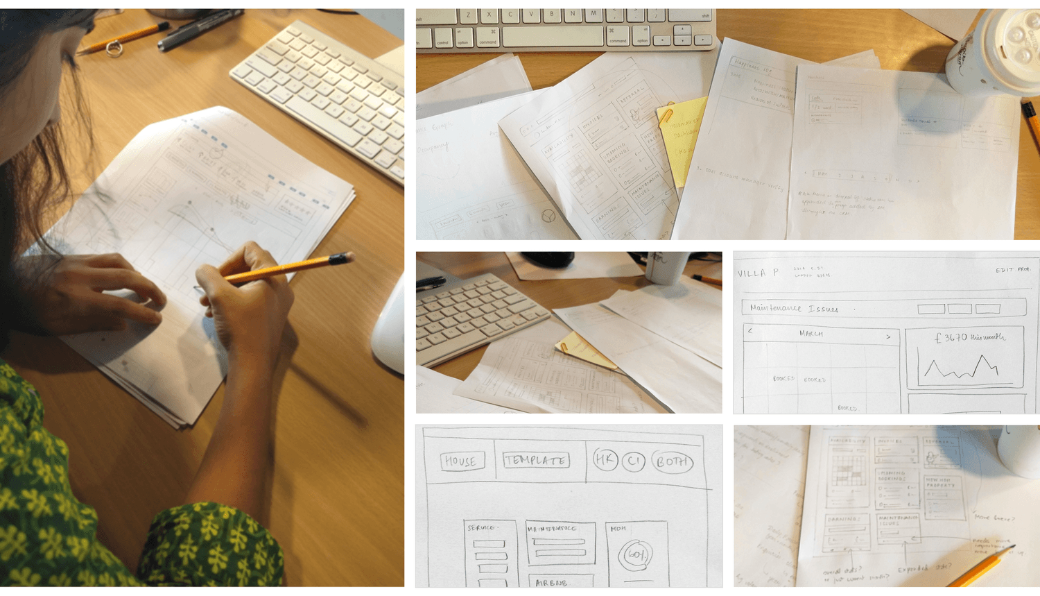
Structuring the dashboard to bubble up relevant information and provide easy access to all information. After trying different approaches, we arrived at a card-based approach, that is flexible and improves accessibility.
UI Design
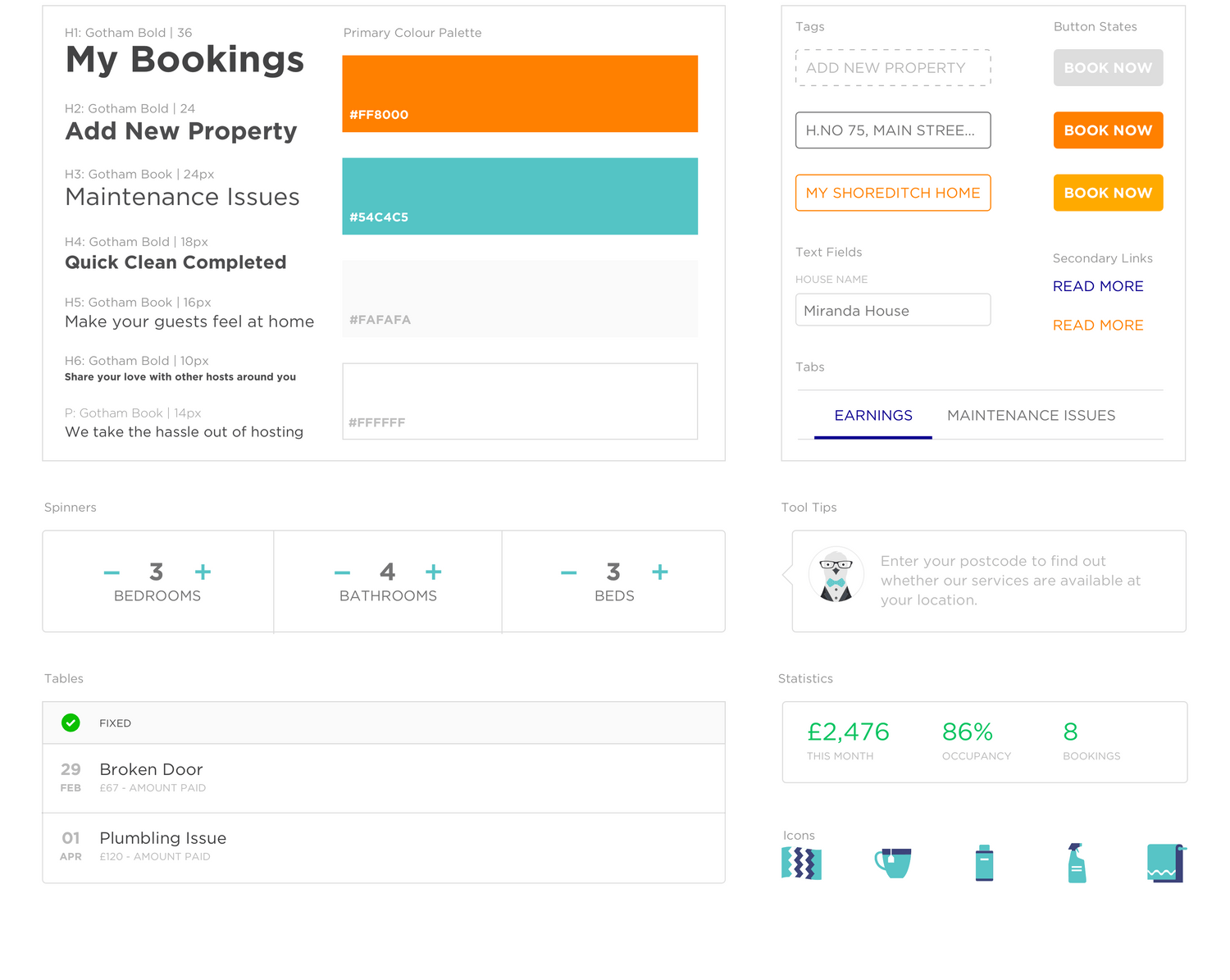
Extending Hostmaker’s Visual Language to a UI Style Guide for Functional Interfaces. The key consideration was to create UI that felt familiar and natural, so there would be almost no learning curve for the user.
