Happy Ratio
Website Design For Food Tech

Happy Ratio is a new kind of food – nutritionally balanced, easy to make and tasty.
Most of the food we consume today doesn’t have the right ratio of macro and micro nutrients that the body needs. So we end up with more of some nutrients and deficient in others. And making even a reasonably healthy and palatable meal requires significant effort in buying fresh ingredients and preparing the meal – something that doesn’t sit very well with the busy lifestyles of today.
Happy Ratio has the perfect balance of nutrients the body needs everyday and is as simple as blending the product with 300 ml water for 30 seconds!
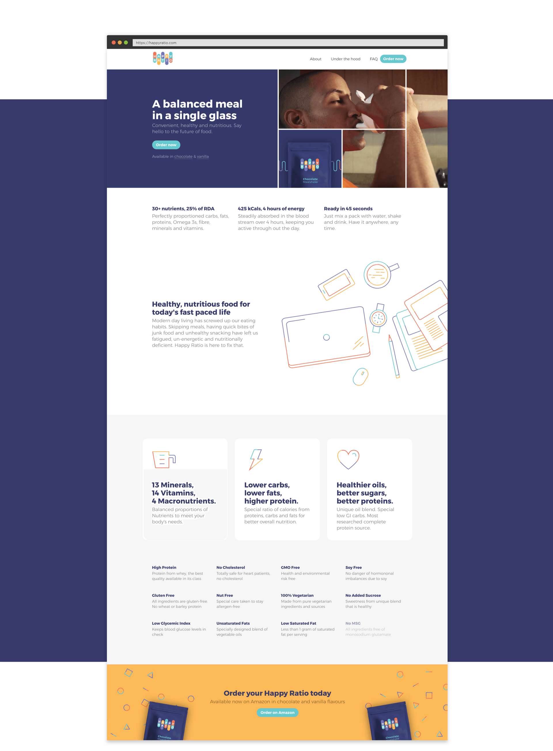
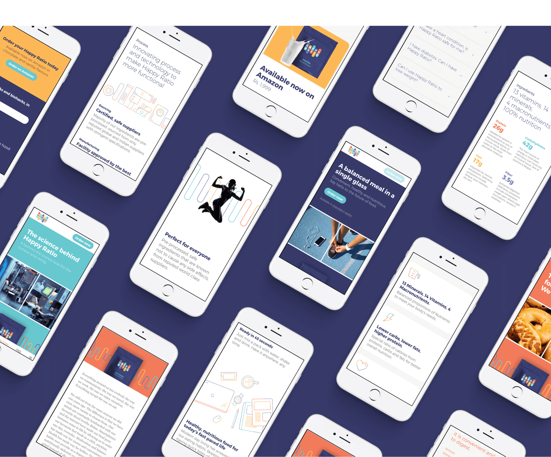
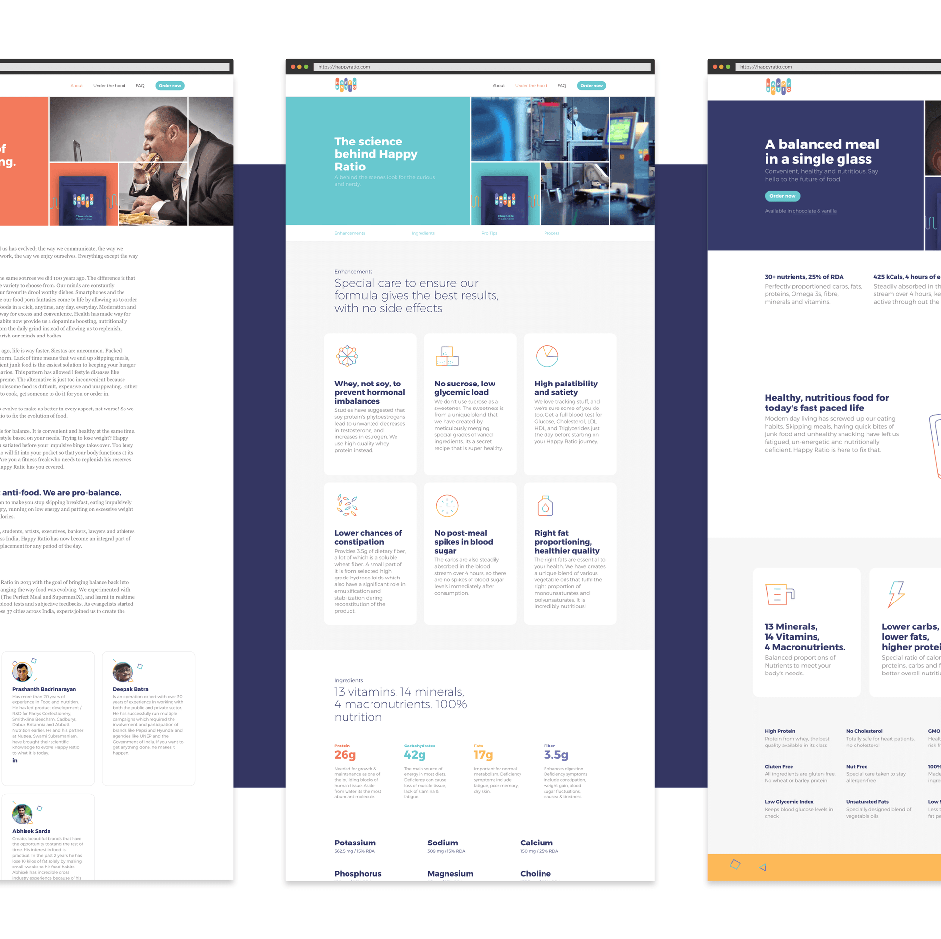
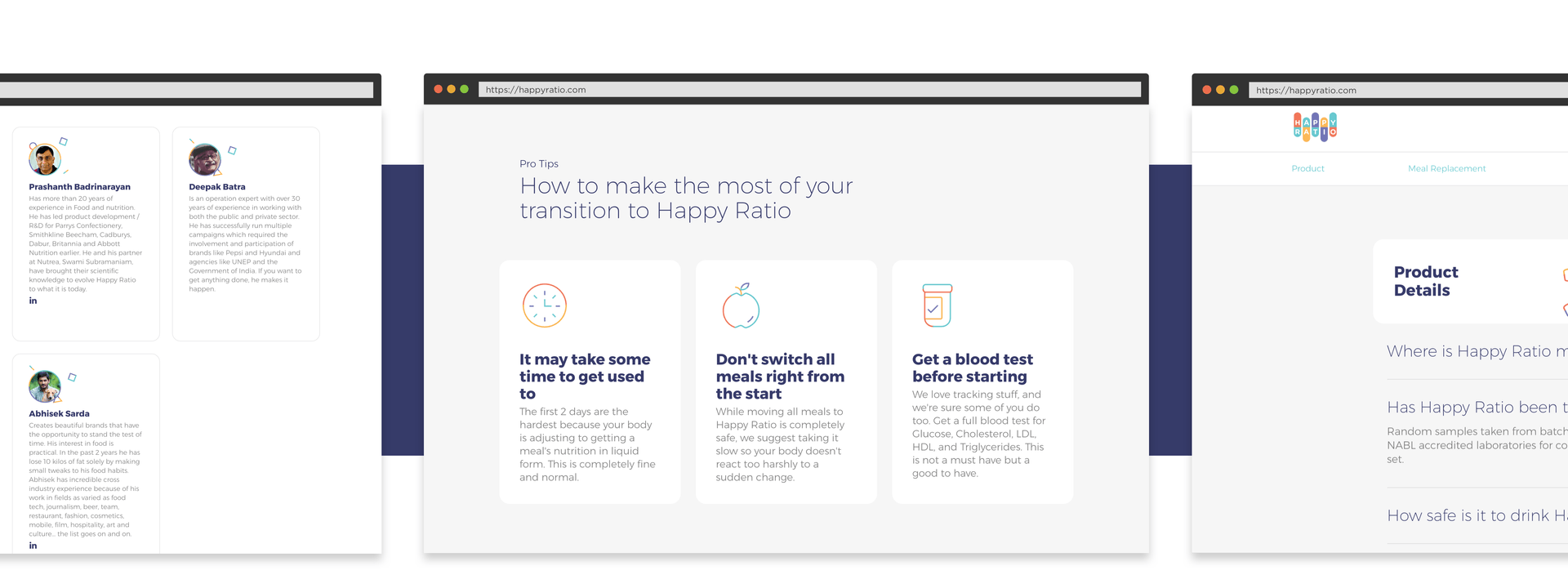
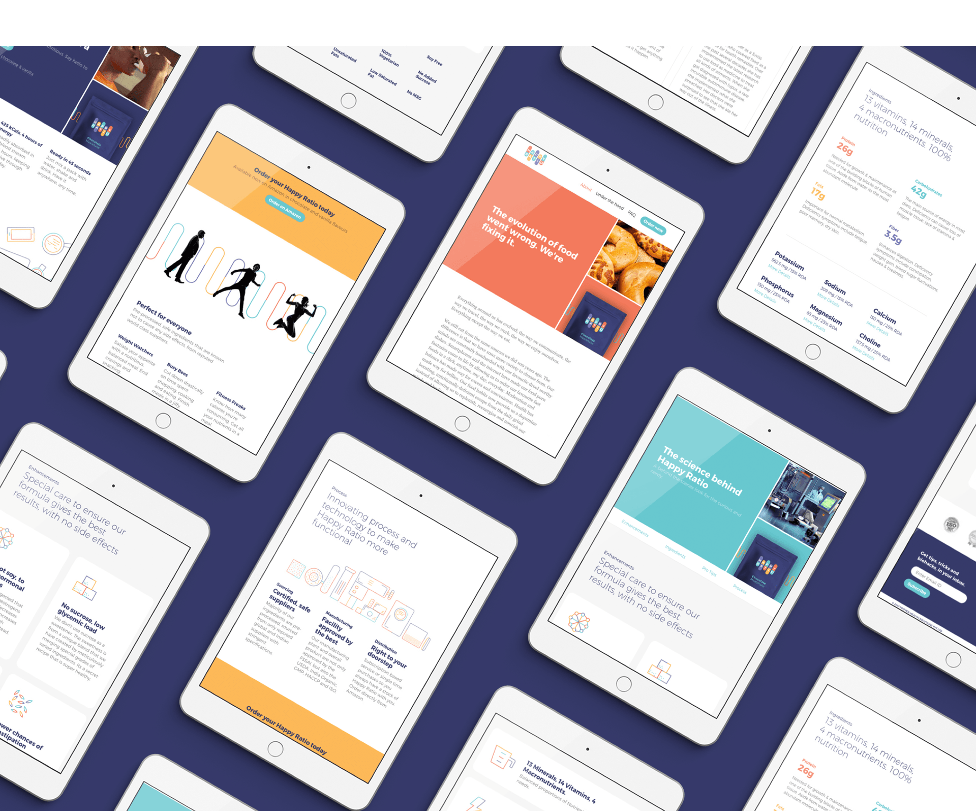
We worked with the founding team to create the Brand Strategy and Positioning, the Brand Name, Identity and Visual Language, and the packaging for the product. We then extended this to a content dense website that beautifully explains the product, the creation story and is rich in detail for the Food Geeks and Body Hackers who want to look “Under the Hood”
