Haiku
Branding for Restaurant

Haiku is an Asian fine-dining restaurant that serves authentic cuisine from Japan, Korea, Vietnam, China, Thailand and other East Asian countries.
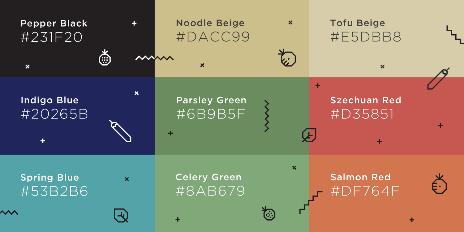
Our engagement with Haiku started with the Brand Positioning and Brand Name. We studied the Asian Fine Dining market in India and identified common trends in how restaurant brands are developed – typically they are focused on China and heavily borrow from Chinese iconography to create a sense of authenticity – right from unchecked use of red to using laughing buddhas, pagodas and mandarin script. We decided to position Haiku as a truly Asian fine dining restaurant, without any Chinese influences.
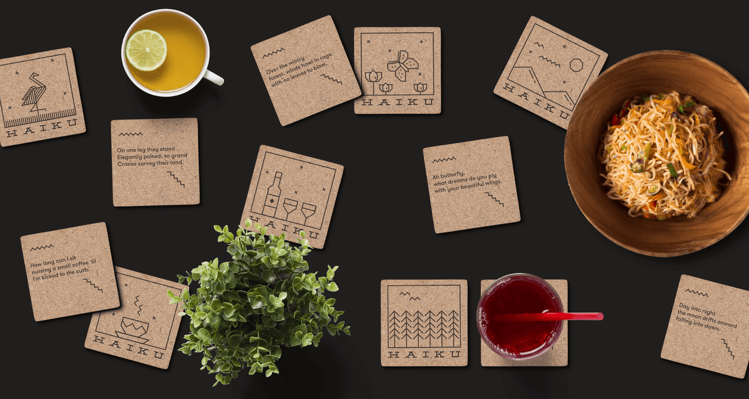
“Haiku” is a form of Japanese short poetry. It is highly structured and its construction is based on the principle of 5-7-5 syllables across 3 lines. Unlike other forms of poetry, Haikus are usually very visual in nature, typically describing a scene or observations of nature. We used this as a starting point and created an identity that uses a blank canvas to visually illustrate a Haiku about a crane.
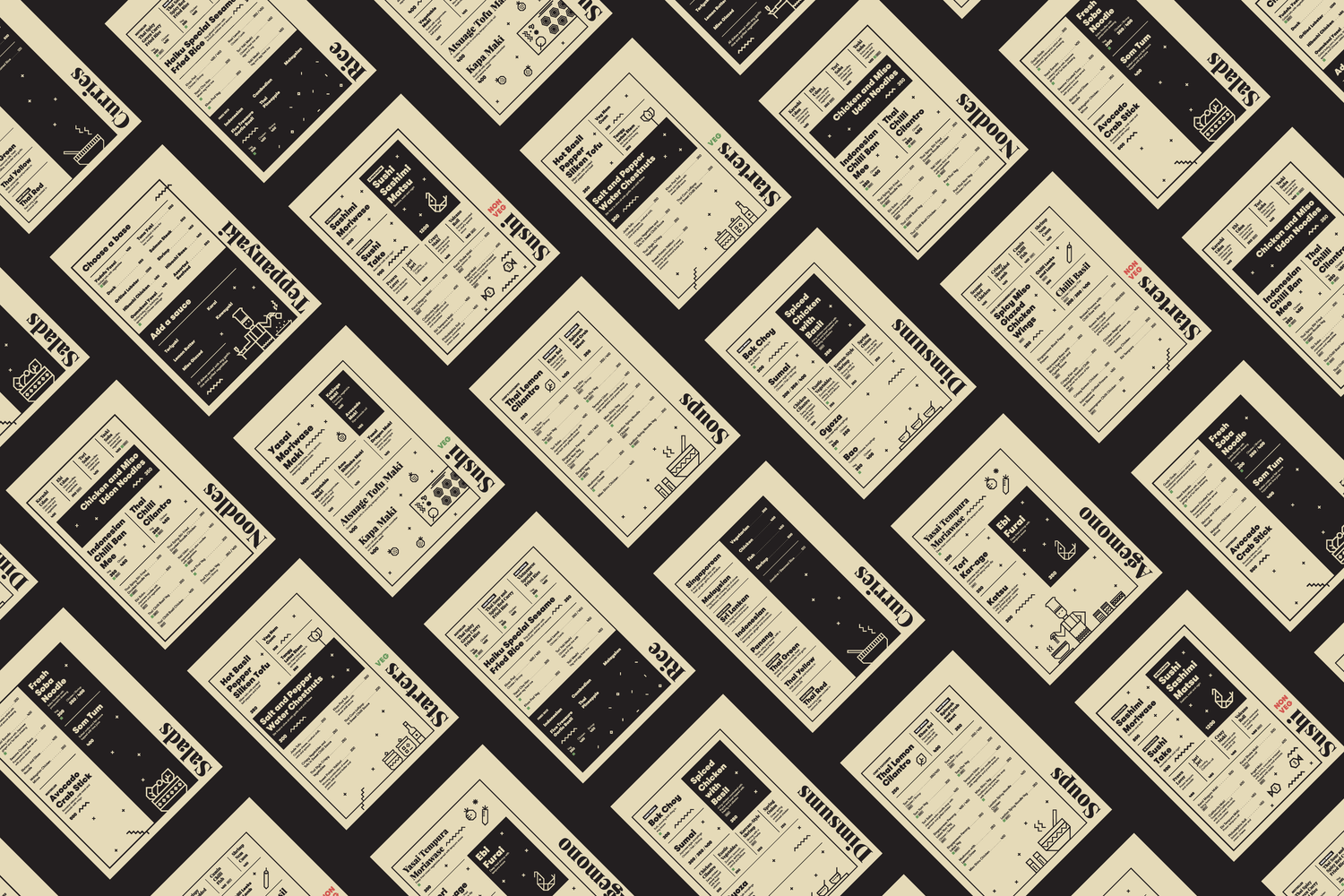
The entire identity and visual language have been crafted to be extremely flexible and dynamic. The visualization inside the canvas changes to illustrate different haikus and the proportions of the logo fit any available space. This is used beautifully across applications of the brand’s visual language.
P.S: Everything is created with 45 and 90 degree angles – no curves or angles. This is our homage to the precision and craft of the disciplined souls who construct Haikus.


