Frolick
Branding & Packaging / Food-tech
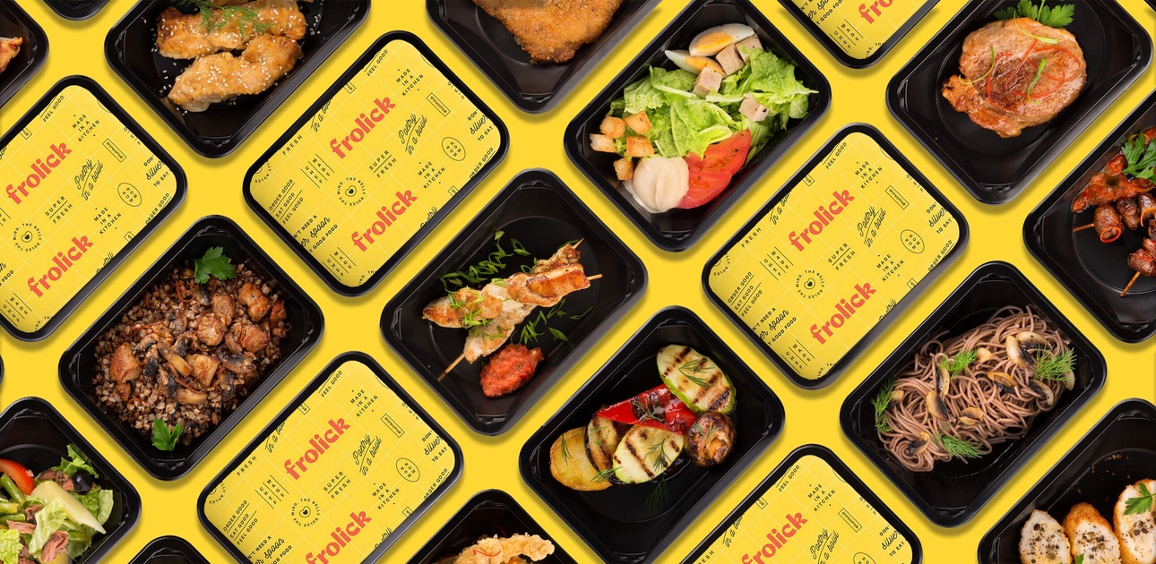
Food delivery has become commoditised over the years in the pursuit of scale and efficiency. Frolick, a US-based meal service is changing that with chef-prepared dishes, made with high-quality, healthy ingredients. They run their own kitchens and deliver freshly prepared meals from a curated daily menu. No assembly lines. No crappy ingredients. No fast food. And definitely no "dashing".
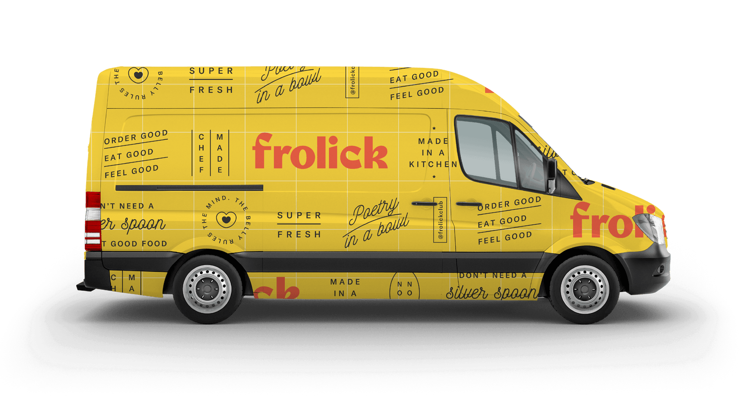
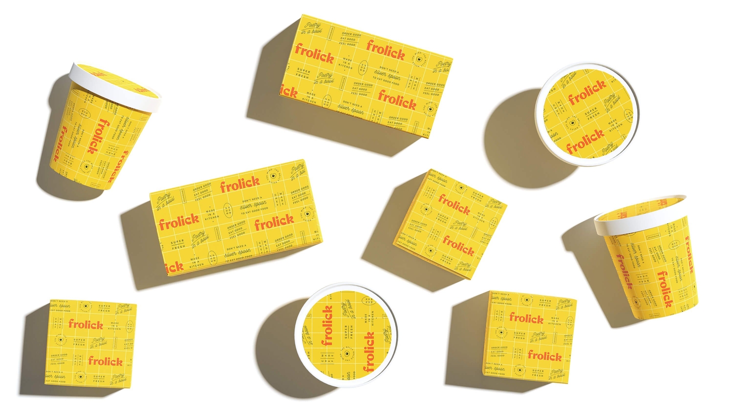
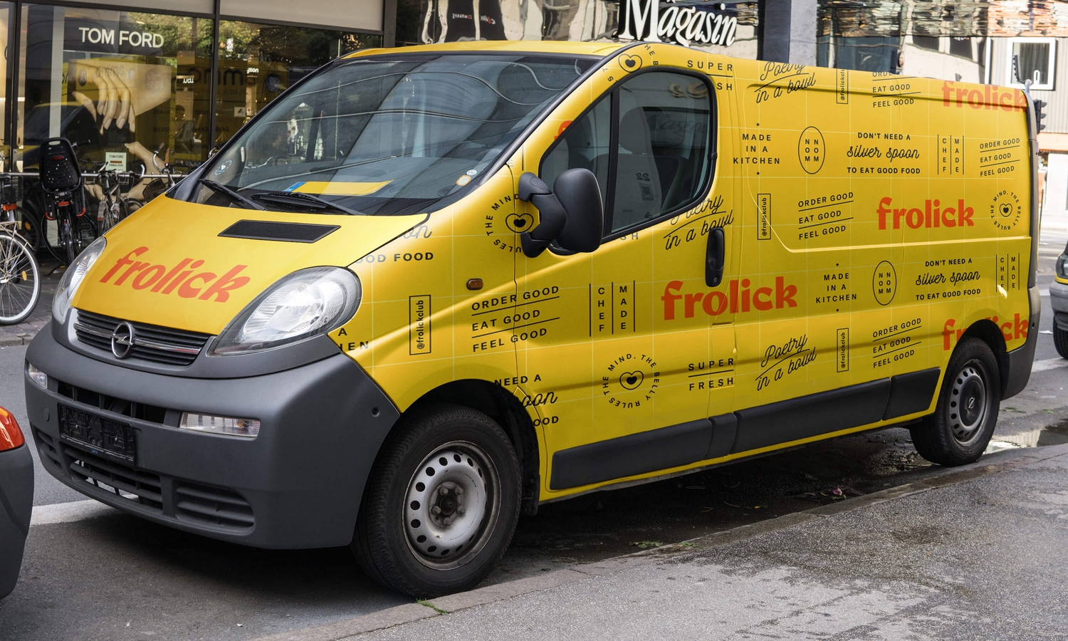
Opposite worked with the founding team to develop the Brand Name, Logotype, Visual Language and Packaging.
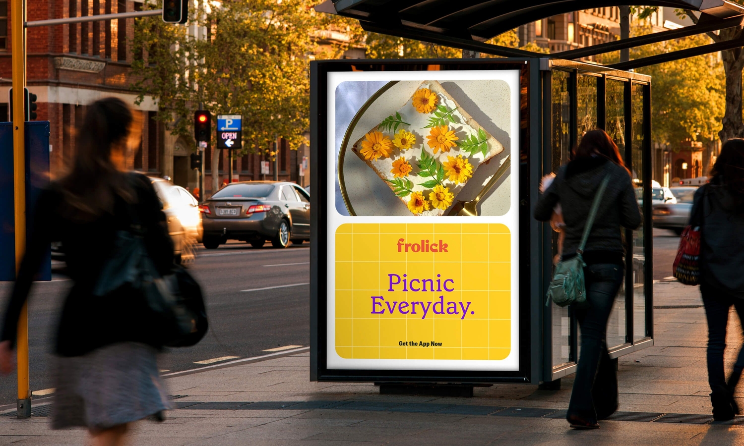
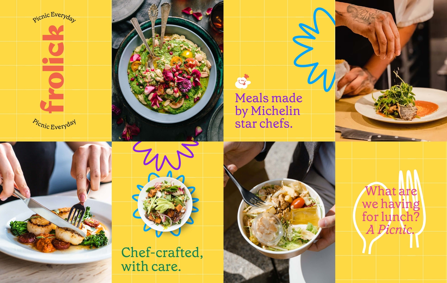
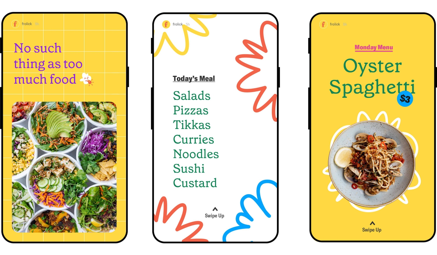
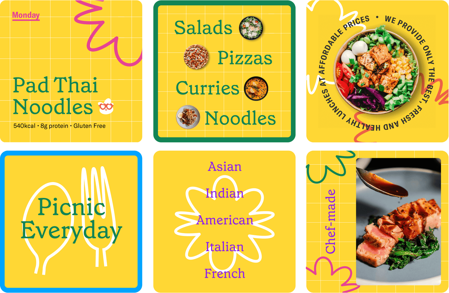
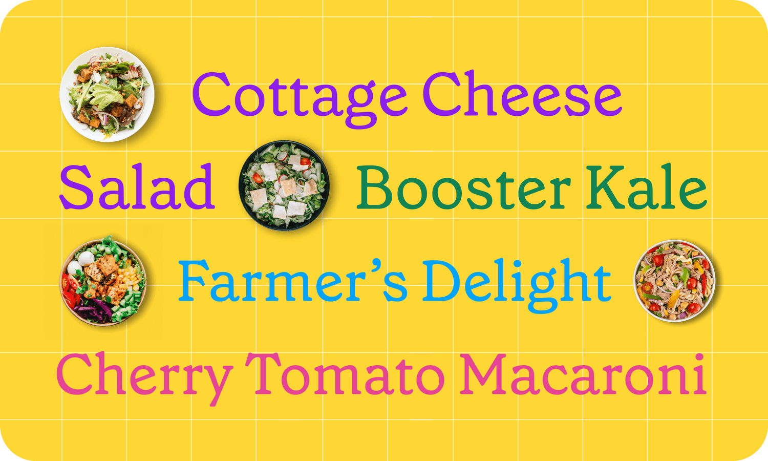
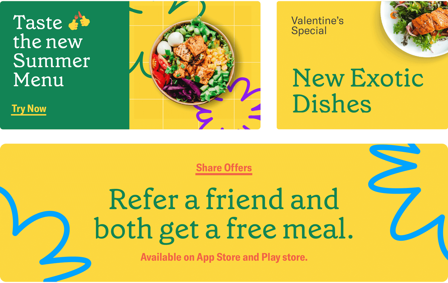
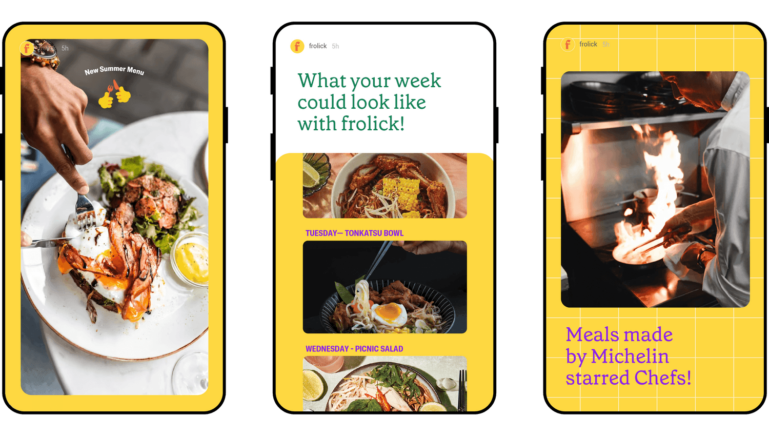
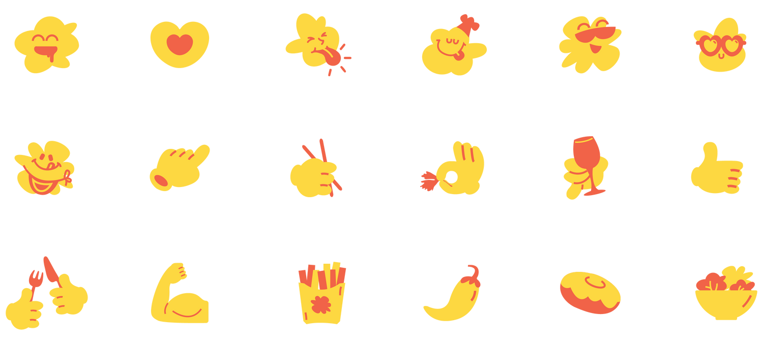
Our approach was to reverse the commoditisation of meal delivery. Make every meal a celebration - indulgent, extravagant, fun. A picnic! This strategy is reflected in the name, the sunny and vibrant color palette, the eclectic and cheerful visual system and the warm typography.
