Flatheads
Brand Identity / Sneakers
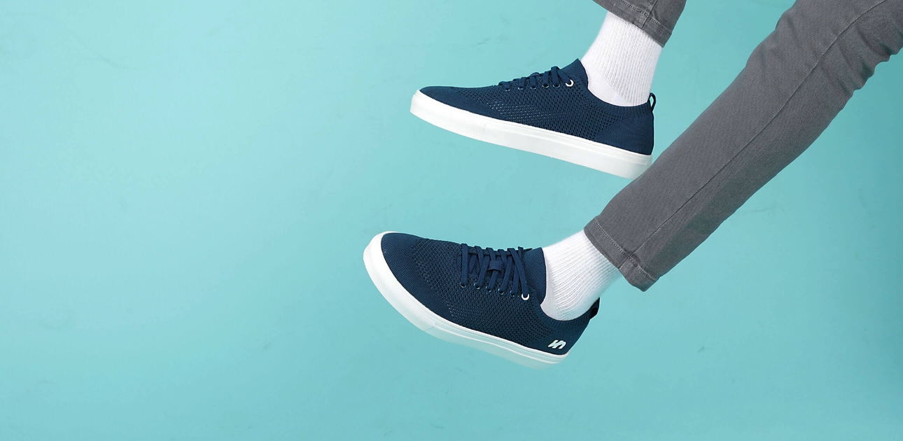
Flatheads is a brand of casual, all-day shoes made out of sustainable materials and sold Direct to Consumers (D2C). They launched in 2019 to address the growing shift away from large-brand, sporty shoes to micro-brand shoes with a focus on materials, all-day comfort and sustainability.
After a year of validating the product, they approach us in 2020 with a simple ask – make the Flatheads brand worthy of the shoes. And that’s what we did!
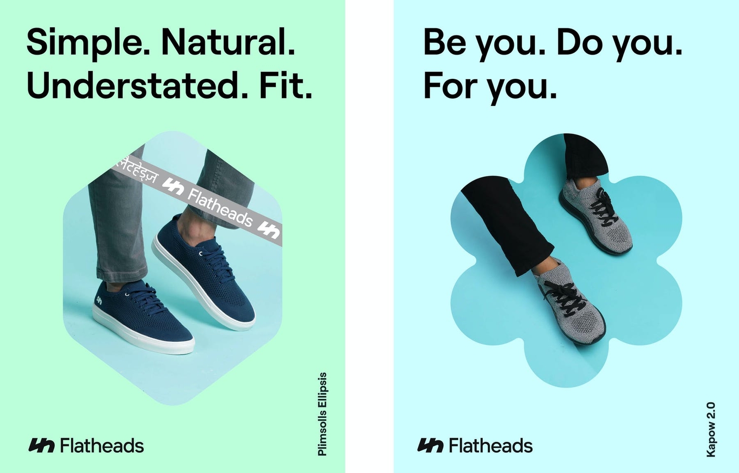
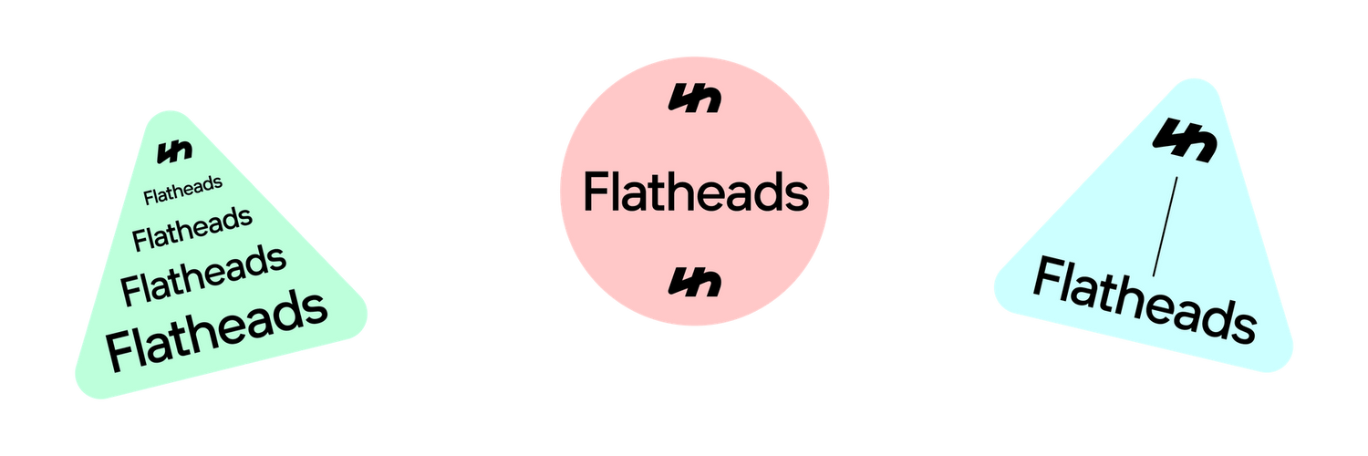
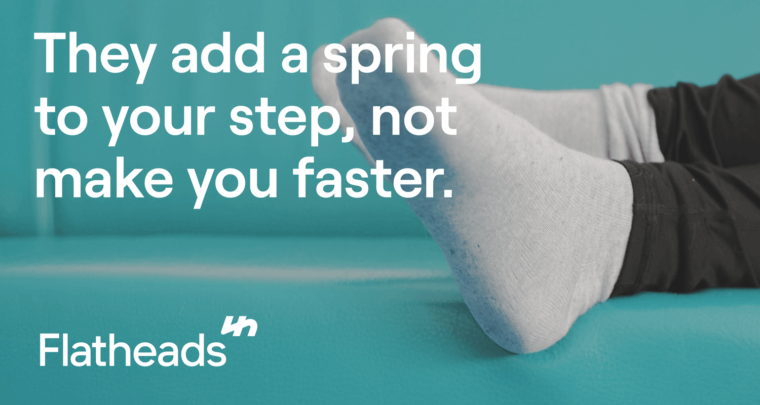
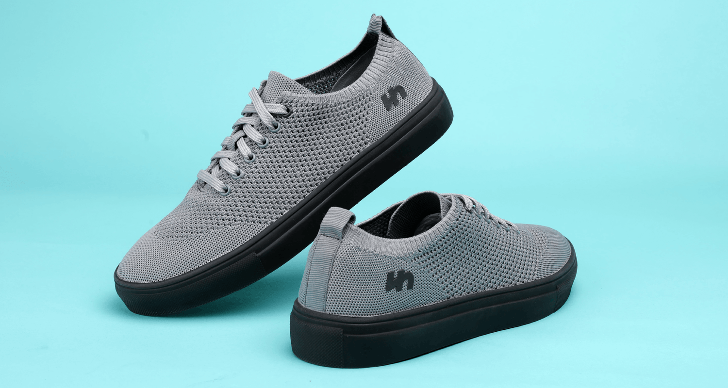
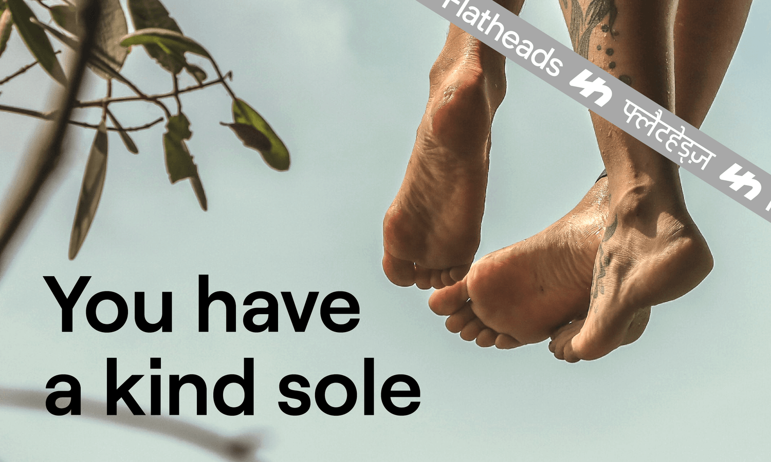
We worked with Flatheads over a 3-month engagement to define the brand’s positioning and tone of voice, create the iconic “fuh” logo and create a distinct and flexible visual system for the brand. The “fuh” symbol is the Devnagri alphabet for “F” and its construction cues the Flathead Arrows. The two key considerations for the design of the symbol were “wearability” (does this work on the shoe?) and “extendibility” (can the symbol be used in various ways that it becomes a part of the shoe’s aesthetic?).
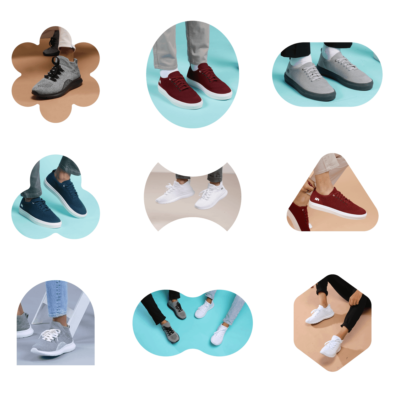
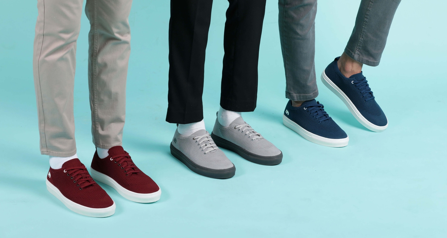
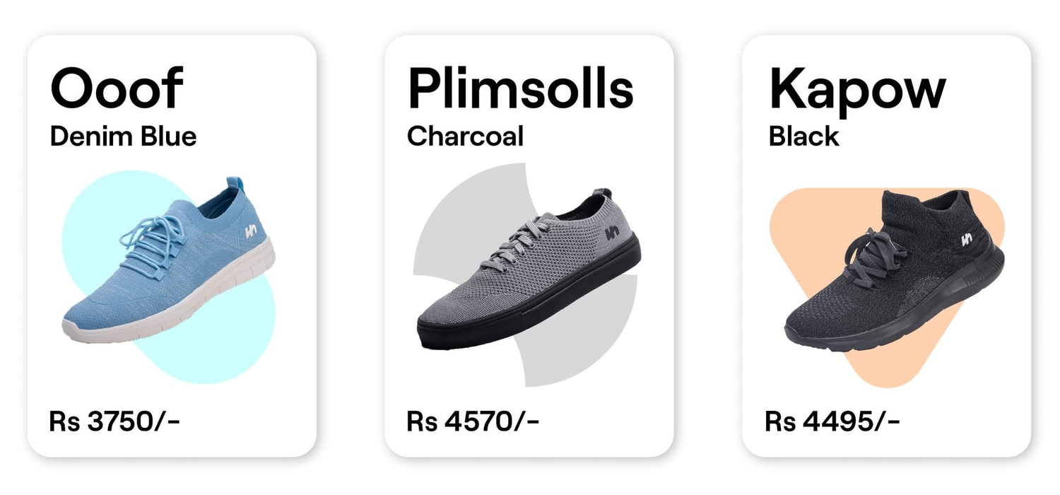
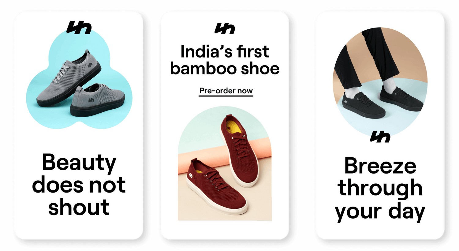
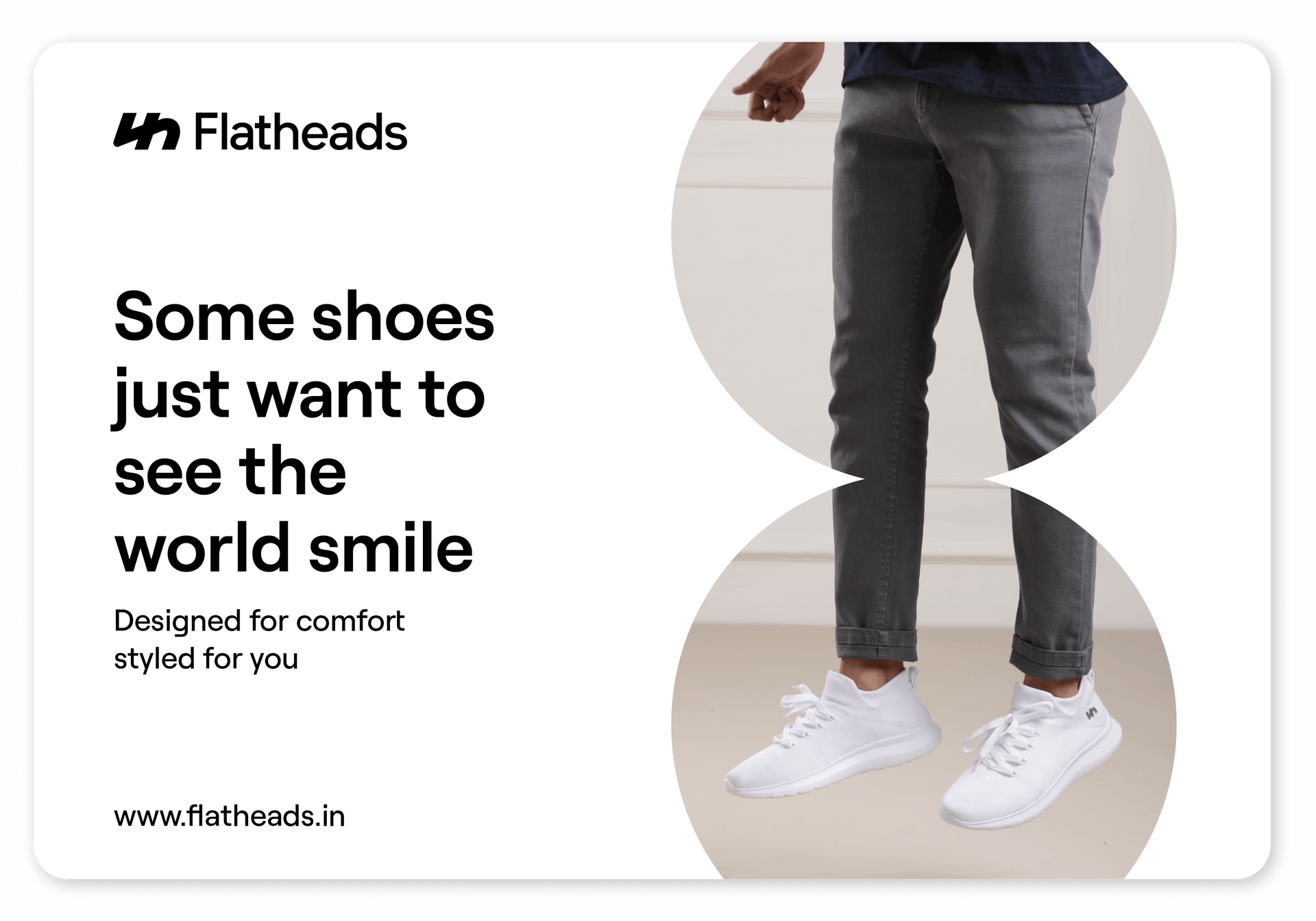
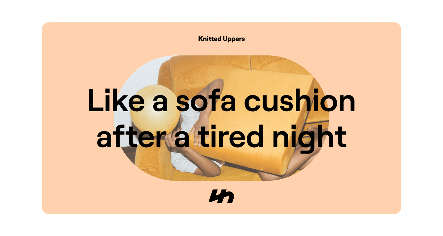
The visual language of the brand uses geometric shapes as windows – keeping the focus on the product while creating distinctiveness, without being distracting. The soft color palette was chosen to let the color of shoes shine in the brand’s communication.
