Cowrks
Brand Identity for Co-working Space
Cowrks is one of the largest coworking space brands in India and over the next 12 months, is set to open more than 15 centers across 6 cities. The flagship Cowrks center in Bangalore is more than 150,000 sqft, the largest in India and fifth largest in the world.
Their coworking spaces are typically beautifully designed large-format spaces ranging from 50,000 to 100,000 sqft, housed in campuses that give members access to health clubs, swimming pools, tennis courts, amphitheatres, jogging tracks etc.
We worked with Cowrks over a 6 week engagement to redefine the brand and develop a bold, edgy visual language that would help it compete in and win the increasingly crowded industry, especially with the arrival of the global brands in the country.
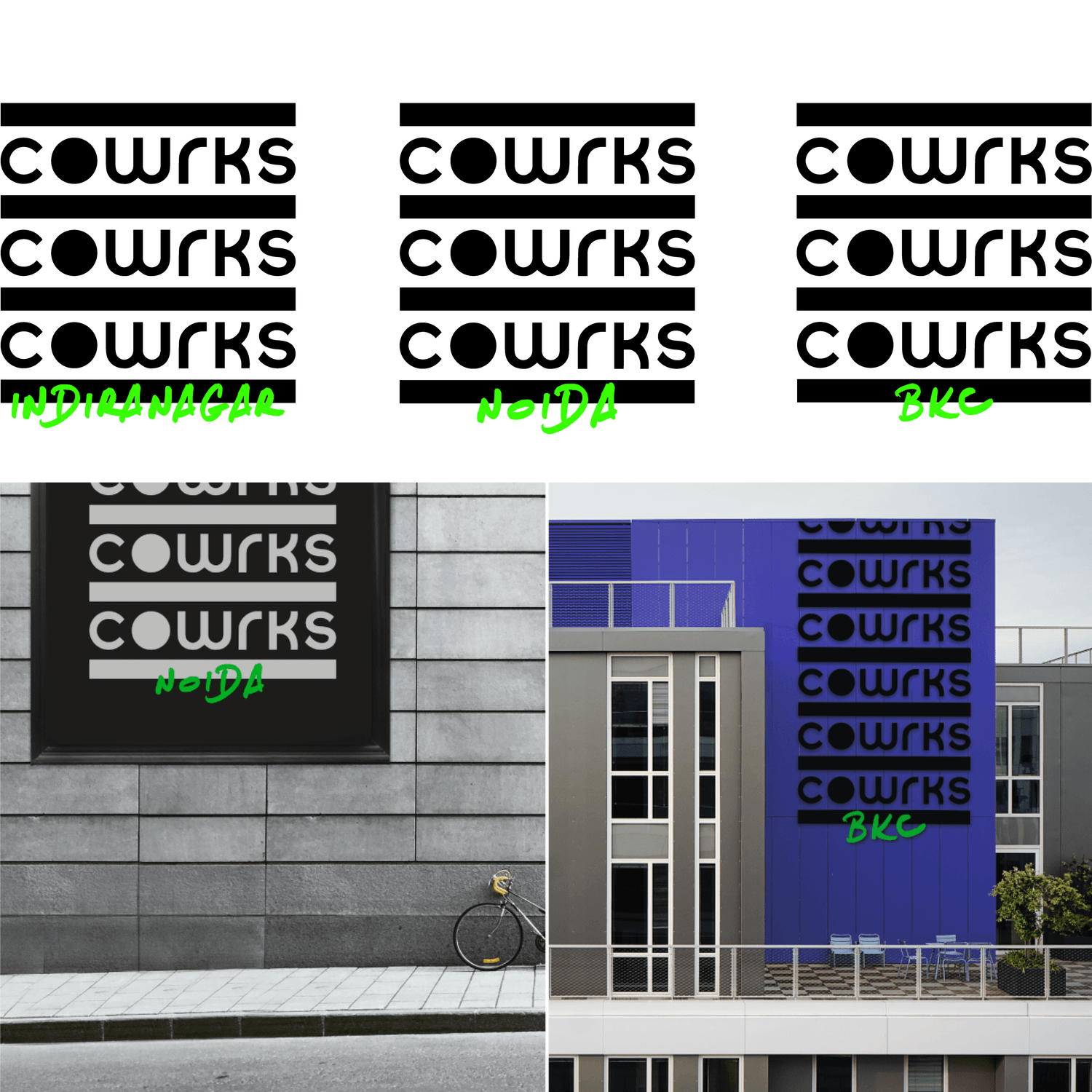
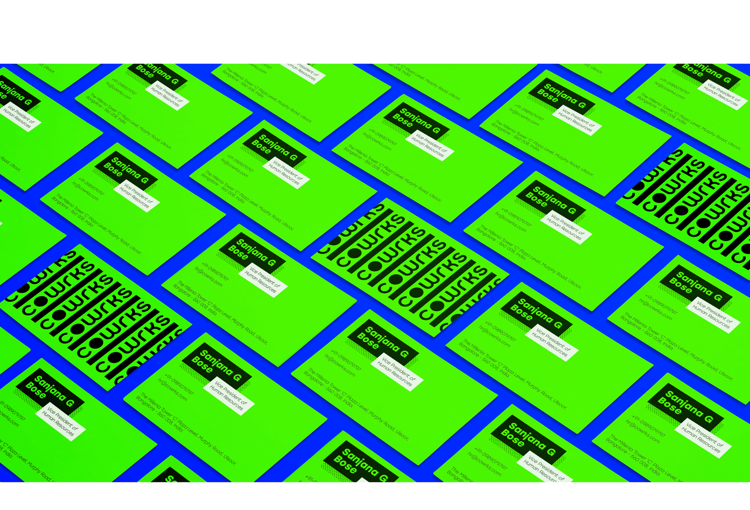
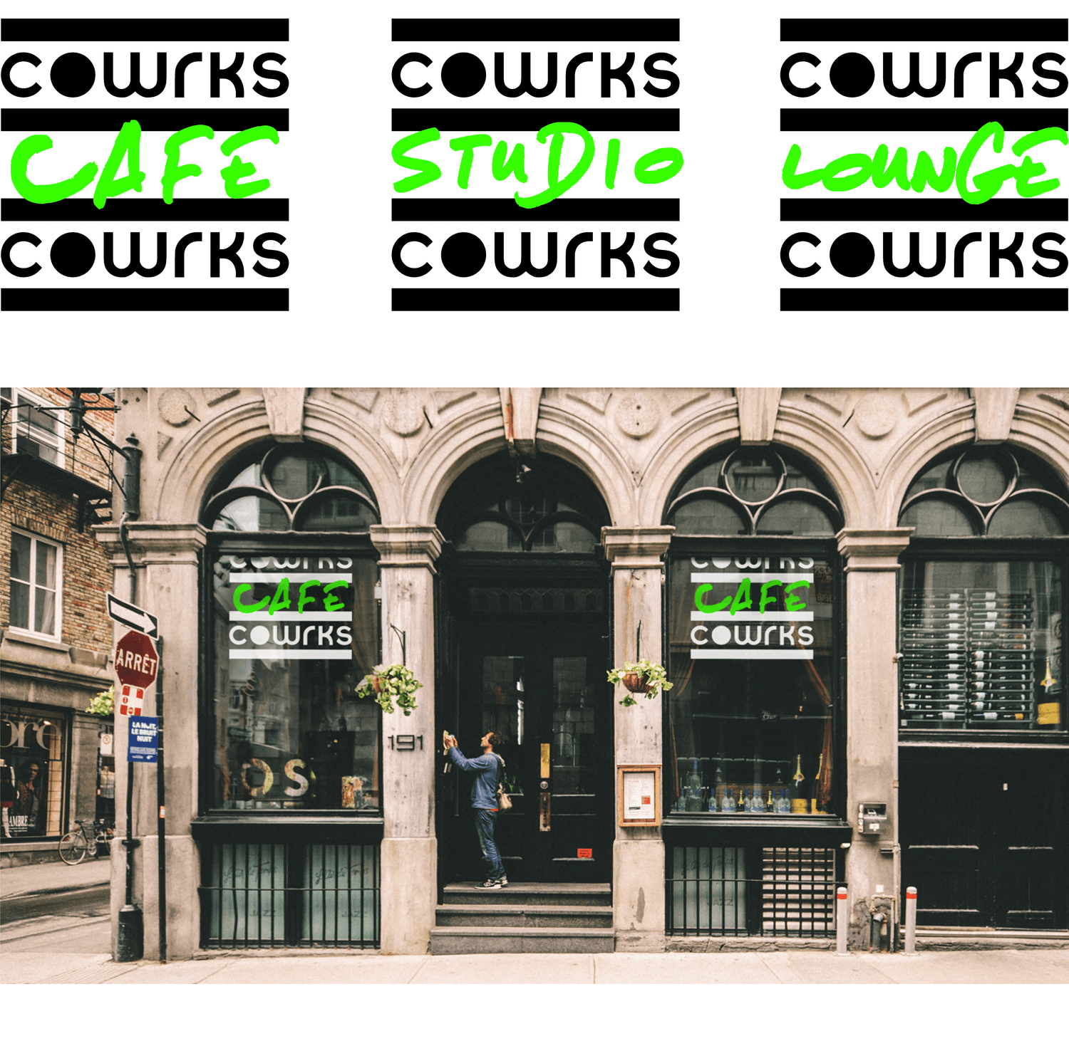
The typemark got a contemporary refresh and became the starting point for a flexible identity system and visual language. Rather than sitting obligingly in a corner like conventional logos, the Cowrks identity pushes the envelope of how a logo can be used. It’s a window, it’s a pattern, it’s a layout grid – the typemark and the pattern derived out of its repetition provide a distinctive, memorable and cohesive framework for the brand applications. The typemark pattern can be used in dozens of different configurations, creating fresh extensions of the brand while reiterating the core aesthetic.
