Convergery
Brand Identity + Motion
Convergery is unlike most brands Opposite works on. It has no customers and no product/service to sell. It is an investment firm, part of the Nilekani Family Office, carved out into a separate entity, as a playground for more experimental investment strategies.
The Convergery team, led by its founder Shray Chandra, collaborated closely with Opposite to create the brand identity, visual language, motion system and a website for the brand.
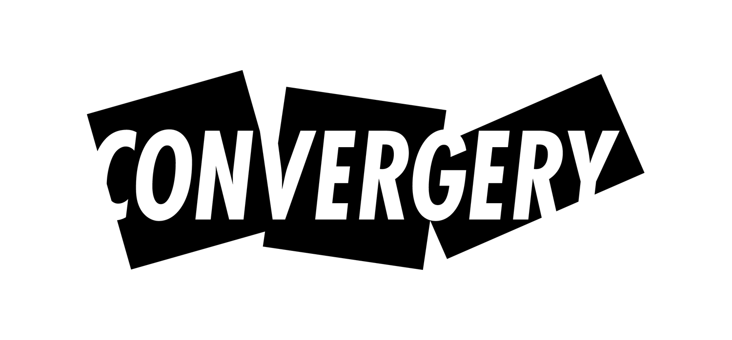
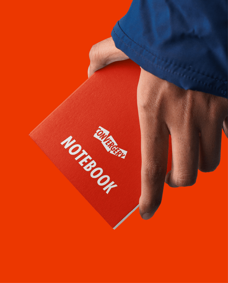
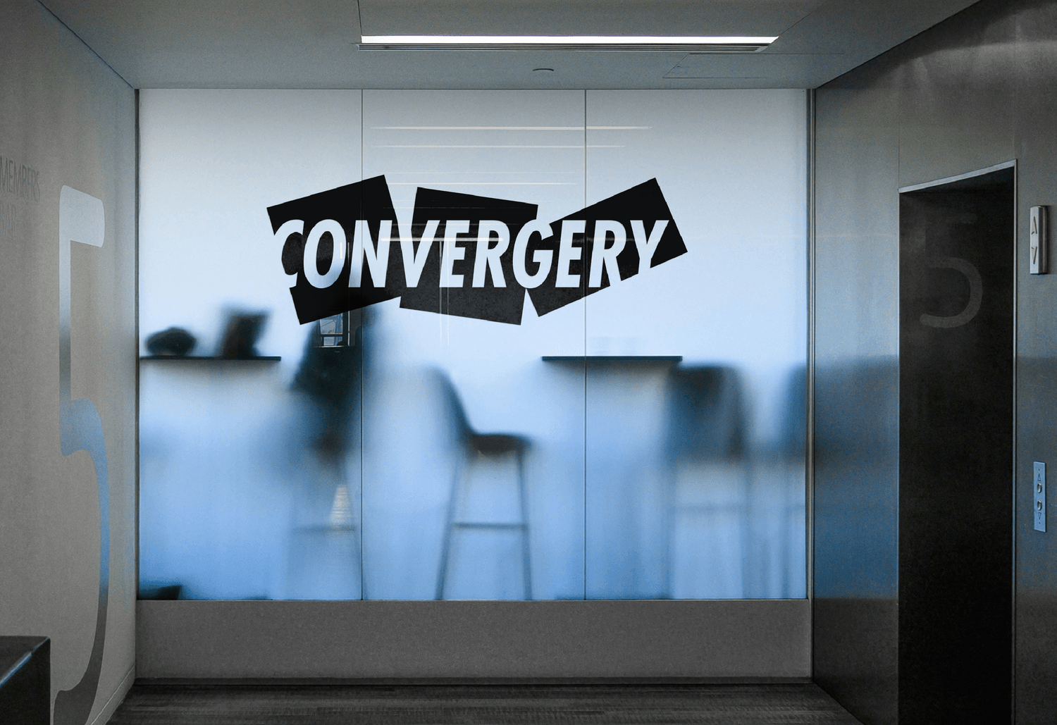
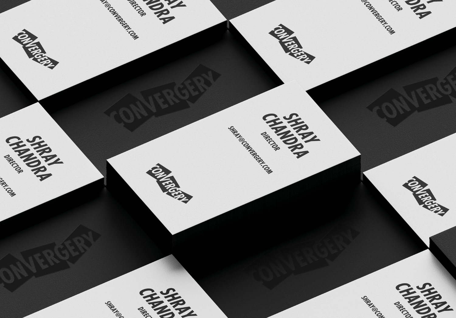
Inspired by the idea of a playground, the brand's visual design is built around the graphical device of a block. The logo is a set-up of blocks frozen in motion, encasing the typemark and evoking a sense of energetic play. This carries through in the design system of the brand, with blocks acting as holding devices for visuals and anchoring elements in layouts.
Convergery's motion system is designed to amplify the idea of a playground and complement the visual language. It is anchored in simple motion principles that allow the animation of typography, layout objects and transitions.
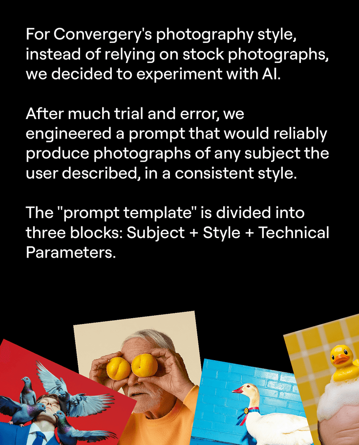
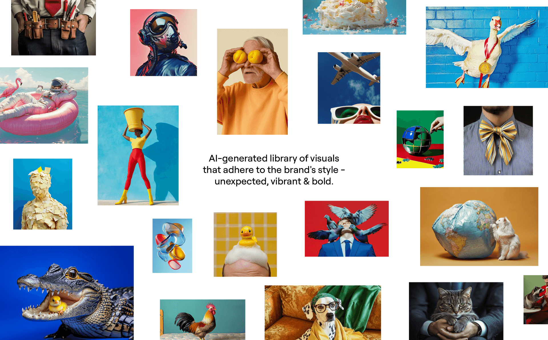
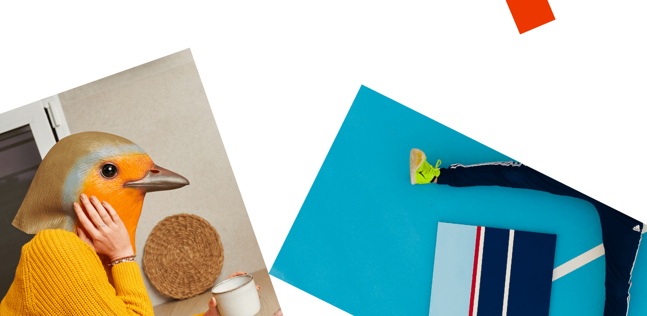
In the spirit of a playground, the brand relies on Midjourney to create imagery on demand. We engineered a prompt template that would reliably generate photographs on Midjourney in the brand's style - unexpected, vibrant and bold.
The brand's visual system is sophisticated in its simplicity, allowing for fresh applications easily, using a very limited set of brand elements.
www.convergery.com | Instagram | Linkedin
