Antidote Craft Coffee
Branding & Packaging
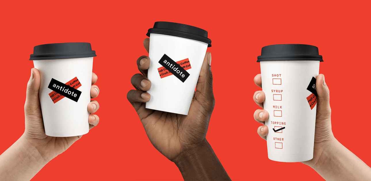
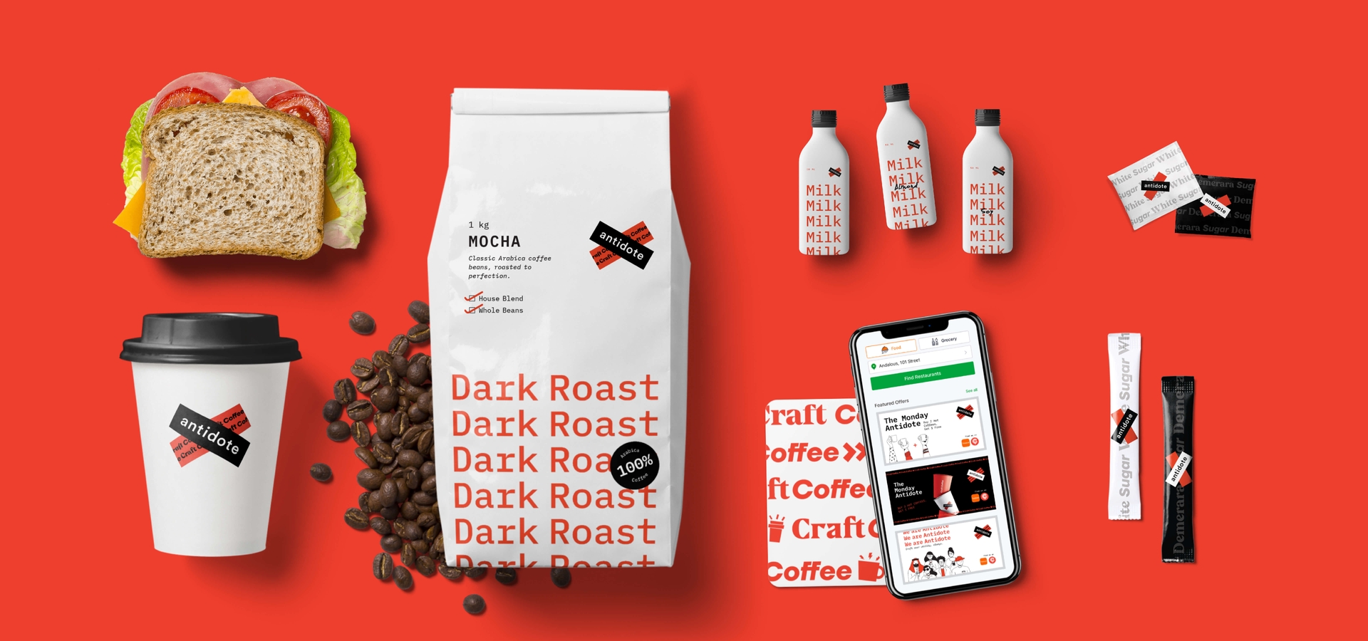
We partnered with a global food delivery giant (name withheld temporarily) to create a delivery-only coffee brand that will have multiple locations in cities around the world.
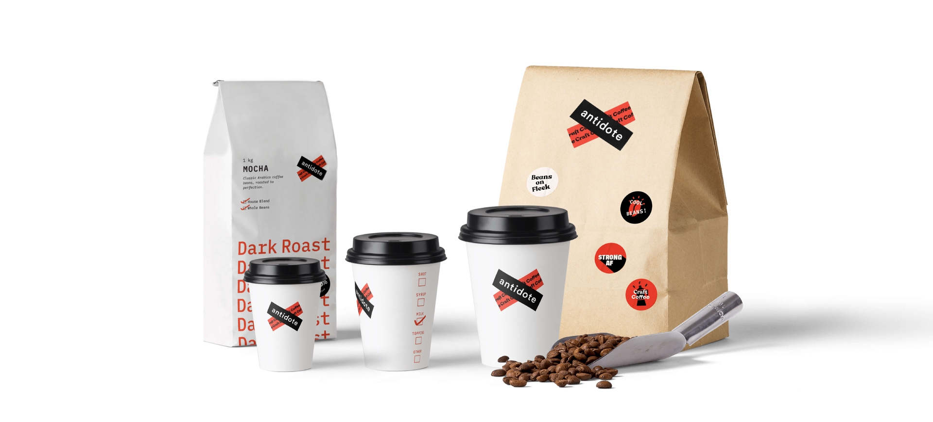
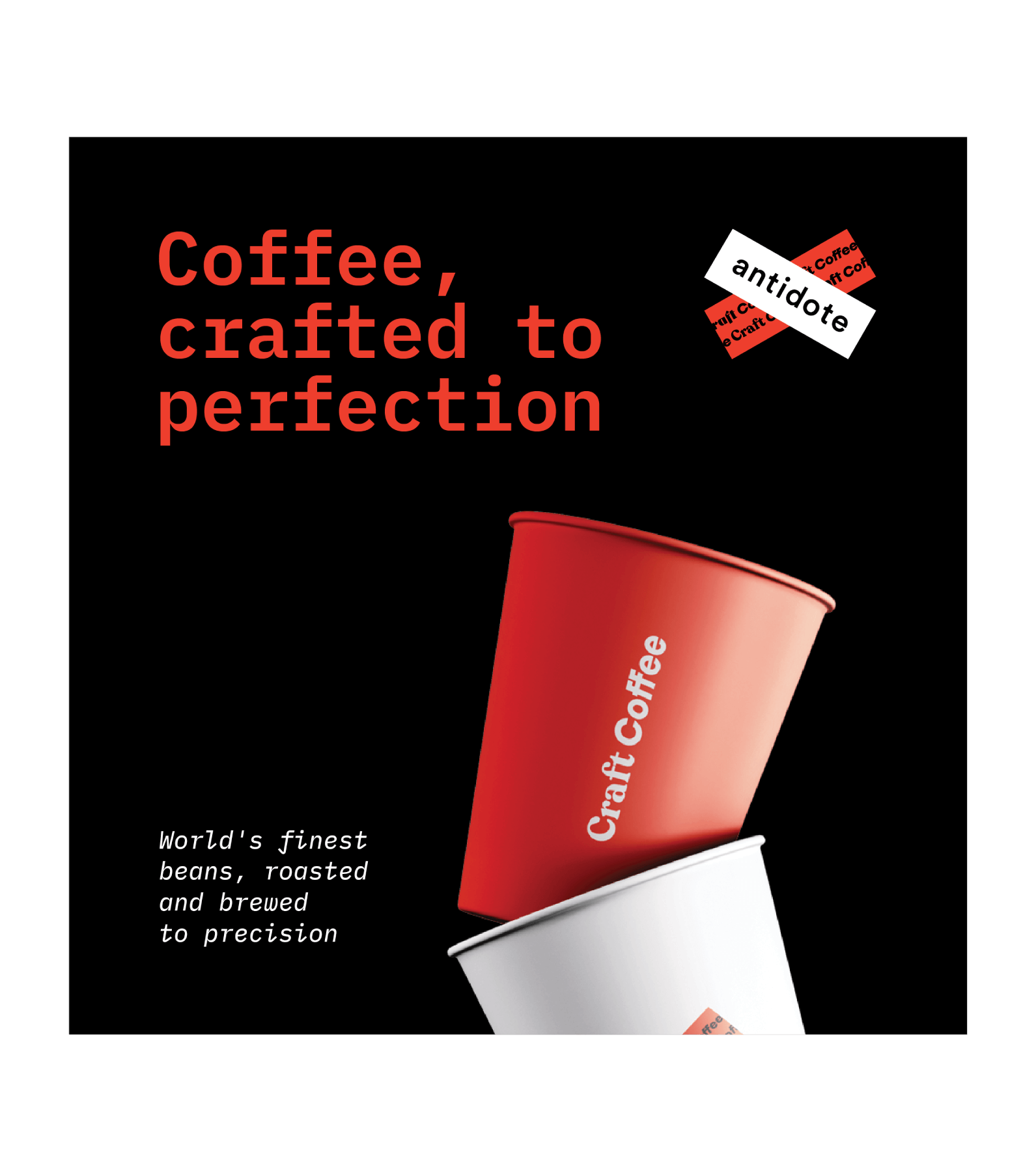
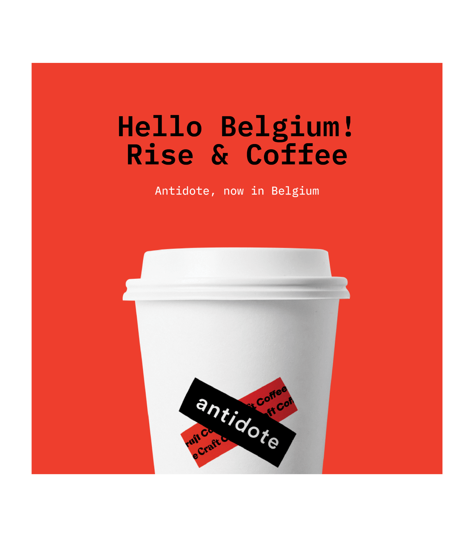
Our work started with creating the nomenclature – the brand name (Antidote) and descriptors (Craft Coffee) – and covered the brand identity, visual language and visual expressions of the brand, including packaging and collateral.
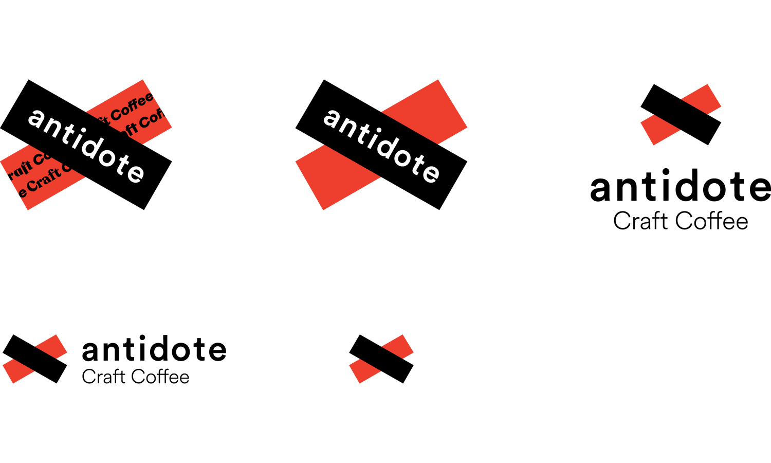
Antidote is a brand that is fun. And serious about good coffee. It is a brand for the morning’s first cup. And the fifth cup working on the last slides of your pitch. It is a brand about crafting the perfect cup from the finest beans. And it is about the convenience of 15-minute delivery. From this dichotomy emerged the symbol of the brand – the layered cross – which also forms the container for the name and descriptors.
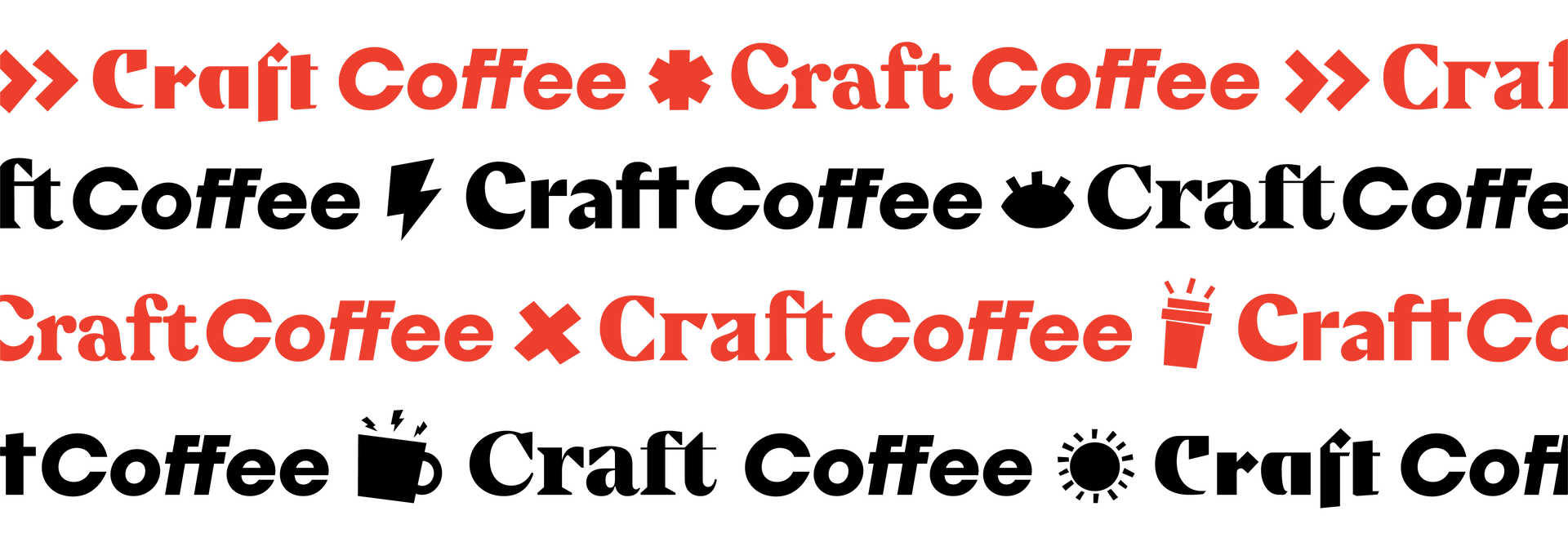
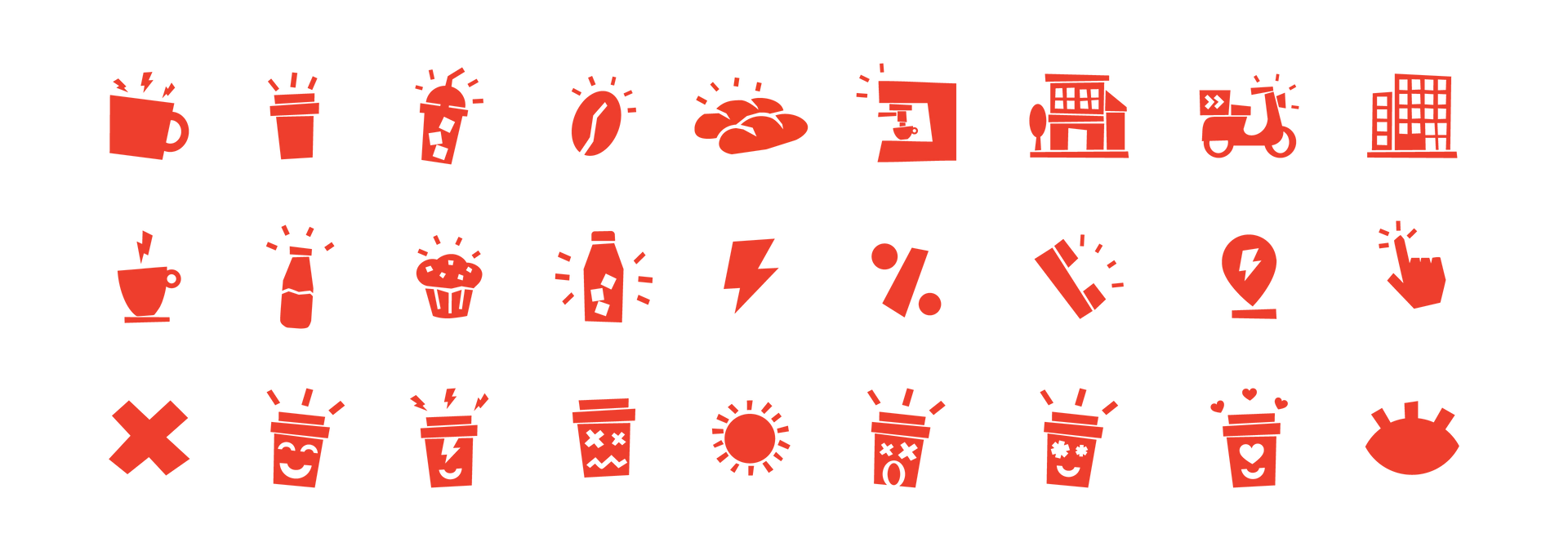
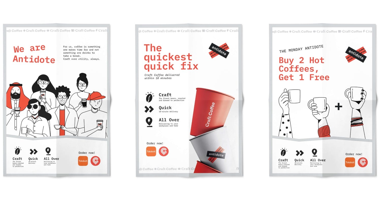
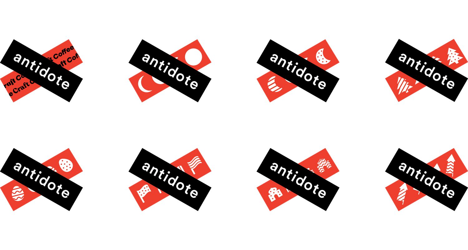
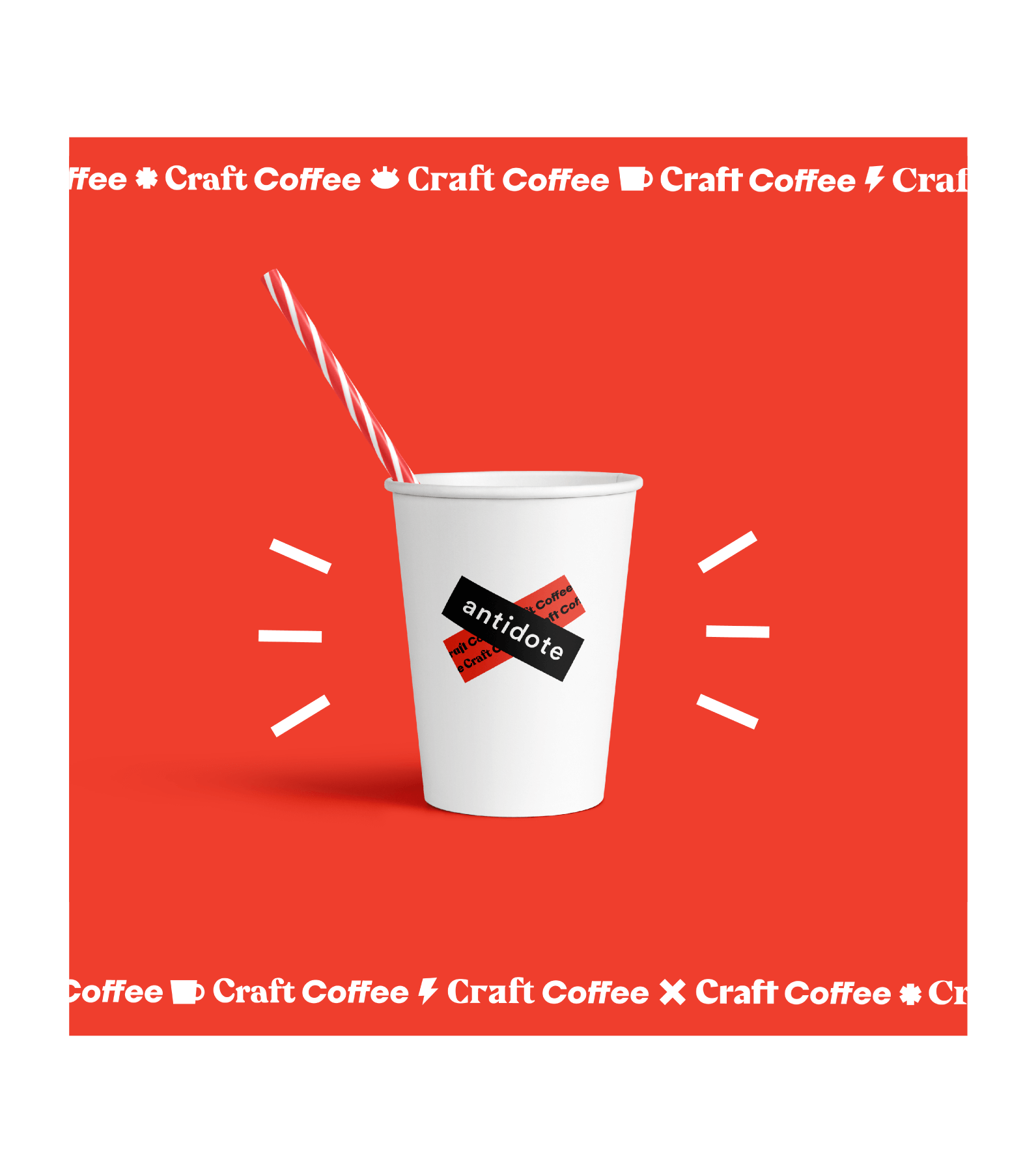
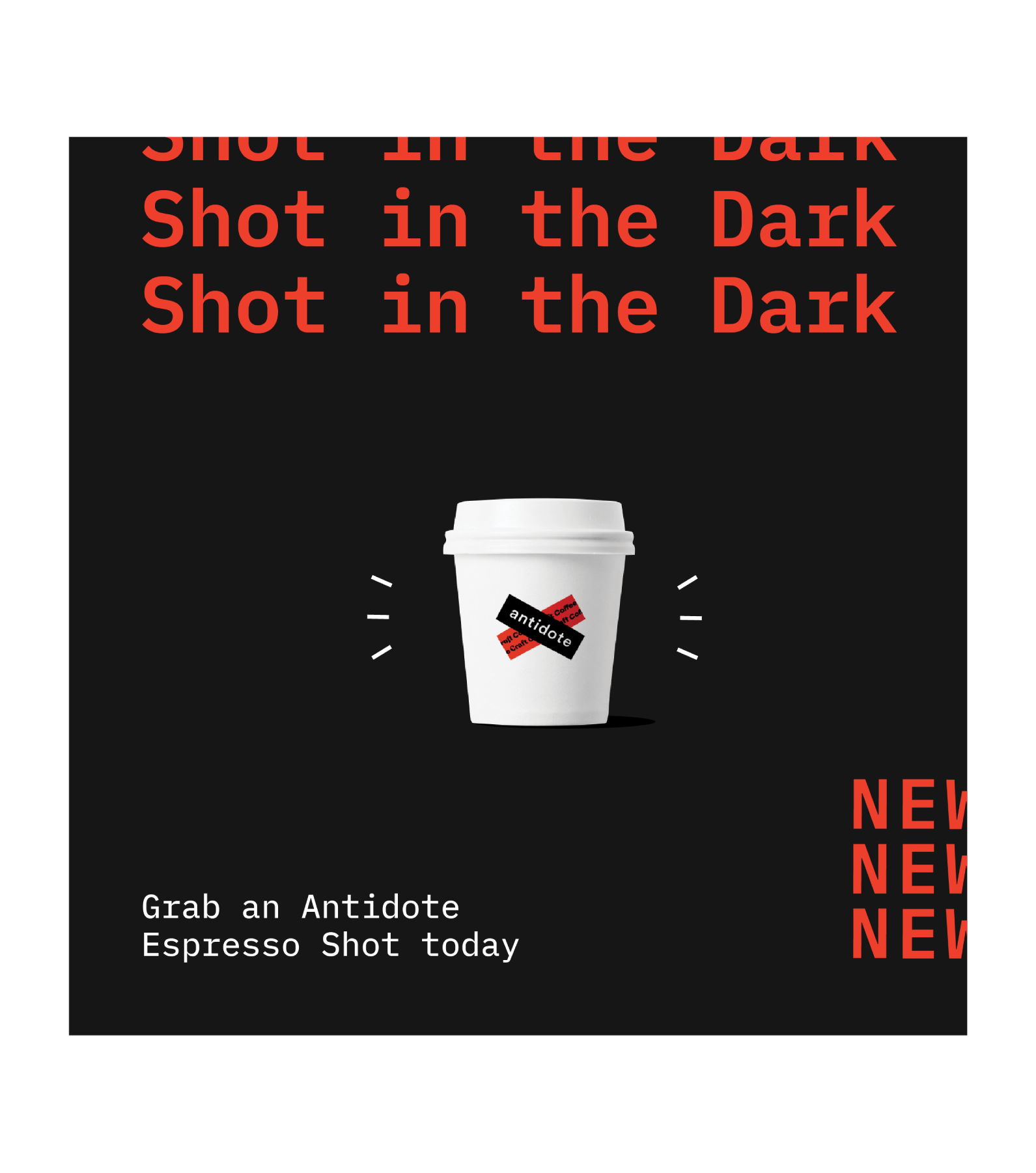
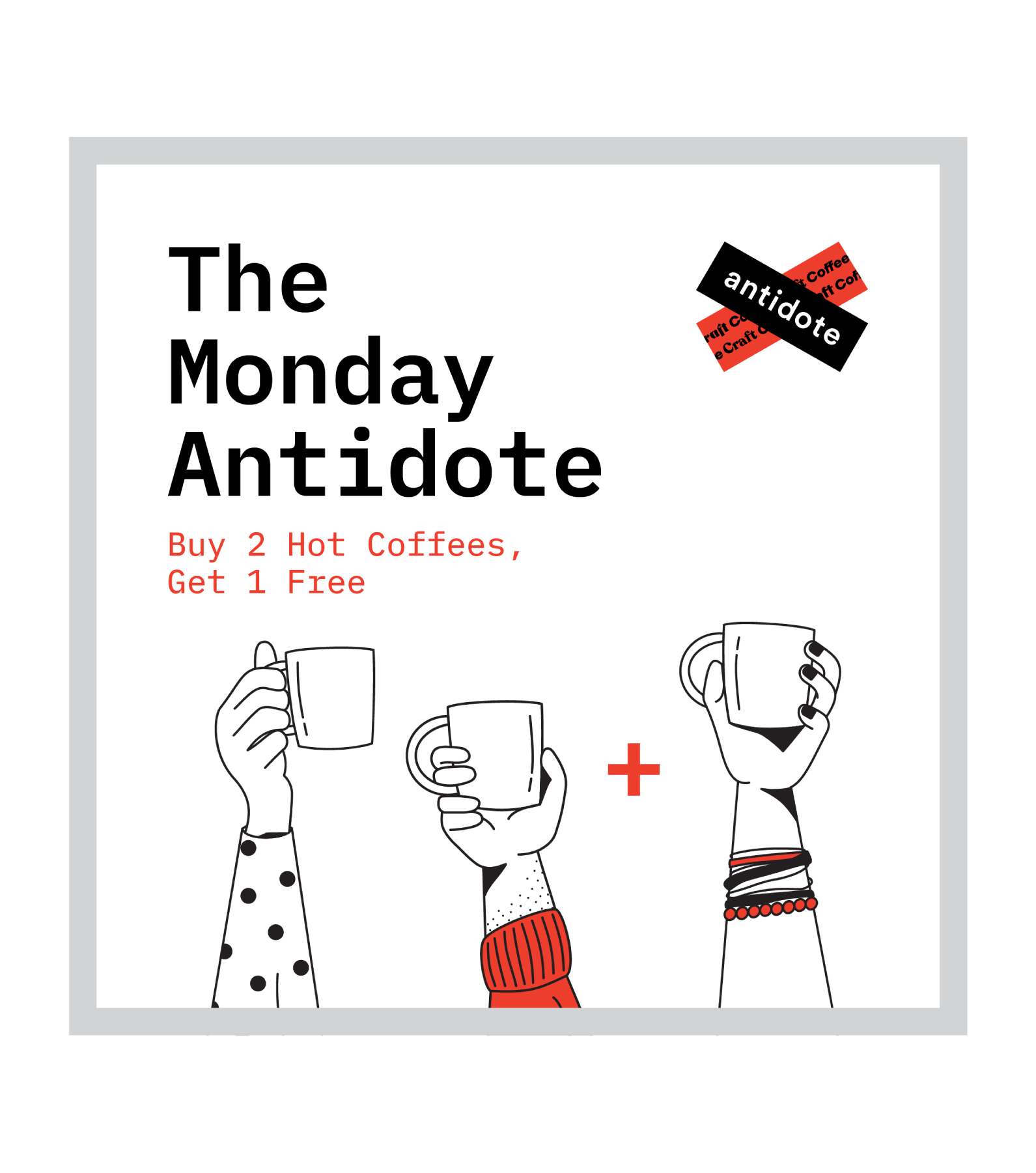
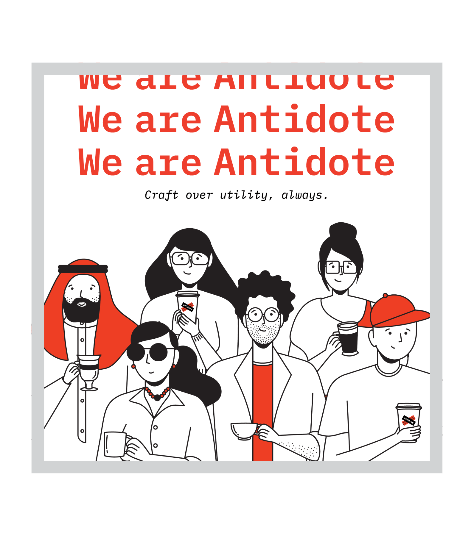
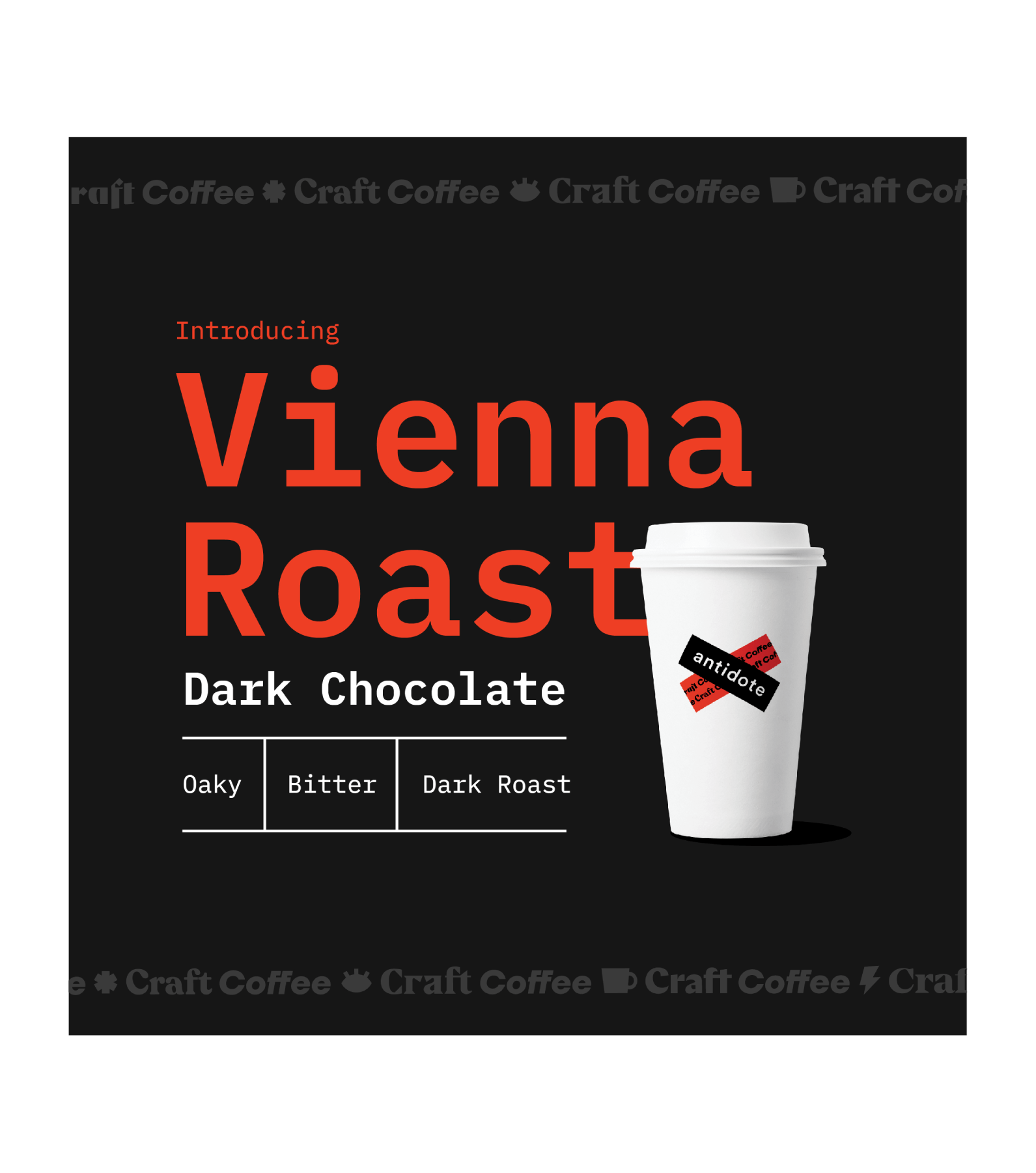
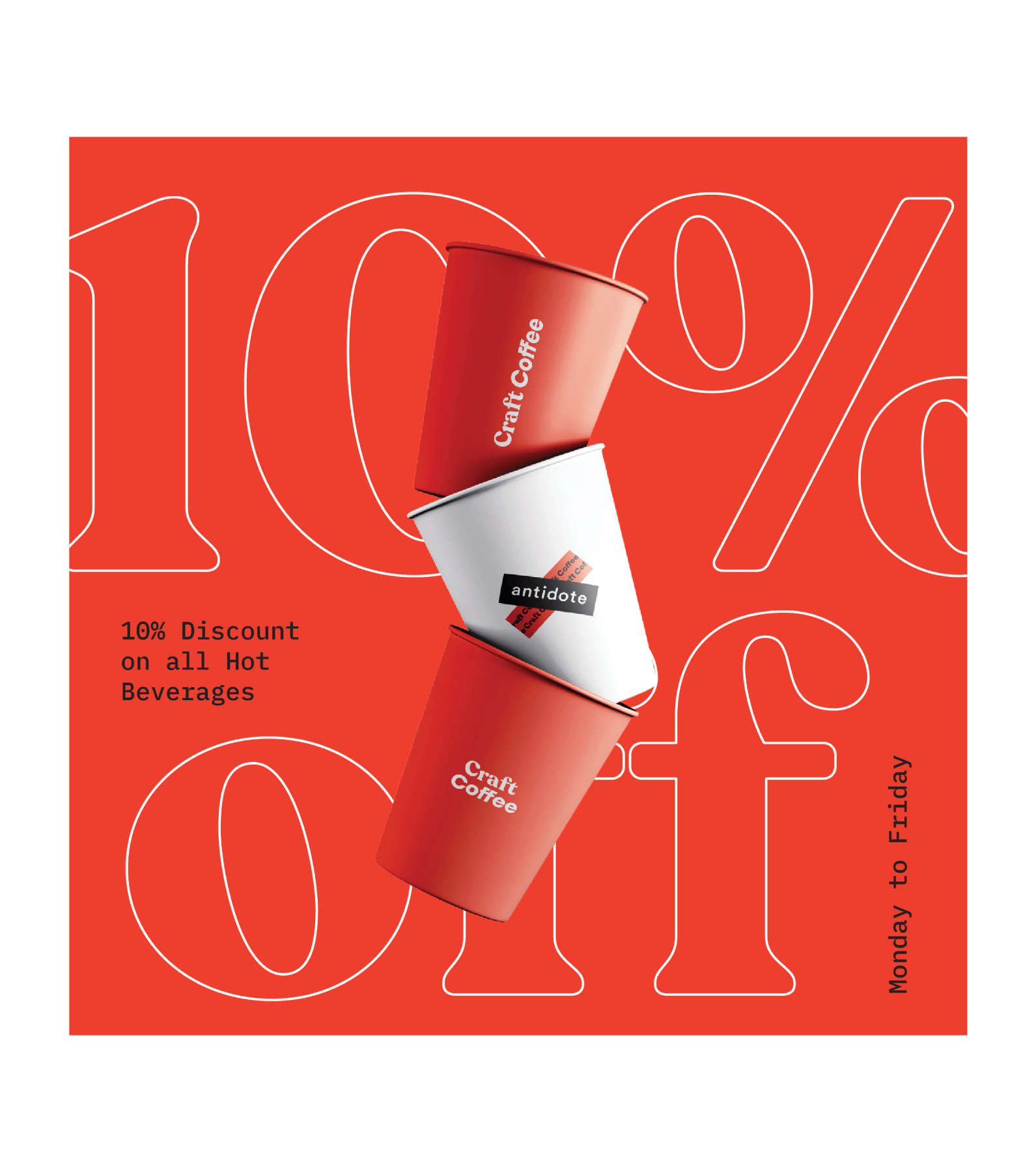
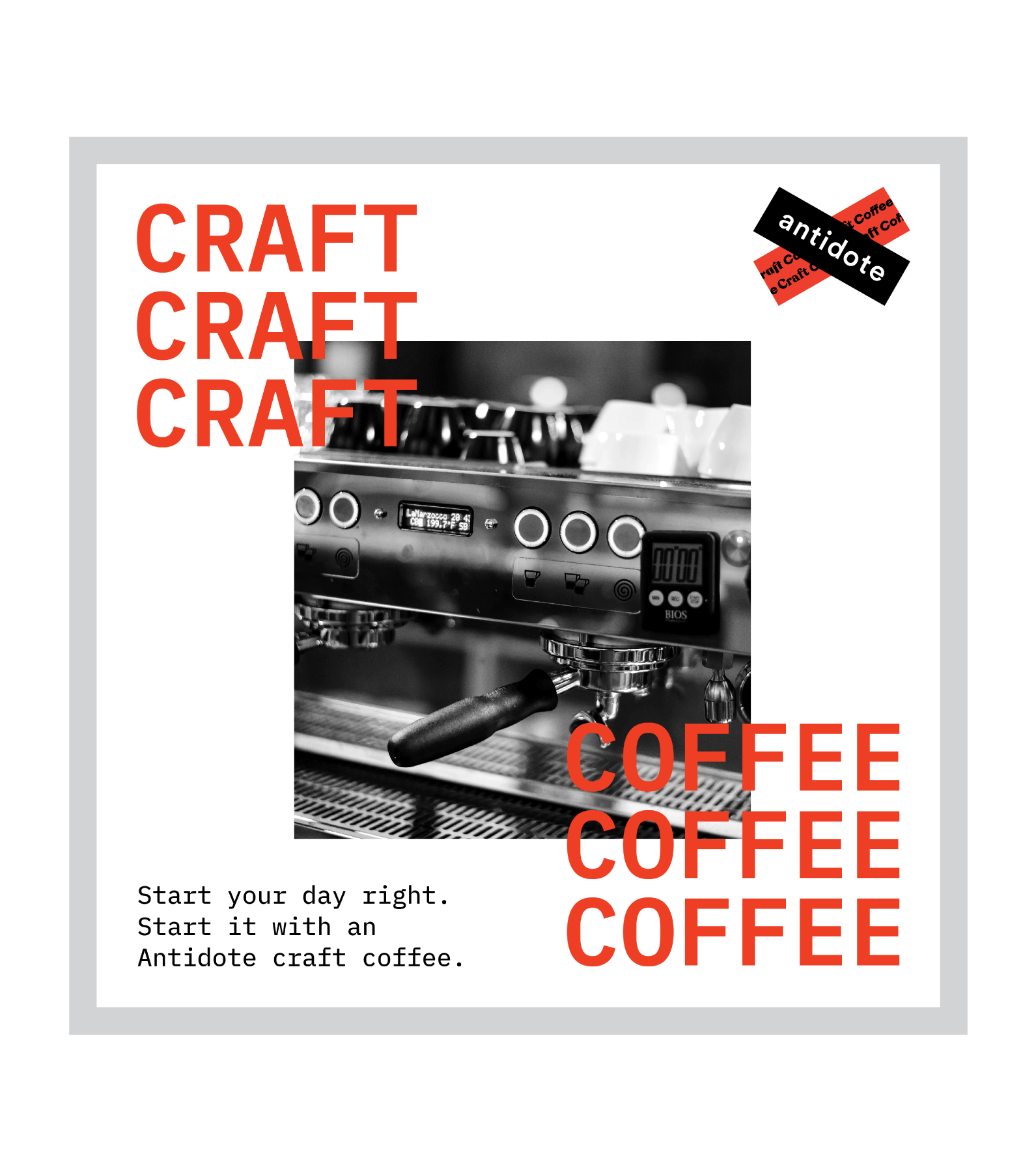
The layering of two bands to form the logo allows for great flexibility – in creating varying logotypes and playing with the logo by changing the contents of one of the bands. This flexibility extends to Antidote’s visual language, where we use a mix of illustrations, graphical stickers and typography to keep the use of the brand fresh and exciting.
