Anthem
Brand Identity / Fintech

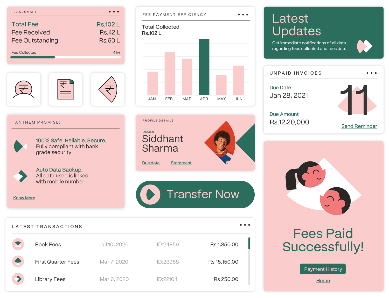
Anthem is a Fintech brand with Ed-tech leanings. Or an Ed-tech brand with Fintech leanings. It is a technology platform that helps educational institutions manage their finances - automated fee collection, cash-flow projections, AI-enabled analytics, expense tracking, payout automation and more.
Founded in 2019 as Finwego by Shiv Vadivelalagan and Pavee Ramanisankar, it has worked with over 9,000+ educational institutions, won Harvard University's Innovation Award and counts Elevation and Village Capital as investors.
Opposite worked closely with the founders to reimagine the brand from the ground up. A bold new name, supported by a strong identity and visual framework. The Anthem logo is the starting point of the brand identity, with a sleek geometric symbol that forms an abstract A and a custom crafted wordmark.
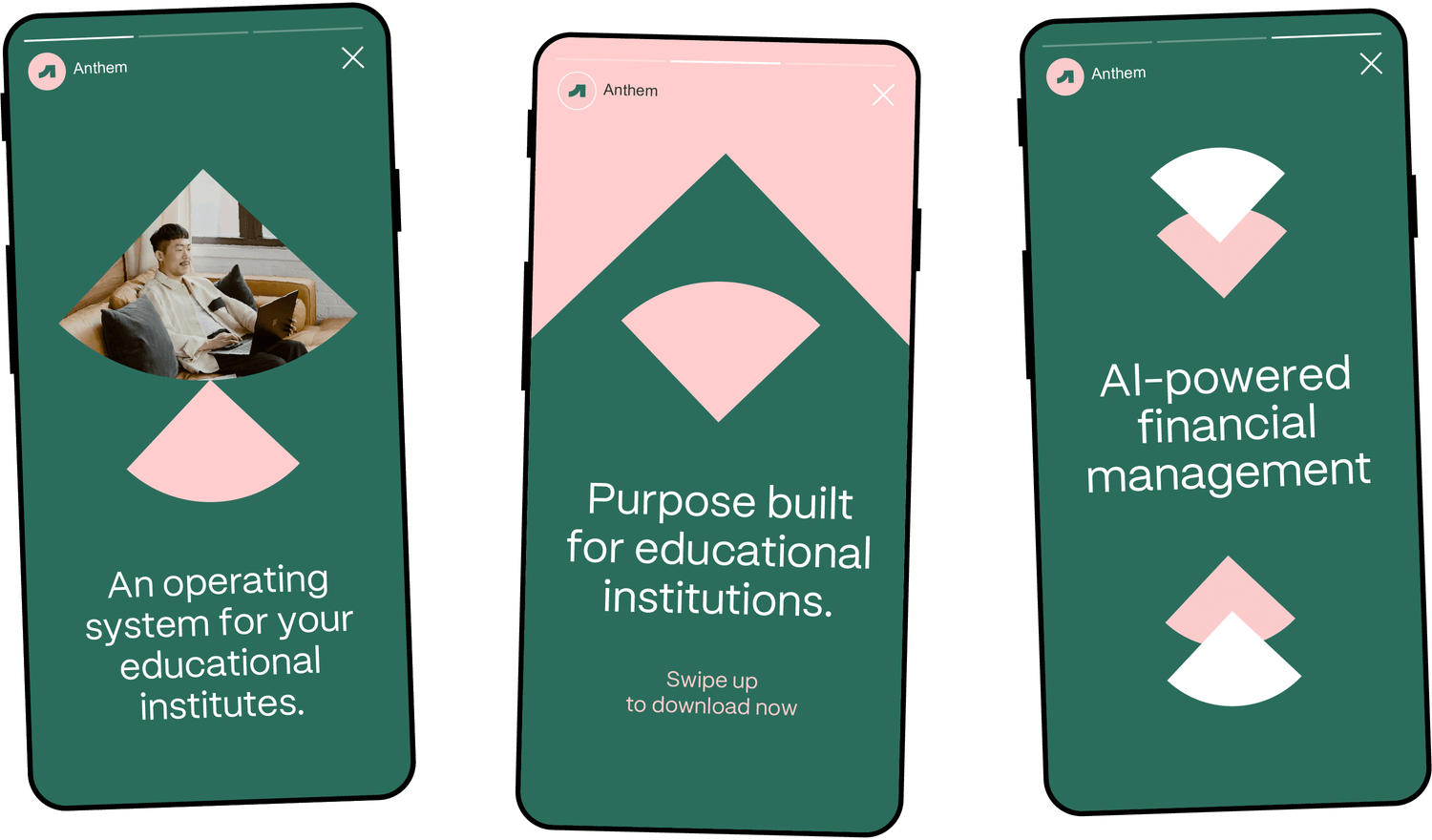
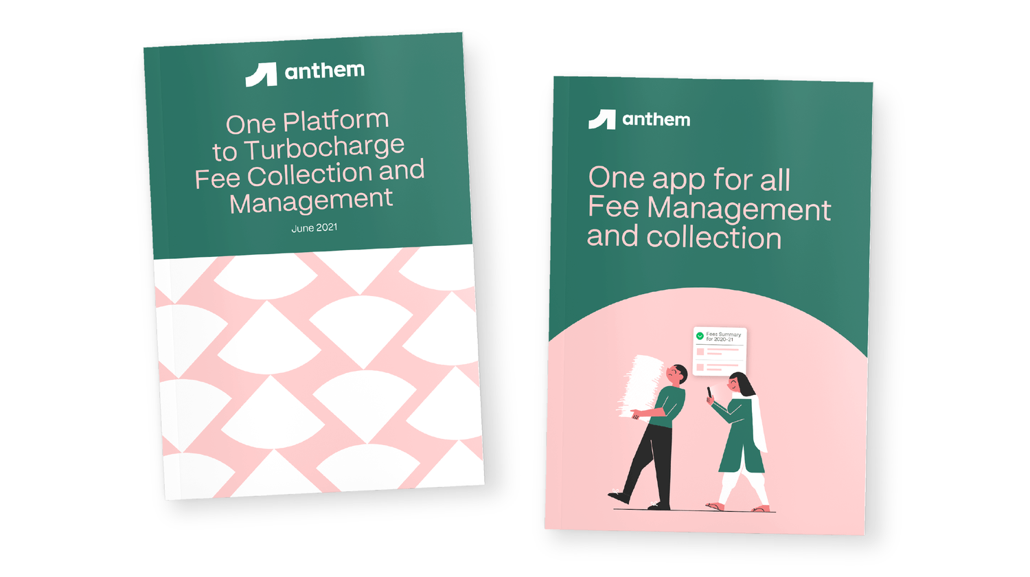
Taking cues from the logo, the visual framework is built around the use of quadrants as the primary graphical shape in the form of windows for images, an animated icon system and as patterns. The visual framework is further held together by a fresh and distinct color palette, dominated by pink and dark green.
