Abhisek Sarda / 2016-11-15
Noteworthy or Not-worthy? A Design Critique of the new Rs. 2,000 note
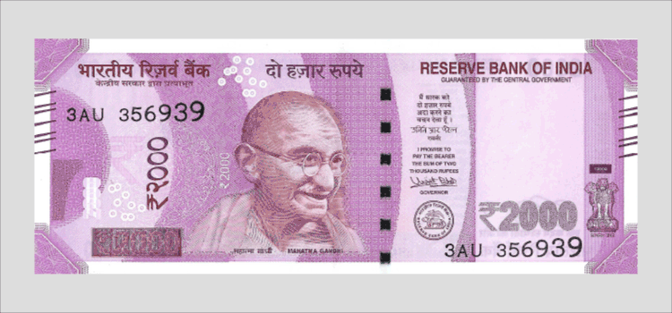
India has a brand new currency note – a Rs. 2,000 note – the highest denomination in circulation currently. The new currency note was introduced in the backdrop of a massive disruption of India’s Financial System – with the demonetisation of existing Rs. 500 and Rs. 1,000 currency notes, which formed 86% of the currency in circulation. This was done to make all “Black Money” and Counterfeit Currency held in Rs. 500 and Rs. 1,000 notes useless.
My current view is that the demonetisation exercise is a bad idea – economically, practically and morally. The costs are massive and the benefits are vague and at best negligible. However, that is a subject for another day. Today, I’d like to focus on evaluating the visual design of the new Rs. 2,000 currency note.
The Reserve Bank of India (RBI) has said that the note was designed internally at the central bank.
At first look, the new design is a dramatic departure from the aesthetic of all Indian Currency notes – Rs. 1, 5, 10, 20, 50, 100, 500, 1,000. You could easily describe the previous currency aesthetic as “vintage”, “retro”, “ornamental”… But such clear description eludes the Rs. 2,000 note.
The new design is at once vintage and brutalist. It is ornamental and geometric. It combines 500 year old patterns with attempts at a post-modern aesthetic.
Here is my critique of India’s new Two Thousand Rupee currency note:
No Unifying Concept
The new note has no underlying idea. It is little more than a mishmash of several unconnected elements – Gandhi, Mars Mission, Swachh Bharat Logo, Elephants + Lotus + Peacock Patterns, and various completely random ornaments. Interestingly, Lotus is our national flower, Peacock is our national bird, but Tiger (not Elephant!) is our national animal.
Terrible Typography
The front (Gandhi side) of the note has 11 different typefaces, written in 14 sizes and 12 weights. The back (Mars Mission) has 6 (without counting the various scripts), written in 11 sizes and 9 weights. This is not counting the serial number which itself has 7 different sizes of numerals (apparently a security feature).
The typographic choices range from condensed sans-serifs to thin serifs. Worse, there is absolutely nothing common between the typefaces used for the English text and the Devanagari text. I would have imagined our notes to have benefitted from the flourishing Indian Typographic scene – but sadly, that is not the case.
Merawala Pink
This can be subjective of course and I’m sure there are people out there who love the pink / magenta. I hate it. The color choice could have been much better. Among the reactions I’ve heard so far – “it looks like a bus ticket”, “it looks like a fun-fair coupon”… However, objectively – the highest denomination bank note of our country deserved to look more sophisticated and subtle – stately perhaps – not a in-your-face pink extravaganza.
Inconsistent Aesthetic
The new Rs. 2,000 note has no consistent aesthetic palette. The aesthetic swings from ornamental motifs (of which there are 4 different styles!) to spirograph motifs. From an etched rendering of Gandhi to a rendering of “Mangalyaan” in some kind of a three tone style. From bold geometric to batik-style motifs of elephants and peacocks. From Swiss Punk Typography to Mughal-esque patterns. In comparison, previous notes (100, 500, 1,000) had a clear aesthetic – ornamental / vintage. I didn’t like those either – but they were at least consistent. The new notes seem to have suffered from a malaise some designers might be quite familiar with – letting the client dictate individual elements (“I like this”, “My wife’s favourite color is…”, “I don’t like serifs”, “I want it like that note”…), resulting in an unsalvageable hodgepodge.
The new note attempts a modern aesthetic, but falls woefully short.
Size: The Cost of Change
The Rs. 2,000 note is 66 mm tall, about 6mm shorter than both the Rs. 500 and Rs. 1,000 notes, which share the same height at 72 mm. I’m assuming there is some justification for the change in size – but I’m not sure if the reason for making a 6mm change justified the enormous logistical effort of recalibrating 200,000 ATM machines spread across the entire country. An effort the government has struggled with and expects will take about three weeks in the best case scenario. With currently available facts, this seems like a classic case of a rookie designer not thinking about the real cost of their design decisions.
They forgot to do the layout
The layout of the Rs. 2,000 note is all over the place. There is no clear organization of information – with different typographic, decorative, functional and security elements, seemingly floating around. Absolutely no attention has been paid to alignments – as you will see in the image below, almost none of the 23 visual units on the front and 17 on the back seem to align with each other. The lack of any sort of a grid, especially when you have almost two dozen visual elements, is unforgivable.
Rs. 2,000 can’t buy you imagination
Above all, the new Rs. 2,000 note is completely unimaginative. Instead of using this opportunity to reimagine Indian currency design (perhaps even global!) – the design of the new note is unremarkable in every way. All our notes have Gandhi on them (putting others might be too controversial) – but could we have at least been more imaginative with the aesthetic of Gandhi’s portrait?
No Functional Improvements
One of the highlights of the Prime Minister’s announcement of the new currency regime was to implement new security features that would make it difficult for counterfeiters to make fake notes. Apparently, the RBI didn’t get that brief. A few days later, RBI officials have clarified that the notes have no new security features – since there wasn’t enough time (To all the designers reading this – even the Central Bank of our country has impossible deadlines – it’s not just you!). As most designers are painfully aware, the lack of actual features has never stopped the marketing department from making tall claims.
UX: Does it work?
This point is probably outside the scope of a purely visual design critique – but as someone who believes that design runs much deeper than the visual, I ask two questions: “Does the new note fulfil its stated purpose?” and “Does it work well with the rest of the system?” – this is the most fundamental way to determine if a design exercise has achieved its goal.
While demonetising the Rs. 500 and Rs. 1,000 notes and thereafter, the Prime Minister has explained the purpose of this move in the following ways:
1) Remove “Black Money” from the country
2) Move from a “Cash Economy” to a “Cashless Economy”
3) Encourage Digital Transactions
We also know that:
1) In the “non-black economy” – cash is usually used for small transactions, while large transaction are usually carried out using cheques, online transfers etc…
2) “Khulla nahi hai” (“I don’t have change”) is a refrain everyone hears at least once a day.
If this is the context, the answer to both questions (purpose and system) is NO:
1) A higher denomination note is suited only for “storing” money – not for everyday transactions that most people engage in using cash – buying groceries on the street, snacks, beverages, local train / bus ticket, cab fare…
2) A study of the system will tell us that there isn’t enough “change” in the system to facilitate the easy use of the Rs. 2,000 note for everyday transactions. A Rs. 2,000 note is useful if your purchase is over Rs. 1,500.
3) More importantly, the Rs. 2,000 note encourages payments in cash, thereby defeating the objective of moving to a cashless economy – unless of course the RBI and the government expect Inflation to go up dramatically enough to make Rs. 2,000 equivalent to the Rs. 1,000 note it replaces!
It might make sense to “go cashless” by removing higher denomination notes and limiting cash use to smaller retail transactions that are too small to merit using a digital route.
On a positive note, it seems the new notes are now “braille-enabled” – so users with vision difficulties might be able to use them more easily.
If the government is of a mind to make India go “cashless” – it is not clear how a Rs. 2,000 note fits with that objective.
As much as I want to find some redeeming qualities in the design of the new Rs. 2,000 currency note – I can’t. At the risk of being facetious – the only thing going for the new currency design is that the bad design is consistent with new Rs. 1, 2, 5 and 10 coins designed recently. Like the demonetisation, the new note is an unmitigated design disaster and a missed opportunity. With the kind of update cycles that currency notes have, it is unlikely that the design and the visual language of Indian Currency will change for the better in the next 5 years. And that is sad.
By Abhisek Sarda, with inputs from Palak Sanghani and Aakash Rodrigues.


If you want to reproduce this article or use one of the images above, please write to 911@oppositehq.com.
If you are from the RBI and want to get a better note designed, please write to the same address.
The critique has been reproduced at: